scDeepDive
The scdeepdive app is mainly used to visualize single cell RNAseq data and to annotate different cell types either by using machine learning algorithm, which requires an annotated reference data set, or by manual annotation using selected gene markers.
Study Selection
In the study selection panel, users can utilize the following options to analyze their data:
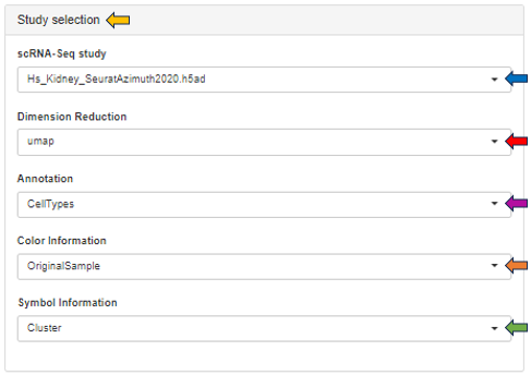
- scRNA-Seq study: Choose your study of interest from the dropdown
- Dimension Reduction: Visualize study data using UMAP or t-SNE techniques
- Annotation: Annotate data based on cell types, sample ID, region, sex, or species
- Color Information: Customize the color scheme of sample data, either individually or by clusters
- Symbol Information: Display information for each symbol, either individually or by clusters
Gene selection
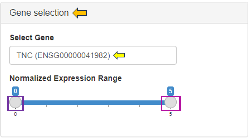
The gene selection panel facilitates the selection of genes or features of interest for analysis in the study. Within the feature selection dropdown, users can choose from various data selection methods, including Manual Autocomplete, Manual Freetext, Custom Feature Lists, and Feature List Collections. A detailed description of these options is available via the this link: Highlighting Specific Genes or Features.
Genes

The Genes tab offers a detailed analysis of the data through the following sub-tabs:
Cluster Gene Comparison

- This section allows for the analysis of annotated data and its expression levels.

- Below, you will find a dimension reduction plot (UMAP or t-SNE) of the selected gene or feature.

- A download option is available at the top of the plots, enabling users to save them as a PPT file. The plot point size can be adjusted using the highlighted scroll bar. Users can also switch between light and dark view modes according to their preference.

Expression Overlay Comparison

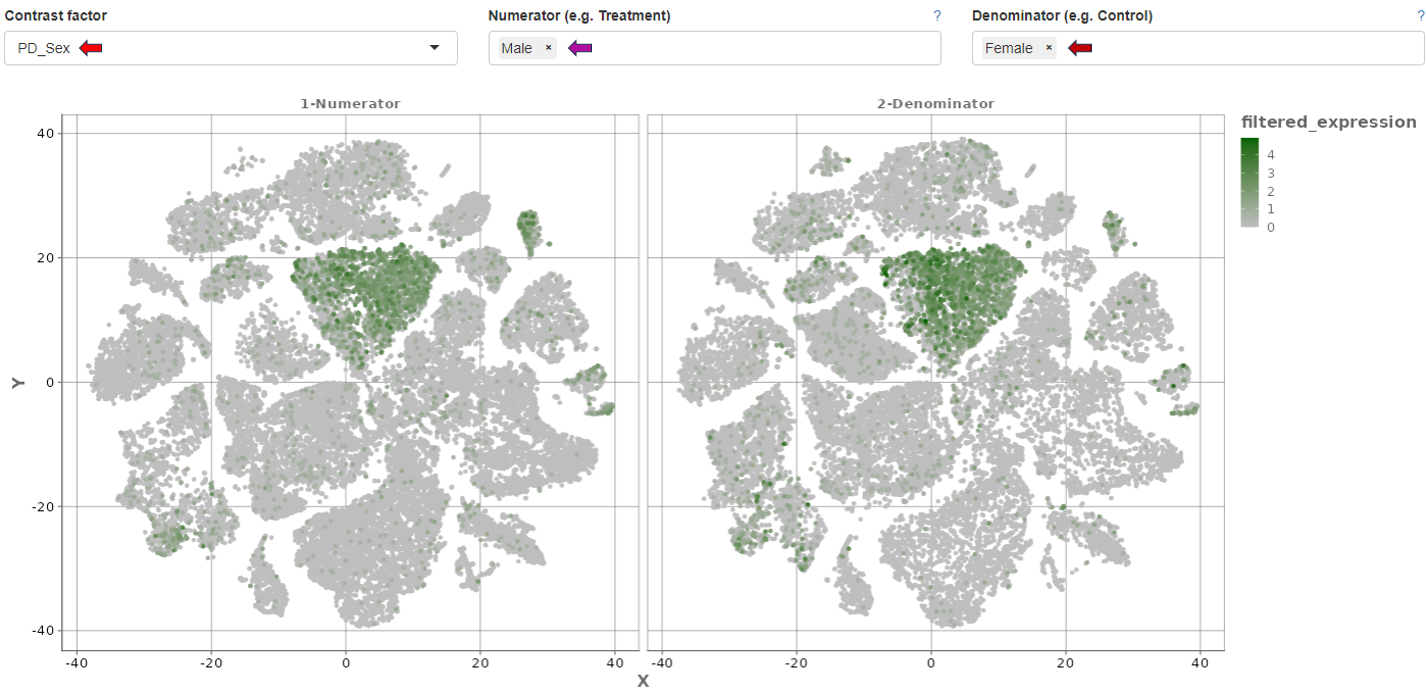
- This sub-tab enables the analysis of individual genes selected from the gene selection panel, with the ability to adjust their normalized expression values.
- It supports comparison using contrast factors such as sex, donor, region, and species.
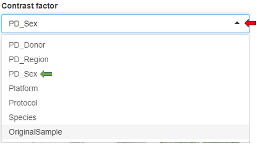
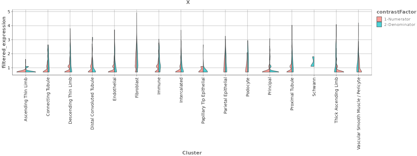
- Additionally, it provides a deeper visualization of cluster comparisons of the selected contrast factor in terms of numerator and denominator. The comparison is depicted both as a dimension reduction plot and a violin plot including their expression ranges.
Expression Violin Plots

- The Expression Violin Plots section displays violin plots that illustrate the gene’s presence, measured in counts per 10k, across each cell type as well as combined.

- Additionally, it provides the percentage of the gene’s expression within each cell type cluster below as a bar graph.

Cluster analysis

The Cluster Analysis tab comprises the following sub-tabs for comprehensive study analysis:
Mosaic Plot

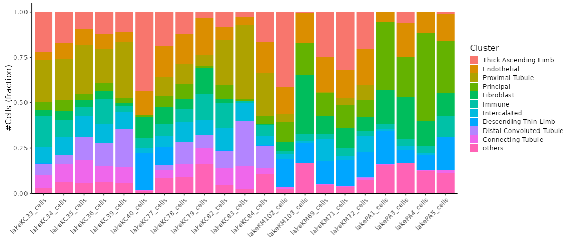
This section presents mosaic plots that display the fractions of cell clusters within each sample.
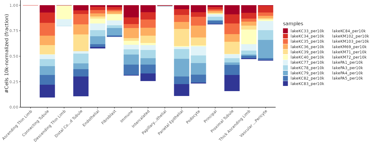
It also includes an analysis of the expression patterns of these cell fractions across the samples.
Comparison

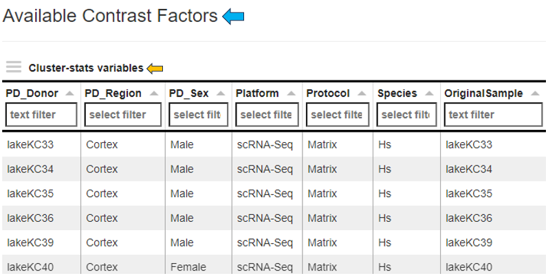
The comparison tab features a table listing the available contrast factors within the study for comparative analysis.
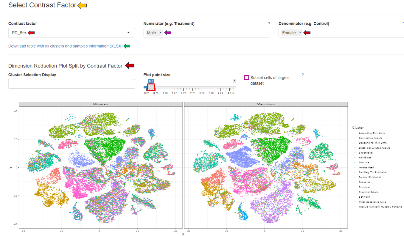
The “Select Contrast Factor” panel allows users to choose individual contrast factors for comparison and visualization as a dimension reduction plot. By selecting the “Subset cells of largest dataset” box, the dataset with the most cells will be subset to match the number of cells in the smallest dataset. This panel also includes a download option to export all clusters and sample information in Excel format.
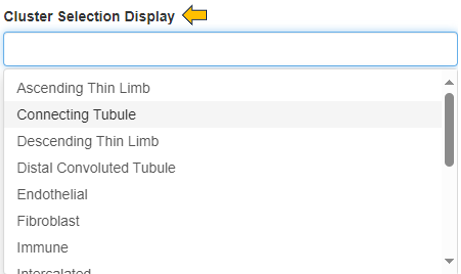
The “Cluster Selection Display” option enables users to refine the comparative analysis to specific cell clusters.
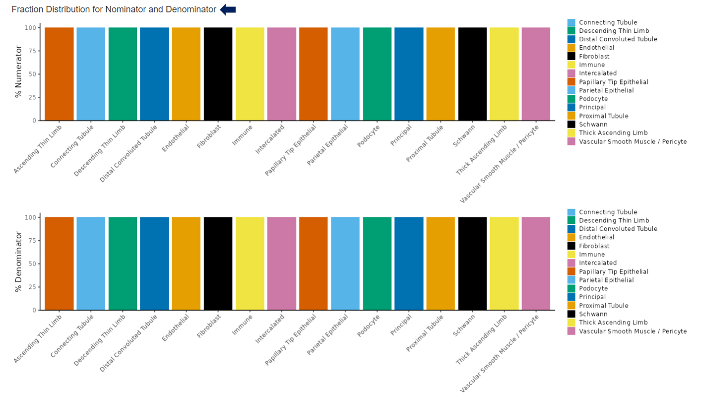
Below the dimension reduction plot, users can observe the fraction distribution for the selected numerator and denominator within each cell cluster.
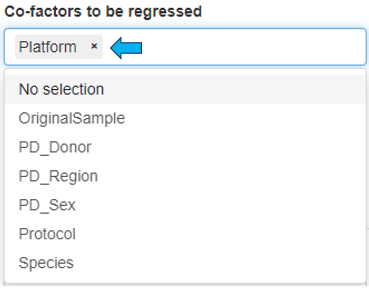
The “Differential Abundance Test” panel allows for the selection of co-factors that may influence cell type abundance, enabling users to better identify them. Users can filter out low changes (<2 log fold change), calculate normalization factors, and run the “Cluster Comparison” by selecting the appropriate checkboxes.

Plots

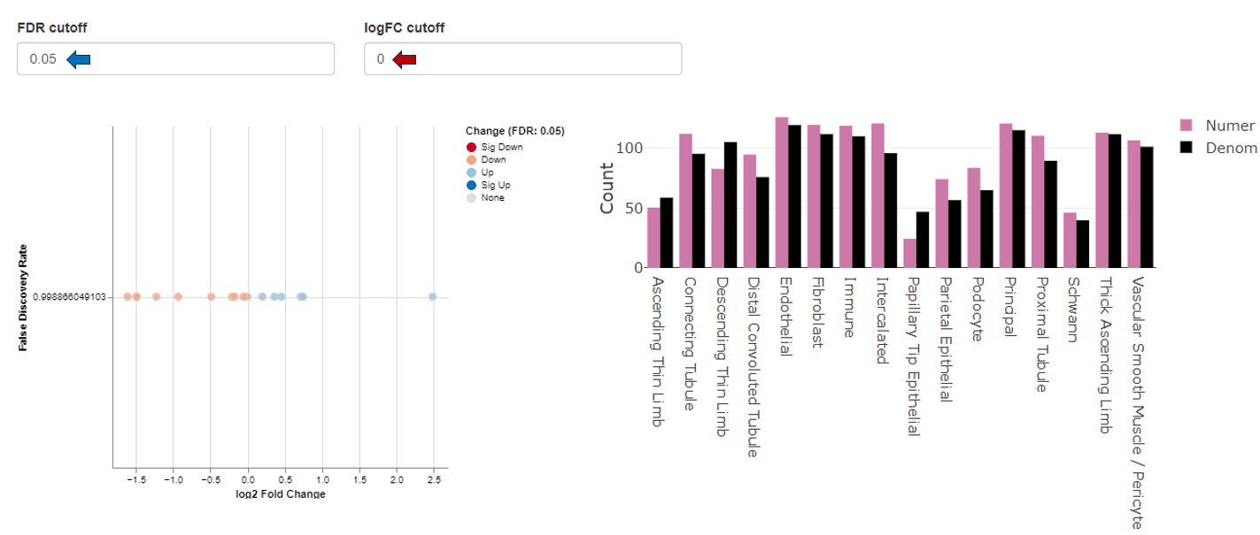
This sub-tab visualizes the resulting cluster comparison through FDR change plots and bar graphs. The FDR cutoff and logFC cutoff can be changed as per user’s interest.
Abundance Table View

This sub-tab provides a differential cluster abundance table with the corresponding log values, p-values, and FDR results.

Annotation Overlap

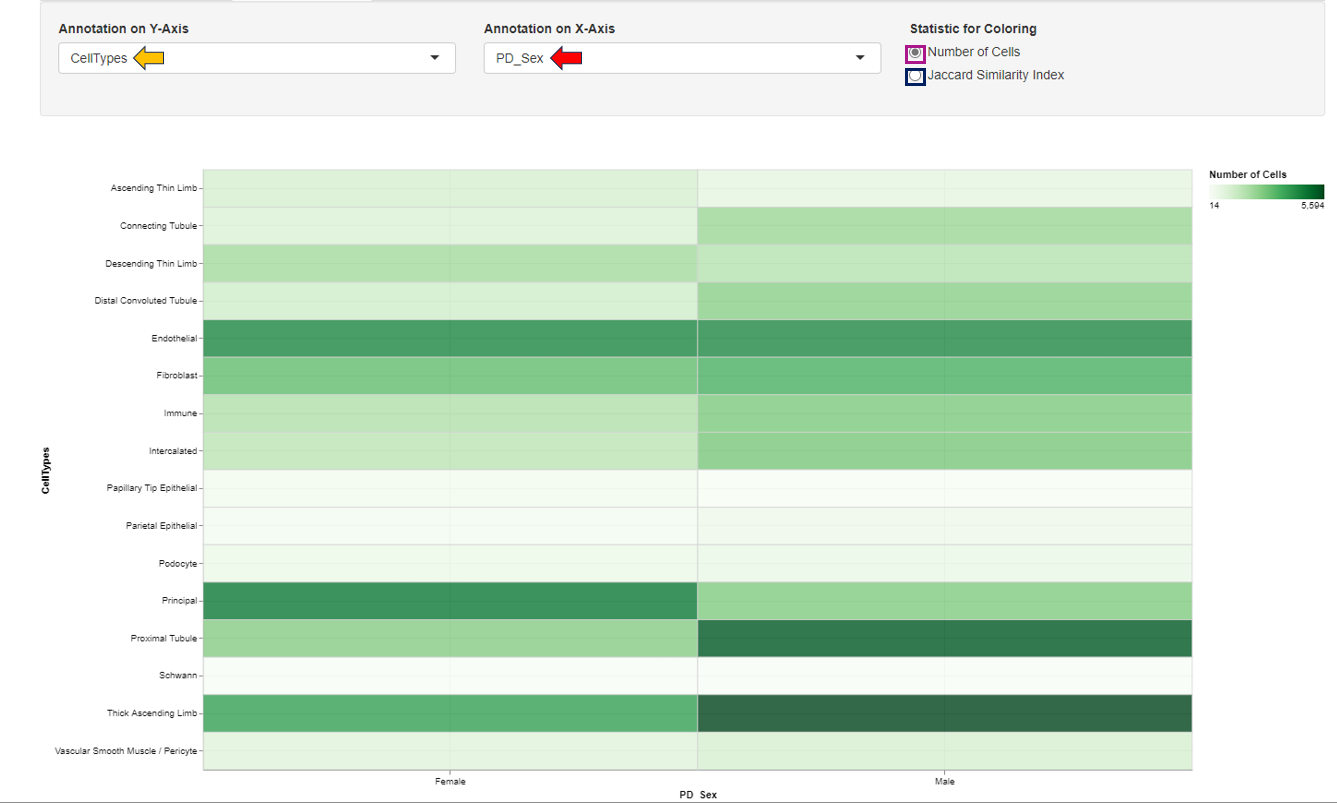
The Annotation Overlap tab enables visualization of expression patterns across various annotated study factors. Users can select the annotations to be displayed on the respective axes from the provided panel. The expression pattern can be color-coded based on either the number of cells or the Jaccard similarity index, allowing for detailed observation and analysis.
