ProteomicsQC
The Proteomics QC App is a comprehensive tool designed to streamline and enhance quality control processes in proteomics research. It offers features for assessing data integrity, identifying anomalies, and ensuring the reliability of protein analysis results. By integrating various QC metrics and analytical tools, this app enables researchers to efficiently monitor and improve the quality of their proteomic experiments, ultimately enhancing the accuracy and reproducibility of their findings.
Introduction
Before we can dive into the actual analysis of your proteomics data, you might want to check that your data is reasonable at all. This is exactly what the Proteomics QC (quality control) app is doing!
Detecting problems in your underlying data at a late stage of your analysis can be inefficient, so this app will be probably one of your first steps of your analysis. Such problems can originate at every stage of the preprocessing: E.g. during the sample preparation, the data generation by a protein identification software or even in the data integration phase. Each of these steps will be tackled in the ProteomicsQC app. Currently, support for the protein(groups) and ptm data is available. We are actively advancing the support for peptides and PTMs in our data, stay tuned for exciting updates!
Before jumping directly into all features of the app, there are some general remarks about this app: As you know, this app is only a small part of the full PanHunter universe. Hence, if you stumble about interesting patterns in your data that you want to investigate immediately, you can always switch to all other PanHunter apps by clicking on the “≡” button on the top .
Pre-processing info tab

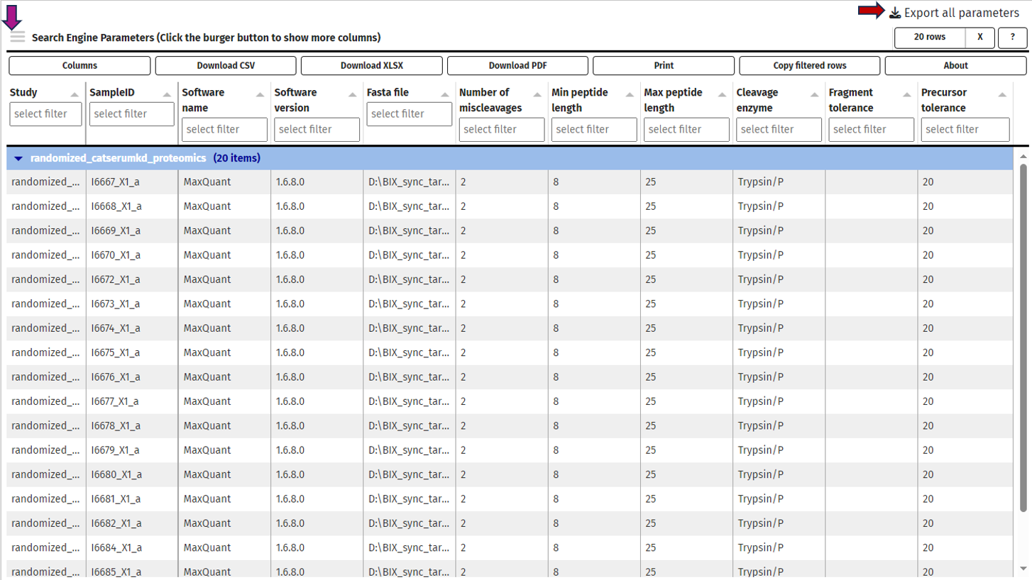
This tab gives you information about the used settings of your protein identification software for your selected samples.
Samples can be chosen using the “Sample selector” tab found on the left side of the interface. Check out the “Sample selection” section in SampleQC for guidance on using the Sample selector.
Currently, we support MaxQuant, DIA-NN and Spectronaut. These values are extracted from the log files of your software during the data integration and processed to an overview table. By default, only the most common columns are displayed. If you are interested in different columns, you can adapt the displayed columns as you prefer just by clicking on the “≡” button in the upper left corner of the table, next to the “Search Engine Parameters” table title. Of course, you can also filter your samples for certain values in any column. If you want to process this table outside PanHunter, you can export the complete table as a .xlsx file.
Contaminants tab

In this tab we can investigate the occurrence of possible contaminations in your samples. Contaminations can happen at basically every step from taking the sample to analysing the samples in a mass spectrometer. Hence, it is important to be aware of a contamination to take this into consideration for downstream analyses or to exclude the sample. You can always switch between the log- and the log-normalised data set, so you can rule out problems with the normalisation process as well. Apart from that, every plot can be also done for subgroups of your samples.
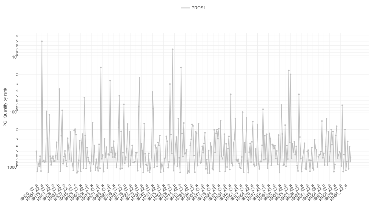
The first plot under the tab called “Quantity ranking” shows the rank of chosen protein(groups) across your samples. This means that for every sample the expressions of all identified protein(groups) are ranked and then the ranks of your chosen protein(groups) are plotted for every sample on a logarithmic y-axis. Since ideally, contaminations should be detected only at a very low level, hence their rank should be low (a protein ranked on position 1000 is less highly expressed as a protein ranked on position 100).
For example: Let us say you are studying protein expression in cancer cells. You have identified several protein(groups) that are associated with cancer progression. In your “Quantity ranking” plot:
- A protein group that is consistently ranked low across all samples (i.e., towards the bottom of the plot) likely represents a protein expressed at very low levels. This could indicate that it’s not relevant to your study.
- Conversely, a protein group that consistently appears towards the top of the plot (i.e., high rank) across multiple samples might be highly expressed and potentially relevant to cancer progression.
Known contaminants such as krt6a can be selected and it can be investigated whether the contaminant is ranked high in one or several of the samples, then this sample might be contaminated. Especially if the protein was not expected to be expressed to that high degree or at all.
For investigating a more systematic pattern of contaminations across your samples, you can also color or split the samples by any characteristic, e.g. by plate, gender or treatment. This might give you hints that a subgroup of your samples is affected by the same cause of contamination. The mean rank across samples is indicated with a line and the area between sample-specific-rank and mean rank is shaded, this helps to identify especially contaminated samples.

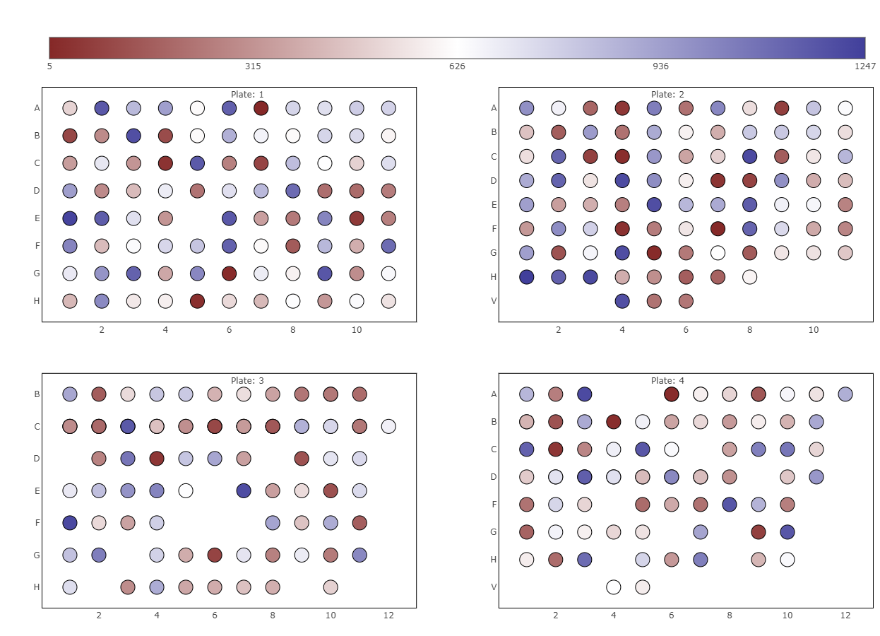
The second plot called “Well specific quantity ranking” depicts the samples that were analysed in a plate layout. Each sample is represented by a dot, so you see the real positions of your samples on the plates. By selecting a protein(group) of interest the rank of this protein(group) is color-coded on each dot. If there is a regular pattern of its rank across the plates, your samples may have cross contamination introduced during the wet lab sample preparation or sample injection into the LC-MS. Currently, only the first six plates are displayed, but you can always select specific plates in the sample selector.
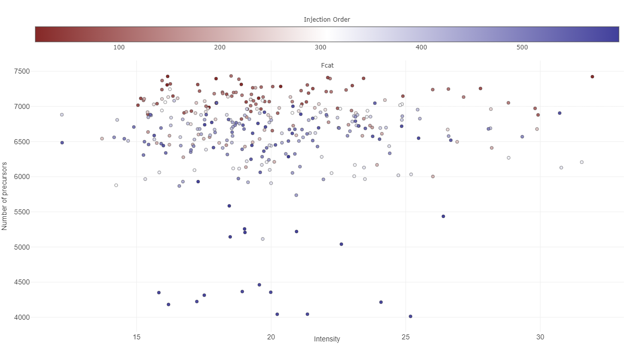
The third plot named “Precursors identified by injection order”, investigates the time-dependence of identified precursors of a protein(group). Ideally, this should not correlate, so you have a constant detection rate for the whole study. If that is not the case, your results might be biased based on the time of analysis. Apart from that, the injection order is color-coded, so you can see whether the number of precursor or protein (groups) intensity depend on the time of injection. The correlation of injection order and intensity values is sometimes also referred to as drift.

Quantification tab

This tab is dealing with the number of identified protein(groups) and how they vary across your samples.
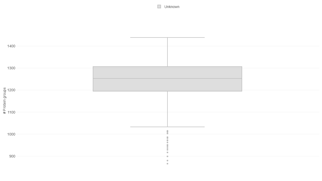
The first plot under the tab “Feature counts” depicts the total number of identified protein(groups) per sample. With a bar plot you can investigate the distribution on sample level and use different sorting or coloring criteria to highlight hidden patterns. The dashed line indicates the mean number of protein (groups) identified in all selected samples. If you switch to a box plot, your samples get binned on the coloring variable and you can see the distributions of identified protein(groups) within each bin.

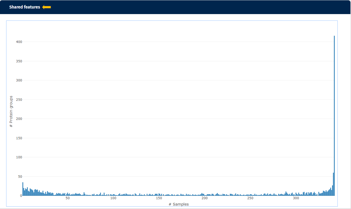
The second plot named “Shared Features” works out how many of the identified protein(groups) are shared in the samples. While the number of identified protein(groups) might be similar (see first plot), the samples are only comparable, if they are including the same protein(groups). If the samples are from e.g. the same tissue type, possessing relatively similar proteomes, the number of shared features observed should be high in all samples.
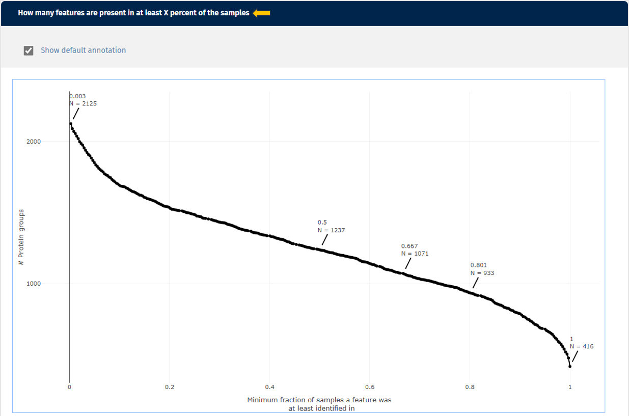
The third plot demonstrates how many protein(groups) are shared with at least X percent of the samples. So it basically cumulates the second plot and visualizes the similarity of the identified protein(groups) for the samples from a different perspective. Here you can also add the default annotations to the line that show you the exact numbers of protein(groups) directly next to your data points.
Intensities tab

This tab gives you an overview about the expression intensities. It complements the “Quantification tab” very well, because after dealing with the identified protein(groups) on a general level, now you can look at the intensity of these identifications in more detail. Here too, you can always switch between the log- and the log-normalised data set, so you can rule out problems with the normalisation process as well. Apart from that, every plot can be also done for subgroups of your samples. Just select a splitting variable and explore the distributions within these subgroups.

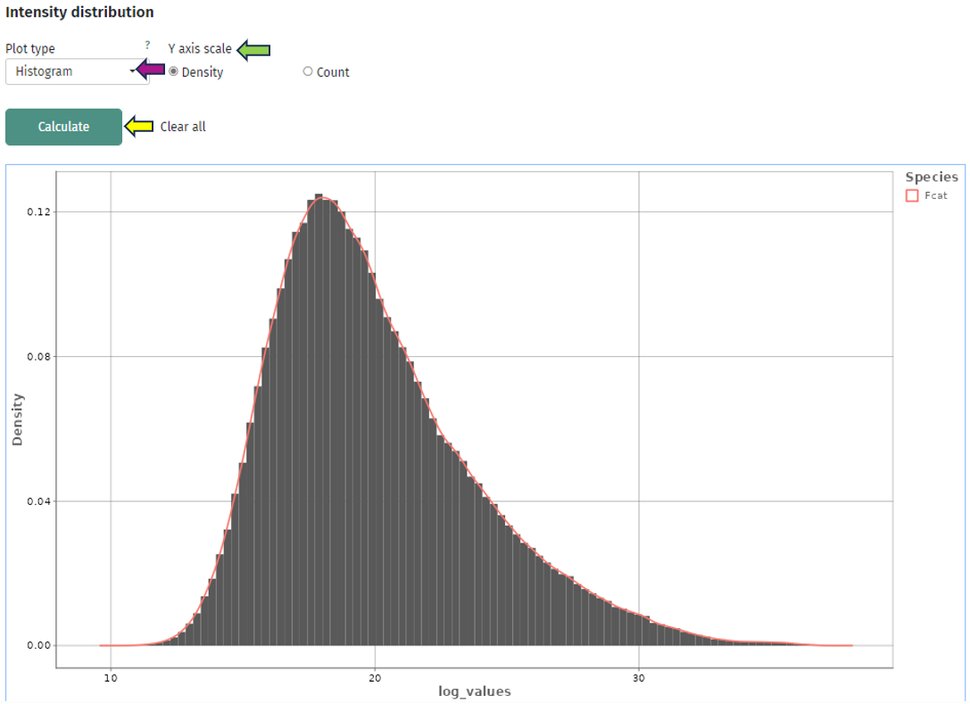
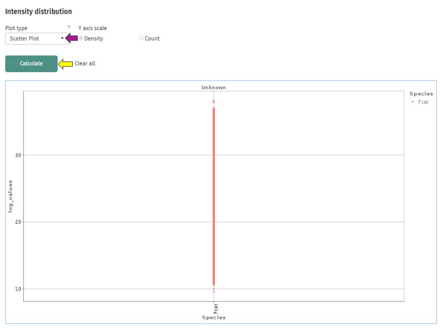
The first plot “Intensity distribution” shows the density distribution of the expression intensity in a bar plot. Here you can look at the general distribution for all samples and see whether all samples align to the same distribution or you have distinct subgroups with several peaks. For further analysis you can split your samples by any characteristic and create several plots. This can give you some deeper insight whether your samples behave differently depending on this characteristic or they share the same underlying distribution. You can also switch the plot layout from a histogram plot to a scatter plot: where you have on the x-axis the split variable and on the y-axis you have the intensity, while each protein(group) is represented by a dot.
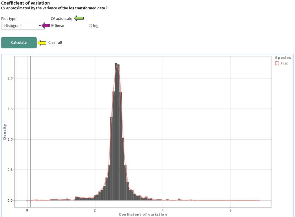
The second plot depicts the density of the coefficient of variation as a bar or box plot. While the coefficient of variation is defined as the standard deviation divided by the mean in the linear space, it can be approximated by the variance in log-space. So, here you can check that the variations of the intensities are similar across all protein(groups) or whether they vary strongly. In addition to the bars, the plot is superimposed by a smoothed density curve.
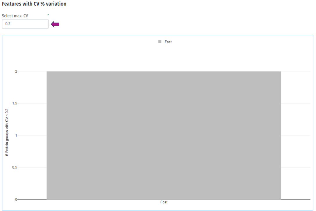
In the third plot you can see the number of protein(groups) below an user-defined threshold of the coefficient of variation, which you can set under the title Select max. CV. As usual, you can split your samples into subgroups and investigate the behavior for each of these subgroups individually. Below is an example plot of Felis catus (Fcat) and it’s protein(groups) with CV < 0.2.
Sample Similarity tab

This tab, besides the information about QC, serves as a starting point for your further analysis.
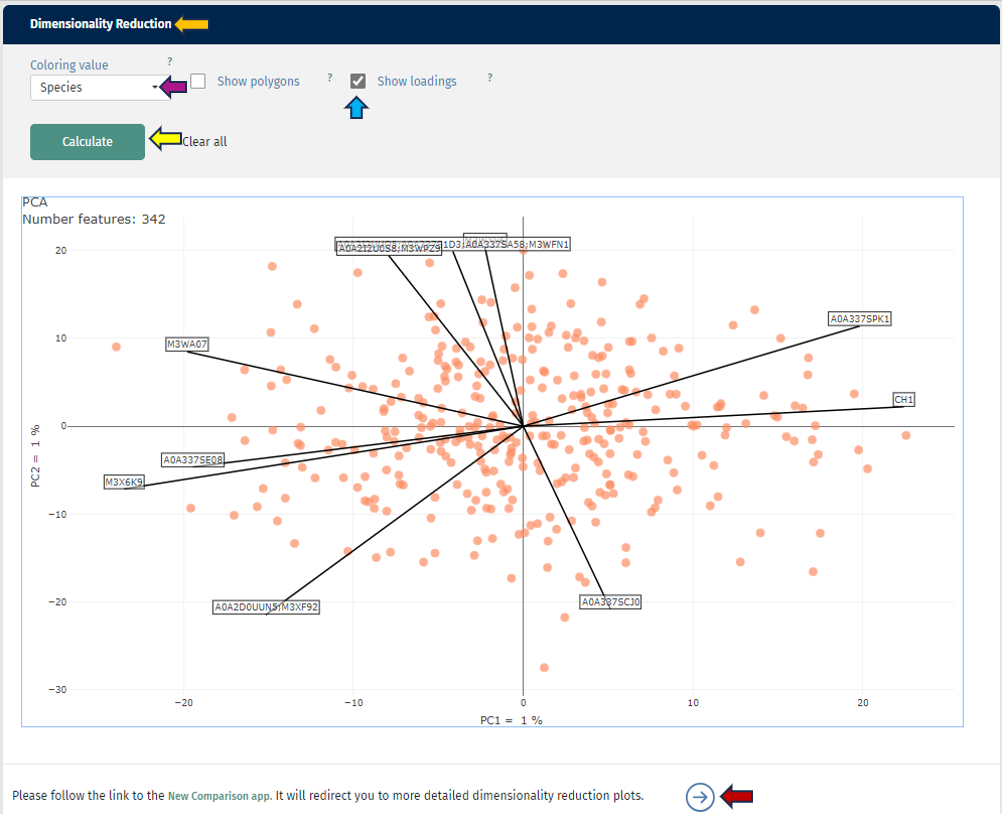
The first plot shows you a simple dimensionality reduction plot. Here the first two principal components of a PCA are shown. This gives you insights about the hidden subgroups in your multidimensional data set. For a better understanding, you can also color your samples depending on any characteristic or add polygons to your plot. The loadings (arrows) shows you the top 10 protein(groups), that are driving the distribution. You can also switch to the New Comparison app and have additional capabilities there.
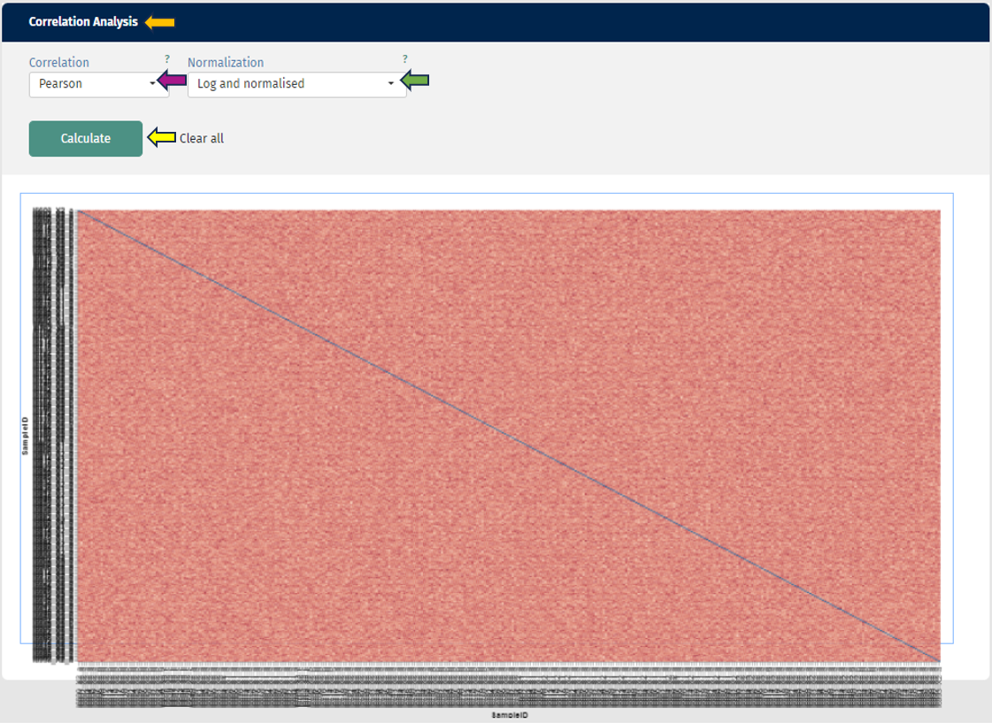
In the second plot you can see a correlation analysis for your samples. Here you have the choice between “Spearman” or “Pearson-Correlation”. The correlation coefficient is color-coded, and by hovering over the plot, you can also get the exact value for two samples. As usual, you can also switch between log and log-normalised data to investigate the effect of the normalisation step.
