Pathway Visualization
The Pathway Mapping app has been meticulously designed to facilitate the visualization and comparative analysis of gene fold change values. This analysis can be conducted using data derived from either one or two comparisons, as integrated with the Top Tables app. This app operates within the framework of organism-specific pathway maps, leveraging the capabilities of the WikiPathways platform.
Users have the flexibility to select one or two comparisons through the Primary Data Selection and Secondary Data Selection (optional) panels.
Primary Data Selection

Users can select a comparison with the help of Comparison 1 search bar, which opens the Comparison Selector table. This selector displays a list of available studies for selection. Refer Comparison selector for this process.
After selecting the comparison, users can advance to select a specific pathway. This selection is facilitated by the Select Pathway filter bar. A comprehensive list of pathways corresponding to the chosen study is accessible via a dropdown menu in this filter bar.
To refine the pathway selection, additional filters can be accessed by toggling the Filter pathways option located beneath the Select pathway bar.
These additional filters include:
Pathway collection: This filter is currently exclusive to WikiPathways, providing users with a diverse and well-curated range of pathways for detailed analysis.
Species: Tailoring the analysis further, users can select from various species related to their study, enabling focused pathway visualization for the chosen species.
Although WikiPathways provides comprehensive pathway maps for various species, the coverage beyond humans, mice, and rats is limited. Our application bridges this gap by facilitating the mapping of fold change values onto pathway graphs for a wide range of species. The Species control feature within the app allows users to select the relevant species for their pathway map, making it possible to carry out a versatile and comparative analysis even when primary tables originate from different species.
Feature: This option allows users to select specific genes or features involved in pathways. The pathways listed in the dropdown menu of the Select pathway panel will then display only those pathways that include the chosen gene or feature, ensuring a targeted and efficient selection process.
The Pathway Mapping application has a selection process that results in a dual-panel display of outcomes. When a specific gene is picked, the application automatically narrows down the pathway options to only those pathways that are associated with that gene.
In the application, the following error message will be displayed at the top of the page if a selected gene or feature is not present in the chosen pathway or if the pathway is not associated with the desired gene or feature:

Secondary data selection (optional)

Users can utilize the Secondary Data Selection (optional) panel to incorporate a secondary study into their analysis. By clicking on the Comparison 2 search bar, the application presents a Comparison selector table similar to that used for the Comparison 1 under Primary Data Selection. Please refer to the Primary Data Selection for detailed guidance on utilizing the comparison selector. Using a secondary study enables users to include and compare data from an additional study or dataset to the primary one. This feature will allow users to simultaneously analyze and visualize pathways from two studies, facilitating comparative analysis. Users can compare various aspects of pathways, such as the expression levels of genes, fold changes, or other relevant metrics across the two studies. The results of this selection process are then displayed in a dual-panel format.
Pathway Color Options

In this application, users are provided with the tools to intricately fine-tune their pathway maps, thereby enabling a deeper and more insightful analysis. This level of customization is achievable through the use of the Pathway Color Options panel, which is divided into two primary sections:
Highlighting Specific Genes or Features
Features to highlight panel, offers various methods for filtering and highlighting specific genes or features. Users can access these methods from the dropdown menu within the Features to highlight filter bar. The options include:
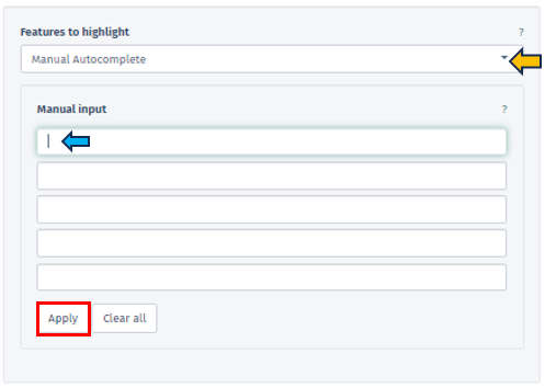
Manual Autocomplete
Allows users to manually enter the names of genes or features they want to highlight on their pathway map. Once the user applies their input by pressing the Apply button, the chosen features are visually marked with a green border around their corresponding boxes on the map.
Manual Freetext
This option permits the direct input of Feature IDs into a text box. Users can separate multiple Feature IDs using whitespace or by starting a new line, providing a flexible approach to data entry.
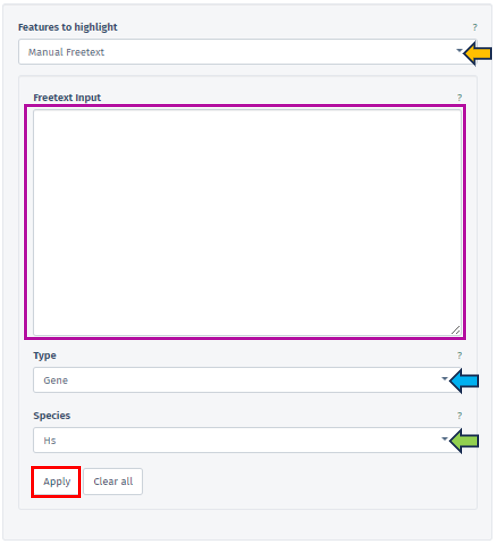
In this panel, users are provided with the ability to specify the type of their input data precisely facilitated through the Type filter bar covering various feature types, including Gene, Protein, Transcript, microRNA, and SNP. The accepted Feature IDs for each type are as follows:
-
Gene: Includes NCBI GeneIDs, Ensembl IDs, or Gene Symbols.
-
Protein: Accepts Uniprot IDs.
-
Transcript: Uses Ensembl Transcript IDs.
-
microRNA: Employs miRBase IDs.
-
SNP: Encompasses rsIDs or positional IDs.
The availability of these types depends on the Sample Selection; for instance, microRNA IDs are available solely for microRNA-Seq studies.
The species related to the entered feature IDs can also be specified by the user using the Species tab. One of the key functions of this tab is the capability to map Feature IDs between different species, thereby enabling cross-species comparative analysis.
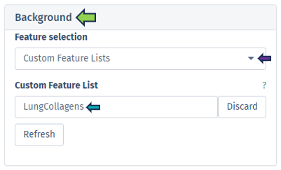
Custom Feature List
Users have the option to choose from a variety of custom feature lists based on the current sample selection. The Refresh button is a convenient tool to update available lists and the current selection.
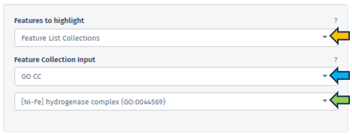
Feature List Collection
In this section, users can select their preferred feature collection through the Feature Collection input filter. This filter offers choices for the dataset collections of genes or features. Below this, another tab allows the selection of different gene set collections, such as GO CC, GO BP, and etc, facilitating an analysis that is specifically tailored to certain biological processes or functions.
Enhanced Visualization through FDR and logFC Thresholds
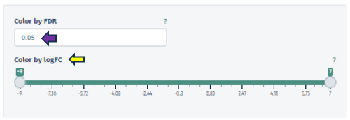
Color by FDR
In this panel, users are equipped with the capability to precisely input or adjust the FDR value, which is a key parameter in statistical analysis. This can be done either by directly entering a specific FDR value or utilizing the spinner control for incremental adjustments. Altering the FDR value has a direct impact on the visual representation of the pathway map: it changes the color gradient of the boxes corresponding to different pathway nodes, thereby visually delineating the statistical significance of each feature.
Color by logFC
This option features a scrollbar for setting the logFC value from -4 to 3. The chosen logFC value alters the color of the pathway boxes to indicate gene regulation status. A critical aspect of this feature is that pathway nodes are colored only if their respective logFC values fall within the user-selected range. The color scale itself is dynamic and shifts based on the minimum and maximum values set by the user.
The application employs a color scheme to represent varying ranges of logFC values: When the selected range includes both positive and negative values, a red-white-blue color scheme is utilized. This scheme is designed such that the extremities of the color scale are determined by the maximum absolute value within the selected range. This provides a balanced visual representation of both upregulated (red) and downregulated (blue) features, with white indicating neutrality.
In cases where only positive or only negative values are present within the selected range, the color scheme adjusts accordingly. For exclusively positive values, a white-to-blue gradient is used, transitioning from zero to the maximum selected value. Conversely, for solely negative values, a red-to-white gradient is employed, indicating the transition from the minimum selected value to zero. These tailored color schemes allow for an intuitive understanding of the data, where blue typically represents upregulation and red signifies downregulation in the context of gene expression or similar biological parameters.
Graph panel

Once users have selected primary and/or secondary dataset, and set the necessary filters such as Select pathway and Feature, the software’s main interface displays a detailed graph in the Graph panel.
This graph illustrates fold changes, marked on the chosen pathway map, with color coding to denote variations: violet indicates up-regulation (positive changes), and red signifies down-regulation (negative values). Each pathway map entry can be potentially linked to several genes (such as enzymatic reaction).
In scenarios involving a single study, the graph shows the average fold change of genes on the corresponding boxes in the pathway. Conversely, in comparative analyses of two studies, the graph splits the display of each corresponding box: the left half represents average log fold changes from the first study and the right half for the second study. If an element is not associated with any gene in one of the studies, that portion is shaded in gray.
To highlight the relevance of a selected gene or feature, its associated pathway corresponding box is labeled with a green box. The following figure serves as an illustrative excerpt from the “Adipogenesis pathway”. This example is part of the pathway mapping feature, showcasing how the application visualizes and represents specific biological processes:
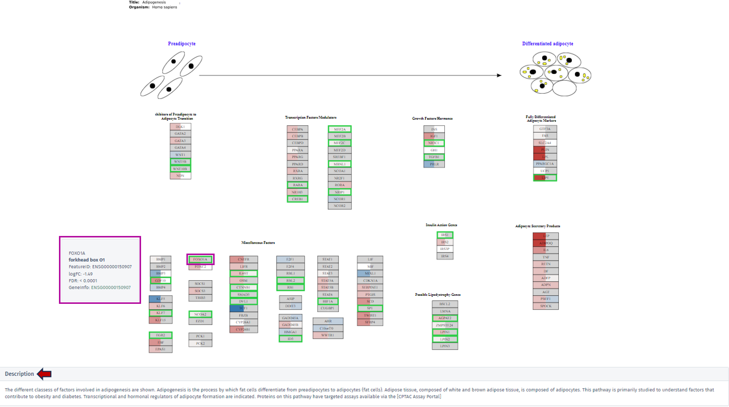
By clicking on the desired gene’s box within the pathway, a tooltip will appear, offering key insights including the gene’s symbol, name, Feature ID, and technical data such as the logFC and FDR value. For comprehensive exploration, the Geneinfo section at the bottom of the tooltip contains a direct link to the Ensembl database. This link leads users to an external page where they can acquire extensive information about the selected gene.
Description
A dedicated description section is directly below the displayed pathway maps within the graph tab. This section is designed to provide users with contextual information about the selected pathway. Users can access a detailed description encompassing various aspects of the pathway by clicking on this section. This narrative includes insightful explanations and pertinent details, offering a deeper understanding of the pathway’s biological significance, its components, and its role in various cellular processes or disease states.
Table panel

This panel presents a meticulously compiled table containing detailed information about the genes associated with the selected pathway. The table is organized into various columns, including Feature ID, Gene ID, Symbol, and Name, offering users a comprehensive overview of the gene attributes. A significant aspect of this table is that the feature IDs are hyperlinked to the Gene Info app. This linkage provides users with an expansive and detailed exploration of each gene, encompassing not only meta-information like gene symbol and name but also specific gene-related data.

Furthermore, the table includes gene-specific log2 fold changes (logFC) and log10 false discovery rates (FDR) corresponding to the comparison for both selected top tables – labeled as A for the primary dataset and B for the secondary dataset. This information is vital for understanding the gene expression dynamics within the pathway context. A key feature of this table is its color-coded fold change values. The values are displayed in a “red-white-blue” gradient to visually represent the magnitude and direction of change. Positive fold change values are indicated in red, signifying upregulation, while negative values are shown in blue, denoting downregulation. Values that are close to zero are colored in a whitish hue, highlighting their neutrality. This color-coding enhances the table’s readability and allows users to quickly discern the gene expression trends in the pathway.