New Comparison
The New Comparison app is used to explore the variability between samples or features, and to create Comparisons (formerly Top Tables) to identify differentially expressed genes between different groups of samples (e.g. different treatments, tissues, ages, etc.). The results of the Comparisons and the parameters used are stored in the Comparisons app (formerly Top Tables app).
Studies Overview panel
The first panel displays a Study Overview table, which summarizes both the technical information and the sample meta information of all available studies in the project.
Like other tables in PanHunter, this one is also interactive. The rows can be sorted by a selected column by clicking on the column header. The sorting order can be changed from ascending to descending with another click. The width of individual columns can be changed by left-clicking on a column divider and dragging the mouse.
Clicking the tribar symbol ≡ next to the table title provides additional column settings and options for downloading and copying the table. Columns can be shown or hidden using the checkboxes in the Columns drop-down menu. The order of the columns can be changed by dragging values in the Columns drop-down menu or by dragging the table column headers. For more details, see the Table-Filter website.
After opening the app and identifying the study and samples of interest in the Study Overview table, use the Sample Selector to specify them (Introduction to the Sample Selector). The specified studies and samples will be highlighted in bold in the table.
Feature Selection panel
This panel visualizes and ranks the variance of the features (genes or proteins) in this study.
For each feature, the variance of the values is calculated and displayed. By default, PanHunter uses the Expression values for this calculation, i.e. to calculate the dimension reduction, and displays the 500 features with the highest variance. The expression value from different sequencing platforms are as follows:
- Transcriptomics:
- Bulk RNA-seq and Pseudobulk RNA-seq: log-normalized counts in counts per million (log-CPM)
- ScreenSeq: log-normalized counts in counts per 10,000 (log-CP10,000)
- Proteomics: log-normalized protein group intensities
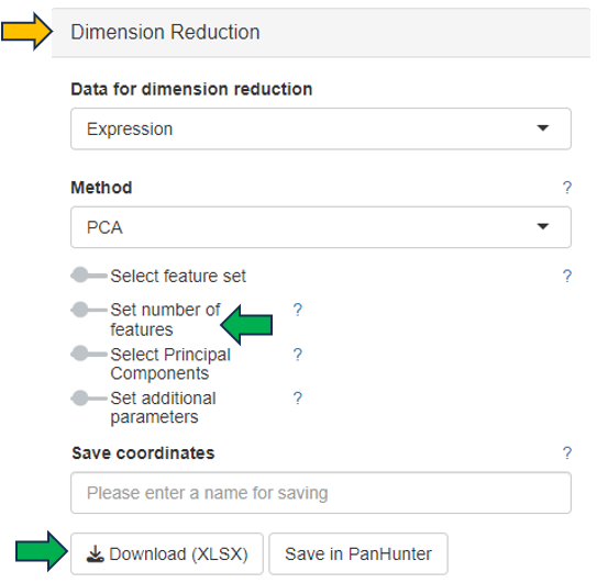
The data used for this calculation and the number of features displayed in the graph can be set in the Dimension Reduction section on the left:
- Data for dimension reduction: a drop-down menu with four options described below
- Precalculated Dimension Reduction: select a dimension reduction plot precalculated and saved in PanHunter
- Expression: select the expression value as described above to calculate the dimension reduction
- Comparison analysis (logFC) or Comparison analysis (PI-score): select a precalculated comparison group in the study. The feature variance is calculated based on the log fold change (logFC) or based on the PI-score, which combines information from the FC and the p-value. The percent coverage indicates the number of features covered by the selected comparison group.
- Set number of features: a slider is available to activate this setting
All features used for dimension reduction can be downloaded by clicking Download feature list (XLSX).
Sample Clustering panel
This panel presents a 2D scatter plot of the selected samples, which provides an overview of their similarity based on their feature expression profiles, i.e., transcriptome or proteome.
As feature expression profiles are highly dimensional data, dimension reduction is typically applied to reduce the dimensionalities and visualize the data in a 2D dimension reduction plot. By default, PanHunter uses principal component analysis (PCA) to generate the dimension reduction plot. Each dot represents one sample. Samples with similar expression profiles cluster closely together, while samples with larger differences in their feature expression profiles are further apart in the plot. Excluded samples are not plotted unless Show excluded samples is checked in the Sample Selector.
Like other plots in PanHunter, the 2D dimension reduction plot is also interactive. There are several ways to interact with the plot, as described below:
- Display sample information: move the mouse key over the sample dot
- Adjust the zoom level: move the mouse wheel
- Reposition the plot: click the left mouse button and drag the plot
- Reset to original zoom level and position: double-click the left mouse button in an empty area of the plot
- Select sample dot(s): click the left mouse button on the dot, click the left mouse button on the annotation legend, or click the right mouse button and drag around the sample dots of interest to activate the lasso tool
- Add new sample dots to the existing selection: select the new sample dots while holding down the Shift key
- Cancel all selection: click the left mouse button in an empty area of the plot
The dimension reduction plot can be downloaded as a PNG image with a transparent background using the Export Image button, making it easy to integrate into presentations with customized slide backgrounds.
PanHunter provides additional methods, such as t-SNE and UMAP, to calculate the dimension reduction. Selecting the method, fine-tuning the parameters and saving the coordinates in PanHunter are available in the Dimension Reduction section on the left.
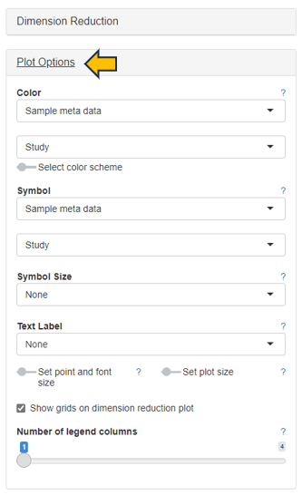
Plot Options on the left offers several options for customizing the plot. Drop-down menus are available to select which attribute to apply as Color, Symnol, Symbol Size and Text Label. Additional settings are provided to Set point and font size, Set plot size, Show grids on dimension reduction plot and change the Number of legend columns.
The following figure shows an example PCA plot using the Yu2014 study of the Body Map project in PanHunter. Here, Tissue is used as Color, Sex as Symbol. Samples of the same tissue type form distinct clusters, with no clear separation between female and male rat samples.
The Sample Annotations section allows users to create and save custom annotations. This section is available after an Enrich modifier for Custom annotations is added to the Sample Selector (Introduction to the Sample Selector). An Existing annotation key (i.e. the unique ID for a set of annotations) created by project users can be selected, deleted or duplicated using the drop-down menu. To create a new set of annotations, enter a string of characters as the Annotation key, select the samples to be annotated in the dimension reduction plot, name the selected samples by entering an Annotation value and click Set current annotation to save it temporarily. When all samples of interest are annotated, click Save annotation permanently to save the annotation in PanHunter and to be able to reload it as an Existing annotation key.
PanHunter provides a powerful feature called Exploratory Analysis to facilitate data exploration. By default, PanHunter analyzes the coordinates of the Current 2D plot and matches them to the sample metadata to find the highly correlated categorical or numerical variables when clicking Analyze Categories or Analyze Numerics. Similarly, the feature expression profiles that are most highly correlated with the coordinates are identified when clicking Analyze Features. For general description of the exploratory analysis calculation description, please see Exploratory analysis under Algorithms section.
The Coordinates to analyze option indicates which values for each sample will be submitted to the analysis:
-
Current 2Dplot - the x and the y coordinates of the currently displayed plot are used. This is the default setting in PanHunter.
-
Top Features and All Features - the abundance values of either the top variable features (number is set under Dimension Reduction tab) or all features are used.
NA as a class is only relevant in case Analyze Categories is performed. It decides whether samples with NA in the analyzed category are included or not.
-
If you want to exclude samples with NA value for given categories, select No. This is the default setting in PanHunter.
-
If you want to include samples with NA value for given categories, select Yes.
Minimum span is only relevant in case Analyze Features is performed. This setting checks whether the span (the difference between the 90% and the 10% quantile) is greater than or equal to the specified threshold. If that is not the case, the feature is discarded from the analysis. Thus, the noise coming from features with low variability can be eliminated.
Features NA values to zero checkbox is only relevant in case Analyze Features is performed. If it is checked, all NAs in the feature are replaced by zeros. Otherwise, the NAs are retained and the feature is skipped.
An overview table of the highly correlated categories, numerics or features is displayed below the dimension reduction plot.
Important!! The Exploratory Analysis should be used for exploratory purposes only. To perform an accurate differential analysis, use the New Comparison panel in this app to set up a differential analysis and the Comparisons app (formerly Top Tables app) to examine the results and link to downstream analyses.
Density Curves panel
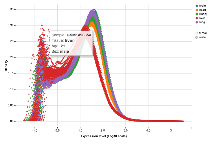
This panel visualizes the feature density, i.e. the relative number of genes or proteins, versus expression levels in the selected sample. Each curve represents a single sample. The color and symbol settings are the same as for the dimension reduction plot. The x-axis corresponds to logarithmic expression levels and the y-axis shows the density of genes or proteins associated with that expression level.
 .
.
Again, the density plot is interactive like other plots in PanHunter. See the ways to interact with the plot described in the Sample Clustering panel of the app.
Check Outliers panel
If some samples are suspected to be outliers based on the dimension reduction plot or density curves, this panel provides a quick way to check the top features (genes or proteins) responsible for the observed difference.
After selecting the suspected outliers in the dimension reduction plot in the Sample Clustering panel, click the Insert plot selection button to add them to Group A, similarly add the other samples to be compared to Group B, and start the comparison by clicking Compare samples.

The result is displayed in the Custom outlier table, including a list of the top features with high absolute fold changes between the two sample groups. The result may explain the observed difference, e.g. due to activated inflammation or contamination by other tissues, and allows an informed decision whether to exclude the suspected outliers from further analysis.
Important!! This quick comparison should not be considered as a precise statistical analysis or the result of a differential analysis. To perform an accurate differential analysis, use the New Comparison panel in this app to set up a differential analysis and the Comparisons app (formerly Top Tables app) to examine the results and link to downstream analyses.
Selected Samples panel
This panel displays detailed information about the selected samples in the interactive Sample Metadata table. Clicking on the Sample IDs takes you to the Sample QC app.

For RNA-Seq studies, the align Params table is displayed below that lists important parameters used during data preprocessing. The Aligner, GenomeFastaFile, and GenomeGTFFile columns show the version of the alignment program, the reference sequence file, and the gene annotation file used for read counting, respectively.

These parameters should normally be identical for all samples within a study. If there are differences, PanHunter will issue a warning. In this case, it may be advisable to re-align the sequence data.
New Comparison panel
This panel allows the configuration and creation of new comparisons.
To help you create a comparison, PanHunter provides an overview of the selected samples in a table with the number of samples in each category combination in the Freq column. The columns that are displayed can be easily removed from consideration by using the drop-down menu below the Remove columns option. Both the sample table and the abundance data can be downloaded from the Download data section on the right.
Once the groups of samples to be compared are identified, a formula indicating the factor used to create the comparison has to be specified. Here, the formula is case sensitive.
- For a single factor, the formula is a ~ sign followed by the name of the factor, e.g. “~Treatment” as a formula to compare samples with different treatments.
- For multiple factors, the formula is a ~ sign followed by the names combined with + signs, e.g. “~Tissue+Age+Sex” as a formula to compare samples with different tissues, ages, and sexes.
The advantage of using multiple factors in the formula for a complex study is that interaction terms can be included in the differential analysis. These terms are used to model the effect of interactions between different factors. For example, the formula “~Tissue+Age+Sex” can be used to identify features that are differentially expressed in the kidneys of male and female samples only at a specific age.

After entering the formula, drop-down menus are available to select the Contrast factor, the Numerator (e.g. Treatment) and the Denominator (e.g. Control). Additional settings to filter samples for the specific comparison and to select the statistical method and filter features can be configured by activating the Comparison-based sample filtration and Method and feature filtration sliders. By default, PanHunter uses DESeq2 for statistical analysis of transcriptomics data and limma for proteomics data (further details about the DESeq2 and limma).
The calculation of the defined comparison can be started by clicking the Calculate button. A custom name can be entered under Comparison name to name the newly calculated comparison. Additional options are available to configure the comparison here, including adjusting the FDR cutoff and logFC cutoff, and deselecting subsequent Post-processing steps. All existing post-processing steps are performed by PanHunter by default.

When the calculation is complete, an interactive Comparison Preview table with the top differentially expressed features (genes or proteins) is displayed in the Table View sub-panel. The Abundance and logFC columns are colored to visualize the magnitude of the values. The result can be explored using volcano and MA plots in the Plots sub-panel. The complete comparison result can be saved in the Comparisons app (formerly Top Tables app) by clicking the Save table button.

