MA Plot
The MA Plot app is used to visualize and inspect the log fold changes (M) vs. average expression levels of the contrast denominator (A) for genes from two Comparisons (refer TopTables app). In many scenarios, genes showing a high log fold change in combination with a high expression level are of particular interest, especially if found with the same direction of expression-change in multiple comparisons.
The two selection menus on the top of the app allow to select the Comparisons of interest. For each Comparison, a FDR threshold determines the genes which are considered as significantly differentially expressed.
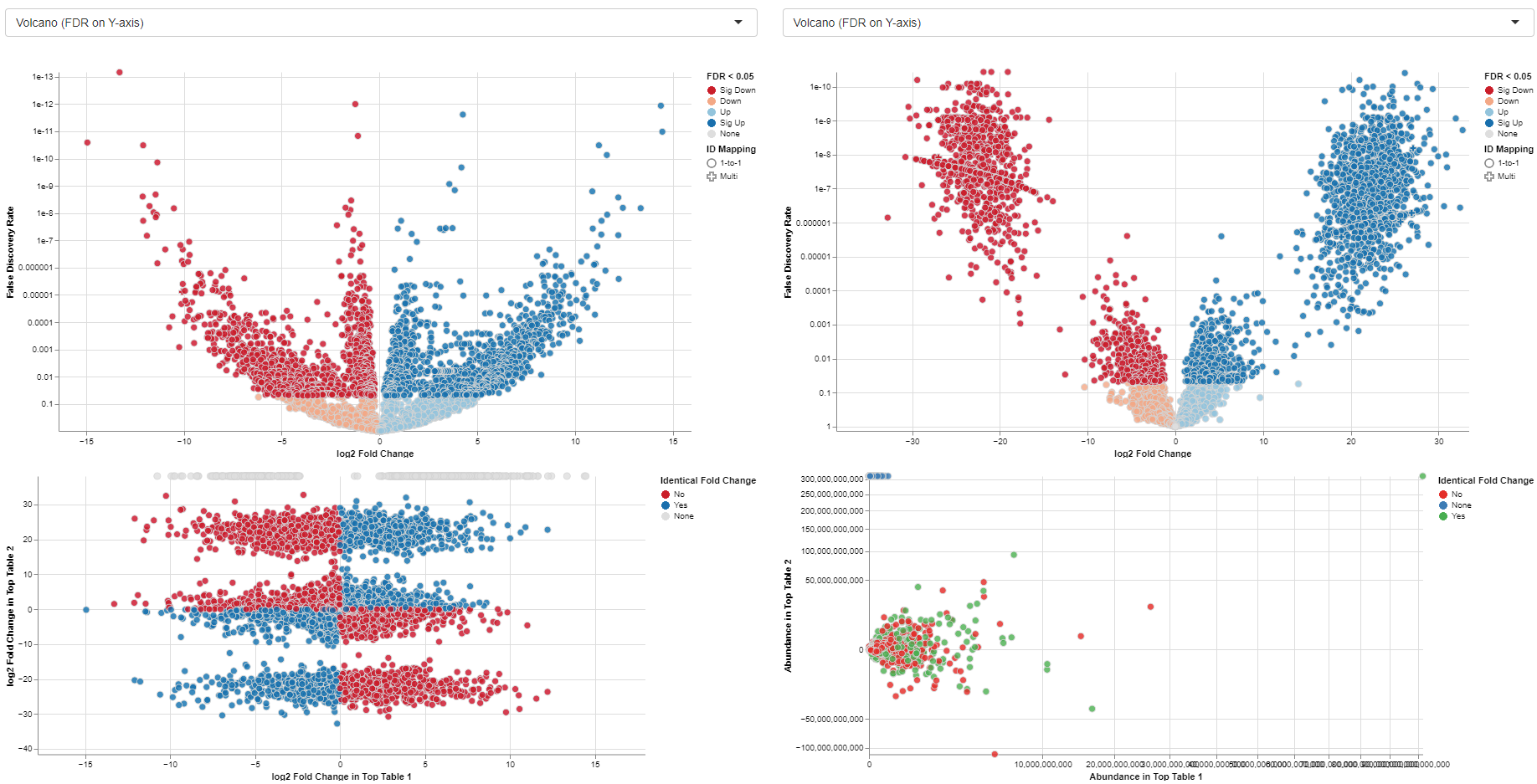
Only the features that are significantly expressed (in accordance with the chosen FDR threshold) are displayed in the plots tab. There are, however, exceptions to this general rule that only features passing the FDR threshold are displayed. Non-significant features are displayed if they were matched with a significant feature in the other selected comparison. Let’s look at an example: In the table below we are looking at 2 features that were matched in the 2 selected volcano plots. Feature 1 is displayed in volcano plot 1 and feature 2 in volcano plot 2. The feature px1 is displayed although it is not significant because it is matched to feature px1-1 from the 2nd comparison. Feature px1-2 on the other hand is not displayed, although matched to px1. Since both px1 and px1-2 are not significant px1-2 is not displayed. Px1 is displayed not because of the match with px1-2 but the match with the significant feature px1-1.
| Display Feature 1 | Display Feature 2 | ID feature 1 | Significance feature 1 | featureID 2 | Significance feature 2 |
|---|---|---|---|---|---|
| Yes | Yes | px1 | No | px1-1 | Yes |
| Yes | No | px1 | No | px1-2 | No |
Changing the FDR threshold for one volcano can thus change which features are displayed in both volcanos, if a previously non-displayed feature is now matched with a feature that just became significant by changing the threshold.

Below the selection menus, a short list of differences in terms of settings between the two selected Comparisons is given.
The main part of the app comprises a direct comparison of the Comparisons settings/recipe (tab “Metadata table”), the “Plots”, and a table containing the CPM, logFC, and FDR per gene and Comparison (tab “Gene table”) along with a “Detailed plot” tab.
Metadata table

The “Metadata table” allows for a direct comparison of similarities and differences between the Comparisons in terms of recipe. This tables lists all selection criteria as well as the test formula and the contrast numerator and denominator. Differences in the recipe between the Comparisons, are highlighted in bold red font.

Plots

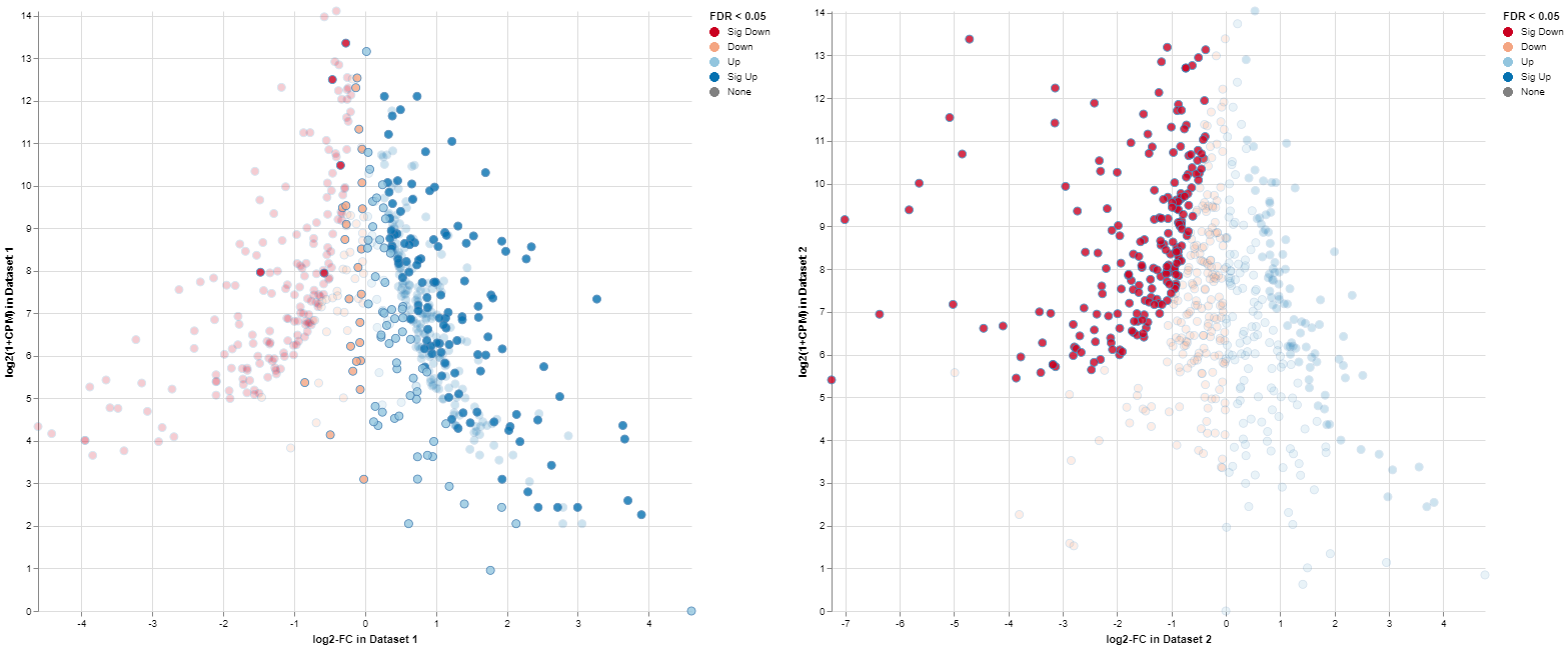
The MA plots for both Comparisons are displayed in the “Plots” tab. The x-axis shows the log2 fold changes, the y-axis the log2 expression levels (i.e., log2-CPM), respectively. For each gene considered significantly differentially expressed in any of the Comparisons, a point is shown in each of the plots at the position determined by the left or right Comparison respectively.

Gene table

The gene table tab gives a table comprising all genes with CPM, log2-fold change and log10-FDR for each of the Comparisons. Additionally, it reports a Meta-p-Value calculated using Fisher’s method. Important: In many cases, the assumptions of Fisher’s method are not valid for combining p-values from two Comparisons. Therefore, the p-value should not be considered as statistically solid but for sorting/ranking the gene list only!

Detailed plot

The “Detailed plot” tab gives additional information about the abundance distribution across the contrast factor.

On the left, a MA plot for the first Comparison is shown. By selecting a single feature in the plot or in the dropdown menu a detailed plot is shown on the right. For the selected feature the log-expression is plotted over the categories of the contrast factor. This gives an overview, what is driving the fold-change in the Comparison. Additional cofactors are reported in the hovering.
Please keep in mind that Detailed plot is not available for comparisons computed with scExplorer app and custom uploaded comparisons computed outside of PanHunter.

Exemplary MA plot for two Comparisons. The “Sig Down” genes from the right plot were selected and this selection is propagated to the left plot. Many genes which are down-regulated in the right Comparison seem to be up-regulated in the left Comparison.
The app features interactive selecting and deselecting of genes. Each point in the MA plots can be selected and this selection is propagated to the other plot and the gene table. These selections are transparent for the complete app, i.e., you can select all significantly upregulated genes in one plot and combine them with the ones significantly upregulated in the other plot.
For more information about the matching of features between proteomics or peptidomics comparisons, please see the Algorithms section.
Finally, a list of selected genes can be downloaded using the “Download” button in the top-right side of the interface.
