Enrichment Visualization
Enrichment visualization analysis is a computational technique to identify and visualize functional or biological themes over-presented within a set of genes, proteins, or other biological entities. This technique intuitively interprets large data sets, such as gene expression profiles or lists of differentially regulated genes, by mapping them to a biological context, such as biological pathways, gene ontologies, or protein-protein interactions.
The enrichment visualization app presents the statistical significance of the overlap between the set of interest and predefined sets of genes, such as those associated with a specific biological function or process. The statistical value is usually determined by a p-value, which measures the probability of observing the observed overlap by chance, given a null hypothesis of no association between the sets. The p-value is then corrected for multiple testing, such as the false discovery rate, to account for the fact that many tests are performed simultaneously.
Tabs within the application are interconnected, meaning that selections made in one tab, such as using lasso selection for the plot, will also apply to other tabs.
In addition, if at least one enriched set is selected, all genes associated with one or more selected terms (whether differentially expressed or not) will be highlighted in the Genes for the selected gene sets tab.
Comparison type
This App provides a range of tools for conducting enrichment analysis, including Individual comparisons and Comparison groups:
Individual Comparisons

This panel provides a valuable framework for comparing gene expression patterns between two distinct samples, such as control and treated samples or samples derived from different disease states. The analytical approach used here enables the visualization of differential gene expression through 2D and bar plots. In addition, users can explore enriched gene sets and genes for the selected gene sets, thereby facilitating the identification of specific biological pathways and mechanisms differentially regulated in the samples under comparison.
Dataset selection
To initiate the analysis process, selecting the comparison type followed by the desired dataset is necessary. The dataset can be selected using the interface elements under the Data selection panel, located in the top left window. Initially, it is essential to identify the Data source type using the radio buttons control.
There are two distinct types of dataset that can be selected:
Comparison

Denotes a dataset type encompassing the outcomes of differential expression analysis for a single group of samples. Generally, this dataset is produced by conducting a statistical test (ANOVA or t-test) to recognize genes that display differential expression between two or more conditions. In addition, the comparison dataset encompasses relevant details to the fold change, p-value, and FDR-adjusted p-value for each gene. To run this analysis, after selecting the Comparison from the radio buttons control, using the Comparison search bar user can select the desire comparison through the Comparison selector panel. Refer Comparison Selector for further instructions.
Manual input
This option offers users the capability to input their own gene or identifier list for comprehensive analysis. This feature facilitates the inclusion of genes or proteins relevant to specific Species, utilizing preferred Databases such as Ensembl or UniProt IDs. In selecting the control or reference dataset, the Background Type section is instrumental. The Complete option signifies a background dataset that encompasses all possible entities relevant to the study, providing an exhaustive reference framework for analyzing the primary dataset. Conversely, the Manual option allows users to define their own reference dataset. By selecting the Manual option in the dropdown menu under Background Type, an additional tab titled Background will appear at the end of the Data Selection panel. Refer Pathway App
Within this segment, users have the flexibility to specify their reference dataset through various methods: Manual Autocomplete, Manual Freetext, or by employing Custom Feature Lists.
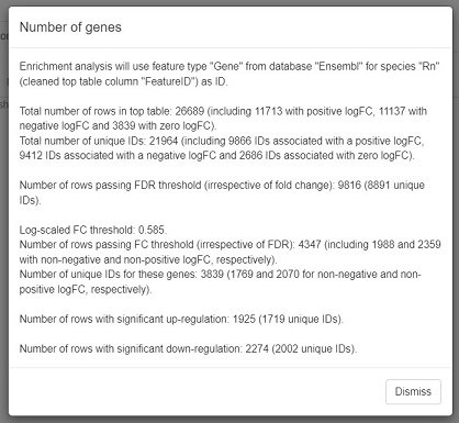
In Manual Autocomplete user can use the empty fields to enter the Feature IDs separately. Under the Manual Freetext, Feature IDs should be separated by any white-space character or comma. In case of manual input of a feature list, which often has typos or unrecognized IDs, it is highly recommended to check messages at the top of the screen and also check the details that can be viewed by pressing Test gene num. button under the Feature Filter panel.
The Custom Feature Lists refers to bespoke sets of entities, such as genes, proteins, metabolites, or other biological elements, curated specifically for the analysis. These custom lists are designed to align with the unique goals of the study, serving as a specialized background dataset. Moreover, the Refresh button enables the dynamic reloading of the feature lists, ensuring they are updated in accordance with the current sample selection.
Gene set collections
Once the user has selected the dataset they desire, they need to conduct an enrichment analysis using their preferred gene set collections. This can be done by selecting the relevant check boxes from the Gene Set Collections list and clicking the “Perform Enrichment Analysis” button.

The analysis will then be executed and take approximately 10-15 minutes, depending on the output size.
The Enrichment Analysis application employs a combination of advanced algorithms and statistical tests for accurate and robust analysis. It utilizes the weight and elim algorithms in conjunction with Fisher’s exact test on 2x2 contingency tables, a method particularly effective for small sample sizes, to assess the significance of associations in gene set enrichment analysis.
For secondary feature set collections, the application applies a standard hypergeometric test, akin to Fisher’s 2x2 exact test, ensuring a thorough analysis across various data sets. Multiple testing adjustments are executed separately for each feature set collection, enhancing the accuracy of the results.
2D plot and visualization options

Upon completion of the analysis, the 2D Plot tab within the application presents a diagrammatic representation of enriched or depleted gene sets/GO terms, distinguished by a series of uniquely characterized dots.
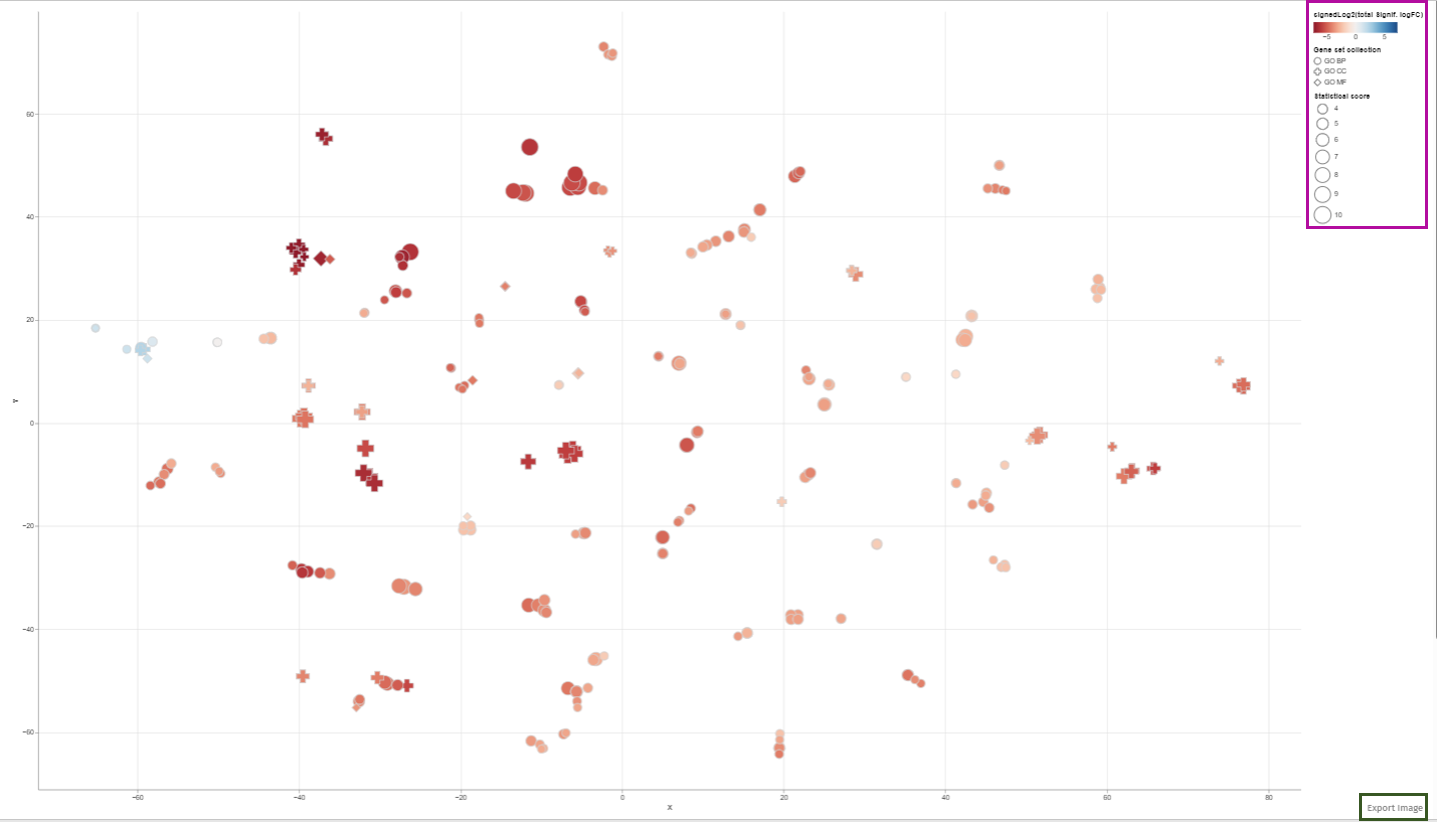
Each dot in this 2D plot represents an enriched gene set. The size of each dot corresponds to the statistical significance of gene set enrichment, while the color represents the overall fold change of differentially expressed genes that support such enrichment. The dot’s shape identifies the gene set collection to which it belongs.
The legend in the 2D plot image functions as a key for understanding the visual data representation. It categorizes gene sets by their collection each associated with a unique shape such as circles, diamonds, or squares etc. The color gradient from blue to red indicates a reference for the signed log2 fold change of genes, with blue representing downregulation, red signifying upregulation, and varying shades denoting the degree of expression change. The size of the shapes corresponds to the statistical score, providing immediate visual cues about the data’s hierarchical significance.
Users can retrieve comprehensive identification details and statistical figures by hovering over any dot, thereby triggering a supplementary information window. Also, users can modify the zoom level using the mouse wheel and reposition the plot area via the left mouse button. Selection of dots (or gene sets) is achievable either by left-clicking on a dot or by encircling a cluster of dots with the right mouse button depressed (Lasso tool). In cases where multiple gene set collections are analyzed, selecting a collection name in the chart’s legend highlights all gene sets linked to that collection. While a new selection supersedes the previous one, holding down the shift key during selection adds the new choice to the existing selection. Clicking an unoccupied area of the plot with the left button cancels the selection. Double-clicking an empty plot space resets the plot to its original configuration.The plotted diagram can be downloaded as a PNG image with a transparent background, facilitating its integration into presentations with customized slide backgrounds through the Export Image link located near the plot’s lower-right corner:
Constructing of visualization plot is based on t-Distributed Stochastic Neighbor Embedding (t-SNE) or Uniform Manifold Approximation and Projection (UMAP) techniques. These methodologies are elaborated in the Plot options subsection, which also explains the Plot options tab parameters influencing the visualization.
The tabs in this App are internally linked. This feature makes it convenient for the user to check the terms associated with a group of closely located dots under the other tabs. For example selecting enriched gene sets in the plot automatically implies filtration in the enriched sets table shown under the Enriched Gene Sets tab. For further information please refer to Enriched Gene Sets section.
In order to facilitate a comprehensive and precise identification of significant features within the dataset, our application provides users with the functionality to set specific enrichment thresholds:
Enrichment Thresholds
This feature is accessible via the Enrichment thresholds configuration panel, which presents two distinct options for refinement: The p-value threshold and the num.genes threshold. The integration of both thresholds is pivotal in enhancing the accuracy and relevance of the analysis:

The p-value threshold parameter is instrumental in filtering the analysis results based on statistical significance. It plays a crucial role in ensuring that the observed differences in the dataset are not merely a product of random variation. By setting the p-value threshold, users can define the level of statistical stringency to apply, thereby determining the probability cut-off for significance.
The num.genes threshold introduces an additional dimension of biological relevance to the analysis. It ensures that only those categories that demonstrate significant p-values and contain a sufficient number of entities (genes, proteins, etc.) are considered for the analysis. This criterion is essential in establishing the biological validity and meaningfulness of the results. The application’s design allows users to fine-tune these thresholds, providing a balanced approach between minimizing false positives (achieved through more stringent thresholds) and ensuring no significant findings are overlooked (achieved through more relaxed thresholds).
It is important to note that the optimal settings for these thresholds are contingent upon the specific objectives of the study and the unique attributes of the dataset being analyzed. Users are encouraged to adjust these parameters thoughtfully, taking into account the context and requirements of their research.
Feature filter
The Feature Filter panel is expertly designed to assist users in defining a precise foreground of features, categorized as “differentially expressed” or “differentially abundant.” This process is critical for accurately identifying significant features in the dataset and involves the meticulous setting of thresholds for both FDR (False Discovery Rate) and Fold Change (FC).
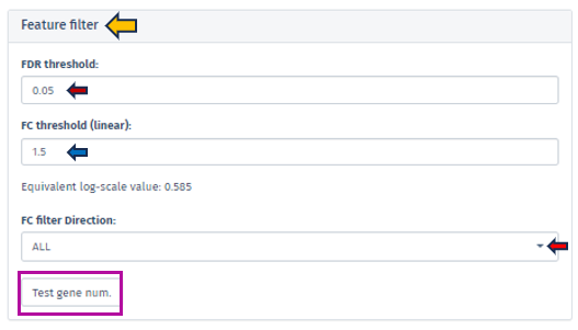
The FDR threshold is crucial in controlling the rate of false discoveries, a common challenge when analyzing multiple features simultaneously. Users can easily set their desired FDR threshold using the intuitive FDR threshold filter bar. This can be achieved by directly inputting the desired value or incrementally adjusting it with the spinner control .
Similarly, the FC threshold (linear) can be set using the same interface. This threshold allows users to concentrate on features exhibiting changes of a magnitude that are significant and relevant to their specific research objectives.
Accompanying the FC threshold, the application automatically calculates and displays the Equivalent Log-Scale Value. This feature provides a logarithmically transformed perspective of the fold change, simplifying the interpretation and comparison of changes across various magnitudes. The log transformation is particularly advantageous as it converts multiplicative alterations into additive ones, offering clarity, especially in datasets with extensive variability.
Further refinement in the analysis is achievable through the FC Filter Direction input field. This functionality permits users to narrow down their analysis to features that are either exclusively up-regulated or down-regulated, enhancing the specificity of the study.
After setting these thresholds, we highly recommend users verify the number of features that meet these criteria. This is easily accomplished by clicking the Test gene num. button. This step is instrumental in providing users with valuable insights regarding the scope and precision of their analysis, thus reinforcing the robustness of the research findings.
Plot Options
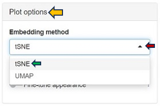
A crucial feature of the Enrichment Visualization app is the Plot Options panel, which becomes accessible upon opening the 2D Plot tab. This panel incorporates key functionalities that significantly augment the app’s capacity to analyze and visualize biological data, streamlining the user experience in data interpretation. The Embedding method section within this panel facilitates data visualuzation through advanced embedding techniques, namely t-SNE (t-Distributed Stochastic Neighbor Embedding) and UMAP (Uniform Manifold Approximation and Projection). t-SNE, the default method in the app, excels in simplifying complex datasets for enhanced visualization, while UMAP is effective in preserving both local and global structures of data. These methods are instrumental in reducing the dimensionality of complex datasets, making it possible to visualize and interpret high-dimensional data in a more comprehensible 2D or 3D format.
Within the Plot Options panel, users have the ability to further refine their analysis through two distinct features: Fine-tune embedding and Fine-tune appearance. Upon enabling the Fine-tune embedding, users gain access to a suite of adjustable parameters, enhancing their control over the data representation:
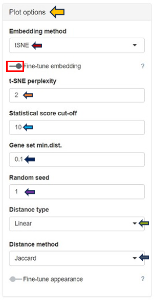
In case of setting the Embedding method to t-SNE:
t-SNE Perplexity: The perplexity parameter in t-SNE, as highlighted by L. van der Maaten & G. Hinton (2008), serves as a critical measure in determining the adequate number of neighbors. This measure, with typical values ranging between 5 and 50, offers a nuanced approach to evaluating the local structure of the data. In this application, particularly for enriched gene sets visualization, lower perplexity values, starting from 1, often yield more insightful results.
In case of choosing UMAP as the Embedding method:
-
N neighbors: A crucial user-controlled parameter that significantly influences how the algorithm constructs the high-dimensional data’s manifold structure (which functions similarly to the perplexity in t-SNE). It determines the number of neighboring points; each point is compared with when mapping the data to lower dimensions. A higher value of this parameter considers more of the global data structure, while a lower value focuses more on local data clusters. Conceptually, it can be likened to a triplicated version of t-SNE’s perplexity, playing a significant role in how UMAP interprets local and global structures in the data.
-
UMAP min.dist.: Influences the degree of separation between clusters by controlling the compactness of points in the embedding space.
Both t-SNE and UMAP share several common parameters that users can adjust:
-
Statistical Score Cut-off: In the enrichment analysis, the statistical significance of each gene set is visually represented by the size of a dot, set as the negative logarithm to the base 10 of the enrichment p-value (-log10(Enrichment p-value)). This method transforms p-values into a more intuitive graphical representation. The Statistical Score Cut-off parameter is a crucial feature that mitigates the disproportionate influence of a single, highly significant gene set on the dot sizes. Scores exceeding the user-defined threshold are capped at this threshold, ensuring a balanced and interpretable visualization across all gene sets. This approach maintains a focus on relative significance without allowing extreme values to skew the overall perspective.
-
Gene Set min.dist.: Impacts the minimum separation distance between distinct clusters in the UMAP plot.
-
Random Seed: Ensures reproducibility of results by setting a specific starting point for the random number generator. UMAP and t-SNE’s reliance on pseudo-random number generation necessitates the specification of a Random Seed for reproducibility. This feature will enable users to replicate their results under identical parameter settings, thereby enhancing the reliability and validity of their analytical outputs. Users are encouraged to test multiple seed values, especially when a specific gene set cluster emerges as biologically intriguing, to validate the consistency and robustness of the observed patterns.
-
Distance Type: Allows selection of the distance measurement type. The linear metric involves a direct calculation of distance as
or
where
is the Jaccard index, and
is Cohen’s Kappa. Here, the distance aligns proportionally with the indices, offering a straightforward and linear representation of dissimilarity. This metric provides a clear, direct measure of how dissimilar two gene sets are, grounded in their shared and unique elements.
The Squared distance (Semi-Metric) method computes the distance as or
. By squaring the complement of these indices, this metric accentuates the differences between gene sets, making even subtle variations more pronounced. This heightened sensitivity is particularly advantageous for unveiling distinct patterns and relationships within the data that might be understated in a linear approach.
- Distance Method: The construction of the distance matrix for enriched gene sets is an intricate process and allows users to select the metric for calculating distances in the analysis. The available options include the Jaccard index and Cohen’s Kappa. The Jaccard index measures similarity based on shared members between sets, while Cohen’s Kappa provides a measure of agreement or correlation between two sets. If the calculated distance between any pair of terms is lower than a user-defined threshold (set in “Gene set min.dist.”), the app will adjust this distance to match the user’s specified threshold. This feature offers users the flexibility to customize the sensitivity of the distance calculation according to their specific analysis needs.
The Fine-tune Appearance feature, on the other hand, provides extensive control over the visual aspect of your plots. Activating this feature reveals the Color Scheme tab, presenting various color options, including Automatic, Diverging Centered, Diverging, Blues, Reversed Reds, and Greens.
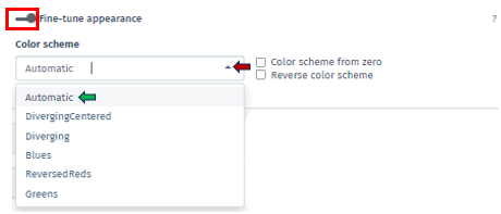
Each option in the Color Scheme tab of Fine-tune Appearance uniquely customizes the plot’s color palette, thereby aiding in the distinction of data clusters or patterns:
Automatic: Automatically selects the most suitable color scheme based on your dataset. It’s designed to provide a good balance of color contrast and visibility, making it easier to differentiate between various data points or clusters without manual adjustments.
Diverging Centered: Particularly ideal for datasets with a natural midpoint, such as zero. It uses contrasting colors on either side of this midpoint to accentuate differences in the data. For example, values above the midpoint might be colored in warm tones, while those below are in cool tones, emphasizing the divergence from the center.
Diverging: Similar to Diverging Centered, this scheme is used to represent data with distinct polarities yet lacks a defined center point. It employs two contrasting color sets to distinguish between two ranges or types of data, which is useful for visualizing datasets where a clear distinction is needed.
Blues: A monochromatic color scheme uses various shades of blue. It is effective for displaying data where the magnitude of a variable is more important than its polarity. Darker shades of blue can represent higher values, and lighter shades indicate lower values.
Reversed Reds: Inverses a typical red color scale and utilizes different shades of red, with lighter shades representing higher values and darker shades for lower values. It is particularly useful for datasets where lower values are more significant and need to stand out.
Greens: Similar to Blues scheme, uses shades of green to represent data. It is monochromatic and is used to signify the magnitude of values, with darker greens typically indicating higher values and lighter greens for lower values.
Additionally, within this tab, there are options for Color Scheme from Zero, which centers the color scheme around a zero value, useful for datasets with both positive and negative values, and Reverse Color Scheme, which inverses the color gradient, offering an alternative perspective for data interpretation. In this app, the total fold change of genes supporting enrichment in a gene set is visually indicated by the color of a dot on the plot. The color coding is derived by first calculating the sum (S) of log-fold changes of the genes, followed by a log-transformation: S→sign(S)log2(|S|+1). This method maintains the original sign of the sum and ensures that a zero value remains at zero. For manually inputted datasets, up-regulated and down-regulated genes are assigned a logFC of +1 and -1, respectively, to reflect their regulatory direction.
Clustering Options
Within the Enrichment Visualization app, clustering is an essential feature that becomes available alongside the 2D Plot tab. It involves the strategic categorization of data points with shared attributes into groups, facilitating the identification of genes or gene sets with similar expression patterns or functional behaviors, which is vital for nuanced biological insights.These clusters often indicate shared biological functions or pathways. The Clustering Options panel empowers users to initiate clustering through the Perform clustering button.
Users are presented with the ability to select their preferred method of clustering through the sophisticated Clustering Method Filter panel. This panel offers two distinct options:
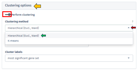
Hierarchical (Euclidean, Ward) clustering: This method thoroughly constructs a hierarchy of clusters, either by integrating smaller groups into larger clusters or segmenting larger clusters. It leverages Euclidean distance for assessing similarities alongside the Ward method to minimize variance within each cluster. This process is visually represented through a comprehensive dendrogram, elucidating intricate data relationships.
K-means Clustering: Functioning as a partitioning method, K-means effectively segments the data into a pre-set number of clusters. It is primarily focused on reducing variance within each cluster. This method necessitates an initial specification of the number of clusters, making it particularly adept for handling extensive datasets.
The app facilitates both automated and manual settings for cluster number determination. By clicking on the check box of the Automated option, the algorithm autonomously calculates the optimal number of clusters, employing techniques such as the elbow method or silhouette analysis, particularly in K-means clustering. Through the Number of Clusters tab, users have the flexibility to specify the cluster count, granting more personalized control over the analysis.
Additionally, the Cluster Labels feature offers varied labeling methods, each providing unique insights into the cluster’s characteristics:
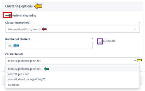
Most Significant Gene Set: Assigns labels based on the gene set with the highest statistical significance in each cluster, aiding in swiftly pinpointing critical biological processes or pathways.
Central Gene Set: Labels clusters using the gene set most representative of the cluster’s overall profile, which could be influenced by median expression levels or network centrality.
Sum of Absolute Significant logFC: Focuses on labeling clusters based on the sum of absolute log fold changes in gene expression, highlighting those with notable changes.
Numbers: Offers a straightforward approach by labeling each cluster with a unique number, simplifying the differentiation of clusters without delving into biological interpretations.
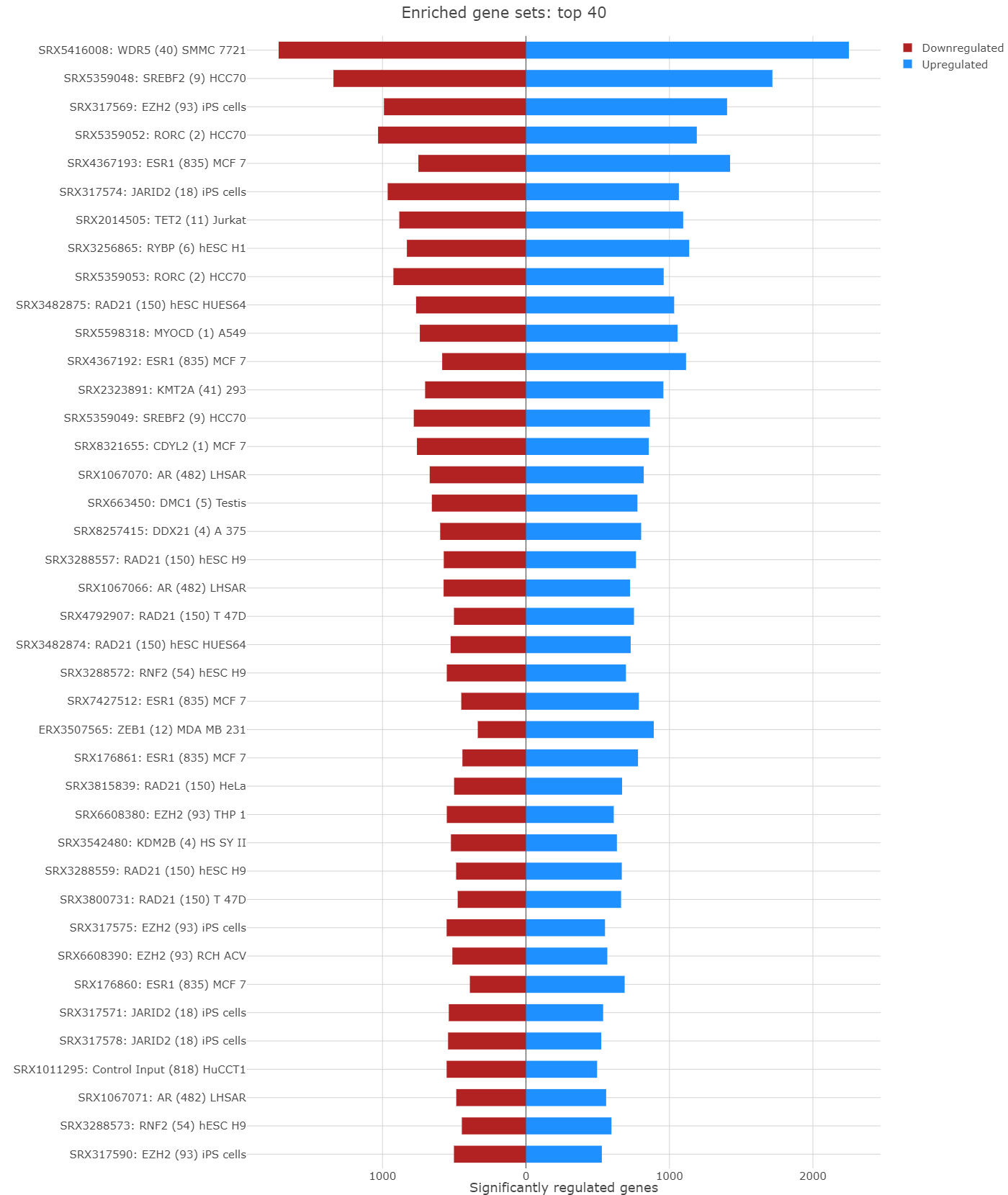
Barplot overview of enriched gene sets

In the Enrichment Visualization application, the Barplot tab provides a detailed overview of gene regulation within enriched gene sets, which can be either the complete set or those specifically selected by user in the 2D Plot. This tab features comprehensive information, including gene set IDs and names, along with bars that represent the number of upregulated and downregulated genes contributing to each enrichment. When an analysis results in more than 40 gene sets, the Barplot tab prioritizes the top 40 for visualization. Customized barplots can be created by selecting desired gene sets either from the 2D Plot (using the shift key and mouse clicks) or from the Enriched Gene Sets EvoTable (using the control key and selecting the relevant rows), allowing users to focus on specific gene sets of interest in their analysis.
Enriched Gene Sets
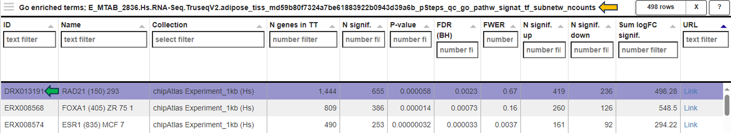
The EvoTable, prominently featured under the Enriched Gene Sets tab, provides a detailed summary of the enrichment analysis. The table’s first row serves as the header, delineating the categories for the presented dataset, with data filtration capabilities using the responsive filter bars below each header and data categorization via spinner control, located on the right side of the headers. Each gene set is distinctly identified by an ID and described by a Name, sourced from a specific Collection. N genes in TT, stands for Number of genes in the Total Target, tabulates the complete count of genes within each set, and N signif. enumerates those genes exhibiting significant expression changes. The P-value column offers the statistical significance, FDR (BH) applies the Benjamini-Hochberg procedure for controlling false discovery rate, and FWER (family-wise error rate) is the probability of making one or more false discoveries, or type I errors, when performing multiple hypotheses tests. The columns N signif. up and N signif. down respectively quantify the genes experiencing upregulation and downregulation, while Sum logFC signific. compiles the log fold changes, providing a quantitative measure of gene expression alterations. The URL links direct users to the QuickGO database, a web-based platform provided by the European Bioinformatics Institute (EBI). This platform offers detailed information about the specific Gene Ontology (GO) term referenced by the respective identifier, including its definition, associated biological processes, cellular components, molecular functions, and related annotations in various species. This resource helps users to understand the role of genes in complex biological systems.
Genes for the selected gene sets
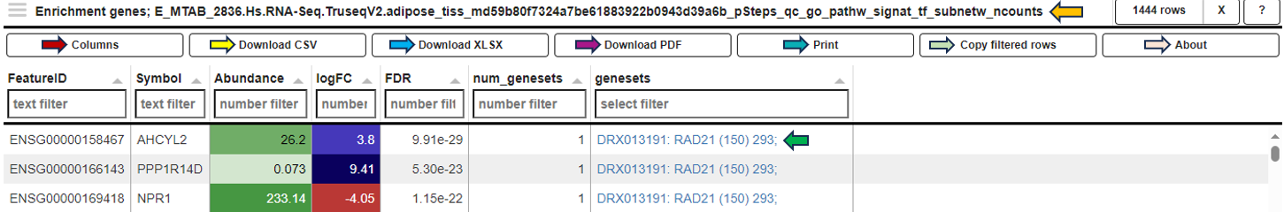
In the Genes for the selected gene sets tab, the application displays a table that gathers genes associated with gene sets chosen by users in their analysis and provides detailed insights into the involvement of each gene in the study.

This table includes general features like the Feature ID (Ensembl Gene ID) and the Symbol (gene’s standardized name). It incorporates the Abundance value, indicating the gene’s expression level within the dataset. The Abundance column is color-coded for intuitive interpretation. A darker green shade indicates higher gene abundance, signifying a more robust presence or higher expression level of the gene in the dataset. As the abundance decreases, the color lightens progressively towards white, visually representing a decrease in gene expression or presence. The LogFC (Log Fold Change) column represents the magnitude and direction of change in gene expression. Similar to Abundance, the LogFC values in the table are color-coded: higher values are shown in darker blue to indicate increased expression changes, shifting to white as values near zero for stability. Negative values are highlighted in red. The FDR column within the table applies a correction to the p-values, addressing the potential for false positives that arise through multiple testing. This visual coding allows users quickly identify genes with significant expression changes, facilitating efficient data interpretation and analysis. The num_genesets reflects the count of gene sets a particular gene is found in, and the genesets column lists the specific gene sets to which the gene is associated, with identifiers that link to the QuickGO database for in-depth gene set information. Users can refine this extensive dataset to display only the most relevant genes by utilizing the filtration options beneath each column header. This functionality enables a focused review of genes pertinent to the user’s research interests within the enrichment analysis framework.
Reports
This section offers two distinct types of downloadable report formats, addressing various user needs and preferences. The available reports are tailored to meet diverse requirements, whether for an interactive (Interactive reports), in-depth data examination or a straightforward, concise summary (Static reports) of the findings. Results are always reported for the latest completed analysis; i. e., even if some parameters have been changed after the completion but Perform Enrichment Analysis button has not yet been pressed, the latest changes will be implied in the results. Report preparation can take certain amount of time (up to minutes) and downloading will be automatically initiated as soon as the report is ready.
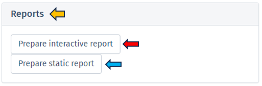
Interactive report
Selecting Prepare interactive reports provides a web-based interface for users to delve into their enrichment analysis results. This HTML report format is designed for an engaging data exploration experience (but without the capability of changing analysis parameters), guiding users through detailed analytical capabilities and emphasizing the role of the report in enhancing understanding of enrichment analysis results. Key features of the Interactive Report include:
Technical and session details: The report begins with essential technical details, including the date and time of report generation, session information, and package details used in the analysis, ensuring both traceability and reproducibility.
Additional package information: This segment offers comprehensive information about the software packages and tools utilized in the background computation of the enrichment analysis, crucial for ensuring reproducibility and grasping the applied methodologies.
Dataset: It presents a thorough overview of the dataset, detailing aspects like Differential expression filters, Gene set collections, and Enrichment thresholds, providing a complete understanding of the data parameters.
Embedding and visualization parameters: Included in the report are details about the embedding and visualization methods applied, shedding light on the analytical techniques used for data representation.
Interactive block of the report: This section showcases an interactive 2D plot where users can discern the extent and importance of each GO term’s enrichment by observing the hue and dimension of the dots. Additionally, it provides a responsive table listing GO terms complete with comprehensive statistics, reflecting the app’s capability for thorough data investigation.
Report focused on selected gene sets: Interactive features such as Barplots and Table of Selected Gene Sets offer dynamic visualization, enabling users to engage directly with the data for a more nuanced understanding of the results.
Genes associated with enriched sets: This section lists a wide range of genes linked to the enriched sets, along with their abundance, fold change, and significance, offering a detailed view of the gene-level impact.
Full list of enriched gene sets: Here, a detailed list of gene sets identified as significantly enriched in the analysis is provided, including key information like gene set identifiers, descriptions, and statistical measures of enrichment (e.g., p-values and FDR). This exhaustive list aids in comprehending the biological context of each gene set and identifying the most relevant biological pathways or functions uncovered by the analysis, serving as a vital tool for thorough biological interpretation and research.
Static report
The Static Report generated by clicking the Prepare static report offers a comprehensive and detailed summary of the enrichment analysis results in a user-friendly PDF format. This report is designed to provide a clear and concise overview of the findings in a non-interactive format, making it ideal for formal presentations, documentation, and archival purposes. The Static report encompasses all the principal features found in the Interactive report, except that it does not contain the Interactive block of the report section.
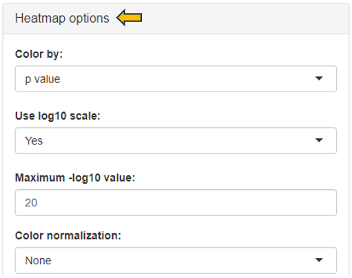
Comparison groups

This panel involves the comparison gene expression patterns between two or more groups of samples, such as samples from control and treated groups or distinct pathological conditions. In this type of analysis, the App utilizes a heatmap to visualize the overall gene expression patterns across the different samples, where each row denotes a distinct gene, and each column indicates a unique sample or group.
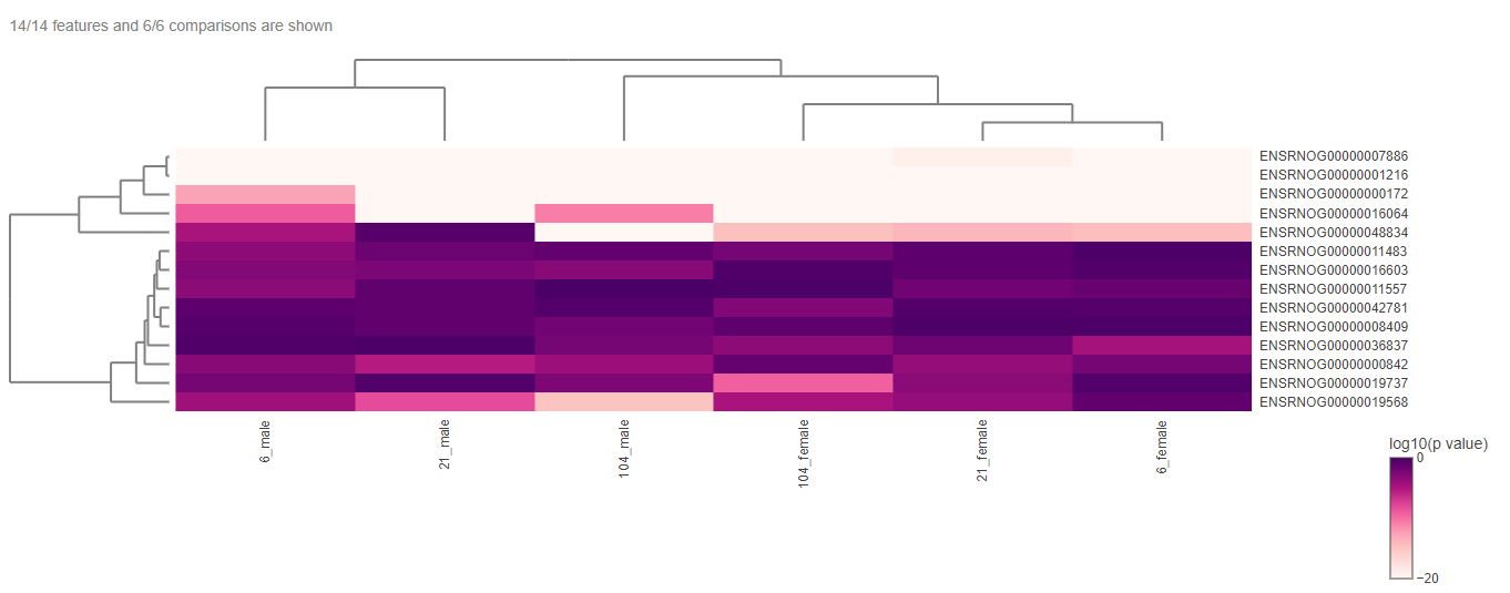
The heatmap can be edited according to the user’s interest with the help of the “Heatmap options”.
The heatmap data can be downloaded in different formats with the help of the “Download” option.
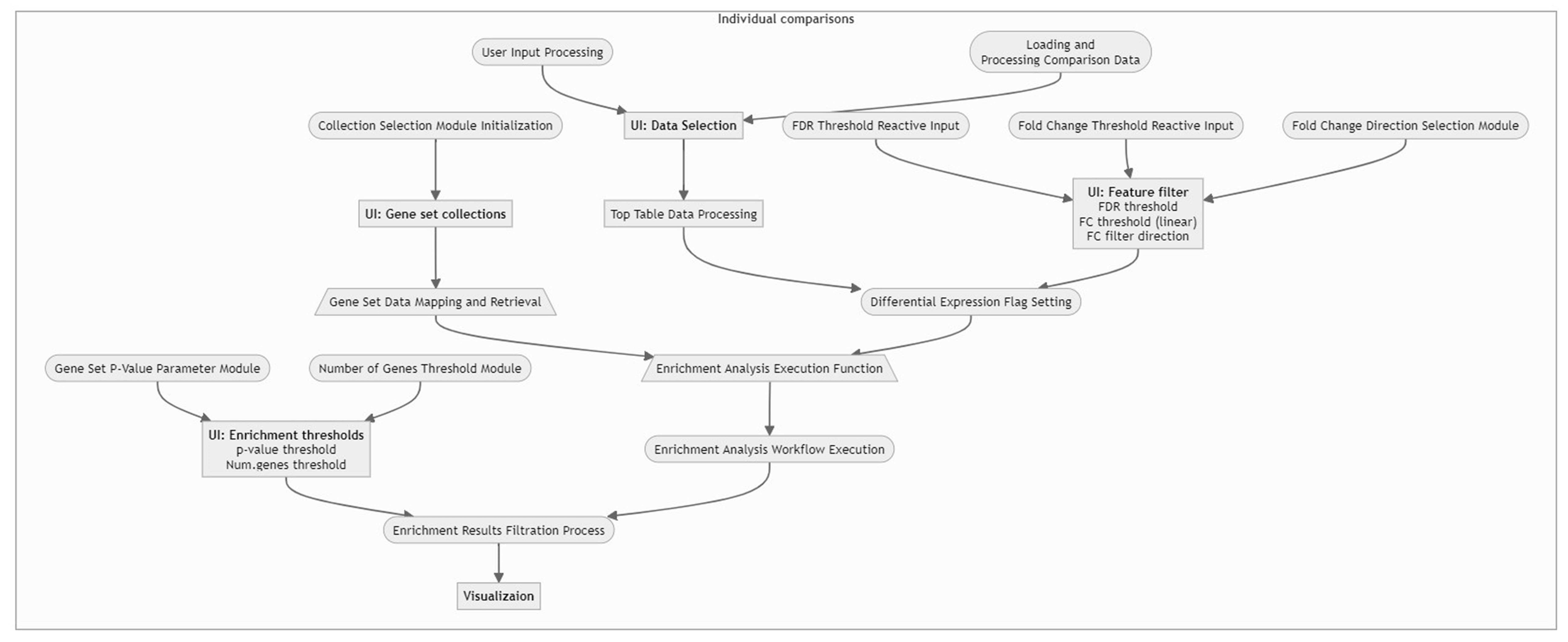
Workflow Overview
For a concise understanding or a quick insight into how the data is processed within our application, please refer to the following flow chart. This visual guide provides an overview of the workflow, illustrating the sequential steps and interactions from data input to final visualization. It is an excellent resource for grasping the app’s core functionalities and the interconnected processes that drive the analysis.