Gene Info
The Gene Info app provides all available information on a single gene or feature of interest.
Important!! Do not use the expression values in the Gene Info app to calculate fold changes of transcriptomic data!! (see details in the Results panel)
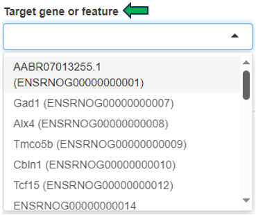
After opening the app, specify the study and samples of interest using the Sample Selector (Introduction to the Sample Selector) and the target gene or feature by searching the NCBI gene ID, symbol, or Ensembl ID in the Target gene or feature drop-down menu. Samples marked as excluded can be shown by checking the Show excluded samples box.
Results panel

The first panel displays a Summary - Abundance table showing the metadata of the selected samples and the Mean and standard deviation SD of the target gene or feature. The column name also indicates the data type (norm, lognorm or log) that has been used for calculating the mean and standard deviation. Each row corresponds to one of the combinations of categorical variables, and the Sample Count column shows the number of samples grouped together. The Mean column is color-coded, with dark green corresponding to high and light green/white color corresponding to low expression/intensity levels.
For example, 4 samples of brain tissue from 6-week-old female rats are grouped in the third row shown below. The samples show high expression levels of the target gene, with an average abundance of 70.75 counts per million (CPM).

The displayed default expression / abundance values of data from different sequencing platforms are as follows:
- Transcriptomics:
- Bulk RNA-seq and Pseudobulk RNA-seq: Normalized counts in counts per million (CPM)
- ScreenSeq: Normalized counts in counts per 10,000 (CP10,000)
- Proteomics: Log-normalized protein group intensity
The transcriptomic data shown here are normalized only for sequencing depth, but not for gene length or batch effects, and should be used for exploratory purposes only, not for calculating fold changes (FCs). To perform an accurate comparative analysis between samples, use the New Comparison app to set up a differential analysis and the Comparisons app (formerly Top Tables app) to examine the results and link to downstream analyses.
The proteomics lognorm data is both normalized and batch-corrected (if batch-correction was carried out), batch-correction should not be used for calculating FC using limma, since limma is applying an built-in batch-correction. The proteomics log data is only normalized and corresponds to the data used for FC calculation in the New Comparison app.
The by default used data types are mentioned above. Still, it can be of interest to use a different data type in the summary table or the expression plot. This can be achieved by the checkbox Use log normalized data. For transcriptomics and specific proteomics protocols (Olink, Somascan and Batch), this switches from normalized to log normalized data. For all other proteomics protocols it switches the underlying data between batch-corrected and non-batch-corrected data, but it stays in the logarithmized space.
Like other tables in PanHunter, this one is also interactive. The rows can be sorted by a selected column by clicking on the column header. The sorting order can be changed from ascending to descending with another click. The width of individual columns can be changed by left-clicking on a column divider and dragging the mouse.
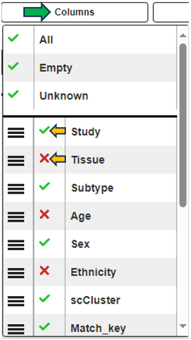
Clicking the tribar symbol ≡ next to the table title provides additional column settings and options for downloading and copying the table. Columns can be shown or hidden using the checkboxes in the Columns drop-down menu. The order of the columns can be changed by dragging values in the Columns drop-down menu or dragging the column headers of the table. For more details, see the Table-Filter website.

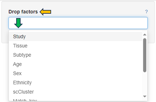
Categories can be completely removed from the visualization using the Drop factors option on the left side. In this case, the selected category would not be considered in any calculation.
Graphic panel
This panel visualizes the expression levels of the target gene or feature from the selected samples in a plot.
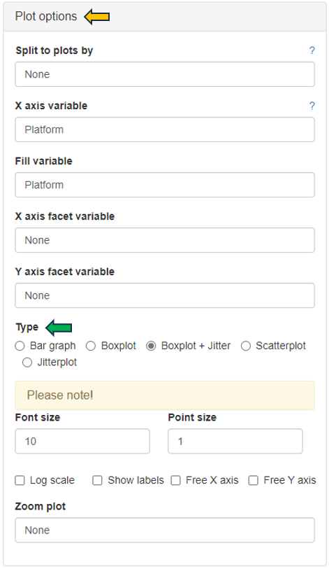
Several options are available to customize the plot, as described below. An additional sorting option is available after selecting a variable in any of the fields.
- Split to plots by: select a variable for which to split into separate plots.
- X axis variable: select a variable to group the data on the X axis.
- Fill variable: select a variable to color the plot.
- X axis facet variable: select a variable for which to divide into sub-plots along the X axis.
- Y axis facet variable: select a variable for which to divide into sub-plots along the Y axis.
Change to another plot type by selecting the available options in Type as shown below. PanHunter offers further customization options, such as changing the Font size and Point size, deciding whether to Show labels, Free X axis, Free Y axis and Zoom plot. The underlying data type for the plots can be changed in the General Options panel
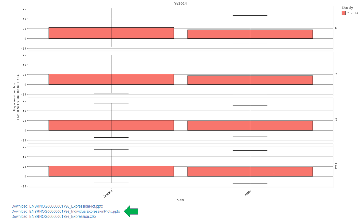
The following bar graph shows the expression levels of an example gene. Sex is used as the X axis variable, Study is selected as the Fill variable, Age is selected as the Y axis facet variable. Tissue is removed from consideration using the Drop factors drop-down menu. The plot is in CPM values and the Log scale box is unchecked. The plot can be downloaded in various formats using the download options below the graph.
Metadata panel
This panel provides a Metadata table with all available meta information for the selected gene or feature and additional hyperlinks to external resources such as Ensembl, GO, Pfam, GWAS and BioGrid databases.
