Gene Clustering
The Gene Clustering app aims to identify co-expressed or co-regulated genes for a single selected gene. Initially, genes with similar expression profiles to the selected target gene and related samples are detected. These expression profiles are then hierarchically clustered in the second step. Finally, the clustering outcomes are visualized for genes with the most similar expression profiles compared to the target gene to allow for closer inspection.
Samples panel

In the first panel, samples which should be included in the clustering can be selected in the “Sample selector” on the left-hand side.
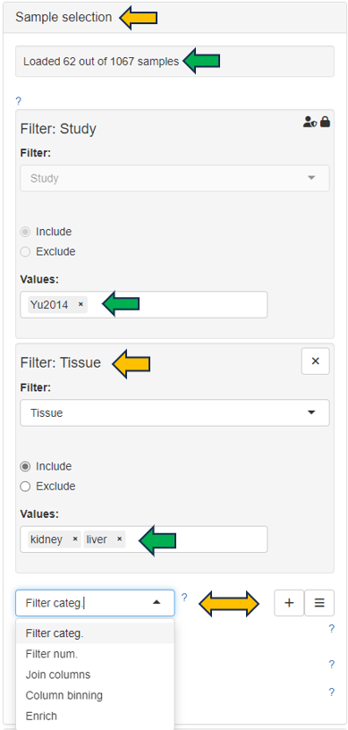
This panel shows a table consisting of the selected sample data.

Feature table panel
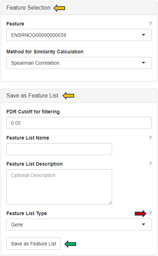
This panel summarizes information about the genes in a table. The feature of interest and the method of similarity calculation has to be selected in the “Feature Selection” section on the left-hand side. It allows to enter the gene symbol, gene ID, or Ensembl ID of the target gene and the available methods for Similarity Calculation are “Spearman Correlation”, “Pearson Correlation”, “Euclidean Distance” and “Manhattan Distance”.
You can give the feature list a name and description in the “Feature List Name” and “Feature List Description” panel respectively. By clicking the question mark next to the “Feature List Type”, you will get a list of accepted IDs. You can save the list with the help of “Save as Feature List” option.
The feature table contains the feature (e.g. gene) meta data, the values for the chosen Similarity method between each gene expression profile and the target gene. The false discovery rate (FDR) is given in case the similarity is either Spearman or Pearson Correlation and is found via a correlation test. By default, features are sorted from high to low according to the selected correlation or distance metric. The table is interactive and can be sorted, for example, according to positive or negative similarity by clicking on the respective column title “Similarity” one or two times. In case a correlation method is selected, the distance corresponds to 1 - the absolute Pearson correlation coefficient. This method is useful when searching for genes which are either positively or negatively correlated with the target gene.

Feature Heatmap panel
In the heatmap itself, color-coded expression profiles are displayed with each row corresponding to a gene and each column to a sample. Dark green color in the heatmap represents high relative expression, light green and white indicate low expression. Expression levels are normalized per gene (unit mean and variance). The target gene profile is shown in the top row. Neighboring genes (rows) or show the lowest distance or highest similarity.
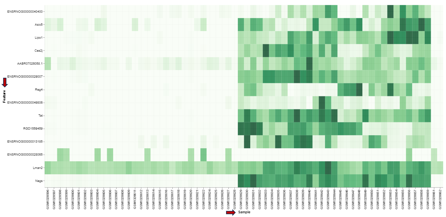
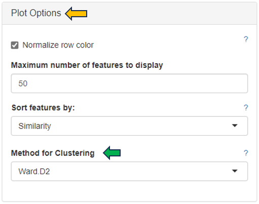
For plotting the heatmap the method for clustering has to be specified. The genes can be clustered based on expression profile similarity using “Ward’s method (Ward.D2)”, “Average clustering” as well as “Complete clustering”. The number features to be plotted can be adjusted in the “Plot Options” section.
