Patient Data
The Patient Data app is used to explore rich clinical data of patients, to link patient data with gene expression samples, and to calculate univariate statistics.
Summary panel

For selected dataset, this panel provides a comprehensive overview of categorical, numerical and time variables. If recruitment date is available, two additional plots displaying patient recruitment process are provided.


Table panel

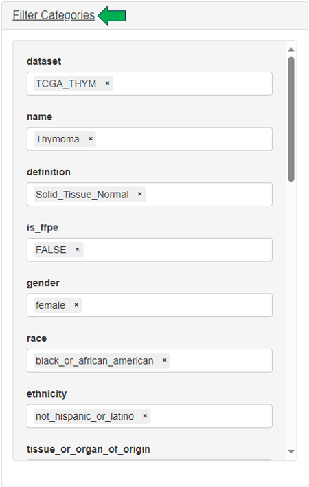
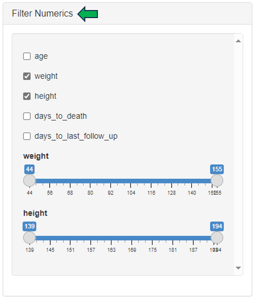
In this panel, the user can filter patients based on:
- Categories (by selecting different category levels) in the “Filter Categories” section
- Numerics (by setting ranges with sliders) in the “Filter Numerics” section
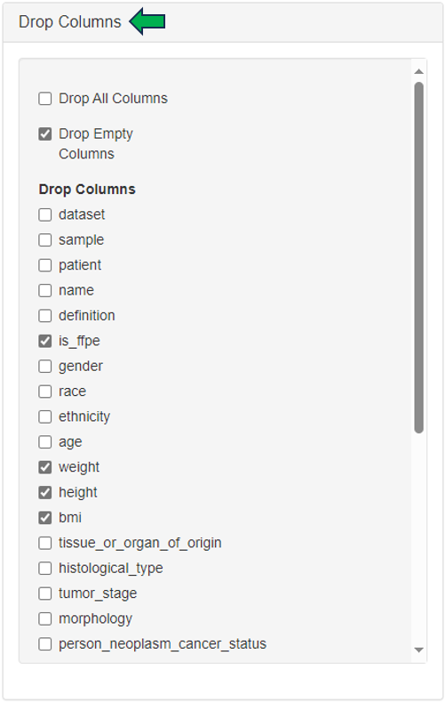
- Drop columns to shape patient table into a smaller dataset with the help of “Drop Columns” section.
Finally, the settings used to filter the patients data can be viewed under the “Show Settings Used” option.

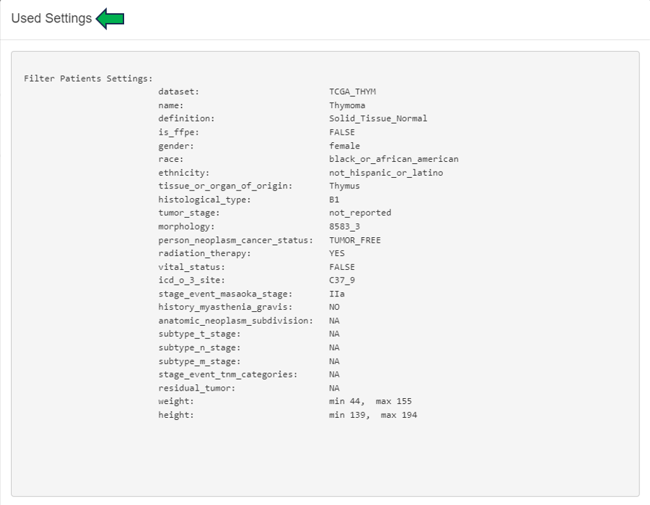
This filtered patient table can be sent to New Comparison app and joined there with sample table and expression data.

Graphics panel
This panel contains a visualization of patient clinical variables. Different variables can be selected from the “Select variables to be plotted” option on the left hand side of the interface.
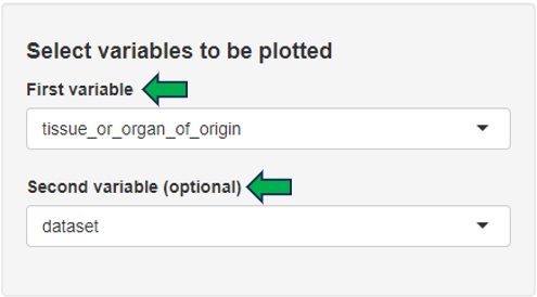
Depending on the number and type of selected variables, a bar plot, a box plot, a histogram, or a scatter plot is displayed. The displayed plot can be downloaded as a powerpoint slide with the help of the download link given below.

Cluster Patients panel
In this panel, filtered patient table from Table panel is joined with sample table and corresponding gene expression samples are loaded. The patients can be here further filtered based on sample’s categories. Hierarchical clustering analysis is performed on the selected patient samples and results are visualized as a dendrogram. Various gene sets can be specified for the clustering analysis: N top variable genes, pathway and GO sets, or manual gene selection. Clinical variables can be visualized as bars added below the dendrogram.
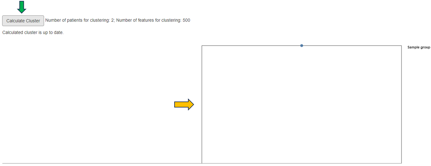
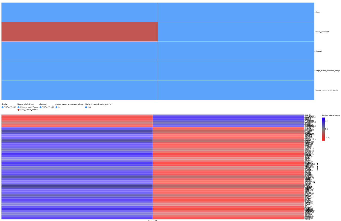
Patient clusters can be interactively defined within the dendrogram plot and the univariate statistics are calculated between the defined patient groups for selected clinical variables. Additionally, corresponding heatmap can be visualized (recommended only after final selection of patients, samples, genes and clinical variables).
Lab Results QC panel
In case the patient data includes measurements from blood and urine tests, the quality of these results can be inspected in this panel.

Lab Time Series panel
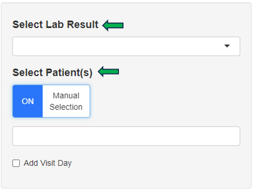
In case the patient data includes measurements from blood and urine tests in multiple time points, a time series plot of a selected measurement is visualized.
Reports
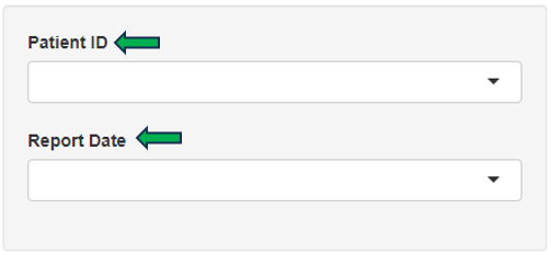
Selected patient’s report can be obtained through this panel for review and analysis.
