TranscriptomicsQC
The Transcriptomics QC application is utilised to inspect bulk and plate RNA-Seq QC statistics. Samples can be selected with the help of the Sample selector panel, located on the left side of the interface.
Generate QC Report

The “Generate QC Report” option allows users to generate standardized QC reports based on the selected metadata. These reports provide a structured overview of quality control metrics and are stored directly within the “Data Overview app” for easy access and review. Currently, the reports can only be generated for bulk RNA-Seq data. Users can use the following options to generate their QC report:
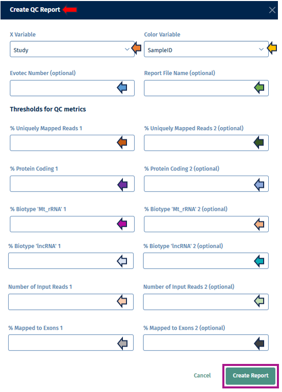
Steps to generate a report
- Metadata Selection
- X Variable: - Choose a metadata column from the dropdown to be used on the x-axis of plots in the report. - Example: Study, SampleID, Protocol → this defines how samples are grouped in the report.
- Color Variable: - Choose a metadata column to color-code the samples in the plots. - Example: Species, Age, Sex → this helps to visually separate categories.
- Optional Report Information
- Evotec Number (optional): - Allows entry of an internal project or reference number. - Useful for tracking and documentation across teams.
- Report File Name (optional) - Enter a custom name for the report file. - If left empty, a default name will be assigned automatically.
- Create Report:
- After entering the data in the options above, click on the Create Report button. It will provide the generated QC report.
Threshold Manager
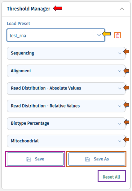
The Threshold Manager allows users to set and adjust thresholds for all QC parameters included in an analysis (details, see below). These thresholds helps to quickly evaluate data quality by applying color-coded indicators across the application.
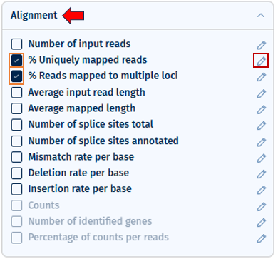
Selecting a parameter in the Threshold Manager automatically includes it in visualizations and general QC indicators. Thresholds can be customized for all parameters, even those not in the current study but included in a loaded template. Changes are reflected across all relevant QC plots after applying.
Parameters are grouped by their QC step (e.g., Sequencing, Alignment, etc). These can be expanded or collapsed for better focus.
- Flexible Threshold Settings: * Add, remove, or modify thresholds for any parameter by clicking on the “pen” button. * Switch between one-sided, two-sided, or more complex thresholds with multiple color ranges. * Set up to 10 threshold points (maximum 11 color segments). * Select “Apply” to apply the changes.

- Template Management: * “Load” existing templates (from your own work or shared by others). * You can delete the loaded template with the “bin” button near the load option. * Update and overwrite your templates using the “Save” button. * Use the “Save As” button for saving your template as new. Set a name for your template under the “Preset name” field. You can click on the tick box near “Publish to Project” to save this template to your project and make it accessible to the other users.
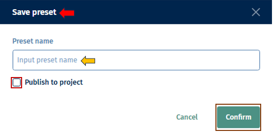
* **Reset Option:** You can untick and empty all thresholds with _"Reset all"_ at any time.
Thresholds for QC Metrics
Users must provide thresholds for a set of standard quality control (QC) parameters. These thresholds are dynamic depending on the underlying data. Furthermore, the thresholds are pre-filled with the thresholds given in the Threshold manager, which the users can overwrite. These thresholds define acceptable data quality ranges. If values fall outside the thresholds, they are flagged in the report.
- % Uniquely Mapped Reads (1 and optional 2nd value): - Minimum percentage of reads that map uniquely to the reference genome. - A second value can be provided to define a stricter or alternative cutoff.
- % Protein Coding (1 and optional 2nd value): - Minimum proportion of reads mapping to protein-coding regions. - Ensures that sequencing captures biologically meaningful transcripts.
- % Biotype ‘Mt_rRNA’ (1 and optional 2nd value): - Maximum acceptable proportion of reads mapping to mitochondrial rRNA. - High values may indicate contamination or poor library preparation.
- % Biotype ‘lncRNA’ (1 and optional 2nd value): - Proportion of reads mapping to long non-coding RNAs. - Helps assess the balance of coding vs. non-coding transcript coverage.
- Number of Input Reads (1 and optional 2nd value): - Minimum number of reads per sample required for downstream analysis. - A second threshold can define a stricter cutoff.
- % Mapped to Exons (1 and optional 2nd value): - Proportion of reads mapping to exonic regions. - Indicates sequencing efficiency and relevance to functional transcriptome analysis.
Overview tab

The Overview Tab provides a comprehensive summary of the selected studies and their quality control (QC) results. It is designed to give users an immediate understanding of the dataset’s quality, enabling quick detection of potential issues before proceeding with further, in-depth analysis.
Details

The first section of the Overview Tab displays key metadata for the selected study or studies, including:
- Study Name(s)
- Platform and Protocol
- Number of Plates and Number of Sample (Displays actual counts for filtered data, e.g., “x of y selected”)
- Date Added (Usually, the date when pre-processing was completed; if unavailable, the integration date is shown)
Additionally, information regarding the pre-processing is displayed which includes:
- Aligner version
- Genome GTF file name
- Genome fasta file name
- Samtools version
- Gene Body Coverage version
- Read Distribution version
The system supports multiple studies from the same platform. When multiple studies are selected, all relevant details are displayed in the same section, with the ability to link each study to its corresponding plates and samples.
General Indicators
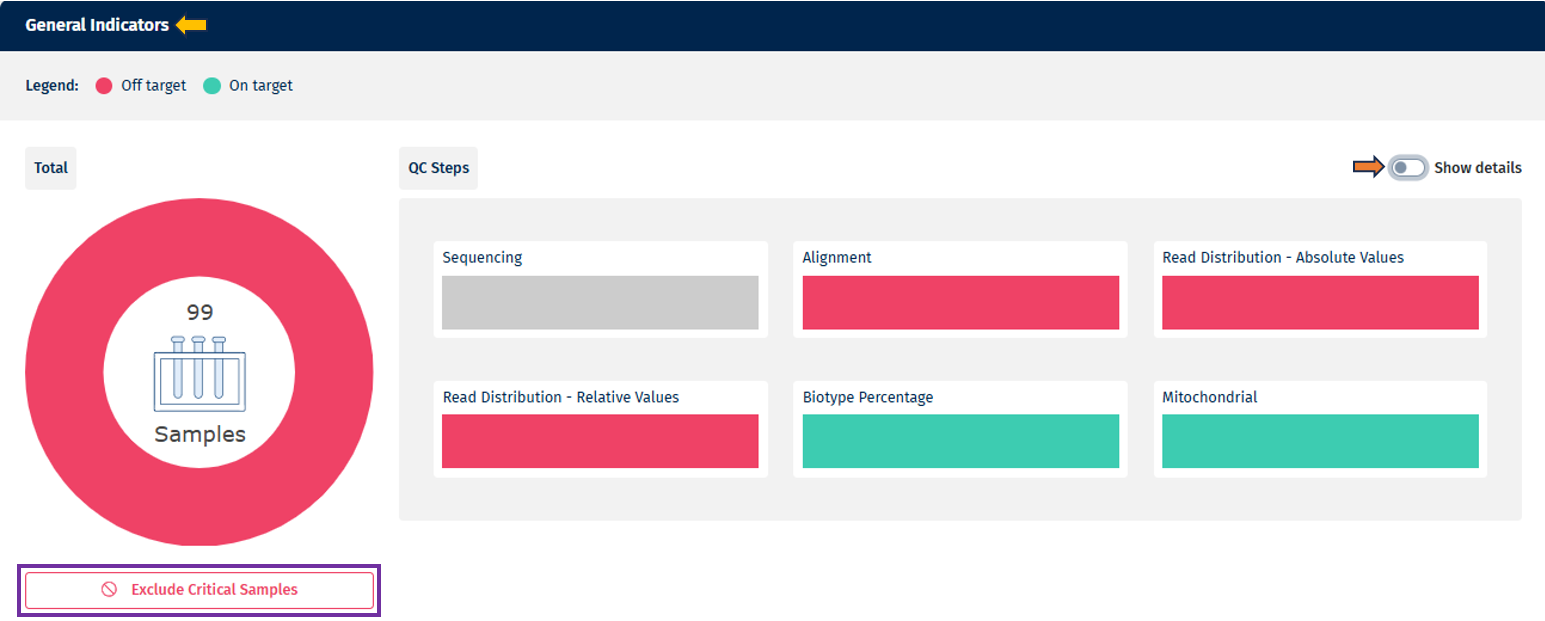
- Overall Summary (Pie Chart)
- Provides a strict summary of QC status across all samples and QC steps combined.
- If a sample fails any QC step, it is classified as “Out of Target” in the overall summary.
- The pie chart displays the total number of samples in the center, and hovering over individual sections reveals sample counts and percentages.
- Under the pie chart there is an option available to “Exclude critical samples” for further analysis. This option is available for the Data manager (who can add data and sample table information) and Project lead (who can assign data managers and add/remove users from a project)
- Summarized View (Bar Charts per QC Step)
- Each bar chart represents a QC step (e.g. Sequencing, Alignment).
- Samples are categorized according to threshold levels, displayed using a color scale (up to 10 levels, from red → green). Note: it always takes the lowest level
- Hovering over a category provides additional details, including sample counts and percentages.
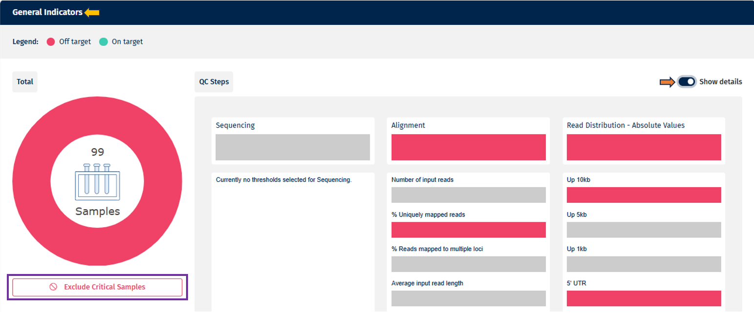
- Detailed View (Bar Chart per Parameter)
- On toggling the “Show Details” slider, the individual QC parameters selected in the Threshold Manager are displayed.
- Parameters are grouped under their respective QC steps.
- Uses the same color-coding and interaction principles as the summarized view.
Threshold Legend
The color legend dynamically adapts to the thresholds defined in the Threshold Manager:
- Two groups: Red = Off Target, Green = On Target
- Gradients of color used : Red, Yellow, Green. For up to ten groups, gradual scale from Red → Green is used for more granular categorization
- If no threshold has been defined for a specific QC step, the corresponding section will appear greyed out for clarity.
Critical/Highlighted Samples
The heatmap provides a detailed view of sample performance across all QC parameters:
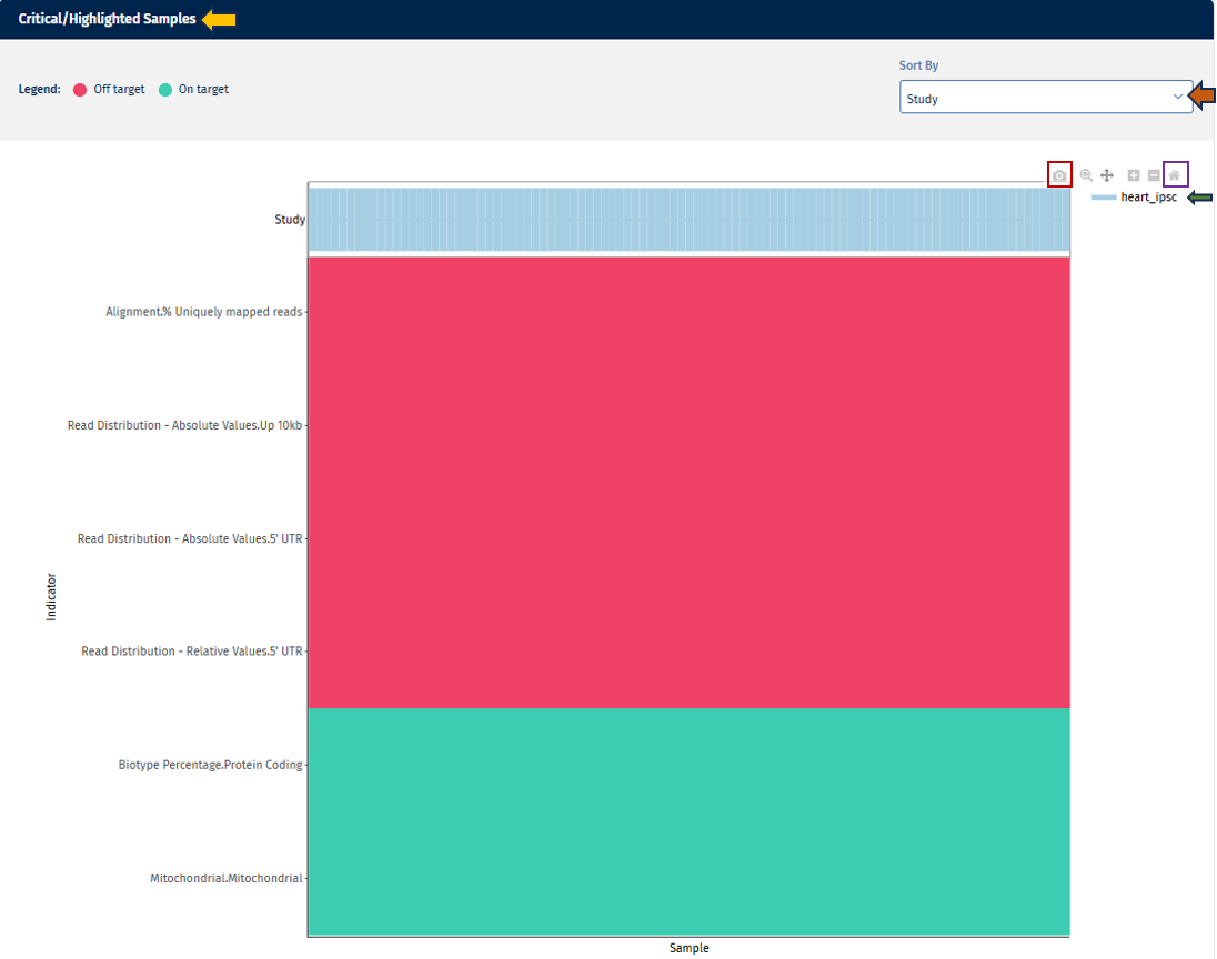
Go to Plot Navigation panel for more information on how to navigate through the plot.
Sequencing tab

The Sequencing tab provides visual and tabular representations of sequencing quality metrics, helping users quickly assess data integrity and detect potential issues.
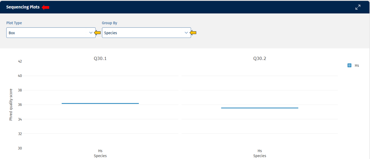
Go to Plot Navigation panel for more information on how to navigate through the plot.
Sequencing Stats Table Below the plots, a table view provides detailed QC values for all parameters in the “Sequencing” tab. Currently, it provides the following data:

Go to Stats Table panel for more information on its features.
The following are columns unique to the “Sequencing tab”.
- Q30 value
- Link to the FastQC report (HTML file generated during pre-processing)
- Key identifiers for proper sample linkage: Study, Sample ID, SeqFile (FASTQ file name)
Alignments tab

The Alignment tab provides visual and tabular representations of alignment statistics for your selected samples. This helps you evaluate mapping quality and detect potential issues.
Alignment Plots panel
This section displays alignment-related parameters in the form of plots. These plots show the distribution of the selected statistics across all samples or fastq files. If you work with a multiplexing protocol like ScreenSeq you have the option to see the statistics on sample level as well as on file level. When you hover over a data point, the exact value for that sample is displayed.
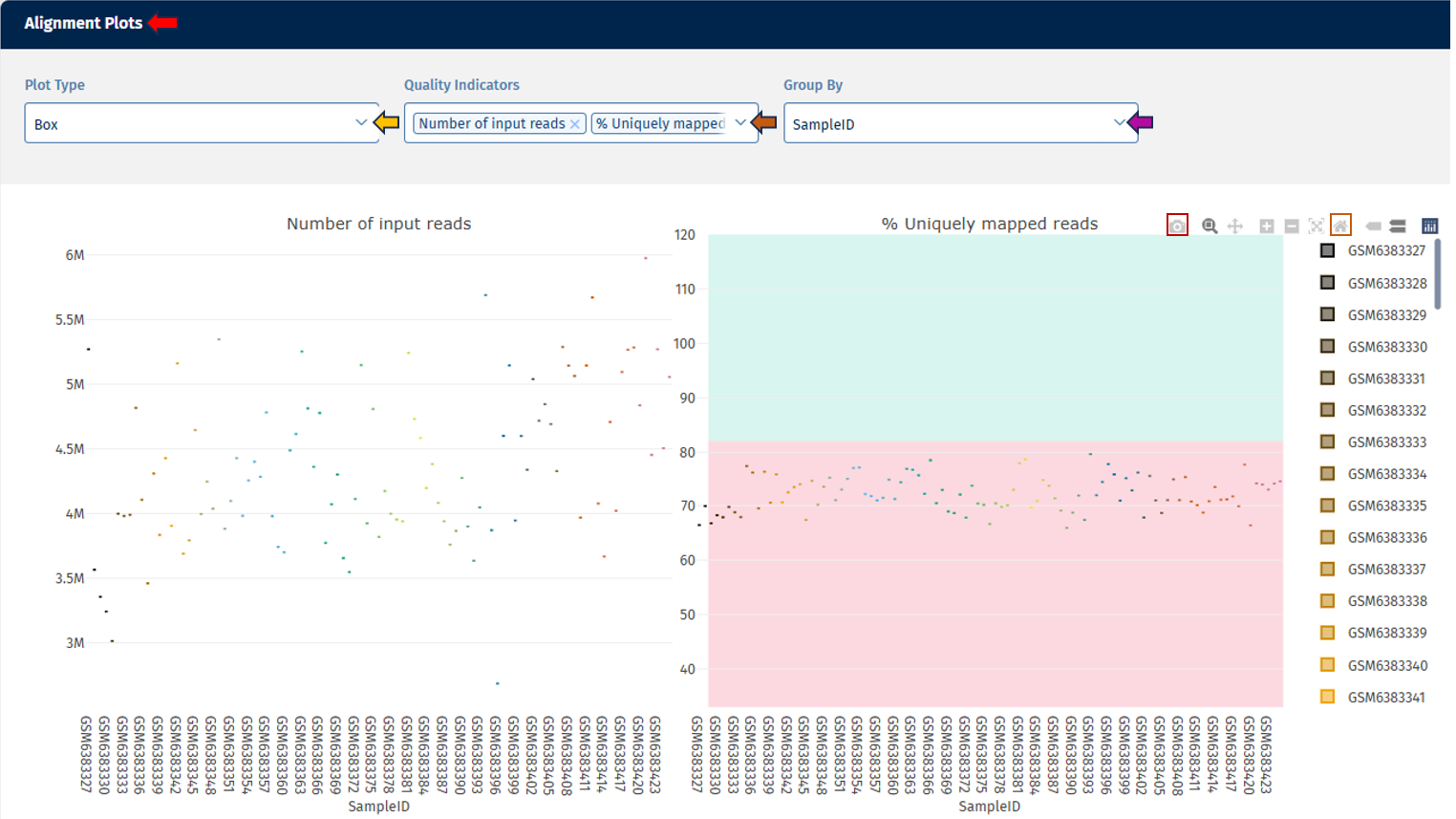
Go to Plot Navigation panel for more information on how to navigate through the plot.
Alignment Stats Table
Go to Stats Table panel for more information on its features.

Read distribution tab

The Read Distribution tab provides visual and tabular insights into how reads are distributed across different genomic regions (e.g., exonic, intronic, intergenic regions) for the selected samples (fastq files in case of a multiplexing protocol like ScreenSeq). This helps you assess sequencing quality and detect potential biases in library preparation or alignment.
Read Distribution Plots panel
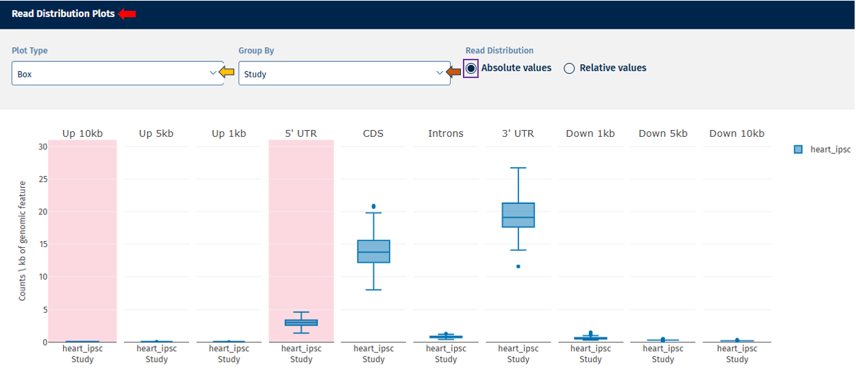
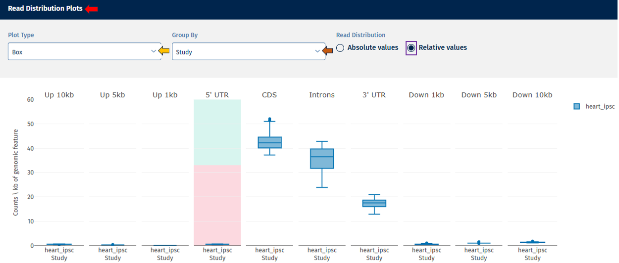
This section displays plots for parameters belonging to the “Read Distribution” tab. Each parameter is plotted separately to ensure proper threshold visualization.
Go to Plot Navigation panel for more information on how to navigate through the plot.
In addition to the options provided for plot navigation, a Switch Data Type option is available here for users to toggle between in the same plot:
- Absolute Value – Displays absolute counts.
- Relative Value – Displays proportional values (e.g., % of reads per category).
-
Legend: Explains metadata groupings and threshold categories (shown on hover).
-
Hover Tooltips: Show exact parameter values for each sample.
Read Distribution Table
Go to Stats Table panel for more information on its features.

Gene body coverage tab

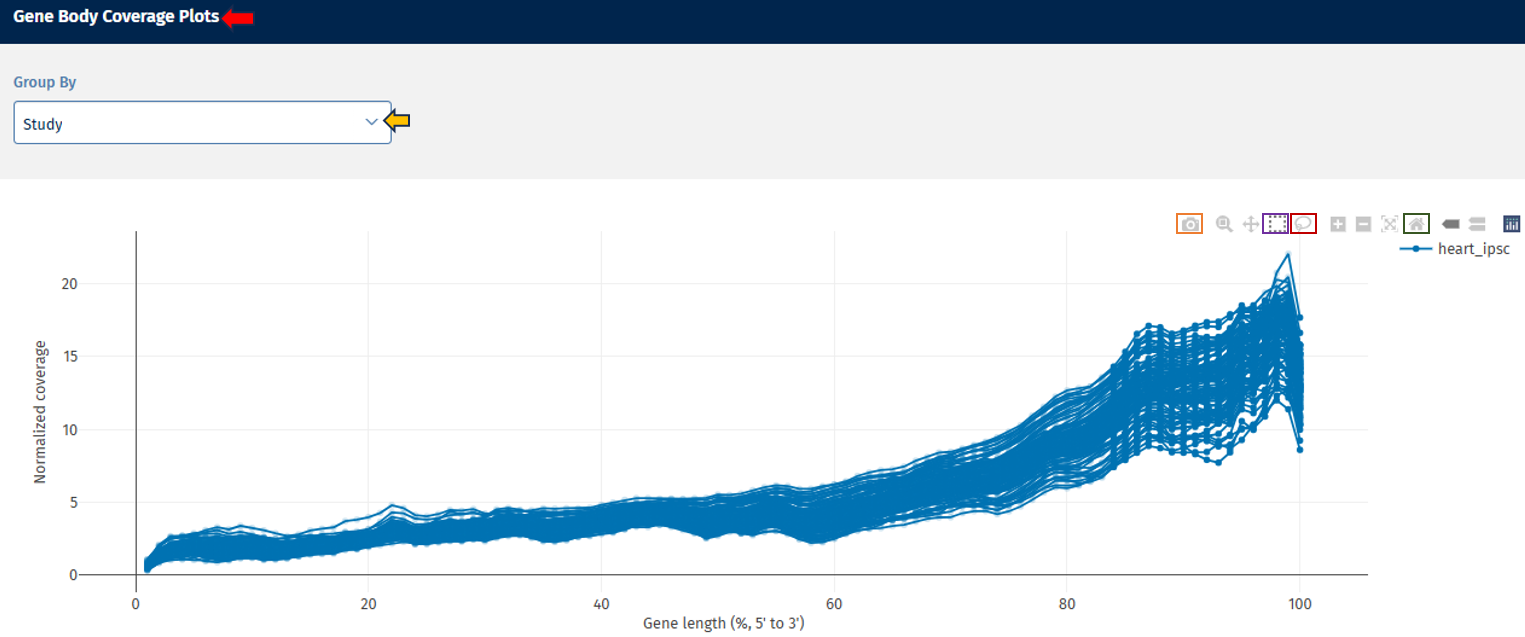
The Gene Body Coverage tab provides a visual representation of the read coverage across the entire length of genes, helping users assess uniformity in RNA-Seq data. This analysis is essential for detecting 5’ or 3’ biases that may indicate RNA degradation or library preparation issues.
Gene Body Coverage Plots panel
This section displays a line plot showing the normalized coverage of sequencing reads along the length of the gene for each FASTQ file.
Go to Plot Navigation panel for more information on how to navigate through the plot.
Biotype tab

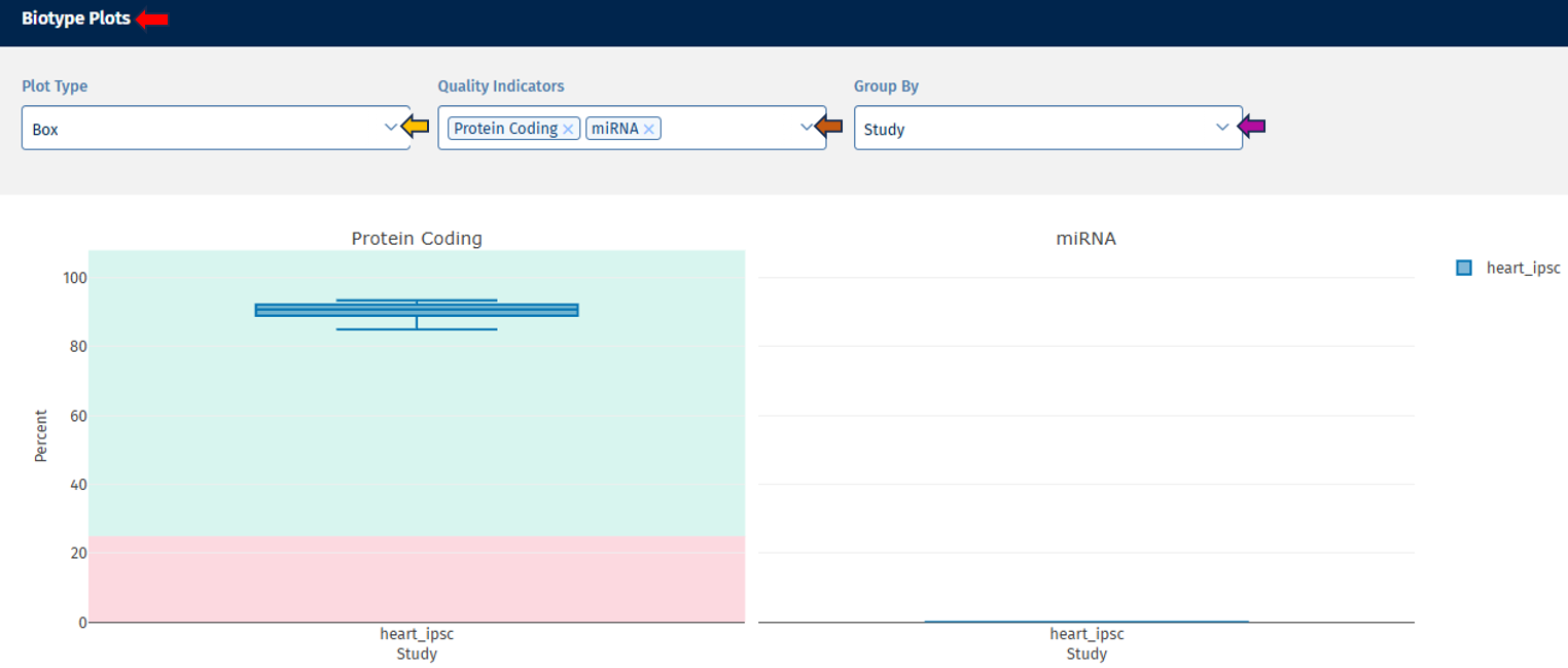
The Biotype tab provides an overview of the distribution of different RNA biotypes within your samples, allowing you to assess sample composition and identify any unexpected biases.
Biotype Plots panel
This section displays interactive plots for visualizing QC parameters related to RNA biotype distribution.
Go to Plot Navigation panel for more information on how to navigate through the plot.
Biotype Stats Table

Go to Stats Table panel for more information on its features.
Mitochondrial tab

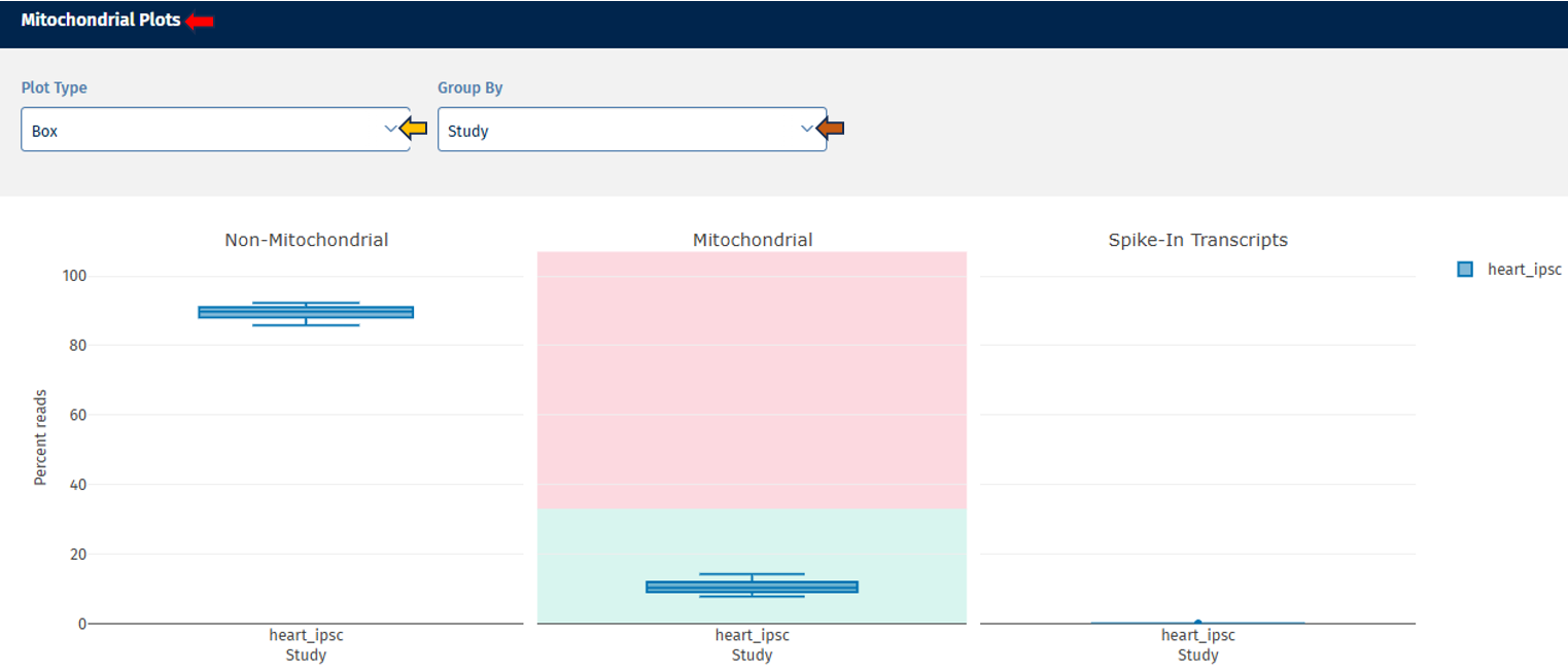
The Mitochondrial tab provides a visual overview of the proportion of reads mapped to mitochondrial genes, non-mitochondrial genes, and spike-in transcripts. This allows users to assess sample quality and identify potential technical artifacts or contamination.
Mitochondrial Plots panel
Go to Plot Navigation panel for more information on how to navigate through the plot.
Mitochondrial Stats Table

Go to Stats Table panel for more information on its features.
Plates tab

The Plates tab provides a visual representation of the distribution of your data over the plate(s) using a heatmap (for this, well information must be available), enabling quick assessment of sample distribution, QC metrics, and metadata across multiple plates.
The heatmap represents the plate layout:
- Y-axis: Plate rows
- X-axis: Plate columns
Each cell corresponds to a sample, and coloring and/or text provides additional information.
The following options are available to users for adjusting the visualization:
- Plates: This option lets you select the number of plates for display. On the top-right of the panel, there is an option to download the plates count data in excel format.
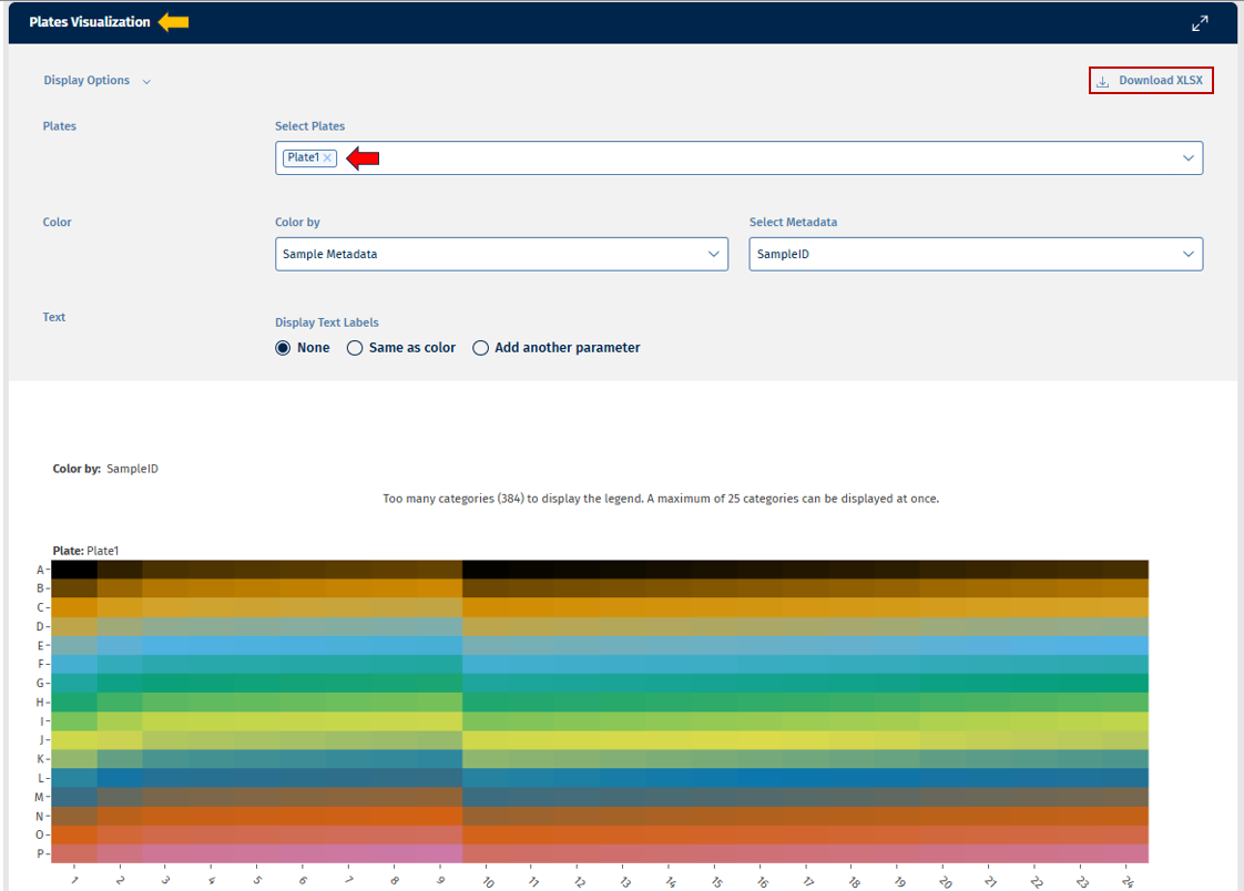
- Color: This option provides a list of options to color your plates for analysis.
The “Color by” option allows users to select from the following variables for analysis:
- Sample metadata: Users can select any available metadata variable from the Select Metadata list such as “Study”, “SampleID”, “Species”, etc and filter the display accordingly.
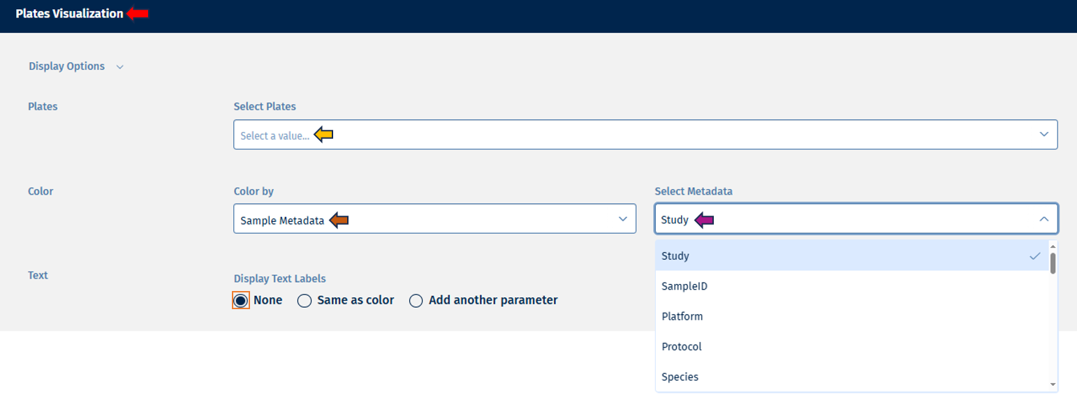
- Feature Intensities: Users can display counts of selected features.
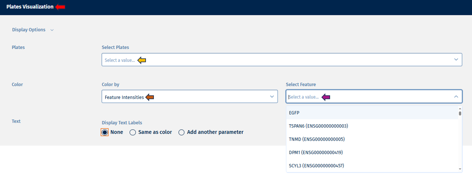
- QC Statistics: All QC parameter that are available on well level can be visualized.
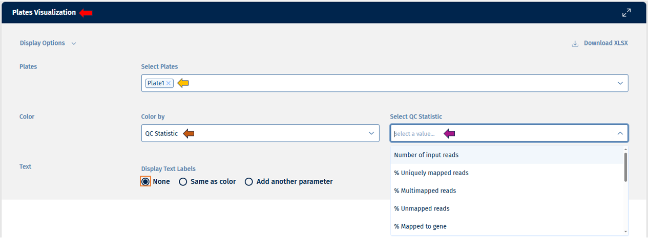
- Users can edit their text labels with the help of options under “Display Text Labels”, which consists of: - “None” if you want no text labels - “Same as color” if you want the text labels to follow the same parameters as the colors - “Add another parameter” if you want the text labels to follow a different parameter which you can coose byfollowing the same instrucions as for color.
Go to Plot Navigation panel for more information on how to navigate through the plot.