New Comparison
The New Comparison app helps explore sample variability and configure differential analyses to identify differentially expressed genes or proteins between groups of samples (e.g. different treatments, tissues, or timepoints). Results and analysis parameters are stored in the Comparisons app.
On launch, the app displays the Studies Overview tab with an empty study table. No data is visible until at least one study is selected via the Sample Selection panel on the left.
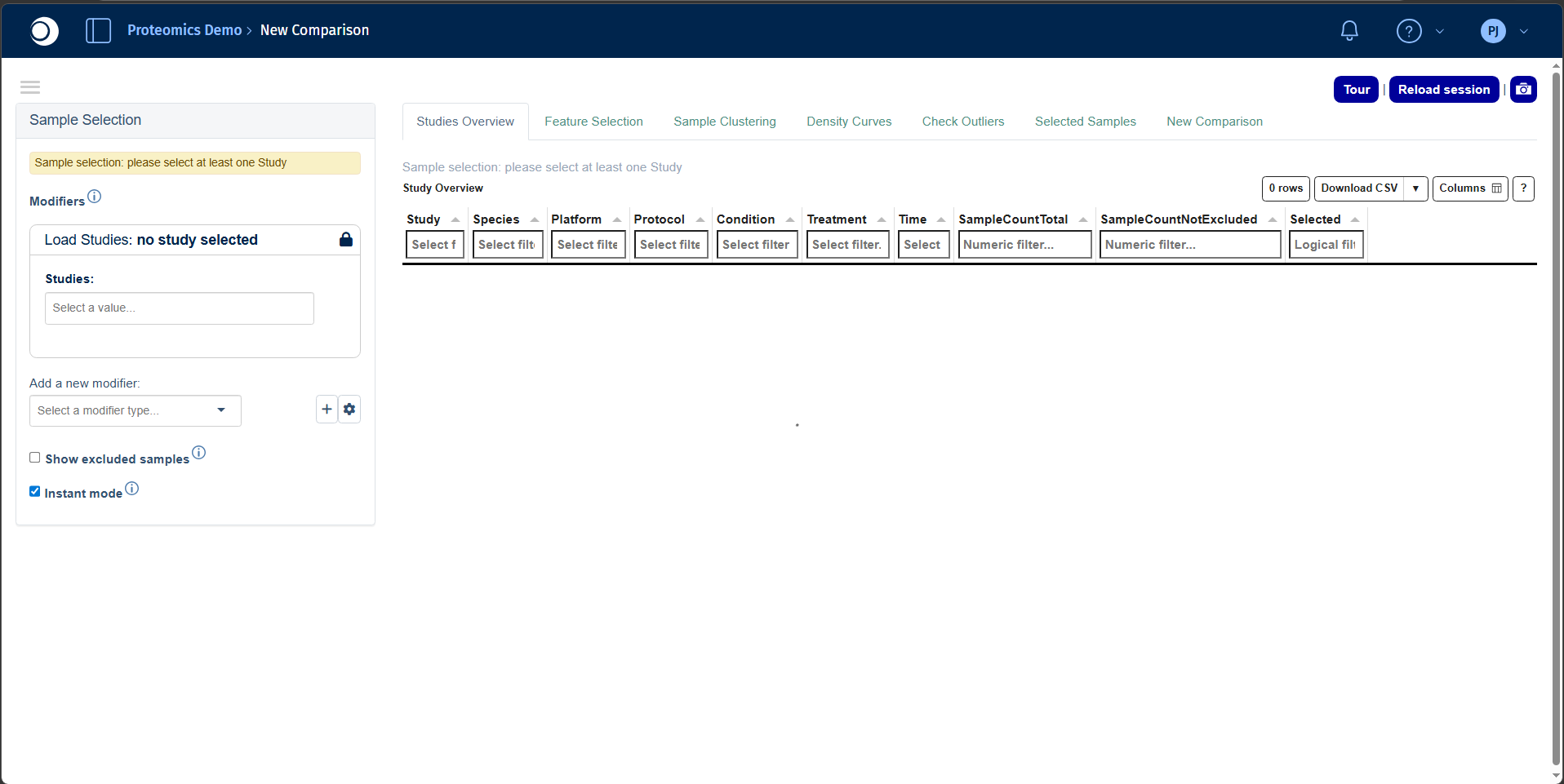
The interface consists of three main areas:
- Left sidebar: Sample Selection panel for controlling which samples and projects are loaded.
- Tab navigation: The app provides seven tabs visible across the top:
- Main content area that updates dynamically based on the active tab and current sample selection.
Refer to the Sample Selector documentation for detailed instructions on selecting and filtering samples.
Studies Overview tab
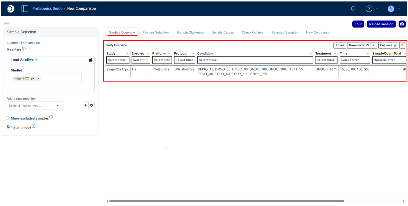
The Studies Overview tab displays a summary table of all available studies in the project, covering both technical platform information and sample metadata. It serves as the starting point for confirming which data is available before proceeding to analysis.
Refer to the Study Overview Statistics Table panel documentation for a detailed explanation of all available columns and filtering options.
Feature Selection tab
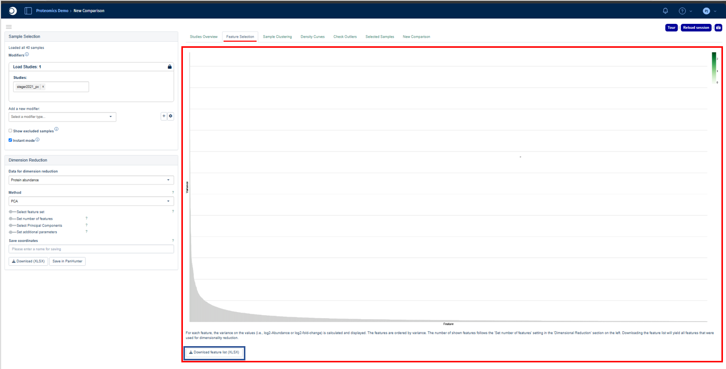
The Feature Selection tab visualizes and ranks feature variability across the selected samples. For each feature (e.g. gene, transcript, or protein), PanHunter calculates the variance of the selected data values and displays them in descending order. This allows identification of the most informative features for sample separation and downstream dimensionality reduction.
By default, the tab shows the top highly variable features used for dimension reduction. The plotted values depend on the selected data type and analysis mode. The feature list can be downloaded using the “Download feature list XLSX” option located below the plot. This will yield all features that were used for dimensionality reduction.
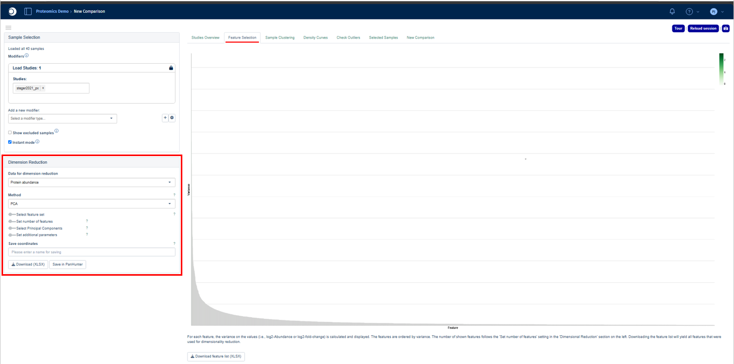
Users can explore and configure the plot using the options in the Dimension Reduction panel on the left sidebar.
Refer to the Feature Selection plot interpretation documentation for a detailed explanation of how to read the variance plot.
Sample Clustering tab
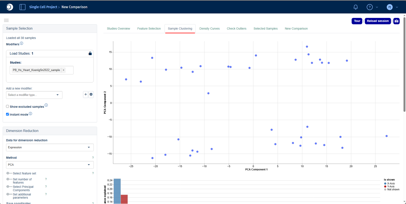
The Sample Clustering tab visualizes similarity between selected samples based on their feature expression or abundance profiles. Because these datasets are highly multidimensional, dimensionality reduction is applied to project the data into a two-dimensional space.
Refer to the Sample Clustering plot interpretation and Plot Options panel documentation for a detailed explanation on how to interpret and edit the plot, respectively.
Excluded samples are hidden by default and can be shown by enabling Show excluded samples in the Sample Selection panel.
Use the Dimension Reduction panel to configure the dimensionality reduction method, feature selection strategy, and analysis parameters. The Sample Annotations panel can be used to assign custom or clustering-derived labels to samples, while the Exploratory Analysis panel helps identify metadata variables and molecular features associated with the observed sample structure.
Density Curves tab
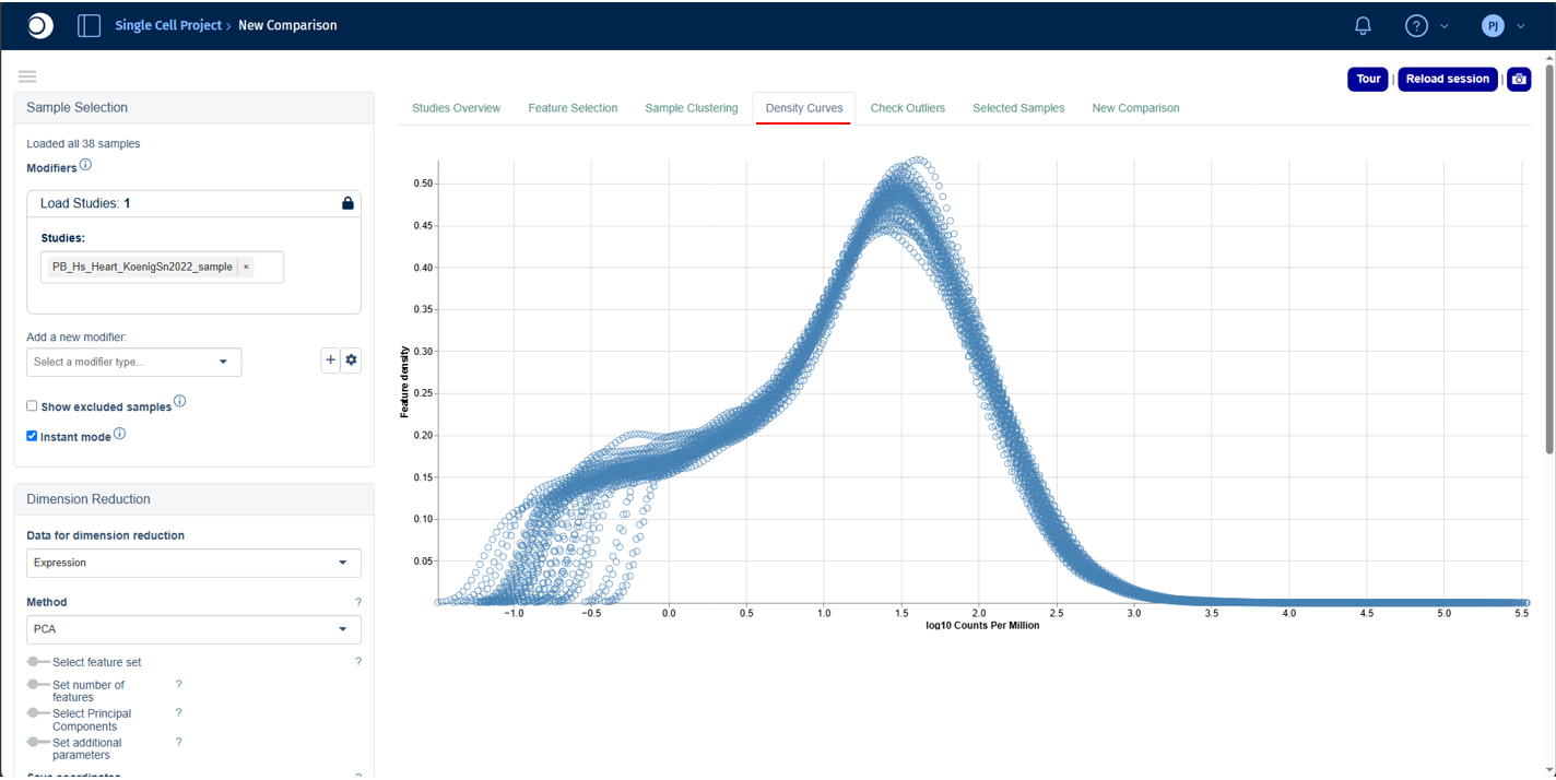
The Density Curves tab visualizes the distribution of feature expression or abundance values across the selected samples. Each curve represents a single sample, allowing rapid comparison of overall data distributions and helping identify potential differences in normalization, technical variation, batch effects, or biological variability.
Refer to the Density Curve plot interpretation documentation for a detailed explanation of how to interpret the density curves. Use the Plot Options panel to customize the appearance of the plot, including colors, symbols, labels, legends, and other display settings.
Check Outliers tab
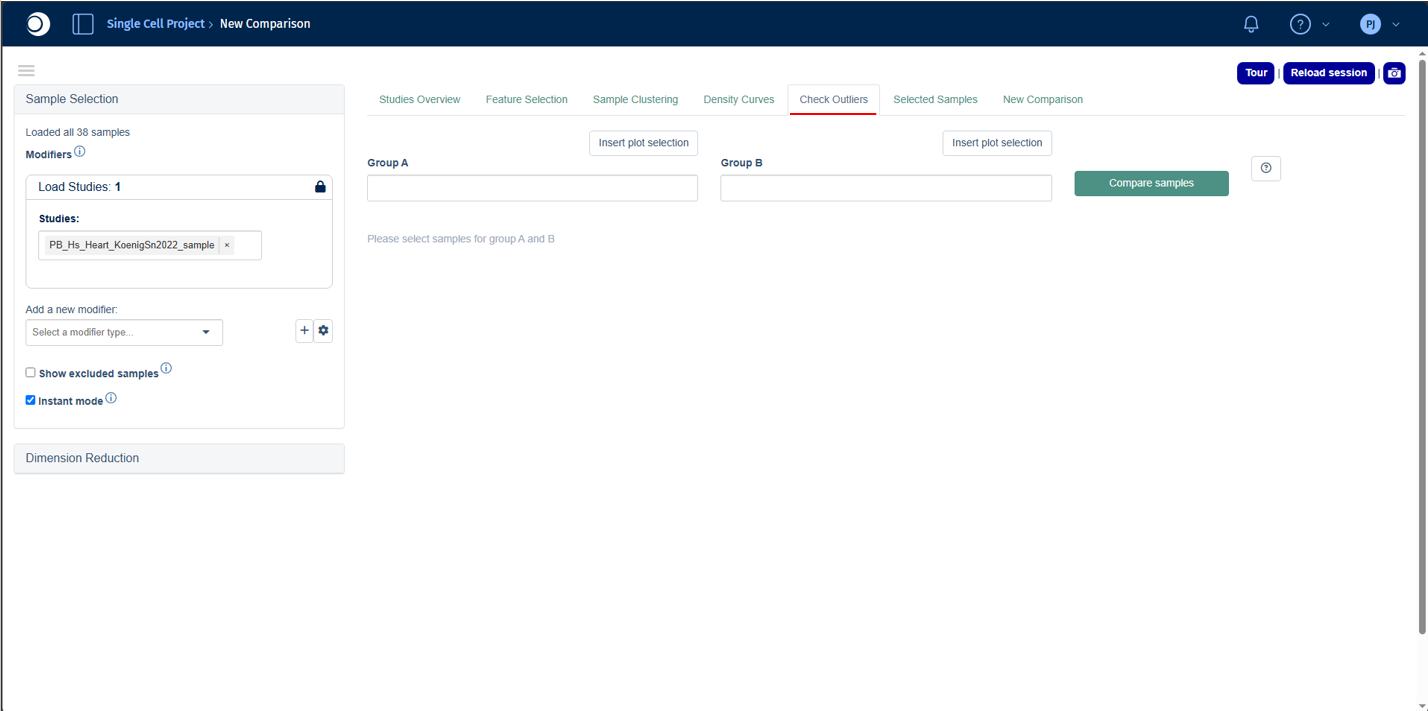
The Check Outliers tab provides a rapid exploratory comparison between two groups of samples. It is designed to help identify features (e.g. genes or proteins) that may be responsible for unusual clustering patterns or suspected outlier behavior observed elsewhere in the app.
This tab is particularly useful when samples appear separated from the main cluster in the Sample Clustering plot or show atypical distributions in the Density Curves tab.
Comparing sample groups
To perform an outlier comparison:
- Select the suspected outlier sample(s) in the Sample Clustering plot.
- Click Insert plot selection to add the selected samples to Group A.
- Select the reference samples and insert them into Group B.
- Click Compare Samples to run the analysis.
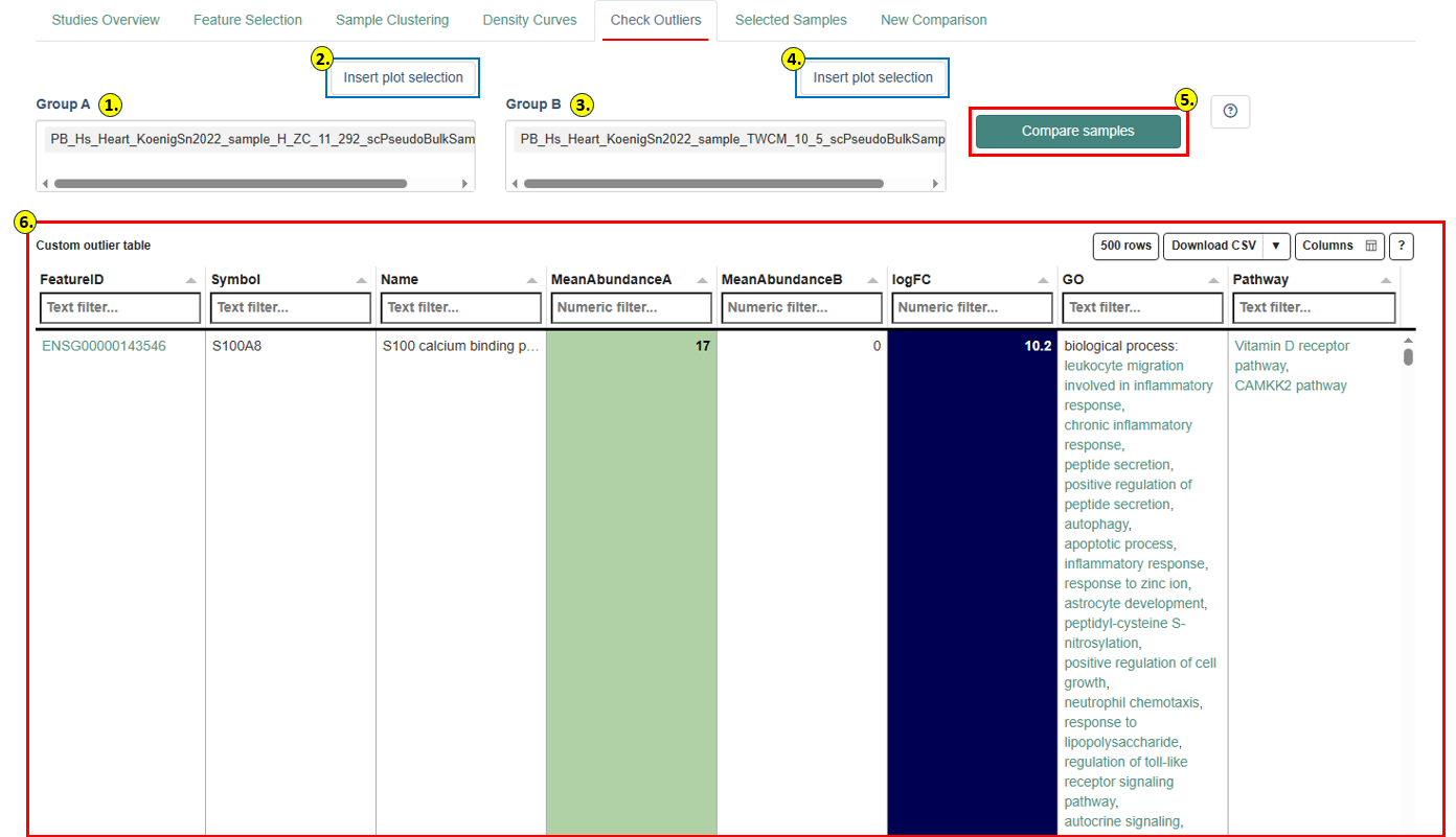
Custom Outlier Table
Results are displayed in the Custom Outlier Table, which lists features with the largest differences between the two groups. For each feature, the table shows the Feature ID, Symbol, Name, Mean log-intensity A, Mean log-intensity B, and logFC (logarithmic fold change). The table is color-coded for rapid identification of enriched or depleted features.
Features are automatically filtered to retain only those with mean abundance above a minimum threshold in at least one group and an absolute log fold-change above a minimum cutoff. The table shows the top features ranked by absolute fold change.
Identified features may help explain outlier behavior and can inform decisions on whether a sample should be retained or excluded from downstream analyses. Possible causes include pathway activation, treatment-specific responses, tissue contamination, technical artifacts, or batch effects.
Refer to the Study Overview Statistics Table panel documentation for a detailed explanation of all available columns and filtering options.
Important: The Check Outliers tab performs a rapid exploratory comparison only. No statistical significance testing or p-value calculation is performed. For statistically rigorous analyses, use the New Comparison tab.
Selected Samples tab
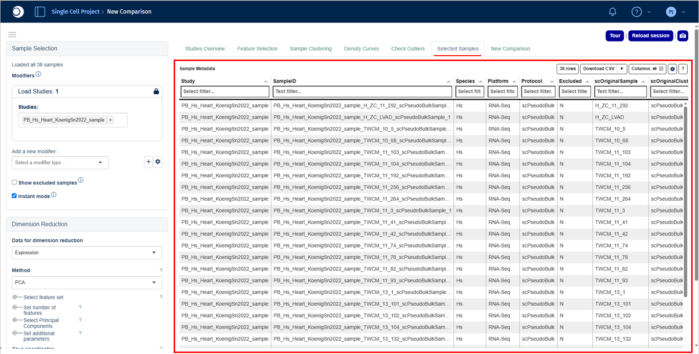
The Selected Samples tab provides a detailed overview of all samples currently included in the analysis. It is the recommended place to review sample metadata, experimental annotations, and quality-related information before proceeding with downstream analyses.
Sample Metadata table
The Sample Metadata table displays one row per sample with all associated metadata attributes, including Study, SampleID, Species, Platform, Protocol, Status, Treatment, Condition, batch identifiers, and platform-specific metrics such as precursor counts or injection order.
This tab is particularly useful for confirming correct sample selection, verifying metadata consistency, checking treatment and condition assignments, and identifying technical confounders such as batch effects.
For some data types, additional platform-specific metadata or preprocessing parameters are displayed below the main table (e.g. alignment and reference genome details for transcriptomics studies, or acquisition parameters for proteomics). These parameters should generally be consistent across samples within a study to ensure reliable comparisons.
Refer to the Study Overview Statistics Table panel documentation for a detailed explanation of all available columns and filtering options.
New Comparison tab
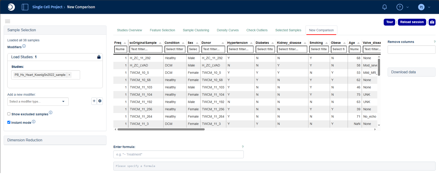
The New Comparison tab is used to configure and run differential analyses between selected sample groups. It provides a flexible interface for defining comparison designs, selecting statistical methods, applying feature filters, and generating results for downstream interpretation.
The workflow consists of four steps:
- review the sample group distribution,
- define the comparison formula,
- configure contrast and
- filtering options, and run the analysis.
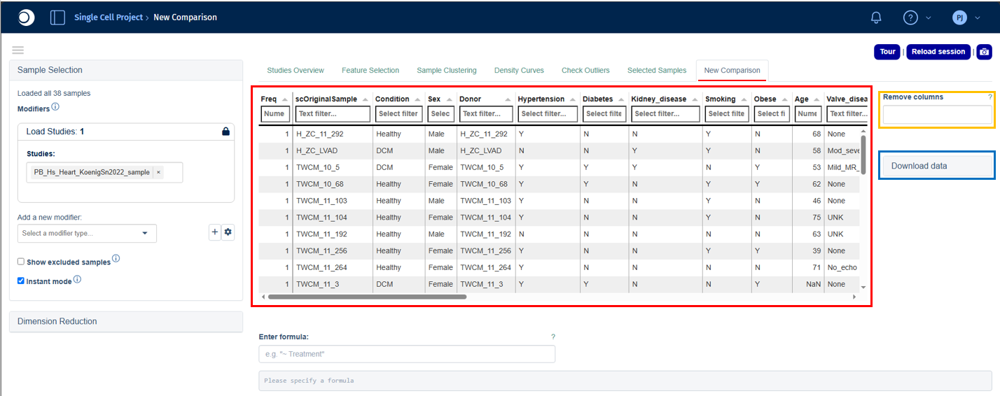
At the top of the tab, PanHunter displays a summary table showing the distribution of samples across available metadata categories. The Freq column shows the number of samples in each category combination. Use the Remove columns option to focus on relevant factors, and Download data to export the table and associated abundance data.
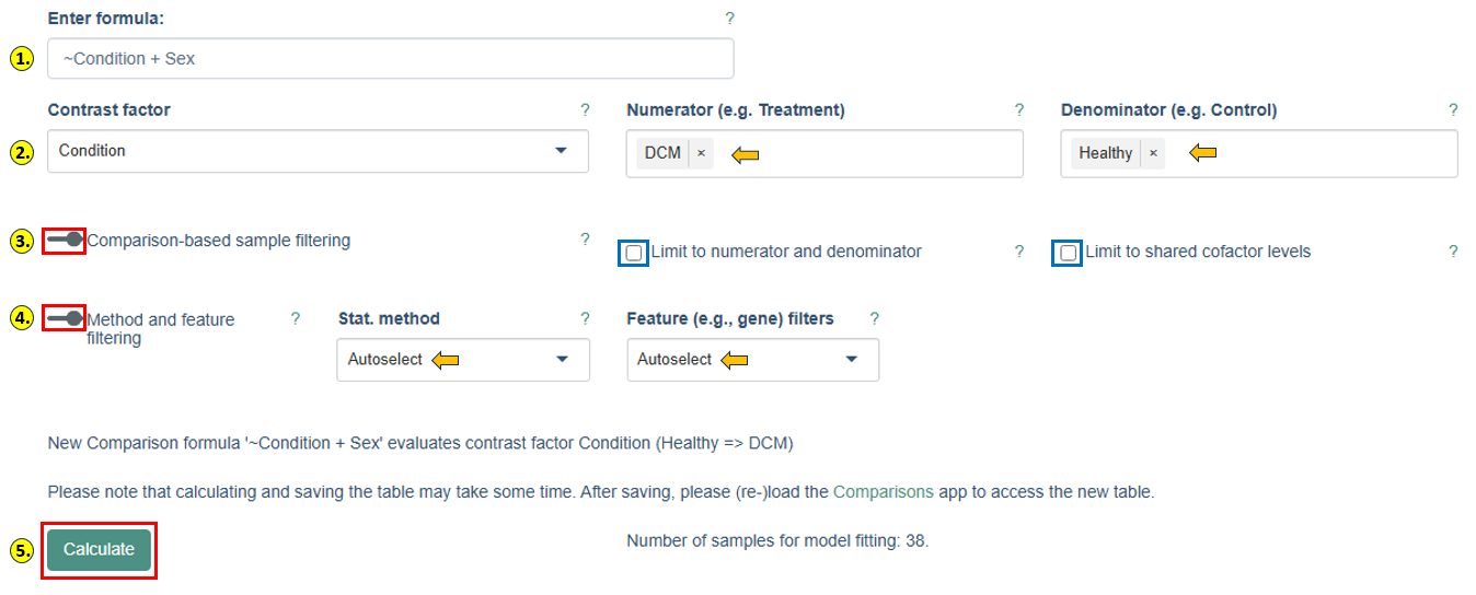
- Defining the comparison formula: The comparison design is specified in the Enter formula field.
Important: Formula names are case-sensitive and must exactly match the metadata column names shown in the sample table.
For a single-factor comparison, use a tilde (~) followed by the factor name:
~Condition
For multi-factor comparisons, combine factors with the + operator:
~Condition + Sex
Multi-factor designs allow PanHunter to account for additional sources of variation and reduce confounding effects during statistical analysis.
-
Selecting the contrast: After entering a valid formula, three additional fields appear.
- Contrast factor specifies which variable from the formula is being tested.
- Numerator defines the group of interest;
- Denominator defines the reference or control group.
For example, setting Condition as the contrast factor with DCM as numerator and Healthy as denominator evaluates differential abundance between those two condition groups. PanHunter displays a summary statement confirming the exact comparison before calculation.
-
Comparison-based sample filtering: When Limit to numerator and denominator is enabled, only samples in the selected numerator and denominator groups are included in model fitting. Limit to shared cofactor levels can be enabled for multi-factor designs, retaining only samples with cofactor levels shared between both groups making it useful for ensuring balanced comparisons.
-
Method and feature filtering:
- Stat. method: selects the statistical framework. DESeq2 is used for count-based transcriptomics data; limma is used for proteomics and continuous abundance datasets. PanHunter automatically selects the appropriate default.
- Feature filters: controls pre-filtering of features before model fitting. Options include automatic, model-based, or no filtering. Filtering removes low-signal features and improves statistical robustness.
- Lognorm intensity threshold: specifies the minimum normalized abundance required for a feature to be retained, evaluated across at least the specified fraction of samples for at least one contrast level.
- Sample fraction: defines the minimum fraction of samples that must satisfy the abundance threshold. The default for proteomics studies is typically 0.6667 (two-thirds of samples).
-
Running the comparison:
- After configuring all settings, click Calculate to start the analysis. PanHunter displays the number of samples that will be included in model fitting so you can verify the comparison is adequately powered before proceeding. Depending on dataset size and complexity, the calculation may take several minutes.
- After completion, the generated comparison can be saved and accessed through the Comparisons app for further exploration, including interactive result tables, volcano plots, MA plots, and pathway enrichment analyses.
- For detailed information on the underlying statistical methods, see the Differential Expression Calculation documentation.