This is the multi-page printable view of this section. Click here to print.
Data
- 1: General widgets
- 2: General Plot interpretation
- 3: Data Quality Control
- 3.1: Quality Control for Bulk RNA-Seq data
- 3.1.1: Starting quality control
- 3.1.2: Deeper look into SampleQC
- 3.1.3: QC clustering
- 3.1.4: Finalizing the Quality Control
- 4: Data Administration
- 4.1: PanHunter Preprocessing
- 4.1.1: Reference genomes
- 4.2: Studies overview
- 4.3: Data upload
- 4.4: Updating data
- 4.5: Deleting studies
1 - General widgets
This section describes all the general panels used in the abundance apps.
Sample Selector
Samples can be selected wih the help of “Sample selector” panel located on the left side of the interface. This panel provides a variety of filters under the operation called "Modifiers", that can be used to narrow down the samples selected from the entire catalogue of samples in your project to the ones you are interested in. For QC purposes it is usually advisable to start with one complete study to get an overview.
To filter the samples, modifier(s) need to be added. It is done by adding as many modifiers as required from the drop down menu (See below). An empty value field in a modifier will result in selection of all available data and has no modification effect. Any column in the sample table can be selected for applying modifier (with constraints of type of modifier and value type in the field). Corresponding values should be selected if to be included/excluded in the modification.
Note: For further information on modifier functionality, check modifier tooltip.
Modifiers
A modifier is a filter or enrichment applied on the table columns resulting from last applied modifier. It consists of the following functions:

- Filter Study is a “mandatory filter” to select and load your studies of interest. Please click on the field below “Values” to select the studies from a drop-down menu.

- Add a new modifier from the drop-down below and confirm the addition by clicking on the "+" button.
- Filter categ. can filter the samples according to categorical variables such as " Tissue, Sex, Compound, etc". The values in the selected column of the table will also appear for selection in the values field under this category.
- Filter num. can filter the samples according to numerical variables. A slider will appear, with range of minimum and maximum numeric value in the column.
- Join columns can combine two or more categorical variables into one. For e.g., on selecting the categories sex (male, female) and tissue (liver, brain, heart) will result in male_liver, male_brain, male_heart, female_liver, female_brain, female_heart, which can now be used for further filtering or as analysis options within the apps. It produces a new column by joining the values from the columns selected in combine field. It uses underscore for joining levels of the selected columns and names the new column by the given label.
- Column binning can divide samples into groups according to a specified numeric variable. It produces a new labeled column with bin ID’s given by selected number of bins. Currently it provides two modes and can only work on columns with numerical values.
- Enrich can add additional information to your sample table, such as “QC Data, Patient data and Custom annotations”
- Additionally, you can toggle between Include or Exclude to keep the specified values in or out of your selection.

- Load, Save, and delete your current set of modifications with the help of the “settings” button. Users can save their modifier selection with a name of their choice in the “Type a name” box.
- It also consists of the option to Return to your initial set of modifications and Switch between the “globe” and the “person” icon which symbolizes global (project wide) and local (only current user). The former helps saving and loading modifier sets stored for all users and the latter for current users. This will also allow you to make the sample selection in all abundance based apps.
- Show excluded samples displays samples that are marked as excluded. Note: In QC apps the default setting is that all the samples including the excluded ones are shown. For all other apps the default is that excluded samples are not shown.
- Instant mode can be enabled to automatically apply changes as they are made. Disable this option to manually apply changes by clicking the apply button. The double tick icon on the “Apply changes” button indicates that there are unsaved changes waiting to be applied.
Plot Navigation panel
This panel provides users with options to navigate through the plots in the apps.
- Plot Type lets you select plot types to visualize your data:
- Boxplot – Summarizes the distribution of data with median, quartiles, and whiskers.
- Jitter Plot – Displays individual data points for better visibility of variation.
- Violin Plot – Combines boxplot with kernel density to show data distribution.
- Plot Options: Users can choose from multiple plot types from the Plot type option for visualizing sequencing quality metrics such as Boxplot, Jitter Plot and Violin Plot
With the help of Group By or Sort by option, users can group their visualization according to the various metadata variables such as “Plate, Tissue, Timepoint,etc”
A settings panel allows users to select or deselect QC parameters to display in the plots. Currently, only Q30 is available for “Sequence tab”, but additional parameters may be added in the future.
-
Quality Indicators lets you choose which alignment parameters to display in the plots (e.g., Number of input reads, Uniquely mapped reads, Average mapped length)
-
Plot Design and Features:
- Each QC parameter is displayed in a separate plot to ensure proper visualization of thresholds.
- Y-axis: Represents the parameter values (e.g., Q30). - Scales are parameter-specific and automatically adjusted based on thresholds, with extra spacing for clarity.
- X-axis: Displays sample groups based on metadata categories (e.g., Tissue, Timepoint, Concentration).
- All samples can be displayed simultaneously by clicking and dragging over it to zoom in, ensuring a detailed overview.
- Users can reset the axes using the small “home” near the plot.
- Background Color Coding:
- Displays thresholds (if defined in the Threshold Manager) with a semi-transparent color scale for easy interpretation.
- Each plot includes a header with the parameter name.
- Legend and Hover Details:
- Threshold categories are displayed on hover.
- Metadata group information and highlighted samples are also explained via hover tooltips.
- Download Options
- The plot can be downloaded using the “camera” icon near the plot.
- A single click allows users to download all plots together for reporting or documentation purposes.
Stats Table panel
This panel provides a detailed tabular view of all the statistical values and key sample identifiers such as “Study, Sample ID, SeqFile (FASTQ file name)” for the parameters with regards to each app.
On clicking the “hamburger icon” above the table, you will be provided with the following options:
- Columns: You can select and deselect the columns you want to explore
- Download CSV: You can download the table in CSV format
- Download XLSX: You can download the table in excel format
- Copy filtered rows: You can copy only the rows you have filtered in the table using the filter option, for further analysis.
2 - General Plot interpretation
This section explains how to interpret the plots belonging to the apps provided by the PanHunter.
For more detailed information on navigating through these plots , please go to Plot Navigation Panel documentation page
Sample QC App
Alignment Stats tab
The Alignment Stats tab summarizes key statistics from the read alignment process, helping evaluate sequencing success and mapping quality.
Interpretation
The alignment metrics help determine:
- sequencing success
- mapping accuracy
- suitability of samples for downstream analysis.

For instance, the above example depicts the following metrics:
Number of Input Reads: This plot shows the distribution of total sequencing reads generated for each sample.
- Higher read counts generally provide better transcriptome coverage.
- The density curve highlights the most common read count values.
- Samples with much lower read counts than the majority may indicate sequencing or library preparation issues.
Uniquely Mapped Reads Percent: This metric shows the percentage of reads that align uniquely to one genomic location.
- High percentages are desirable, indicating reliable mapping.
- Low values may indicate:
- contamination
- poor read quality
- incomplete reference genome
- repetitive sequences.
Reads Mapped to Multiple Loci Percent: This plot shows the percentage of reads mapping to multiple genomic locations. This can occur when reads originate from:
- repetitive regions
- paralogous genes
- homologous sequences.
- Lower percentages are generally better.
- Very high multi-mapping rates may reduce confidence in gene quantification.
Read Distribution tab
The Read Distribution tab shows how sequencing reads are distributed across different genomic features.
Genomic Feature Categories
- The X-axis displays genomic regions such as:
- Upstream regions (Up.10kb, Up.5kb, Up.1kb)
- 5′ UTR
- CDS (coding sequences)
- Introns
- 3′ UTR
- Downstream regions
- The Y-axis shows read counts normalized per kilobase of genomic feature.

Plot Type: Users can visualize distributions using:
- Violin plot: shows full distribution shape
- Box plot: shows median and quartiles
- Points: displays individual sample values.
Coloring Options: This option groups samples according to metadata fields (e.g., Plate, CRank, Batch, etc). Important note: Only categories with 10 or fewer unique values in the current dataset subset can be used for coloring. If no such category exists, coloring will not be available.
Total Counts Option: By default, the plot shows counts normalized per kilobase of genomic features. When the Show total percentages option is selected, the plot instead displays the distribution of total counts (percentage) across genomic features.
Interpretation
This plot helps determine:
- whether reads are mostly located in coding regions (expected in RNA-seq),
- whether unusual read distributions occur in introns or intergenic regions, which may indicate contamination or library issues.
Gene Body Coverage tab
The Gene Body Coverage plot evaluates how evenly reads cover the length of genes.
Axes
- X-axis: Gene Length (%). The gene position is represented from:
- 0% = 5′ end
- 100% = 3′ end
- Y-axis: Shows normalized read coverage across gene positions.

Interpretation
- A relatively flat curve indicates uniform sequencing coverage across the gene.
- 3′ bias: increased coverage toward the 3′ end (often due to poly-A capture methods)
- 5′ bias: indicates higher coverage near the 5′ end
- Uneven curves between samples: shows potential library preparation differences.
Biotype tab
The Biotype plot shows the percentage of reads assigned to different gene biotypes, such as:
- protein-coding genes
- long non-coding RNA (lncRNA)
- pseudogenes
Note: Plot type and coloring options behave the same as in the Read Distribution tab.

Interpretation
This visualization helps confirm that reads map primarily to expected gene classes. Typical RNA-seq datasets show:
- the majority of reads in protein-coding genes
- smaller proportions in lncRNA or pseudogenes
Unexpected distributions may suggest annotation issues or contamination.
Mitochondrial tab
The Mitochondrial tab evaluates the proportion of reads mapping to mitochondrial sequences.
Three boxplots are displayed:

Non-Mitochondrial Reads: This plot depicts the percentage of reads mapping to nuclear genes. High values indicate good RNA-seq data quality.
Mitochondrial Reads: This plot shows the percentage of reads mapping to mitochondrial genes. High mitochondrial content may indicate:
- cell stress
- degraded RNA
- low-quality samples
Spike-In Transcripts: This plot displays reads mapping to spike-in control RNAs.
- Spike-ins are artificial RNA molecules added during library preparation and used as technical controls.
- Consistent spike-in levels across samples indicate stable sequencing performance.
plateRNA-Seq tab
The plateRNA-Seq tab provides several visualizations for plate-based RNA-sequencing experiments.
Samples / Conditions

Plot Settings: Users can configure the following options:
- Boxplot X-Axis: Defines the grouping variable (e.g., treatment).
- Boxplot Y-Axis: Helps selecting metrics such as Unmapped reads, Multimapped reads, Uniquely mapped reads, etc to display:
- Boxplot Coloring: Colors samples according to metadata categories such as treatment, sequencing provider, plate position, etc
Interpretation
These boxplots help identify:
- variability between treatments
- batch effects
- outlier samples with abnormal read counts.
Library Size and UMI Dedup
This scatter plot shows expression levels of a selected gene across samples.

Interpretation
This visualization helps identify:
- expression variability across samples
- differences between experimental conditions
- potential outliers.
Clusters of points may indicate groups of samples with similar gene expression patterns.
Plate / Library
This heatmap displays sequencing metrics arranged according to the physical plate layout.

Plot Elements:
- Rows represent plate rows.
- Columns represent plate columns.
- Cell color intensity indicates the value of a selected metric (e.g., mapped reads).
Interpretation
This visualization helps identify spatial artifacts, such as:
- edge effects
- plate position bias
- systematic technical variation across wells.
For more detailed information regarding the app, please go to SampleQC app documentation page
Transcriptomics QC App
Alignments tab
The Alignment Stats tab summarizes key statistics from the read alignment process, helping evaluate sequencing success and mapping quality.
Interpretation
The alignment metrics help determine:
- sequencing success
- mapping accuracy
- suitability of samples for downstream analysis.

For instance, the above example depicts the following metrics:
Number of Input Reads: This plot shows the distribution of total sequencing reads generated for each sample.
- Higher read counts generally provide better transcriptome coverage.
- The density curve highlights the most common read count values.
- Samples with much lower read counts than the majority may indicate sequencing or library preparation issues.
Uniquely Mapped Reads Percent: This metric shows the percentage of reads that align uniquely to one genomic location.
- High percentages are desirable, indicating reliable mapping.
- Low values may indicate:
- contamination
- poor read quality
- incomplete reference genome
- repetitive sequences.
Reads Mapped to Multiple Loci Percent: This plot shows the percentage of reads mapping to multiple genomic locations. This can occur when reads originate from:
- repetitive regions
- paralogous genes
- homologous sequences.
- Lower percentages are generally better.
- Very high multi-mapping rates may reduce confidence in gene quantification.
Read Distribution tab
The Read Distribution tab shows how sequencing reads are distributed across different genomic features.
Genomic Feature Categories
- The X-axis displays genomic regions such as:
- Upstream regions (Up.10kb, Up.5kb, Up.1kb)
- 5′ UTR
- CDS (coding sequences)
- Introns
- 3′ UTR
- Downstream regions
- The Y-axis shows read counts normalized per kilobase of genomic feature.
Absolute Value: Displays absolute counts.

Relative Value: Displays proportional values (e.g., % of reads per category).

Interpretation
This plot helps determine:
- whether reads are mostly located in coding regions (expected in RNA-seq),
- whether unusual read distributions occur in introns or intergenic regions, which may indicate contamination or library issues.
Gene Body Coverage tab
The Gene Body Coverage plot evaluates how evenly reads cover the length of genes.
Axes
- X-axis: Gene Length (%). The gene position is represented from:
- 0% = 5′ end
- 100% = 3′ end
- Y-axis: Shows normalized read coverage across gene positions.

Interpretation
- A relatively flat curve indicates uniform sequencing coverage across the gene.
- 3′ bias: increased coverage toward the 3′ end (often due to poly-A capture methods)
- 5′ bias: indicates higher coverage near the 5′ end
- Uneven curves between samples: shows potential library preparation differences.
Biotype tab
The Biotype plot shows the percentage of reads assigned to different gene biotypes, such as:
- protein-coding genes
- long non-coding RNA (lncRNA)
- pseudogenes
Note: Plot type and coloring options behave the same as in the Read Distribution tab.

Interpretation
This visualization helps confirm that reads map primarily to expected gene classes. Typical RNA-seq datasets show:
- the majority of reads in protein-coding genes
- smaller proportions in lncRNA or pseudogenes
Unexpected distributions may suggest annotation issues or contamination.
Mitochondrial tab
The Mitochondrial tab evaluates the proportion of reads mapping to mitochondrial sequences.
Three boxplots are displayed:

Non-Mitochondrial Reads: This plot depicts the percentage of reads mapping to nuclear genes. High values indicate good RNA-seq data quality.
Mitochondrial Reads: This plot shows the percentage of reads mapping to mitochondrial genes. High mitochondrial content may indicate:
- cell stress
- degraded RNA
- low-quality samples
Spike-In Transcripts: This plot displays reads mapping to spike-in control RNAs.
- Spike-ins are artificial RNA molecules added during library preparation and used as technical controls.
- Consistent spike-in levels across samples indicate stable sequencing performance.
Plates tab
This tab provides a heatmap displays sequencing metrics arranged according to the physical plate layout.

Plot Elements:
- Rows represent plate rows.
- Columns represent plate columns.
- Cell color intensity indicates the value of a selected metric (e.g., mapped reads).
Interpretation
This visualization helps identify spatial artifacts, such as:
- edge effects
- plate position bias
- systematic technical variation across wells.
For more detailed information regarding the app, please go to Transcriptomics QC app documentation page
Proteomics QC App
Contaminants tab
The Contaminants tab helps identify unwanted proteins (e.g., keratin, albumin, or experimental carryover)
Transformation Options: The Transformation dropdown determines how protein intensities are displayed:
- Log-transformed label-free quantification values (LFQ) Intensity: Default for most downstream comparisons because it corrects for technical variability.
- Summed Intensity: Sum of peptide intensities per protein. It is useful for raw abundance comparisons
- Summed Intensity Scaled: Scaled version of summed intensity. It is useful for cross-sample normalization
- Summed Intensity Normalized: Normalized across samples. It removes systematic biases
- Intensity-based absolute quantification (iBAQ): It approximates protein abundance
- LFQ Intensity Normalized: LFQ values normalized across samples

Contaminant Abundance Across Samples
This plot shows the abundance of known contaminant proteins across samples.
Interpretation
- Each bar represents a sample
- The y-axis shows contaminant abundance
- Samples highlighted as outliers indicate unusually high contamination.
- Good data: Contaminant levels are low and consistent across samples
- Potential issue: A few samples show significantly higher contaminant intensity. This may indicate:
- sample preparation contamination
- handling errors
- carryover between injections
Well-Specific Quantity Rank
This visualization maps contaminant abundance to the physical plate layout to detect spatial contamination patterns.
![]()
Interpretation
- Plate layout with rows (A–H) and columns
- Each circle represents a well/sample.
- Hovering over the circle dispays the Sample ID information.
- Color scale indicates contaminant abundance rank
- Dark red → lower rank
- Blue → higher rank
- Uniform color distribution → no spatial contamination
- Clusters of similar colors → localized contamination
- Edge or row patterns → pipetting or plate handling effects
- Single high-intensity wells → sample-specific contamination
- If spatial patterns are detected:
- Review pipetting procedures
- Check plate handling
- Inspect reagent distribution
Precursors Identified by Injection Order
This scatter plot helps detect instrument drift during LC-MS runs.
Axes and color:
- X-axis: protein intensity
- Y-axis: number of detected precursors
- Point color: injection order

Interpretation
- Healthy experiment:
- Points appear randomly scattered.
- Hovering over the points dispays the Sample ID information.
- Possible instrument drift: Gradual trend from low to high intensity across injection order. This may indicate:
- column degradation
- instrument sensitivity changes
- spray instability
Quantity Ranking of Contaminants
This plot ranks samples by contaminant abundance. Hovering over the points in the graph displays:
- Sample ID
- UniProt ID
- Contaminant
- Rank

Interpretation
- Consistent ranks across samples = stable contamination levels
- Samples with much higher rank = contamination problem
Quantification tab
This section summarizes protein identification coverage across samples.
Feature Counts
Bar Plot: This plot displays how many protein groups were quantified in each sample. It can be observed as both bar and box plot.
Axes
- X-axis: samples
- Y-axis: number of proteins detected

Interpretation
- Good dataset: Similar counts across all samples
- Possible issues: Some samples detect much fewer proteins. This may indicate:
- poor sample loading
- LC-MS failure
- digestion issues
Box Plot: This plot helps assess the distribution of quantified features across samples and conditions, and evaluate consistency in detection depth.

Axes
- X-axis: Groups (e.g., DMSO vs FT671 or other conditions)
- Y-axis: Number of protein groups (features)
- Each box represents the distribution of feature counts across samples within a group
Interpretation
Each box includes:
- Median Feature Counts (center line): Depicts the typical number of features detected.
- Similar medians across groups → comparable data completeness
- Higher median in one group → deeper proteome coverage
- Box (IQR): Represents middle 50% of samples
- Narrow boxes (small IQR) → consistent feature detection across samples
- Wide boxes → variability in sample quality or acquisition
- Overlapping boxes → similar performance between conditions
- Shifted boxes → systematic differences (biological or technical)
- Whiskers: Shows range of values (excluding outliers)
- Short whiskers → stable dataset
- Long whiskers → some samples differ significantly
- Outliers (if present): Denotes samples with unusually high/low feature counts. Samples far from the box:
- May indicate technical issues, missing values, or sample preparation differences
- Should be investigated for quality control
Note: When to Use Box Plot vs Bar Plot
- Bar Plot: Comparing absolute counts per sample
- Box Plot: Understanding distribution, variability, and consistency
Shared Features
This plot shows how many proteins are detected across samples.

Interpretation
*High overlap indicates:
- strong reproducibility
- consistent protein identification
- Low overlap may suggest:
- inconsistent sample preparation
- unstable mass spectrometry runs
Feature Presence Across Samples
This line plot shows how many proteins are detected in a certain percentage of samples.

Interpretation
- Good dataset: many proteins detected in most samples
- Poor reproducibility: many proteins detected only sporadically
Intensities Tab
The Intensities tab provides tools to assess signal distribution, variability, and reproducibility of protein intensities across samples. These plots are essential for evaluating data quality, detecting technical bias, and ensuring consistency across conditions.
Intensity Distribution
This plot helps in evaluating the distribution of protein intensities across samples and check for consistency between conditions.
Plot Options
- Plot type:
- Line plot (density or count-based curves)
- Box plot (summary statistics per sample)
- Y-axis scale:
- Density → normalized distribution
- Count → raw frequency of intensities
Line Plot
Interpretation
- X-axis: Intensity values (e.g., LFQ intensity)
- Y-axis: Density or count
- Each line represents a sample or condition
- Overlapping curves across samples → good normalization and consistency
- Shifted curves (left/right) → systematic differences in intensity (batch effect or normalization issue)
- Wider curves → higher variability within a sample
- Multiple peaks → possible subpopulations or mixed signal distributions
- Density vs Count

- Density: best for comparing shapes across samples

- Count: useful for understanding absolute data distribution
Box Plot

Interpretation
- Each box represents a sample or group
- It displays:
- Median (center line)
- Interquartile range (box)
- Spread/outliers (whiskers and points)
- Similar medians across samples → well-normalized data
- Large differences in medians → systematic bias
- Wide boxes → high variability
- Outliers → extreme intensity values (may require filtering)
Coefficient of Variation
To measure reproducibility and variability of protein intensities across samples.
- CV = standard deviation / mean
- Lower CV → more consistent measurements
Plot Options
- Plot type:
- Histogram / density plot
- Box plot
- Axis scale:
- Linear → standard view
- Log → better visualization of wide CV ranges
Histogram Plot
Interpretation
- X-axis: Coefficient of variation
- Y-axis: Density or frequency
- Separate curves for each condition
- Peak near low CV (e.g., < 0.2) → high reproducibility
- Long right tail → presence of highly variable proteins
- Shift toward higher CV values → increased technical or biological variability
- Tighter distributions → more reliable dataset
Linear vs Log Scale

Linear scale: clear view of low CV region

Log scale: better visibility of high variability proteins
Box Plot

Interpretation
- Distribution of CV values per sample/group
- Lower median CV → better reproducibility
- Narrow boxes → consistent variability
- Wide spread → unstable measurements
- Outliers → highly variable proteins
Feature Count with CV < Cutoff
This plot quantifies how many proteins are reliably measured (low variability) in each sample or condition.

Interpretation
- Bars represent samples or conditions
- Bars are divided into:
- CV < cutoff (e.g., 0.2) → reliable proteins
- CV ≥ cutoff → variable proteins
- Higher proportion of CV < cutoff → better data quality
- Lower counts of reliable proteins → potential issues with measurement consistency
- Differences between conditions → condition-specific variability
Sample Similarity Tab
The Sample Similarity tab is designed to evaluate how similar or different your samples are based on their protein intensity profiles. It provides key tools for assessing data structure, clustering, batch effects, and overall data quality.
Principal Component Analysis (PCA)
This plot helps to reduce high-dimensional proteomics data into a few components and visualize sample relationships and clustering patterns.

Interpretation
- Points: Individual samples
- Colors: Grouping variable (e.g., Treatment: DMSO vs FT671)
- Axes (PC1, PC2): Principal components explaining variance
- Percentage values: Variance explained by each component
- Optional overlays:
- Polygons: Group boundaries
- Loadings (arrows): Features (proteins) driving separation
Sample Clustering:
- Tight clusters within a group → high reproducibility
- Clear separation between groups → strong biological differences
- Overlap between groups → weak or no separation
Variance Explained:
- PC1 (e.g., 28%) = largest source of variation
- PC2 (e.g., 18%) = second largest
- Higher percentages → more meaningful separation
Polygons (Group Envelopes):
- Show spread of samples within each group
- Large polygons → higher variability
- Compact polygons → consistent samples
Loadings (Feature Contributions):
- Arrows indicate proteins contributing to separation
- Interpretation:
- Longer arrows → stronger influence
- Direction of arrow → associated with specific sample group
- Proteins pointing toward a cluster → enriched in that group
Key Insights from PCA
- Detect batch effects or outliers
- Evaluate treatment effects
- Identify drivers of biological variation
Correlation Heatmap
This plot helps to quantify and visualize pairwise similarity between samples using correlation metrics (e.g., Pearson).

Interpretation
- Rows and columns: Samples
- Each cell: Correlation coefficient between two samples
- Color scale:
- Darker → higher similarity
- Lighter → lower similarity
Diagonal Line
- Always highest correlation (sample vs itself)
- Serves as a reference
Within-Group Similarity
- Consistently high correlation within a condition → good reproducibility
- Uniform color blocks → stable dataset
Between-Group Comparison: Compare correlation between:
- Same condition → expected high
- Different conditions → may be lower
Outliers: Samples with:
- Lower correlation across all others → potential outliers
- Distinct color patterns → technical issues or biological anomalies
Batch Effects
- Visible as blocks or stripes across unrelated samples
- Suggest systematic variation unrelated to biology
For more detailed information regarding the app, please go to ProteomicsQC app documentation page
Patient Data App
Graphics tab
The Graphics tab in the Patient Data App allows users to visualize clinical variables and molecular data from the patient dataset. These plots help explore relationships between patient characteristics, disease features, and biological measurements.
By selecting different variables, users can generate plots that reveal patterns, distributions, or associations within the dataset.
The visualization automatically adapts depending on whether the selected variables are categorical or numerical.
Categorical Variable Distribution (Bar Plot): When two categorical variables are selected, the Graphics tab generates a bar plot.
")
_For instance, the above depicted example denotes the following components:
- First variable: tissue_or_organ_of_origin
- Second variable: histological_type
- X-axis: Primary categorical variable (e.g., tissue or organ of origin).
- Y-axis: Number of patients or samples (count).
- Colored bars: Each color represents a category of the second variable (e.g., histological type).
- Legend: Displays the categories corresponding to the bar colors.
- p-value (top of plot): Indicates the statistical significance of the association between the variables.
Interpretation
This plot helps users determine:
- whether certain histological tumor types occur more frequently in specific tissues
- how patient samples are distributed across categories
- whether there is a statistically significant relationship between variables
A small p-value (e.g., 5e-04) suggests an association is statistically significant.
Proportion Plot
When the Proportion option is selected, the bar plot is converted into a stacked proportion chart.
")
_The above depicted example denotes the following components:
- X-axis: Primary categorical variable.
- Y-axis: Proportion (0–1 scale) representing the relative distribution of categories.
- Stacked segments Each segment represents the fraction of samples belonging to each category.
Interpretation
This plot shows relative distributions rather than absolute counts.
It allows users to determine:
- which histological types dominate within each tissue category
- how category proportions differ between groups
- whether certain histological types are over-represented.
This visualization is particularly useful when group sizes differ substantially.
Continuous Variable Comparison (Box Plot): When the second variable is continuous, the Graphics tab generates a box plot.
")
_For instance, the above depicted example denotes the following components:
- First variable: tumor_stage
- Second variable: days_to_death
- X-axis: Categorical grouping variable (e.g., tumor stage).
- Y-axis: Continuous variable (e.g., days to death).
- Center line: median value
- Box edges: interquartile range (25–75%)
- Whiskers: range excluding outliers
- Points: outliers.
- Numbers above each box: Number of patients in that category.
- p-value (top of plot): Indicates whether differences between groups are statistically significant.
Interpretation
This plot helps identify:
- whether survival time differs between tumor stages
- which stages show greater variability in patient outcomes
- whether there is a statistical relationship between stage and survival
For example:
- higher median survival in early stages may suggest better prognosis
- wide boxes indicate high variability in patient outcomes.
Log2 Transform (Box Plot): If the log2 transform option is enabled, the continuous variable is displayed on a logarithmic scale.
Log transformation helps in:
- stabilize variance
- reduce the impact of extreme values
- make skewed distributions easier to interpret
")
Interpretation
After log transformation:
- differences between groups may become clearer
- large outliers have less influence
- distributions appear more comparable across groups.
Types of Variables Supported: PanHunter supports multiple categories of variables that can be visualized in the Graphics panel.
Patient Demographics such as
- gender
- race
- ethnicity
- age
- weight
- height
These variables help describe population characteristics and identify demographic patterns.
Clinical and Pathological Variables such as
- tissue or organ of origin
- histologic type
- tumor stage
- morphology
- cancer status
- radiation therapy.
These variables describe the clinical characteristics of the disease.
Cancer Staging Variables such as
- ICD-O-3 site
- Masaoka stage
- TNM staging categories
- anatomic neoplasm subdivision.
These variables provide detailed information about tumor progression and disease severity.
Sample Processing Variables such as
- dataset
- sample name
- definition
- FFPE status.
These variables describe how the samples were collected and processed, which can influence molecular analyses.
Outcome Variables such as
- vital status
- days to death
- days to last follow-up
These variables are important for survival analysis and prognosis studies.
Biological Data: Variables such as OmicsFeature1 or sampleTable1 represent molecular measurements such as:
- gene expression
- protein levels
- mutation status.
These data allow integration of clinical and molecular information.
For more detailed information regarding the app, please go to Patient Data app documentation page
New Comparison app
Feature Selection Plot
The Feature Selection Plot visualizes and ranks features (genes or proteins) based on their variance across the dataset. The main purpose of this plot is to help determine how many features should be retained for downstream analyses.
Interpretation
- Each bar represents a feature ranked by variance.
- Users should look for a point where the bar heights drop sharply. This point is commonly referred to as the “elbow.”
- Features beyond the elbow contribute less to explaining the overall variance and are often less informative.

For example, in transcriptomic analyses:
- Each feature corresponds to a gene.
- Selecting features up to the elbow ensures that most of the variability in gene expression across samples or conditions is captured.
- This selection is crucial for downstream “comparisons” (formerly top tables) of differentially expressed genes, allowing analyses to focus on genes that show the most meaningful differences between experimental groups.
Sample Clustering Plot
The Sample Clustering panel displays a dimension reduction plot that summarizes relationships between samples in a two-dimensional space.
Interpretation
- Each dot corresponds to a single sample.
- The position of each dot reflects the entire feature expression profile (genes or proteins) of that sample, not individual features.
- The plot summarizes high-dimensional data into two dimensions based on variance across all measured features.

- Samples that cluster closely together have highly similar feature expression profiles.
- When samples are grouped by attributes such as tissue type, distinct clusters may emerge.
- These clusters can reveal:
- Tissue-specific expression patterns
- Potential biomarkers
- Biological differences related to conditions, treatments, or disease states

Density Curve
The Density Curve visualizes the distribution of feature expression levels within samples.
Plot Description
- Each curve represents one sample.
- Up to 100 samples can be displayed simultaneously for clarity.
- Color and symbol settings match those used in the Sample Clustering dimension reduction plot.
Axes
-
X-axis:
- Transcriptomics Analysis: log10 Counts Per Million (CPM)
- Proteomics Analysis: log2 Intensity
-
Y-axis:
- Feature density, representing the proportion of genes or proteins (depending on the type of analysis) within a given expression range.

The above is an example plot belonging to the proteomics analysis
- Feature density, representing the proportion of genes or proteins (depending on the type of analysis) within a given expression range.
Interpretation
- High-density regions indicate many features with similar expression levels.
- Low-density regions indicate fewer features at those expression levels.
- The plot provides an overview of expression distributions and helps identify:
- Global expression trends
- Outliers
- Unusual or sample-specific patterns
- Expected Distributions:
- Transcriptomic datasets typically show:
- Many genes with low expression (left side of the plot)
- Fewer genes with very high expression (right side of the plot)
- Proteomic datasets usually show:
- Fewer proteins with extremely low or extremely high abundance
- Transcriptomic datasets typically show:
For more detailed information regarding the app, please go to New Comparison app documentation page
Comparisons app
Compare Comparisons tab
The Compare Comparisons tab in the Comparisons app allows users to compare the results of up to four comparisons simultaneously using a heatmap.
Plot Description
- The heatmap is a two-dimensional visualization where:
- Rows represent individual features (genes or proteins).
- Columns represent different comparisons.
- Each cell displays the log fold change (logFC) value of a feature in a given comparison.
- logFC values are calculated on a base-2 logarithmic scale.
Interpretation
- Negative logFC values indicate downregulation of a feature in that comparison.
- Positive logFC values indicate upregulation.
- By default:
- Red represents downregulation.
- Blue represents upregulation.
- The intensity of the color reflects the magnitude of the change:
- Darker red = stronger downregulation
- Darker blue = stronger upregulation
- The color scheme can be customized by clicking on the color scale in the upper-left corner of the heatmap.

- Dendrograms displayed next to the heatmap illustrate clustering based on similarity in regulation patterns:
- The row dendrogram groups features that show similar regulation behavior across comparisons.
- The column dendrogram groups comparisons that show similar regulation profiles across features.
- Clustering is based on the overall regulation pattern, not solely on whether features are up- or downregulated.
- Heatmap interpretation depends strongly on the selected feature list, such as:
- Features associated with a specific Gene Ontology (GO) term
- Features involved in a particular biological pathway
- The heatmap displays only the selected features and their regulation across the chosen comparisons.
- Features with both positive and negative logFC values may appear within the same cluster.
- This can occur when features share similar regulation patterns across comparisons, even if their direction of change differs.
- For example, genes within the same biological pathway may act as activators or repressors and be regulated in opposite directions, yet still cluster together due to similar overall regulation profiles.
For more detailed information regarding the app, please go to Comparisons app documentation page
MA Plots App
The MA Plots app provides multiple visualization tools to explore expression changes, statistical significance, and feature behavior across comparisons and samples. The app is organized into two main sections: Plots and Detailed Plots.
Plots Tab
Volcano Plot
The Volcano Plot visualizes the relationship between the magnitude of expression changes and their statistical relevance between two conditions. PanHunter provides two variants of this plot, differing in how statistical information is displayed on the y-axis.
Variant 1: log2 Fold Change vs. Statistical Significance (FDR) - This variant emphasizes biological relevance combined with statistical confidence.
")
Axes
- X-axis: log2 fold change
- Positive values indicate upregulation
- Negative values indicate downregulation
- Y-axis: −log10 False Discovery Rate (FDR), representing the statistical significance of the observed changes
Features appearing high on the y-axis and far from zero on the x-axis show both strong expression changes and high statistical confidence and are therefore often of greatest biological interest.
Interpretation
- Dark red: significant downregulation
- Orange: downregulation
- Light blue: upregulation
- Dark blue: significant upregulation
- Gray: no significant change
Variant 2: log2 Fold Change vs. Standard Error - This variant highlights the reliability and variability of expression estimates rather than significance thresholds.
")
Axes
- X-axis: log2 fold change
- Y-axis: standard error of the log2 fold change
Interpretation
- Features with large fold changes and low standard error indicate robust and consistent regulation across samples.
- Features with high standard error suggest greater variability, which may arise from biological heterogeneity or technical noise.
This variant is particularly useful for:
- Assessing the stability of differential expression estimates
- Identifying features with strong but variable responses
- Complementing FDR-based interpretation by focusing on confidence in effect size estimation rather than hypothesis testing alone
MA Plot

The MA Plot displays the relationship between overall expression level and expression change.
Axes
- X-axis (A): log average abundance
- Y-axis (M): log ratio of expression changes (log fold change)
This visualization is well suited to identify features with significant up- or downregulation while considering their overall expression level, helping to detect expression-dependent effects and systematic biases.
Log2 Fold Change: Comparison 1 vs. Comparison 2

This scatter plot compares feature-wise log2 fold changes between two comparisons.
Axes
- X-axis: log2 fold change in Comparison 1
- Y-axis: log2 fold change in Comparison 2
Interpretation
- Blue: consistent regulation across both comparisons
- Red: inconsistent regulation between comparisons
This plot enables a direct assessment of concordant and divergent expression responses across experimental conditions.
Abundance: Comparison 1 vs. Comparison 2

This scatter plot compares feature abundance between two comparisons.
Axes: Both axes represent log abundance values
Interpretation
- Features with higher expression in one comparison versus the other
- Overall trends in feature expression across datasets
It is particularly useful for identifying highly expressed features that may play key biological roles.
Detailed Plots Tab
The Detailed Plots tab provides an in-depth view of the expression pattern of a user-selected gene across samples.

Axes
- Samples are grouped into separate distributions based on the contrast factor of the selected comparison (e.g. age, tissue type, treatment, or technical parameters such as sequencing platform).
- X-axis: values of the selected contrast variable
- Y-axis: expression levels of the selected gene, shown as individual data points
Interpretation
- Clusters of points indicate consistent expression within a subgroup.
- A wide spread of points suggests heterogeneity.
- Outliers or distinct groupings may reflect biological variation or technical artefacts.
This plot helps identify how gene expression varies with external factors or internal conditions and can reveal patterns that warrant further biological investigation or suggest potential regulatory mechanisms.
For more detailed information regarding the app, please go to MA Plots app documentation page
Gene Info App
The Plot tab in the Gene Info App allows users to visualize the expression of a selected gene across different samples and experimental conditions. The plot helps explore how gene expression changes in response to treatments, compounds, or other metadata variables.
Plot Types: The Gene Info app supports several visualization formats:
- Bar Graph displays the average expression level of the gene for each group, with error bars indicating variability across samples.
- Boxplot shows the distribution of expression values for each group, including:
- median
- interquartile range
- potential outliers
- Boxplot + Jitter combines the boxplot with individual sample points to show both the distribution and the underlying data.
- Scatterplot displays each sample as a point, allowing users to observe individual expression measurements.
- Jitter Plot similar to a scatterplot but spreads overlapping points horizontally to make dense data easier to interpret.
Interpretation
The plot displays normalized gene expression levels for the selected gene across samples. This visualization allows users to:
- compare gene expression across multiple conditions
- identify conditions that increase or decrease gene expression
- observe variability across biological replicates
- detect potential outliers or unusual responses
For more detailed information regarding the app, please go to Gene Info app documentation page
Gene Comparison App
Feature Abundance
The Feature Abundance tab in the Gene Comparison app provides a Gene Expression Heatmap, which visualizes the abundance of selected genes across multiple samples. This visualization helps users explore expression patterns, identify similarities between samples, and detect groups of genes with similar behavior.
Axes: The heatmap displays gene expression values in a matrix format:
- Rows represent genes (features).
- Columns represent samples.
Interpretation
Each cell in the heatmap corresponds to the expression level of a gene in a specific sample. Color intensity indicates the abundance level of the gene.
- Darker colors represent higher expression levels.
- Lighter colors indicate lower expression levels.
This visual representation allows users to quickly detect patterns of gene expression across samples.

The heatmap includes hierarchical clustering, which groups genes and samples based on similarity in expression patterns.
- Row dendrogram: groups genes with similar expression profiles.
- Column dendrogram: groups samples that show similar gene expression patterns.
These clusters help identify potential biological relationships, such as groups of genes involved in the same pathway or samples sharing similar biological conditions.
The Feature Abundance heatmap enables users to:
- identify genes with similar expression patterns
- detect groups of samples with related expression profiles
- examine how gene abundance varies across experimental conditions
- explore relationships between gene sets and sample metadata
For more detailed information regarding the app, please go to Gene Comparison app documentation page
Gene Clustering App
Feature Heatmap
The Feature Heatmap tab in the Gene Clustering app visualizes the expression patterns of genes that show similar behavior to a selected feature (gene) across samples. This heatmap helps users identify groups of genes with correlated expression patterns, which may indicate shared biological functions, regulatory mechanisms, or pathway involvement.
Interpretation
The heatmap displays expression values in a matrix:
- Rows represent genes (features).
- Columns represent samples.
Each cell represents the expression level of a gene in a specific sample.

Color intensity indicates expression abundance:
- Darker green shades represent higher gene expression.
- Lighter shades represent lower expression levels.
This visual format enables users to quickly observe patterns of gene activity across all samples.
The heatmap enables users to:
- identify genes with expression patterns similar to the selected feature
- detect groups of co-expressed genes
- observe sample-specific expression patterns
- explore potential biological pathways or regulatory mechanisms
Genes with similar color patterns across samples are expected to have correlated expression behavior, which may indicate shared biological functions or regulatory relationships.
For more detailed information regarding the app, please go to Gene Clustering app documentation page
Pathway Mapping App
The Graph tab in the Pathway Mapping App visualizes biological pathways and highlights genes from the dataset that are associated with the selected pathway. This view helps users understand how gene expression changes relate to known biological processes and molecular interactions.
Interpretation
The graphic represents a biological pathway diagram. In the example shown, the pathway illustrates the Adipogenesis process, which describes the transition from preadipocytes to differentiated adipocytes.
The pathway diagram contains:
- biological stages (e.g., preadipocyte → adipocyte differentiation)
- functional gene groups (e.g., transcription factors, growth factors, markers)
- individual genes involved in the pathway
- Each box represents a gene or molecular component involved in the pathway.

- Genes within the pathway are color-coded based on their expression behavior in the dataset.
- Color highlighting helps identify genes that meet the selected statistical and expression thresholds. For example:
- Highlighted genes indicate features that satisfy the filtering criteria (e.g., significant differential expression).
- Non-highlighted genes remain in a neutral color and represent pathway genes that do not meet the selected thresholds in the current dataset.
- This allows users to quickly observe which parts of the pathway are active or affected under the studied conditions.
The pathway visualization helps users understand how gene expression changes affect biological processes. By examining highlighted genes, users can:
- identify key regulatory genes involved in the pathway
- observe which pathway components are affected
- detect clusters of activated or suppressed genes
- explore potential mechanisms underlying experimental conditions
For more detailed information regarding the app, please go to Pathway Mapping app documentation page
Network Visualization App
The Network Visualization App displays relationships between genes or molecular features using an interactive network graph. This visualization helps users explore how genes are functionally connected, identify important regulatory hubs, and understand the structure of biological interaction networks.
- Network Structure: The network consists of nodes and edges.
- Nodes (Circles): Each node represents a gene in the dataset.
- Genes of particular interest are displayed as larger circles, making them easier to identify within the network.
- The color of each node reflects the gene’s log fold change (logFC) value:
- Blue indicates upregulated genes
- Red indicates downregulated genes
- This color coding helps users quickly recognize genes whose expression is increased or decreased in the dataset.
- Nodes often form clusters or groups within the network. These clusters represent genes that are highly interconnected. Clusters may correspond to:
- biological pathways
- functional modules
- co-regulated gene groups
Genes located at the center of dense clusters are often key regulators or hub genes.
- Edges (Lines): Lines connecting nodes represent relationships or interactions between genes. These connections may reflect:
- regulatory relationships
- co-expression patterns
- protein–protein interactions
- functional associations
- Genes connected by edges are likely to participate in related biological processes.

Interpretation
This network visualization helps users:
- identify genes that interact with many others (hub genes)
- explore clusters of functionally related genes
- examine expression changes across interacting genes
- understand how genes are organized into biological modules
For example:
- A large, centrally connected node may indicate a key regulatory gene.
- A cluster of interconnected genes may represent a shared biological pathway or functional process.
For more detailed information regarding the app, please go to Network Visualization app documentation page
Signature Visualization App
The Signature Visualization app allows users to explore how different conditions influence gene expression. The app presents the results using two complementary visualizations:
Signature Plot
This plot displays individual genes as dots, allowing users to visually assess how gene expression changes under a selected condition.
Interpretation
- Each dot represents a single gene.
- The position and color of the dot indicate the direction and magnitude of expression changes.
- Blue dots represent upregulated genes, meaning their expression levels increased after the selected condition or treatment.
- Red dots represent downregulated genes, indicating decreased expression levels.
- The plot uses log fold change (logFC) values to position genes:
- Genes located on the left side of the plot have negative logFC values.
- Genes located on the right side have positive logFC values.
- In some cases, the dot color may not match the expected direction of the logFC value. For example:
- A blue dot on the left side (negative logFC) indicates that the gene is upregulated compared to a previously lower baseline expression level.
- A red dot on the right side (positive logFC) indicates downregulation relative to the baseline, despite having a positive logFC value.
- This representation highlights how gene expression levels change relative to their baseline state.
The signature plot helps identify genes that are most affected by a selected condition, such as treatment with a specific compound.
For example, users may explore gene sets derived from resources like CMAP2 drug meta signatures. In such cases, the plot illustrates how genes respond to particular treatments or biological perturbations.

Comparison Plot
This plot summarizes the overall gene expression trend using a bar chart.
Interpretation
- The bars represent the number of significantly regulated genes with the width normalized to their total number:
- The blue bar indicates the number of upregulated genes.
- The orange bar represents the number of downregulated genes.
- The length of each bar corresponds to the count of genes showing significant regulation. This visualization provides a quick overview of the dominant gene expression response.
- A longer blue bar suggests that more genes are upregulated.
- A longer orange bar indicates that downregulation is more prevalent.
Note: Users can also flip the plot, displaying signature genes as bars and comparison genes as dots. This view can be particularly useful for CMAP signatures, where the signature gene set represents a predefined perturbation response. Showing the signature genes as bars highlights their overall regulation pattern, while the dots represent how genes in the comparison dataset align with that signature, making it easier to visually assess whether the dataset shows a similar or opposite transcriptional response to the CMAP perturbation.
- By comparing the gene expression signature from a selected specific comparison against the profile from the signature database, e.g., for a particular compound (e.g., 1,4-chrysenequinone), users can quickly compare the gene expression signatures of both. By default, the signature from the comparison is shown as the orange and blue bar while the signature elements of the here compound is shown via a scatter plot above the bar. If the correlation (same genes show up- and downregulation in both signatures) is high, this is evidence that both conditions follow the same expression regulation mechanisms.
For more detailed information regarding the app, please go to Signature Visualization app documentation page
Enrichment Visualization app
2D Plot
The 2D Enrichment Plot visualizes relationships between enriched gene sets using two advanced dimensionality reduction techniques: t-SNE (t-Distributed Stochastic Neighbor Embedding) and UMAP (Uniform Manifold Approximation and Projection).
Below is an example t-SNE plot of comparison study conditions DCM and Healthy

Axes: The X-axis and Y-axis represent the two dimensions generated by the selected embedding method, which positions gene sets based on similarity in their enrichment patterns.
Interpretation
- Gene sets that appear close together share similar enrichment characteristics, while those farther apart show more distinct behavior. Clusters of points can therefore indicate groups of biologically related pathways or processes that respond similarly under the studied condition.
- The size of each dot reflects the statistical significance of the enrichment for that gene set.
- Larger dots indicate stronger statistical support for the enrichment result.
- This suggests that the enrichment is less likely to be caused by random variation in the dataset.
- The color of each dot represents the overall direction and magnitude of regulation within the gene set, calculated using the signedLog2 value of the total significant log fold change (logFC).
- Red tones generally indicate gene sets dominated by downregulated genes
- Blue tones generally indicate gene sets dominated by upregulated genes
- Stronger color intensity reflects a greater magnitude of regulation
The 2D enrichment plot helps users identify biological pathways or processes that are strongly associated with the studied condition. By examining clusters, dot sizes, and color patterns, users can:
- detect groups of related biological pathways
- identify strongly co-regulated gene sets
- generate hypotheses about affected biological mechanisms
This visualization helps bridge the gap between gene-level results and gene-set-level biological interpretation.
Barplot
The Barplot tab provides a detailed overview of gene regulation within enriched gene sets.
Each bar represents a gene set and shows the number of upregulated and downregulated genes contributing to the enrichment. The plot also displays the gene set ID and name, helping users quickly identify the pathways or functional categories involved.

By default, when more than 40 enriched gene sets are detected, the plot displays the top 40 gene sets.
For more detailed information regarding the app, please go to Enrichment Visualization app documentation page
3 - Data Quality Control
3.1 - Quality Control for Bulk RNA-Seq data
3.1.1 - Starting quality control
General assesement in the Project Overview
In the project overview app, you can check the general parameters for your study, such as the sample size or if the important variables are visible in the details tab.
Investigating Alignment statistics
For further statistics about the data integration we need to go into the ‘Sample QC’ app. First, we are presented with the Alignment statistics tab, showing different histograms for quality parameters.
Number of input reads
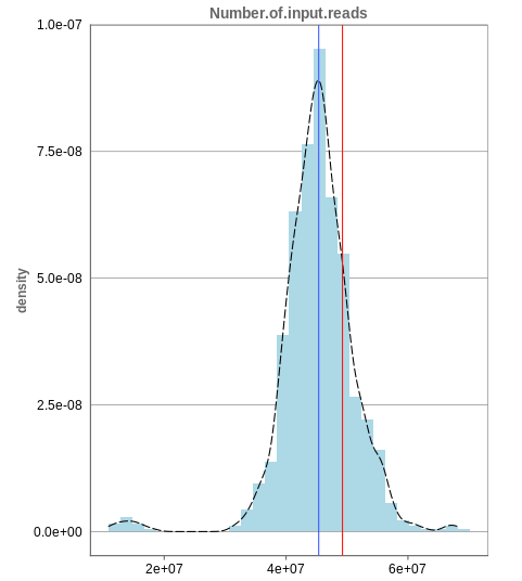
The first histogram is concerned with the number of input reads. While the blue vertical bar shows the median, the red bar shows the position of the current sample selected. A low number of reads can correspond to problematic data, while the definition of “low number” is sometimes subjective and numbers might depend on tissue type or species. Panhunter uses different color codes ranging from white to green to show low to high number of reads in the table below.
While absolute reads may be hard to distinguish by, big jumps should be investigated closely. While most of the data in the picture has 30-60 million reads, there are samples that have half or even less of the input reads. Taking these samples out should yield more homogeneous data which are more meaningful for further analysis.
Unique mapping
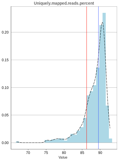
The general plot structure is similar to that of the number of input reads, such that we still want to detect outliers in the histogram. Because non-unique mappings of the input reads are not considered as reads in Panhunter, having a high percentage of uniquely mapped reads is very important.
While the displayed percentage above 85% is good for most samples, there is one with under 70% that should be omitted from the data. This also depends on the type of tissue that was used, such that the given number of 85% is considered meaningful for blood, but when using muscle cells, there might be much more lower numbers.
Mapping to multiple locations
While some reads are uniquely mapped, there is also the case of reads that are not mapped at all and reads that are mapped to multiple locations. As said before, these are not considered in the preprocessing of Panhunter, and only uniquely mapped reads are relevant for the count matrices.
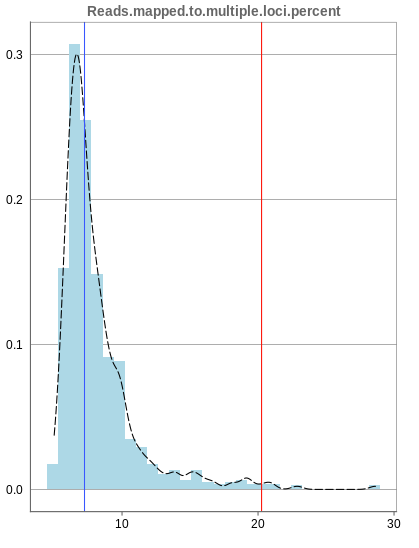
The remaining percentage of reads should largely be composed of multiple mapped reads, i.e. the number of reads that map to no location should be small.
3.1.2 - Deeper look into SampleQC
There are various other tabs in SampleQC, that are relevant for BulkRNA data.
Read distribution
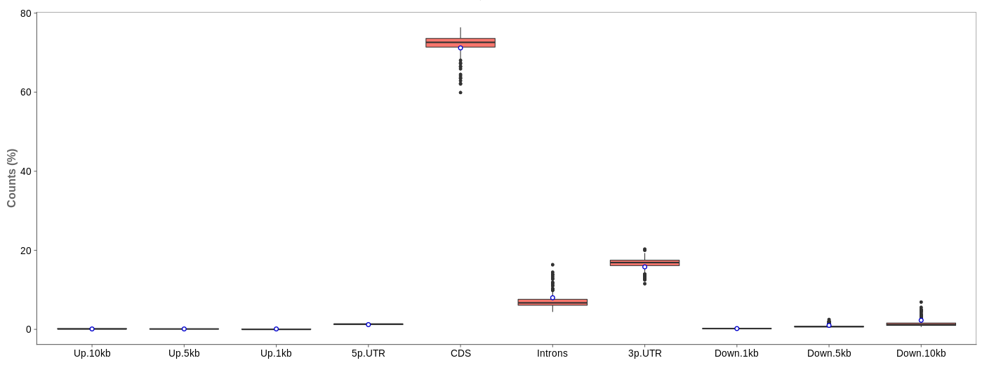
First of all, the box for total percentages should be ticked in the bottom for better comparison.
Ideally, the percentage of counts mapping to the highest should be CDS which stands for coding DNA sequence, relating to the region that codes for protein.
Also important is that up- and downstream are not mapped often.
Gene body coverage
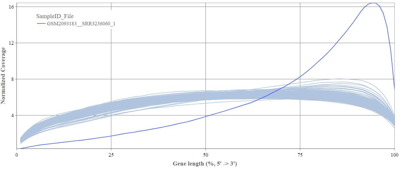
We can see the normalized coverage. The samples gene body coverages should be close to one another and should form a homogeneous band and, in BulkRNA-Seq, should be spanning quite ‘uniform’ over the gene length going down at the start and endpoints. Please note that evoenthouth this QC section is called gene body coverage we effectively measure the coverage along the RNA transcripts corresponding to the gene.
The sample colored in blue shows very untypical behaviour and is advised to be excluded.
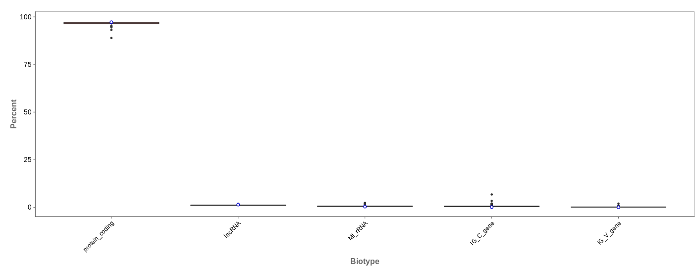
Biotype
The biotype (that is functional types of the genes to which reads are mapped) can be used for quality control. The protein_coding should be the highest and not far away from 100%. We can also see in our example that there we have IgC and IGv genes for tuberculosis data, which seems reasonable because they are relevant for the immune/antibody system of humans.
Mitochondrial
Usually, the proportion of transcripts mapping to mitochondrial genes should be low. If there is phenomenons such as cell death, the amount of mitochondrial transcripts increases and we might infer a lower quality for the data.
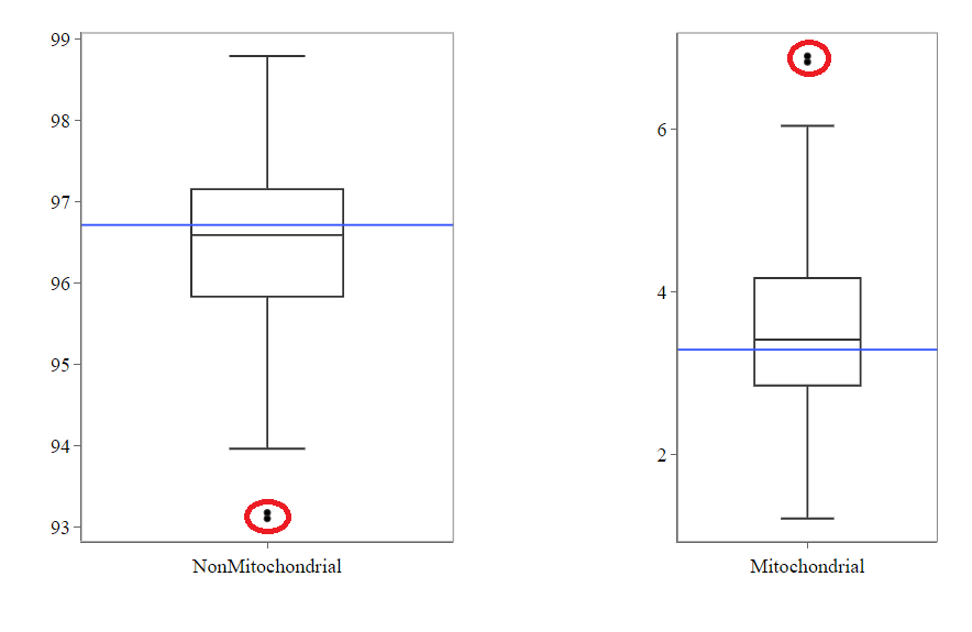
In our example, it may be useful to take out the two circled samples because they are clear outliers from the rest of the data.
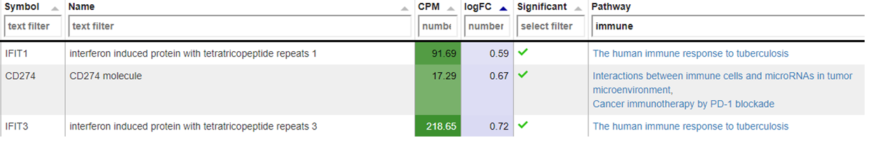
Genes
An additional evaluation can be done by looking into the Genes tab, checking which genes are counted the most. The interpretation of this analysis is experiment specific and requires knowledge of the biological system that is investigated.
3.1.3 - QC clustering
The quality of the data can also be inferred from gene expression profiles represented via dimension reduction methods. Suitable methods in Panhunter are PCA, t-SNE and UMAP. The ‘New Comparisons’ app should be used in the following.
Clustering by sex
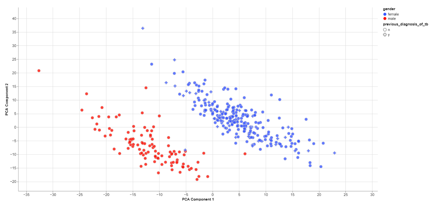
The biological sex should always be one of the greatest disparities between data points because an entire chromosome is different. Thus, there may be reason to exclude samples that are truly different from the rest of their group. However, some studies list gender which should not be confused with the biological sex.
What can also be inferred from the plot is that, in this data set, only females have been diagonsed with tuberculosis before, leading to a dependence between gender and previous_diagnosis_of_tb. These relationships are very important because correlation explained by the previous diagnosis can in some cases be completely explained by the gender/sex association.
PCA features
The categorical and numerical variables that are responsible for the variance in the data can be calculated with the buttons shown below in the picture.
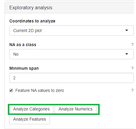
⚠️ Keep in mind that the default is to analyze only the current 2D plot of the dimensional reduction and may vary even by method (PCA,t-SNE, UMAP).
Check outliers
Even when there is no gender/sex variable present, there might be clear clustering. When comparing two groups, one can use the check outliers tab after selecting the groups, to look at up and downregulated genes and infer information from the results.
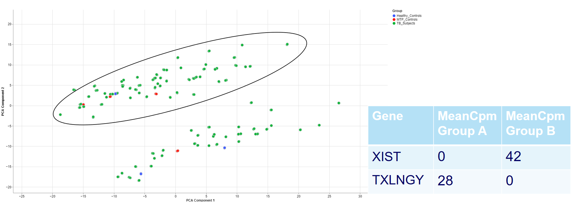
For example, the two groups are clustering completely different in the PCA plot. Even when there is no labeling variable, the comparison shows that certain genes are more present in the groups. Because the presented genes belong to the inactive X chromosome and the Y chromosome, we can infer that there are males and females in the data.
This is important for quality control because of the large influence of the biological sex which might otherwise be neglected.
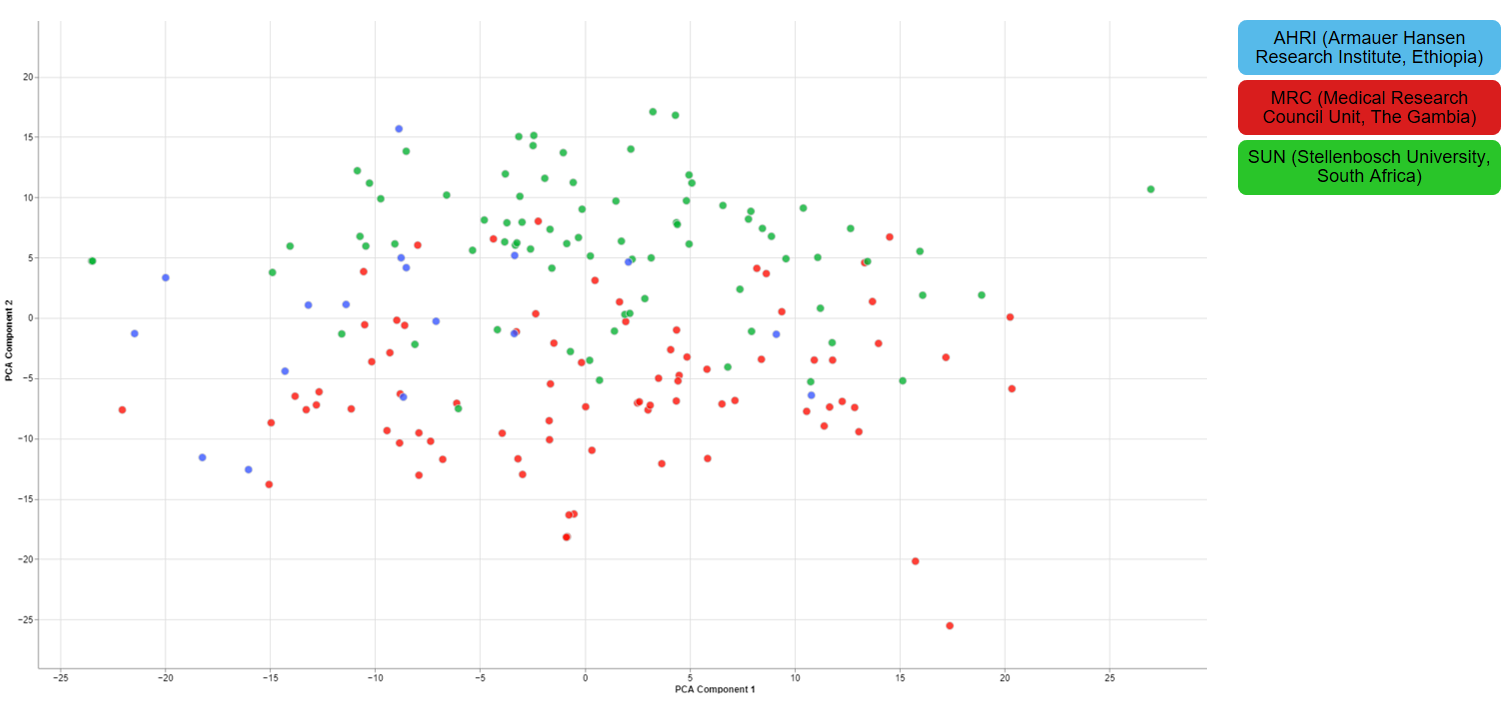
Clustering of other features
For one of the studies, different sites were used to collect blood samples from participants. This inevitable lead to differences that have to be accounted for and are thus important for the quality of the data.
3.1.4 - Finalizing the Quality Control
There are still various things that can be done to investigate the quality of the data but just a few final thoughts are mentioned down below.
New comparisons
As outlook, one can fit a group comparison in the app ‘New comparisons’, tab ‘New comparison’ with relevant groups, such as TB_subjects against control. If important genes are up/downregulated, then this is another sanity check that can be done.
Reporting on the quality
If there are multiple studies, one could present as follows:
- general setup of the study, things that are noticeable immediately (samples missing)
- general QC stats
- clustering
- variables that are relevant and should be/should not be
- New comparison between important groups, i.e. treatment vs control
- short summary of the study, the QC and important conclusions
- general setup of the next study
- comparison of all studies
- Slide with table: study | sample | reason to take out
4 - Data Administration
This section explains to the users how to perform the following data management activities:
- Overview of available studies and their upload status
- Uploading, updating and deleting data
4.1 - PanHunter Preprocessing
4.1.1 - Reference genomes
For the following species reference genomes are available in PanHunter: TO-DO give list
For model species such as mouse and human we maintain several reference genomes. If you would like to know which ensemble version is the latest in the respective release please see our changelog. The reference genome consists of a fasta file that represents the actual DNA strands and an annotation file (gtf file) that contains the positional information of every gene in the genome/fasta file.
For the human reference genome the soft masked (sm) primary assembly is used and this is then extended at Evotec with custom spike-in sequences. Soft-masked means that the nucleotides for repeat stretches are converted to lower-case. Repeats can also be masked (rm), then repeat associated nucleotides are converted to N's. The primary assembly tracks a single unbranched path through the genome. In other words there is only a single base per position and the so called haplotype (alternative base calls) are not included. Toplevel fasta files also include alternative base calls/ haplotype information.
One of the spike-ins, that the soft-masked primary assembly is extended with at Evotec, is PhiX174. PhiX174 is often used in illumina sequencing runs to increase the library quality or balance the GC content (See Phix Illumina version3 - product by illumina). Please note that the reads for PhiX should not be assigned to the fastQ files because there is no index read attached to the PhiX transcripts. Sometimes these reads do get erroneously assigned to a fastQ file due to index read bleeding (the index of a closeby cluster on the flowcell is interpreted as the index of PhiX). Barcode hopping could the other reason for an erronous assignment, this happens when indices break of and reattach within the multiplexed libraries.
The fasta file and gtf annotation contain spike in information for PhiX and for EGFP as well as for 92 ERCC (External RNA Controls Consortium) spike ins that are used to control for variation in RNA sequencing experiments.
4.2 - Studies overview
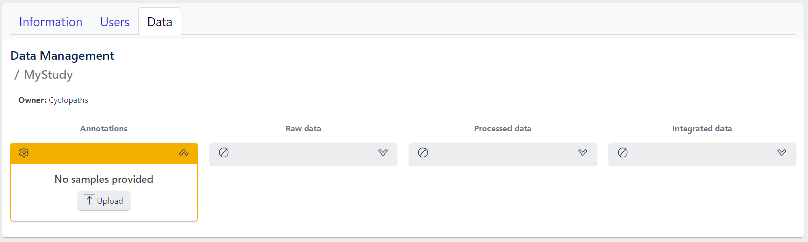
Overview of all available studies in the project
Newly created project
The Data tab lists all studies of the project and indicates the state of samples for each study. Initially, for the newly created project, there will no studies listed:
In the upper right corner an Add a new study button allows creation of new studies. Please see here for more details on how to add a new study to the project.
Existing projects
Once studies have been created, the page shows a list of studies:
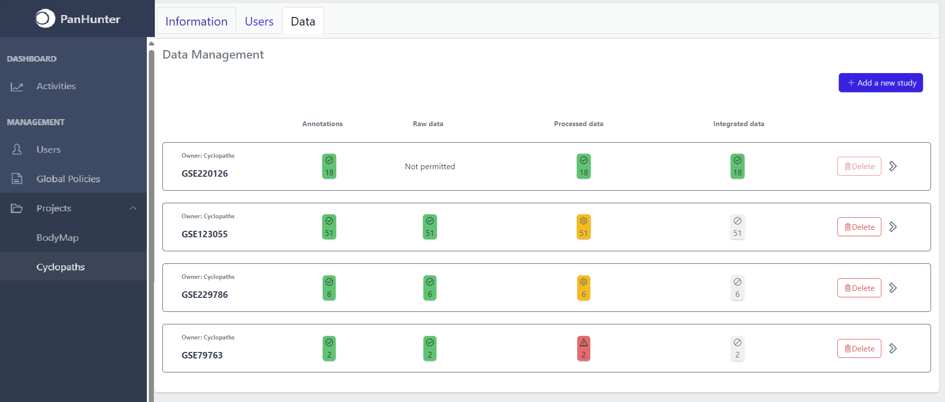
Each row corresponds to the single study, with a graphical visualization of data upload pipeline through the different stages of sample lifecycle:
- Annotations - Shows the number and the status of created (uploaded) samples that are annotated with metadata
- Raw data - Shows the number of samples with raw data and indicates the status of raw data stage
- Processed data - Shows the number of samples with processed data and indicates the status of processed data stage
- Integrated data - Shows the number of samples with integrated data and indicates the status of the integrated data stage
The colour of the tiles indicates the status for each data upload stage described above:
- Grey - data is not yet available for this stage
- Yellow - the stage is ready for upload, import, processing or integration of samples
- Blue - the process is running for this stage
- Green - the process has successfully finished for this stage and samples are correctly annotated, raw data is imported, processed or integrated
- Red - the process for this stage has failed
Detailed view of the study
Clicking on a study row leads to the detailed view of the study, which shows the same information as the overview page, but for a single study. Here, the tiles can be unfolded with a click, displaying more information about the current status of the specific data upload stage.
Additionally, the detailed view of the study enables user to perform operations like sample import, raw data inport, data processing and integration.
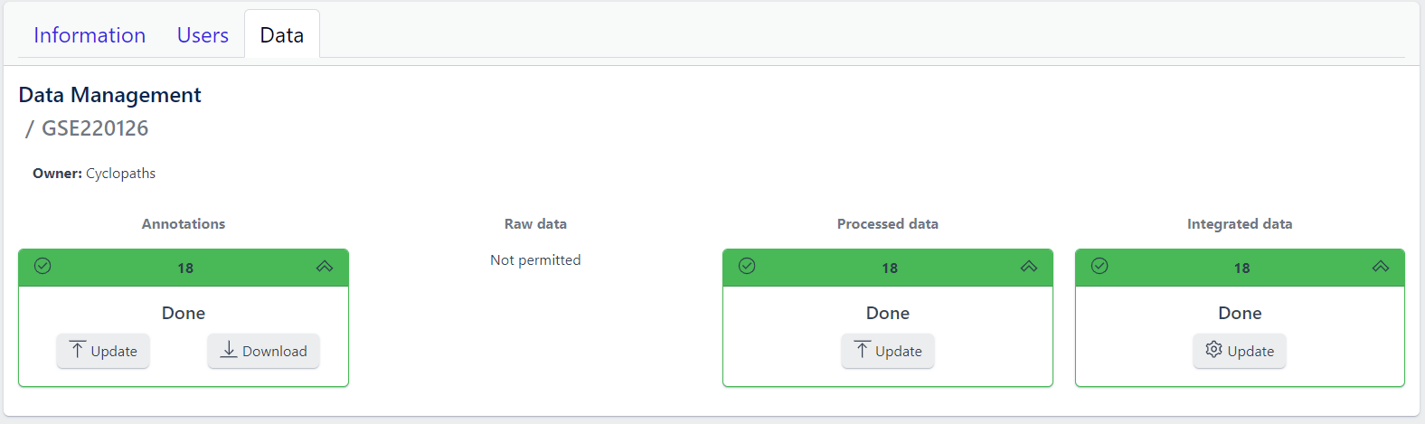
To navigate back to the overview page, click on the Data Management at the top left of the content area.
4.3 - Data upload
1. Creating new study
Step 1: New studies can be created in the project by clicking on the Add a new study button in the top right corner of the data overview page.
A pop-up window appears:
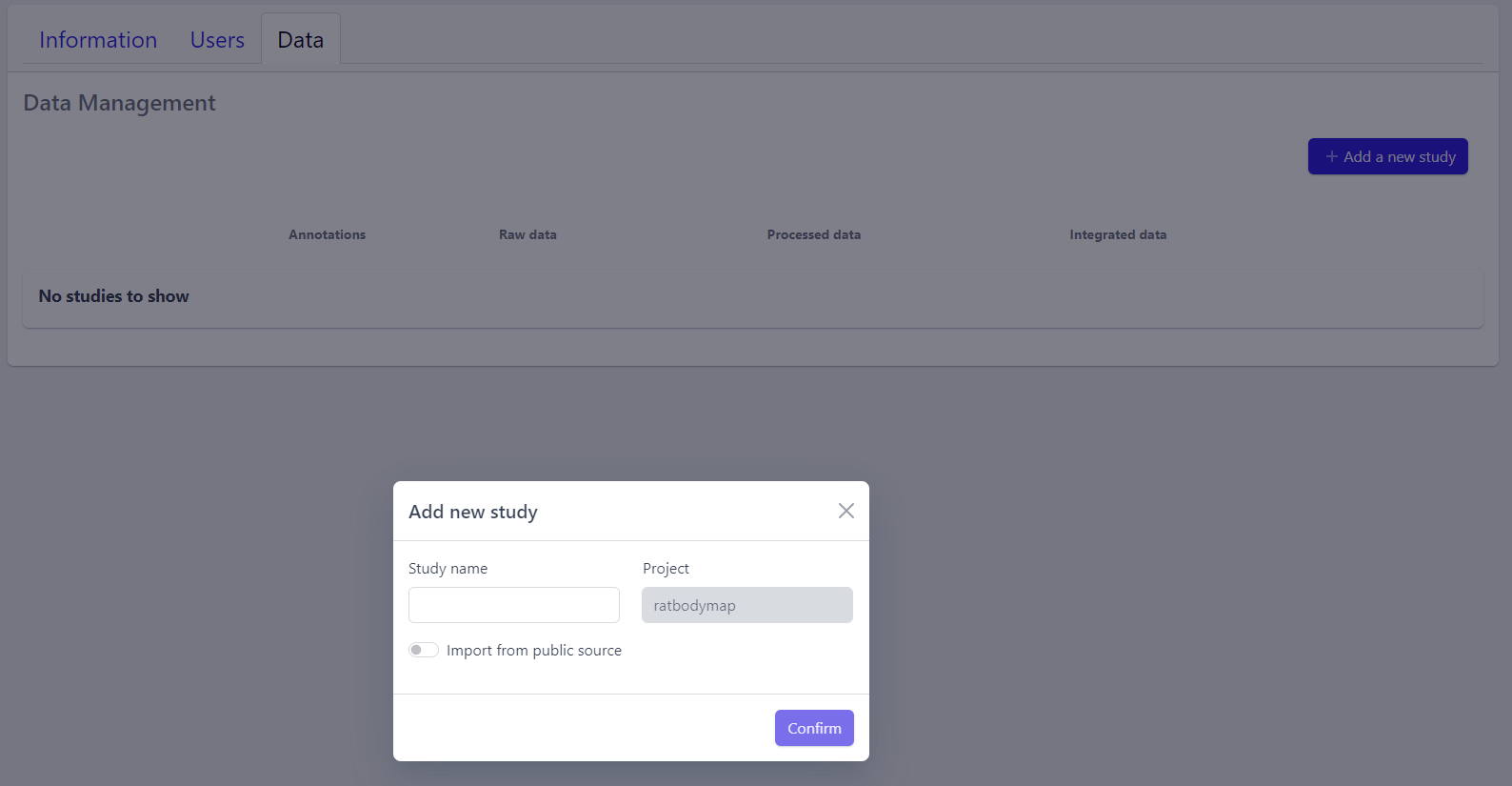
Based on the source the data is coming from, the process can be slightly different:
To upload proprietary data or other custom datasets, the process is as follows:
Step 2: Enter a study name in the pop-up window
Step 3: Click on Confirm
The new study will appear in the studies overview table as a new row, but without any associated samples. The Annotations tile will be coloured yellow with No samples provided status, indicating that the pipeline is ready for sample table upload.
However, with PanHunter it is also possible to import studies directly from public sources.
Direct import from public sources is at the moment supported for Gene Expression Omnibus (GEO), a genomics and transcriptomics database, that freely distributes high-throughput expression data submitted by the scientific community. Datasets are identified by so-called accession numbers (e.g. GSE22423).
Downloading GEO dataset directly from the database can be done with few additional steps:
Step 2: Activate Import from public source option
Step 3: Select GEO Datasets as a Public source
Step 4: Enter a valid GEO Accession number
Step 5: Click on Confirm
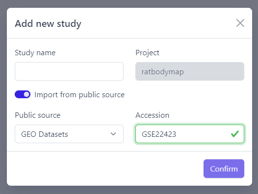
Panhunter will search for the given dataset accession number in GEO and download sample metadata. If successful, a pop-up window for sample table validation appears and user can proceed with Step 2. of sample table validation.
2. Sample table upload and validation
💡 More details about sample table file can be found under data formats supported.
Once study is successfully created, and Annotations tile is yellow with No samples provided status. This means that we need to upload samples, which is done via sample table upload and validation.
Step 1: To upload samples from a sample table Excel file, click on the Upload button on the Annotations tile and select a file from your computer to import.
📝 In case study is imported from public sources, this step is done automatically.
Step 2: Sample table validation
After the uploaded file is successfully read by PanHunter, a pop-up window to perform sample table validation appears, as displayed below:
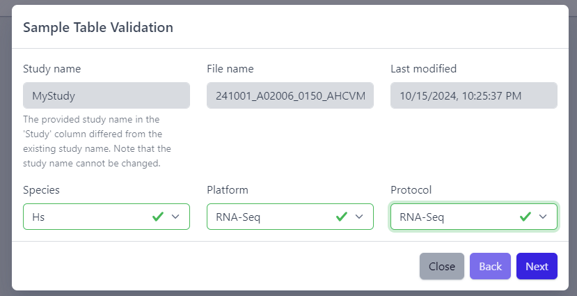
Please note that the Study name, File name and Last modified can not be edited directly. The Study name is defined during the creation of the study, and is taken from the Study column in the sample table file. File name and Last modified are defined by the file itself. To change the study name, please update the sample table file localy and restart the upload.
After you confirmed that Species, Platform and Protocol are correctly preselected, you can start the process of sample table validation by clicking on the Next button.
The result of sample table validation are shown in the same pop-up window:
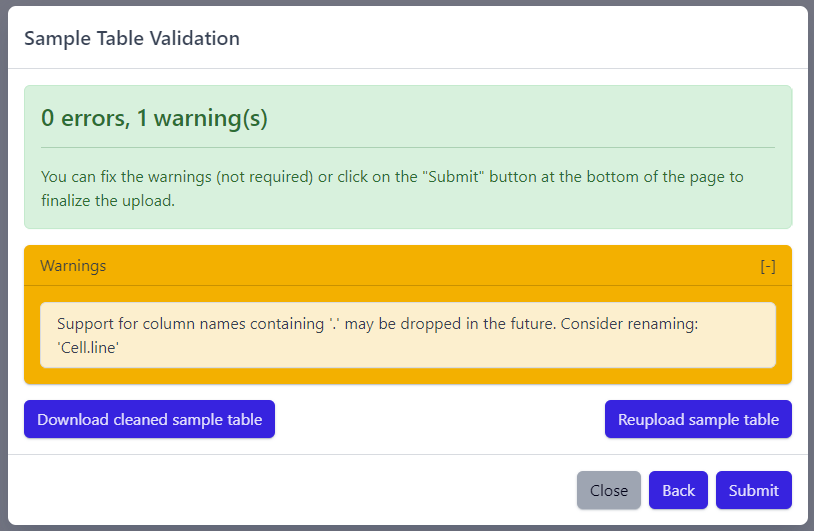
In case of errors (red), the sample table needs to be adapted. If this is the case, it is possible to use the Download cleaned sample table button to get the sample table file and modify it locally. Once sample table is modified as needed, click on the Reupload sample table button to upload the new version. The validation will be run again.
Please note that fixing warnings (yellow) is not required, but is recommended.
Step 3: Finish sample import
Once the validation passed without errors, click on the Submit button and samples will be imported and added to the study. Successfull upload of samples and study metadata will be indicated in the study details view as a green Annotations tile and the yellow Raw data tile, which indicates that the pipeline is ready for import of raw data.
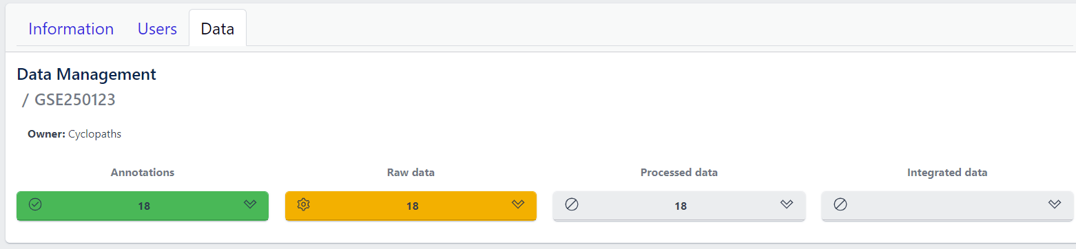
3. Raw data import
After studies are successfully created and samples are uploaded, the yellow coloured Raw data tile indicates that the pipeline is ready for upload of raw data.
📝 Info: Import of raw data via the user interface is currently supported for GEO (link) and proteomics datasets. In case you have other types of data, please contact PanHunter Support.
Step 1: Expand yellow Raw data tab in the detailed study view
Step 2: Click on the Import button
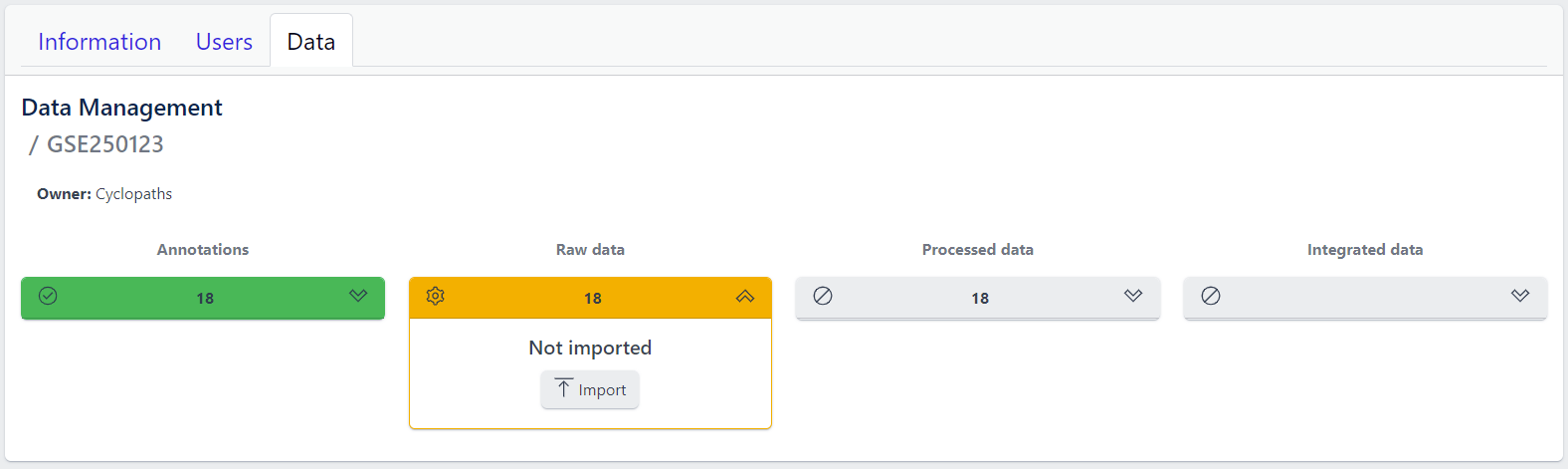
After starting the import, raw data files will be downloaded directly from GEO, with no additional input from user required.
To import output files of mass spectometry instruments, please fill in all required information in the pop up window and select files from local storage to be uploaded.
💡 This section is currently in progress - for more information please contact PanHunter Support.
Once import of raw data is initiated, a background job is started on the server. Blue coloured Raw data indicates that the process is running.
Once the import of raw data is sucessfully completed, Raw data stage is coloured green and displays the number of samples for which raw data is available. Additionally, Processed data tile is coloured yellow, indicating that the data is ready for processing.
In case an error occurs, it is indicated by the red Raw data tile that can be expanded via click to investigate the job output.
4. Data processing
Once raw data is available for imported samples, you can proceed with data processing. The data is ready for processing once Annotations and Raw data stages are successfully finished, and thus coloured green, and Processed data is coloured yellow with Not processed status.
Step 1: Unfold Processed data tile in the detailed study view.
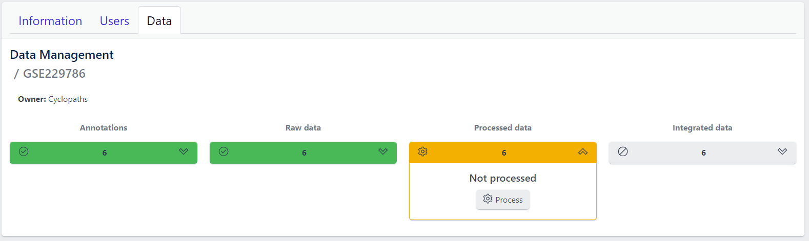
Step 2: Click on the Process button
Once the processing is initiated, a background job is started on the server. Blue coloured Processed data indicates that the job is running. Please keep in mind that depending on dataset sizes, these jobs may run for multiple hours or even days.
Once sucessfully completed, the Processed data stage turns green, displaying Processed status. Additionally, Integrated data tile is now coloured yellow, indicating that the data is ready for integration.
In case of a failure, Processed data stage turns red displaying Error status. To investigate what went wrong, please click on the View button to see output of the job. Clicking on the Retry button will start data processing again.
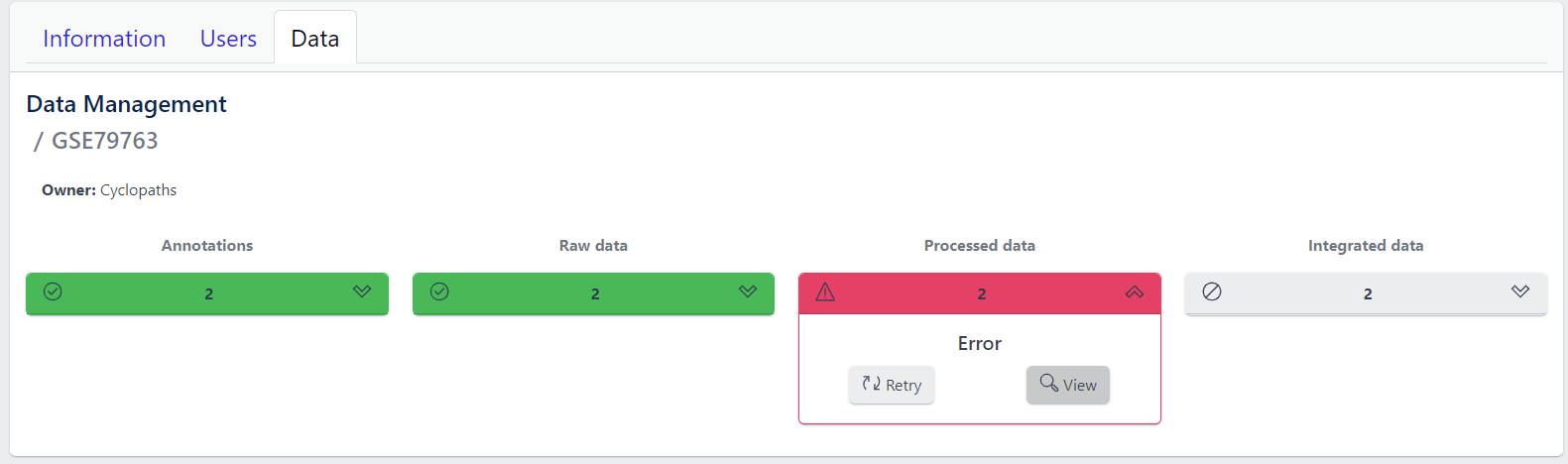
5. Integration of processed data
Once processed data is available in the study, the data is ready to be integrated to PanHunter. The pipeline is ready for integration once Processed data is coloured green and Integrated data is coloured yellow. Data will be available in PanHunter only after integration process is successfully finished.
Similar to the previous stages described above, the Integrated data tile in the study details view allows to run data integration jobs.
Step 1: Unfold Integrated data tile in the detailed study view.
Step 2: Click on the Integrate button
Clicking on the Integrate button starts a background job on the server. While the process is running, the Integrated data tile will be coloured blue.
Once sucessfully completed, the Integrated data stage turns green and data automatically becomes available in PanHunter apps.
In case of a failure, the Integrated data turns red displaying Error status. To investigate what went wrong, please click on the “View” button to see output of the job. Clicking on the Retry button will start data processing again.
4.4 - Updating data
Studies already created and existing in PanHunter, can be updated at any time via detailed study view. This can be done at any stage of data upload pipeline, regardless whether the study has been fully integrated into PanHunter or not.
Updating samples
In order to modify the sample metadata, to either correct or add additional information, it is possible to download and re-upload sample table files via the green Annotation tile in the detailed study view. This can also be done when the raw data have been added, processed and integrated already.
The process is similar to creating new samples as described in here, except that in this case it’s possible to start with sample table that is already available for the study.
- Download button downloads existing sample table which can then be modified locally
- Update button enables upload of updated, changed or newly created sample table. Please note that this will trigger sample table validation process again. Successful update of the sample table will overwrite existing sample table, update the sample information in the project and the additional or modified metadata will be available in PanHunter apps.
Notes
- Depending on the app, reload the of the app in the browser might be required in order to see the new information. In new information is not available after reload, please close the app and wait three minutes to make sure the app process on the server stopped. Opening the app again will force a reload of all data which includes the new information added.
- Samples will be available in PanHunter apps only when the value of the Status column in the sample table is set to Analyzed. This is usually done automatically when data has been processed and integrated. If sample information is modified, there is no need to change the status of samples unless changes have an impact on data processing and integration. In this case processing and data integration need to be re-run.
Updating data
In case update of data is required, this can be done for any stage at any time. To re-upload raw data or re-run processing and/or integration, please use Update button for respective data upload stage in the detailed study view.
Please note that updating raw or processed data requires re-integration of the data as well.
4.5 - Deleting studies
Delete a Study
Deleting a study from PanHunter is possible directly in the overview of available studies in Data tab via Delete button.
Clicking on the Delete button will trigger a pop-up window to confirm deletion of the study.

Please note that at the moment, possibility to delete study depends on the study data type (e.g. RNA seq data). In case you experience issues, please contact PanHunter Support.