Standard Apps in PanHunter are core components that are available across all projects by default. They provide essential functionalities for data exploration and analysis and are designed to be universally applicable regardless of the dataset.
This the multi-page printable view of this section. Click here to print.
Standard Apps
- 1: Comparisons
- 2: Enrichment Visualization
- 3: Gene Clustering
- 4: Gene Comparison
- 5: Gene Info
- 6: MA Plot
- 7: Network Visualization
- 8: New Comparison
- 9: Pathway Visualization
- 10: Project Overview
- 11: ProteomicsQC
- 12: SampleQC
- 13: scDeepDive
- 14: scExplorer
- 15: Signature Visualization
- 16: TF Targets
1 - Comparisons
Comparisons app is used to inspect and compare tables of differentially expressed features (Comparisons) available in PanHunter. Most of the comparisons in PanHunter are generated in the New Comparisons app, potentially in the scExplorer, and even calculated outside of PanHunter, in which case they are refered to as Custom Comparisons in PanHunter.
In addition to single comparisons mentioned above, the Comparisons app supports exploration of Comparison Groups. To learn more on the concept of Comparison Groups, and how they differ from single Comparison, refer to XXX.
<The panels provide information about all or most recently generated Comparisons (see the respective radio buttons on the top-left hand side).
 >
>
The app comprises panels for overview, comparison of multiple comparisons and inspection of comparison groups.
<Additionally, selected Comparisons (selected rows in the overview table in the first panel) can be updated by clicking the “Update” button on the left hand side. This is useful, for example, when new samples are available and the Comparison should be recalculated.>
Comparisons overview
The first available panel in the app is Comparisons OVerview panel.
The overview panel contains Comparison overview table which lists comparisons calulcated in PanHunter, grouped by original Study. The table is accompanied by action items on the left-hand side.
**Comparisons Overview table**
Each row in the Comparison Overview table represents one specific comparison, and the first column for each comparison indicates the name of the Study that comparison was calculated in. Second column gives the Name of the comparison defined by user during calculation, and is followed by unique comparison ID right next to it.
The table provides additional information about each comparison, such as the date of calculation, information about method, formula and cuttoffs used for calculation, details on contrast factor, numerator and denumerator, the number of samples used in the Comparison and the number of present, up, and down regulated genes, as well as details about omics dataset itself.
In addition to standard table functionalities in PanHunter, click on the individual row belonging to specific comparison will select that comparison.
Once individual comparison is selected, Administration, Data and Go To panels left to the table become available. <add reference to image if needed here, maybe the first image on top before focus on the table?>
**Administration**
The Administration panels provides user option to:
- Update - This will trigger comparison recalculation. This is useful, for example, when new samples are available.
- Compare Sample Table - Allows user to compare sample table used during comparison computation and presently and the sample table recreated based on the Comparison recipe. Only categories involved in formula for Comparison computation are taken into consideration. Comparison result is shown as a message at the top of the app. Main reason of difference between stored and recreated sample tables are updates of sample tables (addition of new samples or changing sample annotations). If differences between stored and recreated sample tables are identified, please consider updating the Comparison.
- Check Comparison - Initiates the check whether the Comparison saved and a comparison recomputed based on the Comparison recipe and previously saved sample table are different (i.e. recreation of sample table is not performed as a part of this comparison). A standard reason of difference between stored and recomputed Comparisons are updates in methods for Comparison computation. If differences between stored and recomputed Comparisons are identified and these differences were not expected, please cosult with PanHunter team, or assigned bioinformaticians. All updates in metods affecting calculations are available in our Changelog
. - Remove - Deletes comparison from the project. Please keep in mind that once deleted, comparisons can’t be retrieved. Use with caution.
- Download - Downloads all files associated with selected comparison. The files are packed as zip archive. Please refer to
at the bottom of this page for more information.
Please keep in mind that once triggered, Update and Remove functions can’t be reversed.
In case comparison has been calculated by scExplorer or outside of PanHunter,
**Data**
The Data tab provides user with options for downstream exploration of comparison results and associated post-processing steps performed during computation.
- Comparison - Opens the results of differential abundance analyses (fold changem p-value, FDR) for the features found significantly regulated.
- Geneset Enrichment - Opens results of gene ontology term enrichment analysis.
- Pathway Enrichment - Shows overview of pathways of which the differentially abundant features are members. Calculated based on the gage and GeneAnswers R-packages.
- Signatures - Shows additional information on which known compounds leads to similar differentially abundant features.
- Transcription Factors - Show downstream analysis of the transcription factors that might be relevant to the changes in feature abundances observed in this Comparison.
- Networks - Show the gene interaction networks enriched with differentially regulated features.
Please note that available options depend on post-processing steps selected for each comparison, further explained here
**Go To**
This section provides quick lins to other PanHunter apps where selected comparison can be further explored. Please note that selection of available apps may vary, depending on data available for the comparison.
Compare Comparisons

This panel is used to compare the genes present in different Comparisons. Up to four Comparisons (Top table 1 - Top table 4) can be selected.

After selection, a merged meta-table containing the expression levels (CPM), log fold changes (logFC), and log false discovery rates (log10FDR) for all detected genes in all selected Comparisons is displayed below the user interface. The column titles indicate the respective Comparison, e.g. “CPM1”, “logFC1”, “log10FDR1”, “CPM2”, “logFC2”, and “log10FDR2” in case of two selected tables.
For more information about the matching of features between proteomics or peptidomics Comparisons, please see the Algorithms section.


The columns can be sorted and the fold changes are color-coded (violet color for up and red for down-regulation). Each gene (row in the table) is characterized by its Ensembl and gene ID, symbol, and common name.
Before merging, the selected Comparisons may be filtered according to an expression level (CPM1-4) or log fold change threshold (logFC1-4) (see text fields on the right hand side of the selection menus). For example, the expressions “> 1” (CPM1 field) and “> 2” (logFC1 field) would filter the first selected Comparison for genes associated with an expression level greater than 1 and a log fold change greater than 2 before merging it with the other selected tables. Thresholds may be specified for all selected tables. The changes are applied to the meta-table after clicking the “Filter” button below the text fields. Additionally, the output table can be filtered for genes associated with particular GO terms or gene symbols.
The symbol filter is based on regular expressions:
- Normal text matches (case insensitively) anywhere in the gene symbol
^anchors the search to the begin of the symbol$anchors the search to the end of the symbol[]matches any of the characters within the brackets|represents alternatives, e.g._PER|TIMELESS_may find PER1, PER2, and TIMELESS.is a wildcard matching any character+means that the preceding character can be repeated one or more times.
Example: ^Pko[1234567890]+$ matches any symbol starting with “Pko” followed by one or more digits. A Pko binding protein, e.g. Pko2bp, will not be found since the dollar sign marks the end of the string.
In a multi species Comparison, the symbol filter works on the first selected table.
In addition to the described filter options, the number of rows of the generated output table can be limited by means of the “Max rows” input field. In this case, only the top genes sorted according to false discovery rate (starting with the first selected table) are displayed. This option is useful when dealing with very large tables.
The output table can also be downloaded as Excel file (see the “Download XLSX” button below the input fields).
Comparison Groups

Download Comparison Data
To download all data pertaining to a Comparison:
- Select the “Comparisons Overview” tab.
- Select a Comparison from the table by clicking on it.
- In the “Administration” box on the left, click on button “Download”.
A ZIP-file will be downloaded to your device. The next section describes the contet of this file.
Files and folders - Overview
This is a list of files and folders found in the downloaded ZIP-file. Please note that the top-level files are always present. Folders and files in folders vary depending on the post-processing steps that were performed when creating the Comparison.
- 📄 DifferentialFeatureAbundance.csv
- 📄 Metadata.json
- 📄 Recipe.json
- 📄 SampleTable.csv
- 📂 Enrichments
- 📄 GOBP.csv
- 📄 GOCC.csv
- 📄 GOMF.csv
- 📄 Wikipathways_Rn.csv
- 📂 FilteredOut
- 📄 ModelBased.csv
- 📂 Networks
- 📂 Biogrid
- 📄 Hs.csv
- 📄 Rn.csv
- 📂 Biogrid
- 📂 Signatures
- 📄 Overview.csv
- 📄 ManualSingleDrugPerturbations.csv
- …
- 📂 TFTargets
- 📄 ChipAtlas.csv
Files and folders - Content
📄 DifferentialFeatureAbundance.csv
This file holds the main results of the Comparison calculation. For each Feature in the Comparison the following values are listed, they depend on the underlying type of data (transcriptomics, proteomics, genomics, metabolomics…).
- FeatureID: PanHunter feature ID.
- EnsemblID: gene ENSEMBL ID.
- Symbol: gene symbol.
- Name: Human readable name of the feature.
- Abundance: Average abundance of the feature across denominator samples.
- FDR: P-value adjusted for multiple testing.
- Pvalue: P-value as it is reported by limma or DeSeq2.
- SE: (optional) Standard error as it is reported by limma.
- logFC: Log2 fold change as it is reported by limma or DeSeq2. Please note, that currently fold change shrinkage is not applied.
- sig: Binary value, telling whether a feature is significantly regulated.
📄 Metadata.json
The file contains Comparison metadata in JSON format. This is - for instance - the internal Comparison ID, computation date, user-id, the method and input parameters used to calculate the Comparison, list of samples used, or filter steps applied to sample table. In principle this is the same information as displayed in the table “Comparisons Overview” in the Comparisons app.
📄 Recipe.json
This file holds instructions for PanHunter about how to create the Comparison. This is a JSON formatted version of the input settings provided by a user in the “New Comparison” tab in the New Comparison app:
- rules for filtering the sample table
- parameters for and type of comparison algorithm
- post-processing steps to be carried out
📄 SampleTable.csv
Table of samples used for calculating the Comparison. For each sample the file holds a number of properties, e.g., SampleID, Study, Platform, Protocol, Species. Other properties are dependent on the underlying experiment and type of sample.
📂 Enrichments
This folder contains the results of the “GO enrichment” and “Pathway enrichment” post-processing steps.
Gene Ontology
The information in these files describes the results of enrichment analyses for the GO gene sets based on the features found to be significantly regulated in the Comparison.
For each domain of the GO one file is provided:
- 📄 GOBP.csv - GO terms for biological processes
- 📄 GOCC.csv - GO terms for cellular component
- 📄 GOMF.csv - GO terms for molecular function
Please find more information about Gene Ontology (GO) database. Please see Enrichment Visualization app documentation for more information.
Wikipathways
The information in these files describes the results of enrichment analyses for the Wikipathways gene sets based on the features found to be significantly regulated in the Comparison For example, it provides statistical values from the Wilcoxon, Kolmogorov-Smirnov and Fisher (exact) tests and was computed based on data from Wikipathways. For each available species, a separate file is provided,
For example:
- 📄 Wikipathways_Rn.csv - Information about organism-specific pathways for Rattus norvegicus
Please see Pathway Visualization App documentation for more information.
📂 FilteredOut
This folder contains CSV file for the features filtered out based on their abundance across the samples used in the Comparison.
For example:
- 📄 ModelBased.csv - contains all features that were removed by the model-based filtration step.
📂 Networks
This folder contains the results of the “Subnetwork extraction” post-processing step.
📂 Biogrid
The files hold information about the gene/protein interaction networks enriched with the features found to be significantly regulated in the Comparison. For each available species, a file is provided with references to subnetworks in the Biological General Repository for Interaction Datasets (BioGRID).
For example:
- 📄 Hs.csv - Homo sapiens
- 📄 Rn.csv - Rattus norvegicus
Please see Network Visualization documentation for more information.
📂 Signatures
This folder contains the result of the “Signature analysis” post-processing step. There is an overview file with summary information and one file for each signature collection analysis that has been carried out. The latter contain various statistics and tests in order to identify signatures that are similar or opposite to the Comparison results.
For example:
- 📄 Overview.csv - Overview file with the signature collections for which the analyses was done.
- 📄 ManualSingleDrugPerturbations.csv - File with the results of signature analyses for a particular signature collection (“ManualSingleDrugPerturbations” in this case). Each row in this file represents an individual signature, its annotation, and results of the directed enrichment analyses based on the features found to be significantly regulated in the Comparison.
Please see Signature Visualization documentation for more information.
📂 TFTargets
This folder contains the results of the “TF analysis” post-processing step. The files contain several statistical values to identify Transcription Factors (TFs) whose target genes are overrepresented in the Comparison.
For example:
- 📄 ChipAtlas.csv - This data is compiled by utilizing the ChipAtlas dataset.
Please see TF Targets documentation for more information.
2 - Enrichment Visualization
Enrichment visualization analysis is a computational technique to identify and visualize functional or biological themes over-presented within a set of genes, proteins, or other biological entities. This technique intuitively interprets large data sets, such as gene expression profiles or lists of differentially regulated genes, by mapping them to a biological context, such as biological pathways, gene ontologies, or protein-protein interactions.
The enrichment visualization app presents the statistical significance of the overlap between the set of interest and predefined sets of genes, such as those associated with a specific biological function or process. The statistical value is usually determined by a p-value, which measures the probability of observing the observed overlap by chance, given a null hypothesis of no association between the sets. The p-value is then corrected for multiple testing, such as the false discovery rate, to account for the fact that many tests are performed simultaneously.
Tabs within the application are interconnected, meaning that selections made in one tab, such as using lasso selection for the plot, will also apply to other tabs.
In addition, if at least one enriched set is selected, all genes associated with one or more selected terms (whether differentially expressed or not) will be highlighted in the Genes for the selected gene sets tab.
Comparison type
This App provides a range of tools for conducting enrichment analysis, including Individual comparisons and Comparison groups:
Individual Comparisons

This panel provides a valuable framework for comparing gene expression patterns between two distinct samples, such as control and treated samples or samples derived from different disease states. The analytical approach used here enables the visualization of differential gene expression through 2D and bar plots. In addition, users can explore enriched gene sets and genes for the selected gene sets, thereby facilitating the identification of specific biological pathways and mechanisms differentially regulated in the samples under comparison.
Dataset selection
To initiate the analysis process, selecting the comparison type followed by the desired dataset is necessary. The dataset can be selected using the interface elements under the Data selection panel, located in the top left window. Initially, it is essential to identify the Data source type using the radio buttons control.
There are two distinct types of dataset that can be selected:
Comparison

Denotes a dataset type encompassing the outcomes of differential expression analysis for a single group of samples. Generally, this dataset is produced by conducting a statistical test (ANOVA or t-test) to recognize genes that display differential expression between two or more conditions. In addition, the comparison dataset encompasses relevant details to the fold change, p-value, and FDR-adjusted p-value for each gene. To run this analysis, after selecting the Comparison from the radio buttons control, using the Comparison search bar user can select the desire comparison through the Comparison selector panel. Refer Comparison Selector for further instructions.
Manual input
This option offers users the capability to input their own gene or identifier list for comprehensive analysis. This feature facilitates the inclusion of genes or proteins relevant to specific Species, utilizing preferred Databases such as Ensembl or UniProt IDs. In selecting the control or reference dataset, the Background Type section is instrumental. The Complete option signifies a background dataset that encompasses all possible entities relevant to the study, providing an exhaustive reference framework for analyzing the primary dataset. Conversely, the Manual option allows users to define their own reference dataset. By selecting the Manual option in the dropdown menu under Background Type, an additional tab titled Background will appear at the end of the Data Selection panel. Refer Pathway App
Within this segment, users have the flexibility to specify their reference dataset through various methods: Manual Autocomplete, Manual Freetext, or by employing Custom Feature Lists.
In Manual Autocomplete user can use the empty fields to enter the Feature IDs separately. Under the Manual Freetext, Feature IDs should be separated by any white-space character or comma. In case of manual input of a feature list, which often has typos or unrecognized IDs, it is highly recommended to check messages at the top of the screen and also check the details that can be viewed by pressing Test gene num. button under the Feature Filter panel.
The Custom Feature Lists refers to bespoke sets of entities, such as genes, proteins, metabolites, or other biological elements, curated specifically for the analysis. These custom lists are designed to align with the unique goals of the study, serving as a specialized background dataset. Moreover, the Refresh button enables the dynamic reloading of the feature lists, ensuring they are updated in accordance with the current sample selection.
Gene set collections
Once the user has selected the dataset they desire, they need to conduct an enrichment analysis using their preferred gene set collections. This can be done by selecting the relevant check boxes from the Gene Set Collections list and clicking the “Perform Enrichment Analysis” button.

The analysis will then be executed and take approximately 10-15 minutes, depending on the output size.
The Enrichment Analysis application employs a combination of advanced algorithms and statistical tests for accurate and robust analysis. It utilizes the weight and elim algorithms in conjunction with Fisher’s exact test on 2x2 contingency tables, a method particularly effective for small sample sizes, to assess the significance of associations in gene set enrichment analysis.
For secondary feature set collections, the application applies a standard hypergeometric test, akin to Fisher’s 2x2 exact test, ensuring a thorough analysis across various data sets. Multiple testing adjustments are executed separately for each feature set collection, enhancing the accuracy of the results.
2D plot and visualization options

Upon completion of the analysis, the 2D Plot tab within the application presents a diagrammatic representation of enriched or depleted gene sets/GO terms, distinguished by a series of uniquely characterized dots.
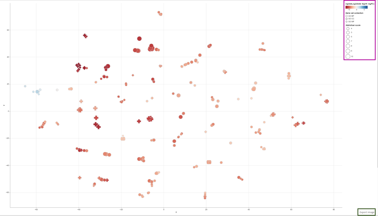
Each dot in this 2D plot represents an enriched gene set. The size of each dot corresponds to the statistical significance of gene set enrichment, while the color represents the overall fold change of differentially expressed genes that support such enrichment. The dot’s shape identifies the gene set collection to which it belongs.
The legend in the 2D plot image functions as a key for understanding the visual data representation. It categorizes gene sets by their collection each associated with a unique shape such as circles, diamonds, or squares etc. The color gradient from blue to red indicates a reference for the signed log2 fold change of genes, with blue representing downregulation, red signifying upregulation, and varying shades denoting the degree of expression change. The size of the shapes corresponds to the statistical score, providing immediate visual cues about the data’s hierarchical significance.
Users can retrieve comprehensive identification details and statistical figures by hovering over any dot, thereby triggering a supplementary information window. Also, users can modify the zoom level using the mouse wheel and reposition the plot area via the left mouse button. Selection of dots (or gene sets) is achievable either by left-clicking on a dot or by encircling a cluster of dots with the right mouse button depressed (Lasso tool). In cases where multiple gene set collections are analyzed, selecting a collection name in the chart’s legend highlights all gene sets linked to that collection. While a new selection supersedes the previous one, holding down the shift key during selection adds the new choice to the existing selection. Clicking an unoccupied area of the plot with the left button cancels the selection. Double-clicking an empty plot space resets the plot to its original configuration.The plotted diagram can be downloaded as a PNG image with a transparent background, facilitating its integration into presentations with customized slide backgrounds through the Export Image link located near the plot’s lower-right corner:
Constructing of visualization plot is based on t-Distributed Stochastic Neighbor Embedding (t-SNE) or Uniform Manifold Approximation and Projection (UMAP) techniques. These methodologies are elaborated in the Plot options subsection, which also explains the Plot options tab parameters influencing the visualization.
The tabs in this App are internally linked. This feature makes it convenient for the user to check the terms associated with a group of closely located dots under the other tabs. For example selecting enriched gene sets in the plot automatically implies filtration in the enriched sets table shown under the Enriched Gene Sets tab. For further information please refer to Enriched Gene Sets section.
In order to facilitate a comprehensive and precise identification of significant features within the dataset, our application provides users with the functionality to set specific enrichment thresholds:
Enrichment Thresholds
This feature is accessible via the Enrichment thresholds configuration panel, which presents two distinct options for refinement: The p-value threshold and the num.genes threshold. The integration of both thresholds is pivotal in enhancing the accuracy and relevance of the analysis:

The p-value threshold parameter is instrumental in filtering the analysis results based on statistical significance. It plays a crucial role in ensuring that the observed differences in the dataset are not merely a product of random variation. By setting the p-value threshold, users can define the level of statistical stringency to apply, thereby determining the probability cut-off for significance.
The num.genes threshold introduces an additional dimension of biological relevance to the analysis. It ensures that only those categories that demonstrate significant p-values and contain a sufficient number of entities (genes, proteins, etc.) are considered for the analysis. This criterion is essential in establishing the biological validity and meaningfulness of the results. The application’s design allows users to fine-tune these thresholds, providing a balanced approach between minimizing false positives (achieved through more stringent thresholds) and ensuring no significant findings are overlooked (achieved through more relaxed thresholds).
It is important to note that the optimal settings for these thresholds are contingent upon the specific objectives of the study and the unique attributes of the dataset being analyzed. Users are encouraged to adjust these parameters thoughtfully, taking into account the context and requirements of their research.
Feature filter
The Feature Filter panel is expertly designed to assist users in defining a precise foreground of features, categorized as “differentially expressed” or “differentially abundant.” This process is critical for accurately identifying significant features in the dataset and involves the meticulous setting of thresholds for both FDR (False Discovery Rate) and Fold Change (FC).
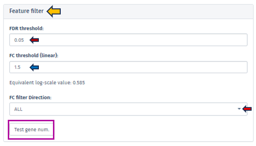
The FDR threshold is crucial in controlling the rate of false discoveries, a common challenge when analyzing multiple features simultaneously. Users can easily set their desired FDR threshold using the intuitive FDR threshold filter bar. This can be achieved by directly inputting the desired value or incrementally adjusting it with the spinner control .
Similarly, the FC threshold (linear) can be set using the same interface. This threshold allows users to concentrate on features exhibiting changes of a magnitude that are significant and relevant to their specific research objectives.
Accompanying the FC threshold, the application automatically calculates and displays the Equivalent Log-Scale Value. This feature provides a logarithmically transformed perspective of the fold change, simplifying the interpretation and comparison of changes across various magnitudes. The log transformation is particularly advantageous as it converts multiplicative alterations into additive ones, offering clarity, especially in datasets with extensive variability.
Further refinement in the analysis is achievable through the FC Filter Direction input field. This functionality permits users to narrow down their analysis to features that are either exclusively up-regulated or down-regulated, enhancing the specificity of the study.
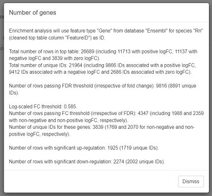
After setting these thresholds, we highly recommend users verify the number of features that meet these criteria. This is easily accomplished by clicking the Test gene num. button. This step is instrumental in providing users with valuable insights regarding the scope and precision of their analysis, thus reinforcing the robustness of the research findings.
Plot Options
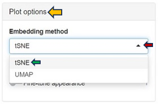
A crucial feature of the Enrichment Visualization app is the Plot Options panel, which becomes accessible upon opening the 2D Plot tab. This panel incorporates key functionalities that significantly augment the app’s capacity to analyze and visualize biological data, streamlining the user experience in data interpretation. The Embedding method section within this panel facilitates data visualuzation through advanced embedding techniques, namely t-SNE (t-Distributed Stochastic Neighbor Embedding) and UMAP (Uniform Manifold Approximation and Projection). t-SNE, the default method in the app, excels in simplifying complex datasets for enhanced visualization, while UMAP is effective in preserving both local and global structures of data. These methods are instrumental in reducing the dimensionality of complex datasets, making it possible to visualize and interpret high-dimensional data in a more comprehensible 2D or 3D format.
Within the Plot Options panel, users have the ability to further refine their analysis through two distinct features: Fine-tune embedding and Fine-tune appearance. Upon enabling the Fine-tune embedding, users gain access to a suite of adjustable parameters, enhancing their control over the data representation:
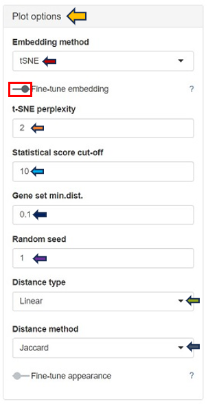
In case of setting the Embedding method to t-SNE:
t-SNE Perplexity: The perplexity parameter in t-SNE, as highlighted by L. van der Maaten & G. Hinton (2008), serves as a critical measure in determining the adequate number of neighbors. This measure, with typical values ranging between 5 and 50, offers a nuanced approach to evaluating the local structure of the data. In this application, particularly for enriched gene sets visualization, lower perplexity values, starting from 1, often yield more insightful results.
In case of choosing UMAP as the Embedding method:
-
N neighbors: A crucial user-controlled parameter that significantly influences how the algorithm constructs the high-dimensional data’s manifold structure (which functions similarly to the perplexity in t-SNE). It determines the number of neighboring points; each point is compared with when mapping the data to lower dimensions. A higher value of this parameter considers more of the global data structure, while a lower value focuses more on local data clusters. Conceptually, it can be likened to a triplicated version of t-SNE’s perplexity, playing a significant role in how UMAP interprets local and global structures in the data.
-
UMAP min.dist.: Influences the degree of separation between clusters by controlling the compactness of points in the embedding space.
Both t-SNE and UMAP share several common parameters that users can adjust:
-
Statistical Score Cut-off: In the enrichment analysis, the statistical significance of each gene set is visually represented by the size of a dot, set as the negative logarithm to the base 10 of the enrichment p-value (-log10(Enrichment p-value)). This method transforms p-values into a more intuitive graphical representation. The Statistical Score Cut-off parameter is a crucial feature that mitigates the disproportionate influence of a single, highly significant gene set on the dot sizes. Scores exceeding the user-defined threshold are capped at this threshold, ensuring a balanced and interpretable visualization across all gene sets. This approach maintains a focus on relative significance without allowing extreme values to skew the overall perspective.
-
Gene Set min.dist.: Impacts the minimum separation distance between distinct clusters in the UMAP plot.
-
Random Seed: Ensures reproducibility of results by setting a specific starting point for the random number generator. UMAP and t-SNE’s reliance on pseudo-random number generation necessitates the specification of a Random Seed for reproducibility. This feature will enable users to replicate their results under identical parameter settings, thereby enhancing the reliability and validity of their analytical outputs. Users are encouraged to test multiple seed values, especially when a specific gene set cluster emerges as biologically intriguing, to validate the consistency and robustness of the observed patterns.
-
Distance Type: Allows selection of the distance measurement type. The linear metric involves a direct calculation of distance as
or
where
is the Jaccard index, and
is Cohen’s Kappa. Here, the distance aligns proportionally with the indices, offering a straightforward and linear representation of dissimilarity. This metric provides a clear, direct measure of how dissimilar two gene sets are, grounded in their shared and unique elements.
The Squared distance (Semi-Metric) method computes the distance as or
. By squaring the complement of these indices, this metric accentuates the differences between gene sets, making even subtle variations more pronounced. This heightened sensitivity is particularly advantageous for unveiling distinct patterns and relationships within the data that might be understated in a linear approach.
- Distance Method: The construction of the distance matrix for enriched gene sets is an intricate process and allows users to select the metric for calculating distances in the analysis. The available options include the Jaccard index and Cohen’s Kappa. The Jaccard index measures similarity based on shared members between sets, while Cohen’s Kappa provides a measure of agreement or correlation between two sets. If the calculated distance between any pair of terms is lower than a user-defined threshold (set in “Gene set min.dist.”), the app will adjust this distance to match the user’s specified threshold. This feature offers users the flexibility to customize the sensitivity of the distance calculation according to their specific analysis needs.
The Fine-tune Appearance feature, on the other hand, provides extensive control over the visual aspect of your plots. Activating this feature reveals the Color Scheme tab, presenting various color options, including Automatic, Diverging Centered, Diverging, Blues, Reversed Reds, and Greens.
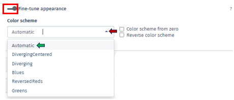
Each option in the Color Scheme tab of Fine-tune Appearance uniquely customizes the plot’s color palette, thereby aiding in the distinction of data clusters or patterns:
Automatic: Automatically selects the most suitable color scheme based on your dataset. It’s designed to provide a good balance of color contrast and visibility, making it easier to differentiate between various data points or clusters without manual adjustments.
Diverging Centered: Particularly ideal for datasets with a natural midpoint, such as zero. It uses contrasting colors on either side of this midpoint to accentuate differences in the data. For example, values above the midpoint might be colored in warm tones, while those below are in cool tones, emphasizing the divergence from the center.
Diverging: Similar to Diverging Centered, this scheme is used to represent data with distinct polarities yet lacks a defined center point. It employs two contrasting color sets to distinguish between two ranges or types of data, which is useful for visualizing datasets where a clear distinction is needed.
Blues: A monochromatic color scheme uses various shades of blue. It is effective for displaying data where the magnitude of a variable is more important than its polarity. Darker shades of blue can represent higher values, and lighter shades indicate lower values.
Reversed Reds: Inverses a typical red color scale and utilizes different shades of red, with lighter shades representing higher values and darker shades for lower values. It is particularly useful for datasets where lower values are more significant and need to stand out.
Greens: Similar to Blues scheme, uses shades of green to represent data. It is monochromatic and is used to signify the magnitude of values, with darker greens typically indicating higher values and lighter greens for lower values.
Additionally, within this tab, there are options for Color Scheme from Zero, which centers the color scheme around a zero value, useful for datasets with both positive and negative values, and Reverse Color Scheme, which inverses the color gradient, offering an alternative perspective for data interpretation. In this app, the total fold change of genes supporting enrichment in a gene set is visually indicated by the color of a dot on the plot. The color coding is derived by first calculating the sum (S) of log-fold changes of the genes, followed by a log-transformation: S→sign(S)log2(|S|+1). This method maintains the original sign of the sum and ensures that a zero value remains at zero. For manually inputted datasets, up-regulated and down-regulated genes are assigned a logFC of +1 and -1, respectively, to reflect their regulatory direction.
Clustering Options
Within the Enrichment Visualization app, clustering is an essential feature that becomes available alongside the 2D Plot tab. It involves the strategic categorization of data points with shared attributes into groups, facilitating the identification of genes or gene sets with similar expression patterns or functional behaviors, which is vital for nuanced biological insights.These clusters often indicate shared biological functions or pathways. The Clustering Options panel empowers users to initiate clustering through the Perform clustering button.
Users are presented with the ability to select their preferred method of clustering through the sophisticated Clustering Method Filter panel. This panel offers two distinct options:
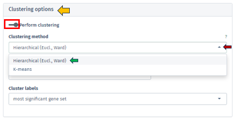
Hierarchical (Euclidean, Ward) clustering: This method thoroughly constructs a hierarchy of clusters, either by integrating smaller groups into larger clusters or segmenting larger clusters. It leverages Euclidean distance for assessing similarities alongside the Ward method to minimize variance within each cluster. This process is visually represented through a comprehensive dendrogram, elucidating intricate data relationships.
K-means Clustering: Functioning as a partitioning method, K-means effectively segments the data into a pre-set number of clusters. It is primarily focused on reducing variance within each cluster. This method necessitates an initial specification of the number of clusters, making it particularly adept for handling extensive datasets.
The app facilitates both automated and manual settings for cluster number determination. By clicking on the check box of the Automated option, the algorithm autonomously calculates the optimal number of clusters, employing techniques such as the elbow method or silhouette analysis, particularly in K-means clustering. Through the Number of Clusters tab, users have the flexibility to specify the cluster count, granting more personalized control over the analysis.
Additionally, the Cluster Labels feature offers varied labeling methods, each providing unique insights into the cluster’s characteristics:
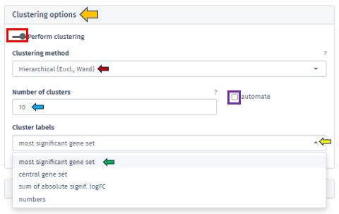
Most Significant Gene Set: Assigns labels based on the gene set with the highest statistical significance in each cluster, aiding in swiftly pinpointing critical biological processes or pathways.
Central Gene Set: Labels clusters using the gene set most representative of the cluster’s overall profile, which could be influenced by median expression levels or network centrality.
Sum of Absolute Significant logFC: Focuses on labeling clusters based on the sum of absolute log fold changes in gene expression, highlighting those with notable changes.
Numbers: Offers a straightforward approach by labeling each cluster with a unique number, simplifying the differentiation of clusters without delving into biological interpretations.
Barplot overview of enriched gene sets

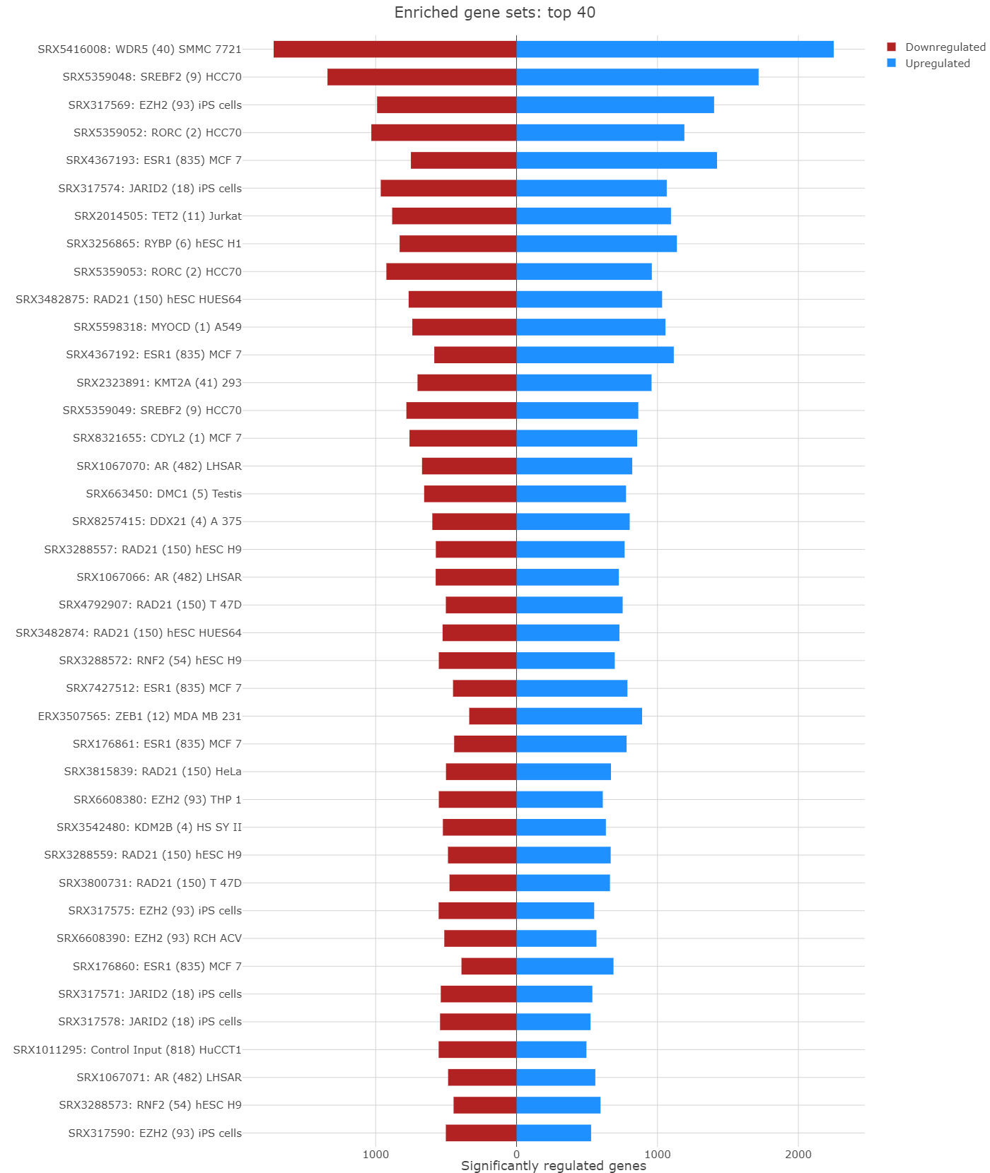
In the Enrichment Visualization application, the Barplot tab provides a detailed overview of gene regulation within enriched gene sets, which can be either the complete set or those specifically selected by user in the 2D Plot. This tab features comprehensive information, including gene set IDs and names, along with bars that represent the number of upregulated and downregulated genes contributing to each enrichment. When an analysis results in more than 40 gene sets, the Barplot tab prioritizes the top 40 for visualization. Customized barplots can be created by selecting desired gene sets either from the 2D Plot (using the shift key and mouse clicks) or from the Enriched Gene Sets EvoTable (using the control key and selecting the relevant rows), allowing users to focus on specific gene sets of interest in their analysis.
Enriched Gene Sets
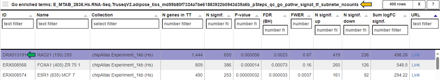
The EvoTable, prominently featured under the Enriched Gene Sets tab, provides a detailed summary of the enrichment analysis. The table’s first row serves as the header, delineating the categories for the presented dataset, with data filtration capabilities using the responsive filter bars below each header and data categorization via spinner control, located on the right side of the headers. Each gene set is distinctly identified by an ID and described by a Name, sourced from a specific Collection. N genes in TT, stands for Number of genes in the Total Target, tabulates the complete count of genes within each set, and N signif. enumerates those genes exhibiting significant expression changes. The P-value column offers the statistical significance, FDR (BH) applies the Benjamini-Hochberg procedure for controlling false discovery rate, and FWER (family-wise error rate) is the probability of making one or more false discoveries, or type I errors, when performing multiple hypotheses tests. The columns N signif. up and N signif. down respectively quantify the genes experiencing upregulation and downregulation, while Sum logFC signific. compiles the log fold changes, providing a quantitative measure of gene expression alterations. The URL links direct users to the QuickGO database, a web-based platform provided by the European Bioinformatics Institute (EBI). This platform offers detailed information about the specific Gene Ontology (GO) term referenced by the respective identifier, including its definition, associated biological processes, cellular components, molecular functions, and related annotations in various species. This resource helps users to understand the role of genes in complex biological systems.
Genes for the selected gene sets
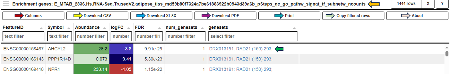
In the Genes for the selected gene sets tab, the application displays a table that gathers genes associated with gene sets chosen by users in their analysis and provides detailed insights into the involvement of each gene in the study.

This table includes general features like the Feature ID (Ensembl Gene ID) and the Symbol (gene’s standardized name). It incorporates the Abundance value, indicating the gene’s expression level within the dataset. The Abundance column is color-coded for intuitive interpretation. A darker green shade indicates higher gene abundance, signifying a more robust presence or higher expression level of the gene in the dataset. As the abundance decreases, the color lightens progressively towards white, visually representing a decrease in gene expression or presence. The LogFC (Log Fold Change) column represents the magnitude and direction of change in gene expression. Similar to Abundance, the LogFC values in the table are color-coded: higher values are shown in darker blue to indicate increased expression changes, shifting to white as values near zero for stability. Negative values are highlighted in red. The FDR column within the table applies a correction to the p-values, addressing the potential for false positives that arise through multiple testing. This visual coding allows users quickly identify genes with significant expression changes, facilitating efficient data interpretation and analysis. The num_genesets reflects the count of gene sets a particular gene is found in, and the genesets column lists the specific gene sets to which the gene is associated, with identifiers that link to the QuickGO database for in-depth gene set information. Users can refine this extensive dataset to display only the most relevant genes by utilizing the filtration options beneath each column header. This functionality enables a focused review of genes pertinent to the user’s research interests within the enrichment analysis framework.
Reports
This section offers two distinct types of downloadable report formats, addressing various user needs and preferences. The available reports are tailored to meet diverse requirements, whether for an interactive (Interactive reports), in-depth data examination or a straightforward, concise summary (Static reports) of the findings. Results are always reported for the latest completed analysis; i. e., even if some parameters have been changed after the completion but Perform Enrichment Analysis button has not yet been pressed, the latest changes will be implied in the results. Report preparation can take certain amount of time (up to minutes) and downloading will be automatically initiated as soon as the report is ready.
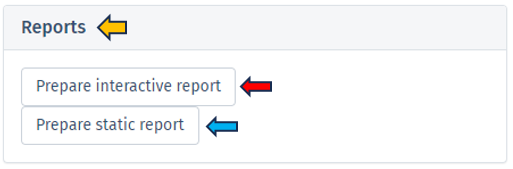
Interactive report
Selecting Prepare interactive reports provides a web-based interface for users to delve into their enrichment analysis results. This HTML report format is designed for an engaging data exploration experience (but without the capability of changing analysis parameters), guiding users through detailed analytical capabilities and emphasizing the role of the report in enhancing understanding of enrichment analysis results. Key features of the Interactive Report include:
Technical and session details: The report begins with essential technical details, including the date and time of report generation, session information, and package details used in the analysis, ensuring both traceability and reproducibility.
Additional package information: This segment offers comprehensive information about the software packages and tools utilized in the background computation of the enrichment analysis, crucial for ensuring reproducibility and grasping the applied methodologies.
Dataset: It presents a thorough overview of the dataset, detailing aspects like Differential expression filters, Gene set collections, and Enrichment thresholds, providing a complete understanding of the data parameters.
Embedding and visualization parameters: Included in the report are details about the embedding and visualization methods applied, shedding light on the analytical techniques used for data representation.
Interactive block of the report: This section showcases an interactive 2D plot where users can discern the extent and importance of each GO term’s enrichment by observing the hue and dimension of the dots. Additionally, it provides a responsive table listing GO terms complete with comprehensive statistics, reflecting the app’s capability for thorough data investigation.
Report focused on selected gene sets: Interactive features such as Barplots and Table of Selected Gene Sets offer dynamic visualization, enabling users to engage directly with the data for a more nuanced understanding of the results.
Genes associated with enriched sets: This section lists a wide range of genes linked to the enriched sets, along with their abundance, fold change, and significance, offering a detailed view of the gene-level impact.
Full list of enriched gene sets: Here, a detailed list of gene sets identified as significantly enriched in the analysis is provided, including key information like gene set identifiers, descriptions, and statistical measures of enrichment (e.g., p-values and FDR). This exhaustive list aids in comprehending the biological context of each gene set and identifying the most relevant biological pathways or functions uncovered by the analysis, serving as a vital tool for thorough biological interpretation and research.
Static report
The Static Report generated by clicking the Prepare static report offers a comprehensive and detailed summary of the enrichment analysis results in a user-friendly PDF format. This report is designed to provide a clear and concise overview of the findings in a non-interactive format, making it ideal for formal presentations, documentation, and archival purposes. The Static report encompasses all the principal features found in the Interactive report, except that it does not contain the Interactive block of the report section.
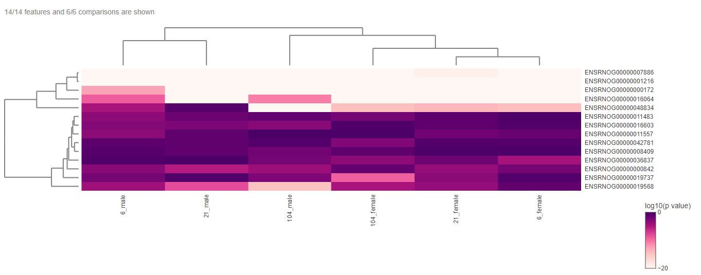
Comparison groups

This panel involves the comparison gene expression patterns between two or more groups of samples, such as samples from control and treated groups or distinct pathological conditions. In this type of analysis, the App utilizes a heatmap to visualize the overall gene expression patterns across the different samples, where each row denotes a distinct gene, and each column indicates a unique sample or group.
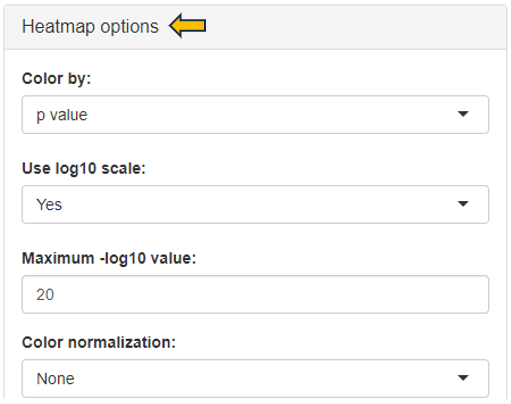
The heatmap can be edited according to the user’s interest with the help of the “Heatmap options”.
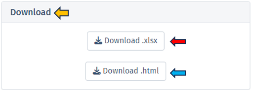
The heatmap data can be downloaded in different formats with the help of the “Download” option.
Workflow Overview
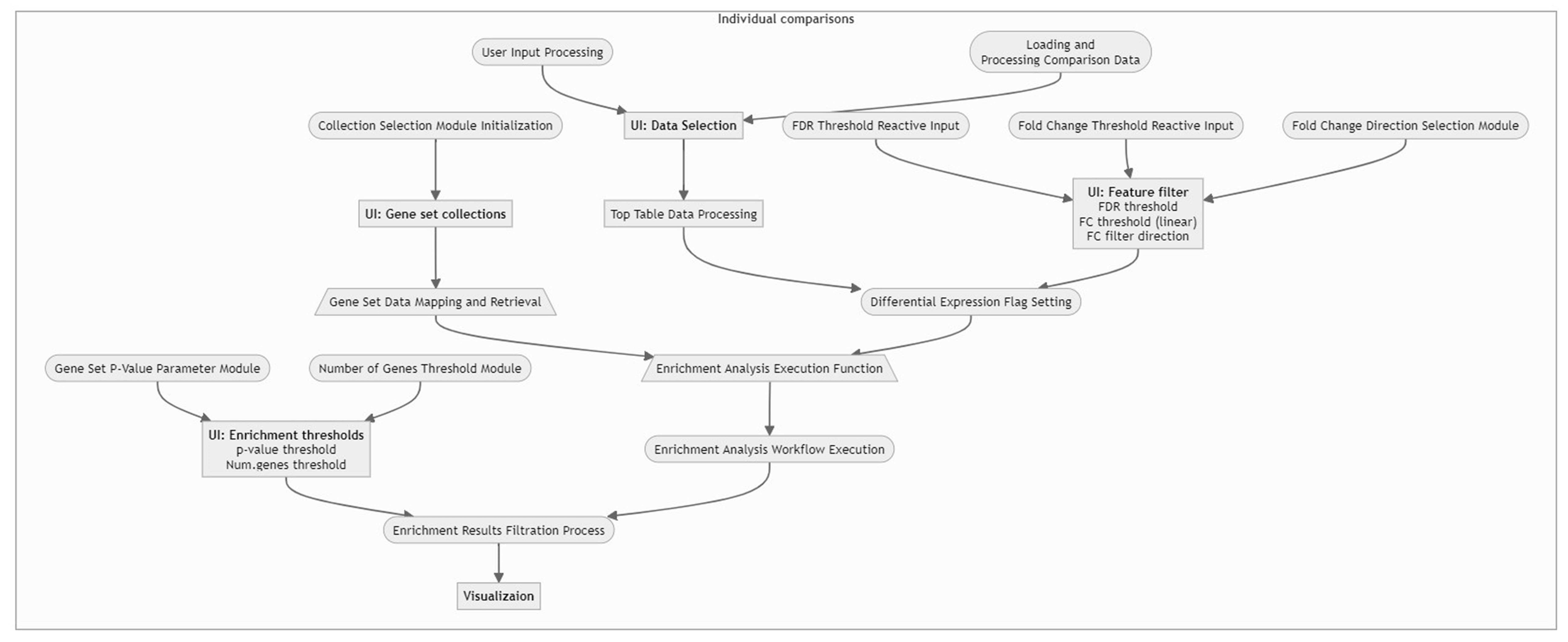
For a concise understanding or a quick insight into how the data is processed within our application, please refer to the following flow chart. This visual guide provides an overview of the workflow, illustrating the sequential steps and interactions from data input to final visualization. It is an excellent resource for grasping the app’s core functionalities and the interconnected processes that drive the analysis.
3 - Gene Clustering
The Gene Clustering app aims to identify co-expressed or co-regulated genes for a single selected gene. Initially, genes with similar expression profiles to the selected target gene and related samples are detected. These expression profiles are then hierarchically clustered in the second step. Finally, the clustering outcomes are visualized for genes with the most similar expression profiles compared to the target gene to allow for closer inspection.
Samples panel

In the first panel, samples which should be included in the clustering can be selected in the “Sample selector” on the left-hand side.

This panel shows a table consisting of the selected sample data.

Feature table panel

This panel summarizes information about the genes in a table. The feature of interest and the method of similarity calculation has to be selected in the “Feature Selection” section on the left-hand side. It allows to enter the gene symbol, gene ID, or Ensembl ID of the target gene and the available methods for Similarity Calculation are “Spearman Correlation”, “Pearson Correlation”, “Euclidean Distance” and “Manhattan Distance”.
You can give the feature list a name and description in the “Feature List Name” and “Feature List Description” panel respectively. By clicking the question mark next to the “Feature List Type”, you will get a list of accepted IDs. You can save the list with the help of “Save as Feature List” option.

The feature table contains the feature (e.g. gene) meta data, the values for the chosen Similarity method between each gene expression profile and the target gene. The false discovery rate (FDR) is given in case the similarity is either Spearman or Pearson Correlation and is found via a correlation test. By default, features are sorted from high to low according to the selected correlation or distance metric. The table is interactive and can be sorted, for example, according to positive or negative similarity by clicking on the respective column title “Similarity” one or two times. In case a correlation method is selected, the distance corresponds to 1 - the absolute Pearson correlation coefficient. This method is useful when searching for genes which are either positively or negatively correlated with the target gene.

Feature Heatmap panel

In the heatmap itself, color-coded expression profiles are displayed with each row corresponding to a gene and each column to a sample. Dark green color in the heatmap represents high relative expression, light green and white indicate low expression. Expression levels are normalized per gene (unit mean and variance). The target gene profile is shown in the top row. Neighboring genes (rows) or show the lowest distance or highest similarity.

For plotting the heatmap the method for clustering has to be specified. The genes can be clustered based on expression profile similarity using “Ward’s method (Ward.D2)”, “Average clustering” as well as “Complete clustering”. The number features to be plotted can be adjusted in the “Plot Options” section.

4 - Gene Comparison
The Gene Comparison app provides a heatmap visualization of average expression levels similar to the gene info app, but for multiple selected genes.
Feature Abundance

The text fields on the left-hand side are used to enter NCBI gene IDs, Ensembl IDs, or gene symbols. If the project comprises multiple species, the species of interest can be selected on the left-hand side using the Sample selector.
In case of a gene symbol, all selected species are searched. In case no species is selected, the default is used. You can also specify the species explicitly by adding the species code after the symbol separated by a blank. E.g. “abca1 hs” will find the human ABCA1 gene. Note that only genes which are present in the expression table can be found.
You can choose your feature list to only display the chosen features from the drop down menu under “Feature Selection”.

Using the “Group by” option, you can choose categories by which to group the expression data. Expression data will be averaged for each combination of chosen categories. Note that the order here (adjustable via drag & drop) also affects the order in which the categories are displayed in the plots / tables. If empty, the expression data will be grouped by ‘SampleID’, or in case of scRNA-Seq data by ‘Study’ and ‘scCluster’.

Table

The normalized feature abundance levels are averaged for the selected category values (for details about the interactive result table, see the description of the gene info app) and color-coded (dark green corresponds to high expression, light green or white to low expression).

Heatmap

Display as a heatmap of only the selected features from the feature list. You can edit the heatmap with the “Options” presented to you above the diagram. The expression heatmap can be downloaded in the excel format using the given download option.

You can also edit the colors used for the depiction of heatmap using the “Color settings” option near the diagram.

Barplots

This sub-panel allows the display of the expression data as a barplot.

Feature List

This panel provides a collection of features (e.g. genes or proteins) that can be used for further analysis. One can use the existing feature lists or create one’s own. You can create your own features list by adding features to this text panel.

It is also possible to access lists that have already been saved, with the help of the “Features selector”. One possibility is to use the “Collection option” in the drop-down.Type GO into the tab below to see all the saved predefined lists from “GO (Gene ontology resource)” feature lists. These lists can be modified with the help of the above shown text panel and saved again to form a custom Feature List.

Similarly, another option is to use “Wikipathways”. Type Wikipathways to see all available Feature Lists. It is also possible to combine different lists and save them as one single list.

Another possibility is to access the Feature List of significant features from an already saved “Comparisons option”. Click the tab (under the Comparisons option) to look for all saved Comparisons table.

As soon as you click the tab, the following table pops up for you to select the features from the “Comparisons Selector”. You can then select from the various options available from both “Single Comparisons” tab and “Comparisons from Groups” tab. You can also search for the desired study or geneID in the given search box.


By clicking the question mark next to the “Feature List Type”, you will get a list of accepted IDs.You can then give the feature list a name and description in the “Feature List Name” and “Feature List Description” panel respectively, and save it to make it available to other apps.

5 - Gene Info
The Gene Info app provides all available information on a single gene or feature of interest.
Important!! Do not use the expression values in the Gene Info app to calculate fold changes of transcriptomic data!! (see details in the Results panel)
After opening the app, specify the study and samples of interest using the Sample Selector (Introduction to the Sample Selector) and the target gene or feature by searching the NCBI gene ID, symbol, or Ensembl ID in the Target gene or feature drop-down menu. Samples marked as excluded can be shown by checking the Show excluded samples box.

Results panel

The first panel displays a Summary - Abundance table showing the metadata of the selected samples and the Mean and standard deviation SD of the target gene or feature. The column name also indicates the data type (norm, lognorm or log) that has been used for calculating the mean and standard deviation. Each row corresponds to one of the combinations of categorical variables, and the Sample Count column shows the number of samples grouped together. The Mean column is color-coded, with dark green corresponding to high and light green/white color corresponding to low expression/intensity levels.
For example, 4 samples of brain tissue from 6-week-old female rats are grouped in the third row shown below. The samples show high expression levels of the target gene, with an average abundance of 70.75 counts per million (CPM).

The displayed default expression / abundance values of data from different sequencing platforms are as follows:
- Transcriptomics:
- Bulk RNA-seq and Pseudobulk RNA-seq: Normalized counts in counts per million (CPM)
- ScreenSeq: Normalized counts in counts per 10,000 (CP10,000)
- Proteomics: Log-normalized protein group intensity
The transcriptomic data shown here are normalized only for sequencing depth, but not for gene length or batch effects, and should be used for exploratory purposes only, not for calculating fold changes (FCs). To perform an accurate comparative analysis between samples, use the New Comparison app to set up a differential analysis and the Comparisons app (formerly Top Tables app) to examine the results and link to downstream analyses.
The proteomics lognorm data is both normalized and batch-corrected (if batch-correction was carried out), batch-correction should not be used for calculating FC using limma, since limma is applying an built-in batch-correction. The proteomics log data is only normalized and corresponds to the data used for FC calculation in the New Comparison app.
The by default used data types are mentioned above. Still, it can be of interest to use a different data type in the summary table or the expression plot. This can be achieved by the checkbox Use log normalized data. For transcriptomics and specific proteomics protocols (Olink, Somascan and Batch), this switches from normalized to log normalized data. For all other proteomics protocols it switches the underlying data between batch-corrected and non-batch-corrected data, but it stays in the logarithmized space.
Like other tables in PanHunter, this one is also interactive. The rows can be sorted by a selected column by clicking on the column header. The sorting order can be changed from ascending to descending with another click. The width of individual columns can be changed by left-clicking on a column divider and dragging the mouse.
Clicking the tribar symbol ≡ next to the table title provides additional column settings and options for downloading and copying the table. Columns can be shown or hidden using the checkboxes in the Columns drop-down menu. The order of the columns can be changed by dragging values in the Columns drop-down menu or dragging the column headers of the table. For more details, see the Table-Filter website.


Categories can be completely removed from the visualization using the Drop factors option on the left side. In this case, the selected category would not be considered in any calculation.

Graphic panel

This panel visualizes the expression levels of the target gene or feature from the selected samples in a plot.
Several options are available to customize the plot, as described below. An additional sorting option is available after selecting a variable in any of the fields.
- Split to plots by: select a variable for which to split into separate plots.
- X axis variable: select a variable to group the data on the X axis.
- Fill variable: select a variable to color the plot.
- X axis facet variable: select a variable for which to divide into sub-plots along the X axis.
- Y axis facet variable: select a variable for which to divide into sub-plots along the Y axis.
Change to another plot type by selecting the available options in Type as shown below. PanHunter offers further customization options, such as changing the Font size and Point size, deciding whether to Show labels, Free X axis, Free Y axis and Zoom plot. The underlying data type for the plots can be changed in the General Options panel

The following bar graph shows the expression levels of an example gene. Sex is used as the X axis variable, Study is selected as the Fill variable, Age is selected as the Y axis facet variable. Tissue is removed from consideration using the Drop factors drop-down menu. The plot is in CPM values and the Log scale box is unchecked. The plot can be downloaded in various formats using the download options below the graph.

Metadata panel

This panel provides a Metadata table with all available meta information for the selected gene or feature and additional hyperlinks to external resources such as Ensembl, GO, Pfam, GWAS and BioGrid databases.

6 - MA Plot
The MA Plot app is used to visualize and inspect the log fold changes (M) vs. average expression levels of the contrast denominator (A) for genes from two Comparisons (refer TopTables app). In many scenarios, genes showing a high log fold change in combination with a high expression level are of particular interest, especially if found with the same direction of expression-change in multiple comparisons.
The two selection menus on the top of the app allow to select the Comparisons of interest. For each Comparison, a FDR threshold determines the genes which are considered as significantly differentially expressed.
Only the features that are significantly expressed (in accordance with the chosen FDR threshold) are displayed in the plots tab. There are, however, exceptions to this general rule that only features passing the FDR threshold are displayed. Non-significant features are displayed if they were matched with a significant feature in the other selected comparison. Let’s look at an example: In the table below we are looking at 2 features that were matched in the 2 selected volcano plots. Feature 1 is displayed in volcano plot 1 and feature 2 in volcano plot 2. The feature px1 is displayed although it is not significant because it is matched to feature px1-1 from the 2nd comparison. Feature px1-2 on the other hand is not displayed, although matched to px1. Since both px1 and px1-2 are not significant px1-2 is not displayed. Px1 is displayed not because of the match with px1-2 but the match with the significant feature px1-1.
| Display Feature 1 | Display Feature 2 | ID feature 1 | Significance feature 1 | featureID 2 | Significance feature 2 |
|---|---|---|---|---|---|
| Yes | Yes | px1 | No | px1-1 | Yes |
| Yes | No | px1 | No | px1-2 | No |
Changing the FDR threshold for one volcano can thus change which features are displayed in both volcanos, if a previously non-displayed feature is now matched with a feature that just became significant by changing the threshold.

Below the selection menus, a short list of differences in terms of settings between the two selected Comparisons is given.
The main part of the app comprises a direct comparison of the Comparisons settings/recipe (tab “Metadata table”), the “Plots”, and a table containing the CPM, logFC, and FDR per gene and Comparison (tab “Gene table”) along with a “Detailed plot” tab.
Metadata table

The “Metadata table” allows for a direct comparison of similarities and differences between the Comparisons in terms of recipe. This tables lists all selection criteria as well as the test formula and the contrast numerator and denominator. Differences in the recipe between the Comparisons, are highlighted in bold red font.

Plots

The MA plots for both Comparisons are displayed in the “Plots” tab. The x-axis shows the log2 fold changes, the y-axis the log2 expression levels (i.e., log2-CPM), respectively. For each gene considered significantly differentially expressed in any of the Comparisons, a point is shown in each of the plots at the position determined by the left or right Comparison respectively.

Gene table

The gene table tab gives a table comprising all genes with CPM, log2-fold change and log10-FDR for each of the Comparisons. Additionally, it reports a Meta-p-Value calculated using Fisher’s method. Important: In many cases, the assumptions of Fisher’s method are not valid for combining p-values from two Comparisons. Therefore, the p-value should not be considered as statistically solid but for sorting/ranking the gene list only!

Detailed plot

The “Detailed plot” tab gives additional information about the abundance distribution across the contrast factor.

On the left, a MA plot for the first Comparison is shown. By selecting a single feature in the plot or in the dropdown menu a detailed plot is shown on the right. For the selected feature the log-expression is plotted over the categories of the contrast factor. This gives an overview, what is driving the fold-change in the Comparison. Additional cofactors are reported in the hovering.
Please keep in mind that Detailed plot is not available for comparisons computed with scExplorer app and custom uploaded comparisons computed outside of PanHunter.

Exemplary MA plot for two Comparisons. The “Sig Down” genes from the right plot were selected and this selection is propagated to the left plot. Many genes which are down-regulated in the right Comparison seem to be up-regulated in the left Comparison.
The app features interactive selecting and deselecting of genes. Each point in the MA plots can be selected and this selection is propagated to the other plot and the gene table. These selections are transparent for the complete app, i.e., you can select all significantly upregulated genes in one plot and combine them with the ones significantly upregulated in the other plot.
For more information about the matching of features between proteomics or peptidomics comparisons, please see the Algorithms section.
Finally, a list of selected genes can be downloaded using the “Download” button in the top-right side of the interface.

7 - Network Visualization
The network visualization app provides an interactive visualization of top table genes in the context of gene and protein interaction networks. For this purpose, the BioGRID database is used.
Comparison selector
To initiate the analysis, the user is required to first select a specific comparison or dataset. This is done with the help of the “Comparison” box located prominently at the top of the app. Upon clicking this search box, the “Comparison Selector” window will open. Here, users are presented with a range of available comparisons to choose from. By navigating through this panel, they can select the desired comparison for their analysis.

To accurately focus on the most relevant comparison for analysis, users can utilize various elements in the comparison table such as:
-
the elements related to the study; ID (categorized by studies), Study, Platform,Protocol
-
the elements related to the samples; Species, Name, Tissue, Subtype, Age, Sex, Ethnicity, Cell type
-
technical elements; scCluster, Technical batch, FDR Cut-off, LogFC cut-off, Formula, Contrast Factor, Contrast Numerator, Contrast Denominator, Formula Terms, Name, Tissue, Subtype
Once the desired dataset has been obtained by applying the appropriate filters, the user is required to select the dataset by clicking on it, followed by clicking on the “Select” button located at the top right corner of the “Comparison Selector” panel.
Users can also simply type the name of the desired dataset into the “Search” bar located above the table. The search feature will then narrow down the displayed results, enhancing efficiency in finding the desired dataset.
To generate a comprehensive network, users must specify additional details. This can be accomplished through “Network Selection” and “Feature Selection” panels on the app’s left side. Collectively, these panels contribute to the customization and refinement of the network generation process.

Network Selection

Network Database
This feature allows users to select the specific database from which they wish to extract their network data. Currently, the selection is exclusively limited to the BioGRID database, a comprehensive resource for biological interaction data.
Network Species
Users must specify the species whose network will serve as the reference point. It is important to note that the human reference network generally offers more detail compared to other species. Therefore, in scenarios where the top table data pertains to a species other than humans, the genes are mapped to their human orthologs, where feasible. Users should be aware that orthologous genes may have different symbols across different species.
Steps
Through this parameter, users have the ability to adjust the size of the displayed network. This parameter is crucial for controlling the expansion of the network from the selected genes of interest, with the number of steps corresponding to the amount of nodes added to the subnetwork. Setting the steps to ‘0’ focuses the network exclusively on interactions between the selected genes, omitting additional nodes and thus providing a concise view of direct interactions, ideal for examining precalculated subnetworks or specific gene interactions. It is advisable to commence with a lower number of steps to manage the network’s size and complexity.
Feature selection
The Feature Selection panel empowers users to make specific choices about the genes or features they wish to include or emphasize in their network analysis. This selection process is integral as it precisely defines the scope and focus of the network visualization, thereby guiding the direction of the analysis.

Feature Selection Type
In this panel, users have the option to specify their preferred feature type from a dropdown menu. The selection criteria for genes of interest can vary, encompassing options such as a single target gene, genes within a regulated subnetwork, or the first N top genes as identified in the selected top table.
-
Manual: Users can manually input target genes to search for corresponding interactions within the network. It is important to note that orthologous genes might have varying symbols across different species, a factor that users should consider during manual entry.
-
Subnetwork: This option allows users to choose from pre-extracted subnetworks, which are part of the top table’s post-processing. Regulated subnetworks are determined using the algorithm proposed by Breitling et al. 2004 during the creation of a new top table in the New Comparison app. These subnetworks are then named based on the central seed gene and the number of genes they cover. These subnetworks are identified by the symbol of the central gene and the count of encompassed genes, providing a focused view of specific gene interactions.
-
Top Features: In cases where no specific target genes or subnetworks are identified, the application defaults to using the most significant genes, referred to as top features.
-
The “Number of top features” setting enables users to define the extent of top features they wish to include in their analysis, allowing for a customizable approach in exploring the most impactful genes.
Upon selecting the desired species and identifying specific genes of interest, this application generates and visualizes a comprehensive network that encapsulates and interconnects these genes. This visualization is informative and interactive, enhancing the user’s analytical experience.
Additional Parameters
This app provides users with a more nuanced and customizable experience in network analysis through the “Additional Parameters” panel. This panel offers a suite of options for refining and enhancing the network visualization, each tailored to specific aspects of the network:

Add Shortest Paths Between Targets
This feature, when activated, includes all genes that lie on the shortest paths between the target or top genes within the network. It ensures a comprehensive view of the gene interactions and pathways. This option is not applicable if a subnetwork has been pre-selected.
Hide Unregulated Features
Provides users with an option to hide unregulated genes in the visualization. When this option is activated, only nodes corresponding to genes that meet specific criteria are displayed. Specifically, those with an absolute log fold change more significant than the specified minimum logFC value and a false discovery rate below the maximum FDR threshold. However, it is essential to note that unregulated genes bridging the gap between genes of interest and regulated genes will still be shown to maintain the integrity of the network’s structure.
Hide Features
Allows users to address the challenge of graph clutter caused by genes that interact with an excessively high number of other genes. Users can input a list of gene symbols (separated by spaces or commas) to exclude these high-interaction genes, thereby simplifying the network for clearer analysis.
Hub Feature Limit
To avoid overwhelming the network with hub features that have numerous interactions, this setting enables users to set a limit on the number of interactions a hub feature can have. Unregulated hub features that are not part of the Feature Selection can be removed if they exceed this limit. Setting this to 0 implies that no hub features will be removed.
Max Features
This feature allows users to set a limit on the number of genes visualized in the network. The application will prioritize the removal of features based on their distance to the target/top features, as well as their FDR and logFC values. Features that are more distant, less significant, and less strongly regulated will be removed first.
Each of these options in the Additional Parameters panel is designed to give users greater control over their network visualization, enabling them to tailor the network to their specific research questions and preferences.
Upon configuring the various criteria in this panel, which can be done through manual input, selection from a dropdown menu, or by utilizing the spinner control buttons, users can initiate the application of these changes by pressing the “Recalculate” button. This action prompts the application to integrate the newly set parameters into the displayed network. The implementation is designed to be efficient and precise, ensuring that the network visualization is promptly updated to reflect the adjusted settings. In instances where genes cannot be mapped to the reference network or become disconnected from other genes after applying these filters, they will not be included in the display. This ensures that the visualization remains relevant and focuses on the most pertinent gene interactions.
Network Representation
-
In the visualized network in the app’s main tab, each gene is depicted as a circle, known as a node. To emphasize the genes of primary interest, comparatively larger circles represent these.
-
The color filling of each node corresponds to the log fold change value associated with that gene, with blue indicating up-regulation and red signifying down-regulation. This color coding provides an immediate visual cue regarding the expression status of each gene.
Interactivity and Navigation
-
Users can interact with the network by rearranging the nodes. This is achieved by pressing the left mouse button on a node and dragging it to a preferred location. The network’s structure will automatically adapt to these changes.
-
A single left-click on any node will highlight it and all its directly connected nodes, making it easier to focus on specific gene interactions. A second click reverts the view to the entire network.
-
Right-clicking on a node reveals a popup field that offers additional information about the gene, such as a direct link to the Gene Info app, enriching the user’s understanding with detailed gene data. A second right-click will close this popup.

- The network can be zoomed in and out using the mouse wheel, enabling users to adjust their view for a more detailed or broader perspective.
Users can download their customized network directly from our application using the “Download Network” button at the network display’s top right corner. Upon clicking this button, the application generates a web-based file encompassing the network in an interactive format. This functionality allows users to save their work for future reference and engage with the network offline in a dynamic and user-interactive manner.

8 - New Comparison
The New Comparison app is used to explore the variability between samples or features, and to create Comparisons (formerly Top Tables) to identify differentially expressed genes between different groups of samples (e.g. different treatments, tissues, ages, etc.). The results of the Comparisons and the parameters used are stored in the Comparisons app (formerly Top Tables app).
Studies Overview panel

The first panel displays a Study Overview table, which summarizes both the technical information and the sample meta information of all available studies in the project.
Like other tables in PanHunter, this one is also interactive. The rows can be sorted by a selected column by clicking on the column header. The sorting order can be changed from ascending to descending with another click. The width of individual columns can be changed by left-clicking on a column divider and dragging the mouse.
Clicking the tribar symbol ≡ next to the table title provides additional column settings and options for downloading and copying the table. Columns can be shown or hidden using the checkboxes in the Columns drop-down menu. The order of the columns can be changed by dragging values in the Columns drop-down menu or by dragging the table column headers. For more details, see the Table-Filter website.
After opening the app and identifying the study and samples of interest in the Study Overview table, use the Sample Selector to specify them (Introduction to the Sample Selector). The specified studies and samples will be highlighted in bold in the table.
Feature Selection panel

This panel visualizes and ranks the variance of the features (genes or proteins) in this study.
For each feature, the variance of the values is calculated and displayed. By default, PanHunter uses the Expression values for this calculation, i.e. to calculate the dimension reduction, and displays the 500 features with the highest variance. The expression value from different sequencing platforms are as follows:
- Transcriptomics:
- Bulk RNA-seq and Pseudobulk RNA-seq: log-normalized counts in counts per million (log-CPM)
- ScreenSeq: log-normalized counts in counts per 10,000 (log-CP10,000)
- Proteomics: log-normalized protein group intensities
The data used for this calculation and the number of features displayed in the graph can be set in the Dimension Reduction section on the left:
- Data for dimension reduction: a drop-down menu with four options described below
- Precalculated Dimension Reduction: select a dimension reduction plot precalculated and saved in PanHunter
- Expression: select the expression value as described above to calculate the dimension reduction
- Comparison analysis (logFC) or Comparison analysis (PI-score): select a precalculated comparison group in the study. The feature variance is calculated based on the log fold change (logFC) or based on the PI-score, which combines information from the FC and the p-value. The percent coverage indicates the number of features covered by the selected comparison group.
- Set number of features: a slider is available to activate this setting
All features used for dimension reduction can be downloaded by clicking Download feature list (XLSX).

Sample Clustering panel

This panel presents a 2D scatter plot of the selected samples, which provides an overview of their similarity based on their feature expression profiles, i.e., transcriptome or proteome.
As feature expression profiles are highly dimensional data, dimension reduction is typically applied to reduce the dimensionalities and visualize the data in a 2D dimension reduction plot. By default, PanHunter uses principal component analysis (PCA) to generate the dimension reduction plot. Each dot represents one sample. Samples with similar expression profiles cluster closely together, while samples with larger differences in their feature expression profiles are further apart in the plot. Excluded samples are not plotted unless Show excluded samples is checked in the Sample Selector.
Like other plots in PanHunter, the 2D dimension reduction plot is also interactive. There are several ways to interact with the plot, as described below:
- Display sample information: move the mouse key over the sample dot
- Adjust the zoom level: move the mouse wheel
- Reposition the plot: click the left mouse button and drag the plot
- Reset to original zoom level and position: double-click the left mouse button in an empty area of the plot
- Select sample dot(s): click the left mouse button on the dot, click the left mouse button on the annotation legend, or click the right mouse button and drag around the sample dots of interest to activate the lasso tool
- Add new sample dots to the existing selection: select the new sample dots while holding down the Shift key
- Cancel all selection: click the left mouse button in an empty area of the plot
The dimension reduction plot can be downloaded as a PNG image with a transparent background using the Export Image button, making it easy to integrate into presentations with customized slide backgrounds.
PanHunter provides additional methods, such as t-SNE and UMAP, to calculate the dimension reduction. Selecting the method, fine-tuning the parameters and saving the coordinates in PanHunter are available in the Dimension Reduction section on the left.
Plot Options on the left offers several options for customizing the plot. Drop-down menus are available to select which attribute to apply as Color, Symnol, Symbol Size and Text Label. Additional settings are provided to Set point and font size, Set plot size, Show grids on dimension reduction plot and change the Number of legend columns.

The following figure shows an example PCA plot using the Yu2014 study of the Body Map project in PanHunter. Here, Tissue is used as Color, Sex as Symbol. Samples of the same tissue type form distinct clusters, with no clear separation between female and male rat samples.

The Sample Annotations section allows users to create and save custom annotations. This section is available after an Enrich modifier for Custom annotations is added to the Sample Selector (Introduction to the Sample Selector). An Existing annotation key (i.e. the unique ID for a set of annotations) created by project users can be selected, deleted or duplicated using the drop-down menu. To create a new set of annotations, enter a string of characters as the Annotation key, select the samples to be annotated in the dimension reduction plot, name the selected samples by entering an Annotation value and click Set current annotation to save it temporarily. When all samples of interest are annotated, click Save annotation permanently to save the annotation in PanHunter and to be able to reload it as an Existing annotation key.
PanHunter provides a powerful feature called Exploratory Analysis to facilitate data exploration. By default, PanHunter analyzes the coordinates of the Current 2D plot and matches them to the sample metadata to find the highly correlated categorical or numerical variables when clicking Analyze Categories or Analyze Numerics. Similarly, the feature expression profiles that are most highly correlated with the coordinates are identified when clicking Analyze Features. For general description of the exploratory analysis calculation description, please see Exploratory analysis under Algorithms section.
The Coordinates to analyze option indicates which values for each sample will be submitted to the analysis:
-
Current 2Dplot - the x and the y coordinates of the currently displayed plot are used. This is the default setting in PanHunter.
-
Top Features and All Features - the abundance values of either the top variable features (number is set under Dimension Reduction tab) or all features are used.
NA as a class is only relevant in case Analyze Categories is performed. It decides whether samples with NA in the analyzed category are included or not.
-
If you want to exclude samples with NA value for given categories, select No. This is the default setting in PanHunter.
-
If you want to include samples with NA value for given categories, select Yes.
Minimum span is only relevant in case Analyze Features is performed. This setting checks whether the span (the difference between the 90% and the 10% quantile) is greater than or equal to the specified threshold. If that is not the case, the feature is discarded from the analysis. Thus, the noise coming from features with low variability can be eliminated.
Features NA values to zero checkbox is only relevant in case Analyze Features is performed. If it is checked, all NAs in the feature are replaced by zeros. Otherwise, the NAs are retained and the feature is skipped.
An overview table of the highly correlated categories, numerics or features is displayed below the dimension reduction plot.
Important!! The Exploratory Analysis should be used for exploratory purposes only. To perform an accurate differential analysis, use the New Comparison panel in this app to set up a differential analysis and the Comparisons app (formerly Top Tables app) to examine the results and link to downstream analyses.
Density Curves panel

This panel visualizes the feature density, i.e. the relative number of genes or proteins, versus expression levels in the selected sample. Each curve represents a single sample. The color and symbol settings are the same as for the dimension reduction plot. The x-axis corresponds to logarithmic expression levels and the y-axis shows the density of genes or proteins associated with that expression level.
 .
.
Again, the density plot is interactive like other plots in PanHunter. See the ways to interact with the plot described in the Sample Clustering panel of the app.
Check Outliers panel
If some samples are suspected to be outliers based on the dimension reduction plot or density curves, this panel provides a quick way to check the top features (genes or proteins) responsible for the observed difference.
After selecting the suspected outliers in the dimension reduction plot in the Sample Clustering panel, click the Insert plot selection button to add them to Group A, similarly add the other samples to be compared to Group B, and start the comparison by clicking Compare samples.

The result is displayed in the Custom outlier table, including a list of the top features with high absolute fold changes between the two sample groups. The result may explain the observed difference, e.g. due to activated inflammation or contamination by other tissues, and allows an informed decision whether to exclude the suspected outliers from further analysis.
Important!! This quick comparison should not be considered as a precise statistical analysis or the result of a differential analysis. To perform an accurate differential analysis, use the New Comparison panel in this app to set up a differential analysis and the Comparisons app (formerly Top Tables app) to examine the results and link to downstream analyses.
Selected Samples panel

This panel displays detailed information about the selected samples in the interactive Sample Metadata table. Clicking on the Sample IDs takes you to the Sample QC app.

For RNA-Seq studies, the align Params table is displayed below that lists important parameters used during data preprocessing. The Aligner, GenomeFastaFile, and GenomeGTFFile columns show the version of the alignment program, the reference sequence file, and the gene annotation file used for read counting, respectively.

These parameters should normally be identical for all samples within a study. If there are differences, PanHunter will issue a warning. In this case, it may be advisable to re-align the sequence data.
New Comparison panel

This panel allows the configuration and creation of new comparisons.
To help you create a comparison, PanHunter provides an overview of the selected samples in a table with the number of samples in each category combination in the Freq column. The columns that are displayed can be easily removed from consideration by using the drop-down menu below the Remove columns option. Both the sample table and the abundance data can be downloaded from the Download data section on the right.
Once the groups of samples to be compared are identified, a formula indicating the factor used to create the comparison has to be specified. Here, the formula is case sensitive.
- For a single factor, the formula is a ~ sign followed by the name of the factor, e.g. “~Treatment” as a formula to compare samples with different treatments.
- For multiple factors, the formula is a ~ sign followed by the names combined with + signs, e.g. “~Tissue+Age+Sex” as a formula to compare samples with different tissues, ages, and sexes.
The advantage of using multiple factors in the formula for a complex study is that interaction terms can be included in the differential analysis. These terms are used to model the effect of interactions between different factors. For example, the formula “~Tissue+Age+Sex” can be used to identify features that are differentially expressed in the kidneys of male and female samples only at a specific age.

After entering the formula, drop-down menus are available to select the Contrast factor, the Numerator (e.g. Treatment) and the Denominator (e.g. Control). Additional settings to filter samples for the specific comparison and to select the statistical method and filter features can be configured by activating the Comparison-based sample filtration and Method and feature filtration sliders. By default, PanHunter uses DESeq2 for statistical analysis of transcriptomics data and limma for proteomics data (further details about the DESeq2 and limma).
The calculation of the defined comparison can be started by clicking the Calculate button. A custom name can be entered under Comparison name to name the newly calculated comparison. Additional options are available to configure the comparison here, including adjusting the FDR cutoff and logFC cutoff, and deselecting subsequent Post-processing steps. All existing post-processing steps are performed by PanHunter by default.

When the calculation is complete, an interactive Comparison Preview table with the top differentially expressed features (genes or proteins) is displayed in the Table View sub-panel. The Abundance and logFC columns are colored to visualize the magnitude of the values. The result can be explored using volcano and MA plots in the Plots sub-panel. The complete comparison result can be saved in the Comparisons app (formerly Top Tables app) by clicking the Save table button.

9 - Pathway Visualization
The Pathway Mapping app has been meticulously designed to facilitate the visualization and comparative analysis of gene fold change values. This analysis can be conducted using data derived from either one or two comparisons, as integrated with the Top Tables app. This app operates within the framework of organism-specific pathway maps, leveraging the capabilities of the WikiPathways platform.
Users have the flexibility to select one or two comparisons through the Primary Data Selection and Secondary Data Selection (optional) panels.
Primary Data Selection

Users can select a comparison with the help of Comparison 1 search bar, which opens the Comparison Selector table. This selector displays a list of available studies for selection. Refer Comparison selector for this process.
After selecting the comparison, users can advance to select a specific pathway. This selection is facilitated by the Select Pathway filter bar. A comprehensive list of pathways corresponding to the chosen study is accessible via a dropdown menu in this filter bar.
To refine the pathway selection, additional filters can be accessed by toggling the Filter pathways option located beneath the Select pathway bar.
These additional filters include:
Pathway collection: This filter is currently exclusive to WikiPathways, providing users with a diverse and well-curated range of pathways for detailed analysis.
Species: Tailoring the analysis further, users can select from various species related to their study, enabling focused pathway visualization for the chosen species.
Although WikiPathways provides comprehensive pathway maps for various species, the coverage beyond humans, mice, and rats is limited. Our application bridges this gap by facilitating the mapping of fold change values onto pathway graphs for a wide range of species. The Species control feature within the app allows users to select the relevant species for their pathway map, making it possible to carry out a versatile and comparative analysis even when primary tables originate from different species.
Feature: This option allows users to select specific genes or features involved in pathways. The pathways listed in the dropdown menu of the Select pathway panel will then display only those pathways that include the chosen gene or feature, ensuring a targeted and efficient selection process.
The Pathway Mapping application has a selection process that results in a dual-panel display of outcomes. When a specific gene is picked, the application automatically narrows down the pathway options to only those pathways that are associated with that gene.
In the application, the following error message will be displayed at the top of the page if a selected gene or feature is not present in the chosen pathway or if the pathway is not associated with the desired gene or feature:

Secondary data selection (optional)

Users can utilize the Secondary Data Selection (optional) panel to incorporate a secondary study into their analysis. By clicking on the Comparison 2 search bar, the application presents a Comparison selector table similar to that used for the Comparison 1 under Primary Data Selection. Please refer to the Primary Data Selection for detailed guidance on utilizing the comparison selector. Using a secondary study enables users to include and compare data from an additional study or dataset to the primary one. This feature will allow users to simultaneously analyze and visualize pathways from two studies, facilitating comparative analysis. Users can compare various aspects of pathways, such as the expression levels of genes, fold changes, or other relevant metrics across the two studies. The results of this selection process are then displayed in a dual-panel format.
Pathway Color Options

In this application, users are provided with the tools to intricately fine-tune their pathway maps, thereby enabling a deeper and more insightful analysis. This level of customization is achievable through the use of the Pathway Color Options panel, which is divided into two primary sections:
Highlighting Specific Genes or Features
Features to highlight panel, offers various methods for filtering and highlighting specific genes or features. Users can access these methods from the dropdown menu within the Features to highlight filter bar. The options include:
Manual Autocomplete
Allows users to manually enter the names of genes or features they want to highlight on their pathway map. Once the user applies their input by pressing the Apply button, the chosen features are visually marked with a green border around their corresponding boxes on the map.
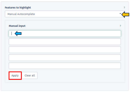
Manual Freetext
This option permits the direct input of Feature IDs into a text box. Users can separate multiple Feature IDs using whitespace or by starting a new line, providing a flexible approach to data entry.
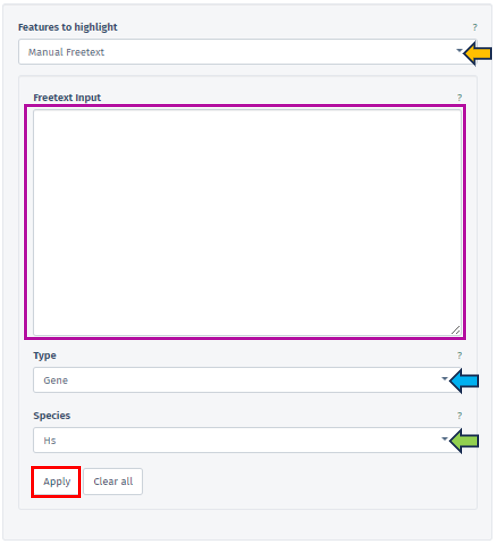
In this panel, users are provided with the ability to specify the type of their input data precisely facilitated through the Type filter bar covering various feature types, including Gene, Protein, Transcript, microRNA, and SNP. The accepted Feature IDs for each type are as follows:
-
Gene: Includes NCBI GeneIDs, Ensembl IDs, or Gene Symbols.
-
Protein: Accepts Uniprot IDs.
-
Transcript: Uses Ensembl Transcript IDs.
-
microRNA: Employs miRBase IDs.
-
SNP: Encompasses rsIDs or positional IDs.
The availability of these types depends on the Sample Selection; for instance, microRNA IDs are available solely for microRNA-Seq studies.
The species related to the entered feature IDs can also be specified by the user using the Species tab. One of the key functions of this tab is the capability to map Feature IDs between different species, thereby enabling cross-species comparative analysis.
Custom Feature List
Users have the option to choose from a variety of custom feature lists based on the current sample selection. The Refresh button is a convenient tool to update available lists and the current selection.
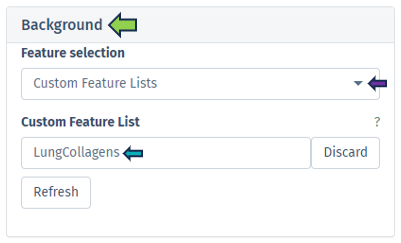
Feature List Collection
In this section, users can select their preferred feature collection through the Feature Collection input filter. This filter offers choices for the dataset collections of genes or features. Below this, another tab allows the selection of different gene set collections, such as GO CC, GO BP, and etc, facilitating an analysis that is specifically tailored to certain biological processes or functions.
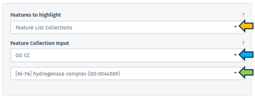
Enhanced Visualization through FDR and logFC Thresholds
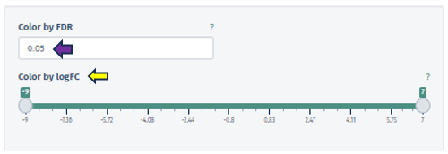
Color by FDR
In this panel, users are equipped with the capability to precisely input or adjust the FDR value, which is a key parameter in statistical analysis. This can be done either by directly entering a specific FDR value or utilizing the spinner control for incremental adjustments. Altering the FDR value has a direct impact on the visual representation of the pathway map: it changes the color gradient of the boxes corresponding to different pathway nodes, thereby visually delineating the statistical significance of each feature.
Color by logFC
This option features a scrollbar for setting the logFC value from -4 to 3. The chosen logFC value alters the color of the pathway boxes to indicate gene regulation status. A critical aspect of this feature is that pathway nodes are colored only if their respective logFC values fall within the user-selected range. The color scale itself is dynamic and shifts based on the minimum and maximum values set by the user.
The application employs a color scheme to represent varying ranges of logFC values: When the selected range includes both positive and negative values, a red-white-blue color scheme is utilized. This scheme is designed such that the extremities of the color scale are determined by the maximum absolute value within the selected range. This provides a balanced visual representation of both upregulated (red) and downregulated (blue) features, with white indicating neutrality.
In cases where only positive or only negative values are present within the selected range, the color scheme adjusts accordingly. For exclusively positive values, a white-to-blue gradient is used, transitioning from zero to the maximum selected value. Conversely, for solely negative values, a red-to-white gradient is employed, indicating the transition from the minimum selected value to zero. These tailored color schemes allow for an intuitive understanding of the data, where blue typically represents upregulation and red signifies downregulation in the context of gene expression or similar biological parameters.
Graph panel

Once users have selected primary and/or secondary dataset, and set the necessary filters such as Select pathway and Feature, the software’s main interface displays a detailed graph in the Graph panel.
This graph illustrates fold changes, marked on the chosen pathway map, with color coding to denote variations: violet indicates up-regulation (positive changes), and red signifies down-regulation (negative values). Each pathway map entry can be potentially linked to several genes (such as enzymatic reaction).
In scenarios involving a single study, the graph shows the average fold change of genes on the corresponding boxes in the pathway. Conversely, in comparative analyses of two studies, the graph splits the display of each corresponding box: the left half represents average log fold changes from the first study and the right half for the second study. If an element is not associated with any gene in one of the studies, that portion is shaded in gray.
To highlight the relevance of a selected gene or feature, its associated pathway corresponding box is labeled with a green box. The following figure serves as an illustrative excerpt from the “Adipogenesis pathway”. This example is part of the pathway mapping feature, showcasing how the application visualizes and represents specific biological processes:
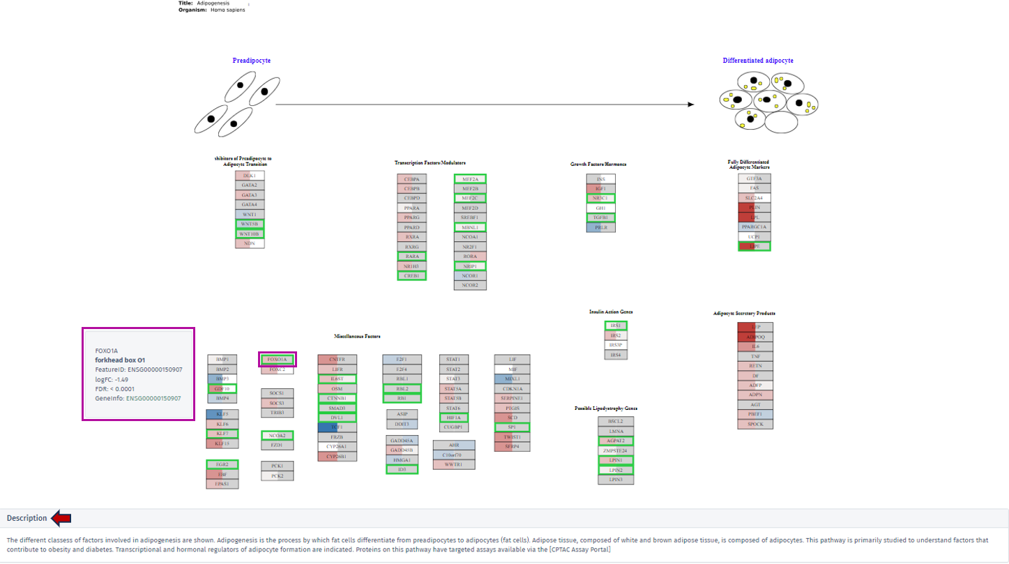
By clicking on the desired gene’s box within the pathway, a tooltip will appear, offering key insights including the gene’s symbol, name, Feature ID, and technical data such as the logFC and FDR value. For comprehensive exploration, the Geneinfo section at the bottom of the tooltip contains a direct link to the Ensembl database. This link leads users to an external page where they can acquire extensive information about the selected gene.
Description
A dedicated description section is directly below the displayed pathway maps within the graph tab. This section is designed to provide users with contextual information about the selected pathway. Users can access a detailed description encompassing various aspects of the pathway by clicking on this section. This narrative includes insightful explanations and pertinent details, offering a deeper understanding of the pathway’s biological significance, its components, and its role in various cellular processes or disease states.
Table panel

This panel presents a meticulously compiled table containing detailed information about the genes associated with the selected pathway. The table is organized into various columns, including Feature ID, Gene ID, Symbol, and Name, offering users a comprehensive overview of the gene attributes. A significant aspect of this table is that the feature IDs are hyperlinked to the Gene Info app. This linkage provides users with an expansive and detailed exploration of each gene, encompassing not only meta-information like gene symbol and name but also specific gene-related data.

Furthermore, the table includes gene-specific log2 fold changes (logFC) and log10 false discovery rates (FDR) corresponding to the comparison for both selected top tables – labeled as A for the primary dataset and B for the secondary dataset. This information is vital for understanding the gene expression dynamics within the pathway context. A key feature of this table is its color-coded fold change values. The values are displayed in a “red-white-blue” gradient to visually represent the magnitude and direction of change. Positive fold change values are indicated in red, signifying upregulation, while negative values are shown in blue, denoting downregulation. Values that are close to zero are colored in a whitish hue, highlighting their neutrality. This color-coding enhances the table’s readability and allows users to quickly discern the gene expression trends in the pathway.
10 - Project Overview
Projects in transcriptomics can hold multiple studies, aggregating data from different experiments. This allows to compare data generated on different technology platforms, different protocols and different biological systems. The Project Overview app provides an overview of the data sets with the current project.
Dashboard panel

The first panel on the left shows an interactive bar graph of the number of samples in the project. Sample numbers can be aggregated by “Study”, “Species”, “Platform”, “Protocol”, or by the sample categories defined in the project.

Details panel

Here, you find more detailed information about the different types of samples within each study. Studies with an info icon next to its name have additional study information available. To see them, click on the respective info icon.

Insights panel

Transcriptomics allows for a highly interactive exploration of complex datasets. The Insights panel allows researchers to share the results of their work with other team members. Documents of different formats (common office docments, pdf, or txt) can be uploaded.

On upload, each document is assigned to a specific study. Uploaded documents are presented to all users as an interative table, detailing the upload date, study, user, and name of the document. Documents can be download by clicking on the link in the “Name” column. Documents can be removed by selecting the corresponding row and clicking the “Remove Report” button.
11 - ProteomicsQC
The Proteomics QC App is a comprehensive tool designed to streamline and enhance quality control processes in proteomics research. It offers features for assessing data integrity, identifying anomalies, and ensuring the reliability of protein analysis results. By integrating various QC metrics and analytical tools, this app enables researchers to efficiently monitor and improve the quality of their proteomic experiments, ultimately enhancing the accuracy and reproducibility of their findings.
Introduction
Before we can dive into the actual analysis of your proteomics data, you might want to check that your data is reasonable at all. This is exactly what the Proteomics QC (quality control) app is doing!
Detecting problems in your underlying data at a late stage of your analysis can be inefficient, so this app will be probably one of your first steps of your analysis. Such problems can originate at every stage of the preprocessing: E.g. during the sample preparation, the data generation by a protein identification software or even in the data integration phase. Each of these steps will be tackled in the ProteomicsQC app. Currently, support for the protein(groups) and ptm data is available. We are actively advancing the support for peptides and PTMs in our data, stay tuned for exciting updates!
Before jumping directly into all features of the app, there are some general remarks about this app: As you know, this app is only a small part of the full PanHunter universe. Hence, if you stumble about interesting patterns in your data that you want to investigate immediately, you can always switch to all other PanHunter apps by clicking on the “≡” button on the top .
Pre-processing info tab

This tab gives you information about the used settings of your protein identification software for your selected samples.
Samples can be chosen using the “Sample selector” tab found on the left side of the interface. Check out the “Sample selection” section in SampleQC for guidance on using the Sample selector.
Currently, we support MaxQuant, DIA-NN and Spectronaut. These values are extracted from the log files of your software during the data integration and processed to an overview table. By default, only the most common columns are displayed. If you are interested in different columns, you can adapt the displayed columns as you prefer just by clicking on the “≡” button in the upper left corner of the table, next to the “Search Engine Parameters” table title. Of course, you can also filter your samples for certain values in any column. If you want to process this table outside PanHunter, you can export the complete table as a .xlsx file.

Contaminants tab

In this tab we can investigate the occurrence of possible contaminations in your samples. Contaminations can happen at basically every step from taking the sample to analysing the samples in a mass spectrometer. Hence, it is important to be aware of a contamination to take this into consideration for downstream analyses or to exclude the sample. You can always switch between the log- and the log-normalised data set, so you can rule out problems with the normalisation process as well. Apart from that, every plot can be also done for subgroups of your samples.
The first plot under the tab called “Quantity ranking” shows the rank of chosen protein(groups) across your samples. This means that for every sample the expressions of all identified protein(groups) are ranked and then the ranks of your chosen protein(groups) are plotted for every sample on a logarithmic y-axis. Since ideally, contaminations should be detected only at a very low level, hence their rank should be low (a protein ranked on position 1000 is less highly expressed as a protein ranked on position 100).
For example: Let us say you are studying protein expression in cancer cells. You have identified several protein(groups) that are associated with cancer progression. In your “Quantity ranking” plot:
- A protein group that is consistently ranked low across all samples (i.e., towards the bottom of the plot) likely represents a protein expressed at very low levels. This could indicate that it’s not relevant to your study.
- Conversely, a protein group that consistently appears towards the top of the plot (i.e., high rank) across multiple samples might be highly expressed and potentially relevant to cancer progression.
Known contaminants such as krt6a can be selected and it can be investigated whether the contaminant is ranked high in one or several of the samples, then this sample might be contaminated. Especially if the protein was not expected to be expressed to that high degree or at all.
For investigating a more systematic pattern of contaminations across your samples, you can also color or split the samples by any characteristic, e.g. by plate, gender or treatment. This might give you hints that a subgroup of your samples is affected by the same cause of contamination. The mean rank across samples is indicated with a line and the area between sample-specific-rank and mean rank is shaded, this helps to identify especially contaminated samples.


The second plot called “Well specific quantity ranking” depicts the samples that were analysed in a plate layout. Each sample is represented by a dot, so you see the real positions of your samples on the plates. By selecting a protein(group) of interest the rank of this protein(group) is color-coded on each dot. If there is a regular pattern of its rank across the plates, your samples may have cross contamination introduced during the wet lab sample preparation or sample injection into the LC-MS. Currently, only the first six plates are displayed, but you can always select specific plates in the sample selector.


The third plot named “Precursors identified by injection order”, investigates the time-dependence of identified precursors of a protein(group). Ideally, this should not correlate, so you have a constant detection rate for the whole study. If that is not the case, your results might be biased based on the time of analysis. Apart from that, the injection order is color-coded, so you can see whether the number of precursor or protein (groups) intensity depend on the time of injection. The correlation of injection order and intensity values is sometimes also referred to as drift.


Quantification tab

This tab is dealing with the number of identified protein(groups) and how they vary across your samples.
The first plot under the tab “Feature counts” depicts the total number of identified protein(groups) per sample. With a bar plot you can investigate the distribution on sample level and use different sorting or coloring criteria to highlight hidden patterns. The dashed line indicates the mean number of protein (groups) identified in all selected samples. If you switch to a box plot, your samples get binned on the coloring variable and you can see the distributions of identified protein(groups) within each bin.


The second plot named “Shared Features” works out how many of the identified protein(groups) are shared in the samples. While the number of identified protein(groups) might be similar (see first plot), the samples are only comparable, if they are including the same protein(groups). If the samples are from e.g. the same tissue type, possessing relatively similar proteomes, the number of shared features observed should be high in all samples.

The third plot demonstrates how many protein(groups) are shared with at least X percent of the samples. So it basically cumulates the second plot and visualizes the similarity of the identified protein(groups) for the samples from a different perspective. Here you can also add the default annotations to the line that show you the exact numbers of protein(groups) directly next to your data points.

Intensities tab

This tab gives you an overview about the expression intensities. It complements the “Quantification tab” very well, because after dealing with the identified protein(groups) on a general level, now you can look at the intensity of these identifications in more detail. Here too, you can always switch between the log- and the log-normalised data set, so you can rule out problems with the normalisation process as well. Apart from that, every plot can be also done for subgroups of your samples. Just select a splitting variable and explore the distributions within these subgroups.

The first plot “Intensity distribution” shows the density distribution of the expression intensity in a bar plot. Here you can look at the general distribution for all samples and see whether all samples align to the same distribution or you have distinct subgroups with several peaks. For further analysis you can split your samples by any characteristic and create several plots. This can give you some deeper insight whether your samples behave differently depending on this characteristic or they share the same underlying distribution. You can also switch the plot layout from a histogram plot to a scatter plot: where you have on the x-axis the split variable and on the y-axis you have the intensity, while each protein(group) is represented by a dot.


The second plot depicts the density of the coefficient of variation as a bar or box plot. While the coefficient of variation is defined as the standard deviation divided by the mean in the linear space, it can be approximated by the variance in log-space. So, here you can check that the variations of the intensities are similar across all protein(groups) or whether they vary strongly. In addition to the bars, the plot is superimposed by a smoothed density curve.

In the third plot you can see the number of protein(groups) below an user-defined threshold of the coefficient of variation, which you can set under the title Select max. CV. As usual, you can split your samples into subgroups and investigate the behavior for each of these subgroups individually. Below is an example plot of Felis catus (Fcat) and it’s protein(groups) with CV < 0.2.

Sample Similarity tab

This tab, besides the information about QC, serves as a starting point for your further analysis.
The first plot shows you a simple dimensionality reduction plot. Here the first two principal components of a PCA are shown. This gives you insights about the hidden subgroups in your multidimensional data set. For a better understanding, you can also color your samples depending on any characteristic or add polygons to your plot. The loadings (arrows) shows you the top 10 protein(groups), that are driving the distribution. You can also switch to the New Comparison app and have additional capabilities there.

In the second plot you can see a correlation analysis for your samples. Here you have the choice between “Spearman” or “Pearson-Correlation”. The correlation coefficient is color-coded, and by hovering over the plot, you can also get the exact value for two samples. As usual, you can also switch between log and log-normalised data to investigate the effect of the normalisation step.

12 - SampleQC
The Sample QC application is utilised to ensure sample quality, with an emphasis on RNA-seq and similar platforms. The application presents data supplied by the STAR aligner tool, Samtools, and the HTSeq package.
Samples can be selected through the “Sample selection” option located on the left side of the interface. The Sample Selector provides a variety of filters and other operations, called "Modifiers", that can be used to narrow down the samples selected from the entire catalogue of samples in your project to the ones you are interested in.
-
Sample information shows you how many samples are selected and loaded according to the current settings.
-
Filter Study is a “mandatory filter” to select and load your studies of interest. Please click on the field below “Values” to select the studies from a drop-down menu.
-
Modifiers can be stacked additionally to narrow down the selected samples. For a more compact view, click on their titles to minimise them.
-
Include or Exclude the specified values in or from your selection.
-
Additional modifiers can be selected from the drop-down menu and easily added by clicking on the + button.
-
Filter categ. can filter the samples according to categorical variables.
-
Filter num. can filter the samples according to numerical variables.
-
Join columns can combine two or more categorical variables into one.
-
Column binning can devide samples into groups according to a specified numeric variable.
-
Enrich can add additional information to your sample table, such as custom annotations.
-
-
Save, retrieve and share your selections are available by clicking on the “≡” button.
The detailed tables and figures for specific quality control aspects or platforms are available on the panels located on the right-hand side.
Alignment stats panel

This panel displays histograms of alignment statistics, such as the number of input reads, uniquely mapped reads, average read length, number of splice sites, and the mismatch rate per base. The histograms show the distribution of these statistics for all selected samples while the values for the highlighted sample/files are indicated as colored line.

Read distribution panel

This panel provides a bar plot of the read distribution for the selected sample. The y-axis corresponds to counts which is mapped to different genomic features represented in the x-axis, e.g. CDS (coding sequences), Introns, 5’ and 3’ UTR, and remote up and down-stream regions. By default, the plot shows the distribution of counts normalized to the Kb of genomic features (in percentage). Check the checkbox “Show total percentages” to display the total counts distribution in percentages.

Gene body coverage panel

In this panel, the read coverage of genes is displayed. The y-axis displays the number of counts per gene sequence position (from 5’ to 3’) and the x-axis shows the gene position in percent of gene length. This figure may indicate issues with RNA degradation. The highlighted sample/files are shown as colored lines.

Biotype panel

In this panel, the number of reads mapped to different gene biotypes, e.g. protein-coding genes, pseudogenes, or ribosomal RNA, are shown as bar diagram. The mean over all selected samples is displayed in contrast to the highlighted sample/files (encoded by distinct colors).

Mitochondrial panel

This panel contains boxplots of the percentage of reads mapped to mitochondrial genes, non-mitochondrial genes and spike-in transcripts. The boxplots show the distribution (e.g. median and quartiles) for all selected samples. The highlighted sample/files are depicted as colored lines.

Parameters panel

This panel shows the software versions and databases used for alignment and read counting of the selected samples. For optimal comparability, these parameters should be identical for all samples within a comparison.
The first table gives an overview and displays the number of samples which were processed with a specific combination of software versions and databases.

The second tables list the parameter for the individual samples.

Gene counts panel

This panel shows the mean and sum of counts for the selected study samples and genes. In addition, mean normalized expression values are displayed. If no genes are specified, the top 250 genes according to mean normalized values are selected.

Single cell RNA-Seq panel

In this panel, single cell RNA-Seq statistics and plots are displayed for the current sample divided into several subpanels. The number of shown barcodes or genes can be adjusted using the slider at the top of the panel, respectively.

Barcodes are usually sorted according to the sum of associated reads and plotted on the x-axis (barcodes with highest sum on the left-hand side). In the following, individual subpanels are described in more detail.
Stats: Table of general file specific statistics. The column “Detected” contains the number of sequenced reads or detected UMIs (Unique Molecular Identifiers identifying individual transcripts). “All” contains the corresponding reference number in order to calculate percentages (“Percent”). The rows correspond to the number of read assignments in the alignment (featureCounts output), the number of multimapping and uniquely mapped reads, the number of reads assigned to a feature (usually exon), unmapped reads, reads assigned to no feature, ambiguously mapping reads, reads not assigned due to low quality, the number of distinct UMIs after deduplication of reads, and the number of UMIs mapped to special spike-in sequences (e.g. phiX). Note that most phiX reads should have been removed during preprocessing.
Expressed Genes: Plot showing the number of genes (y-axis) above (greater or equal) a particular UMI count threshold (see legend). Default threshold, which is also used for cell filtering, corresponds to 2 UMIs. This plot is very useful when trying to estimate the number of sequenced cells vs noise.
Mt Genes: Plot showing the ratio of reads or UMIs per barcode assigned to mitochondrial genes.
Amplification (Barcodes): Plot displaying the summarized read or UMI counts per barcode. This can be used to estimate cell number or check PCR amplification issues.
Amplification (Genes): Plot showing the summarized read or UMI counts per gene. This can be used to check for a gene specific bias in amplification.
Amplification (Gene List): Plot showing the genes with the highest read count and their fraction of the total read count. This helps to identify over represented genes which might indicate a contamination. Mitochondrial and ribosomal protein coding genes are expected to have high counts.
Species Distribution: Plot displaying the distribution of species specific UMIs per barcode in mixed species control experiments. Each dot corresponds to one barcode. The sum of UMI counts associated with genes corresponding to the first species is depicted on the x-axis, the sum of UMI counts associated with the second species on the y-axis. This plot is shown only for mixed species samples and can be used to estimate contamination or cell doublets (more than one cell associated with the same barcode). Dot color corresponds to species classification. Note that the number of displayed barcodes can be adjusted using the slider at the top of the panel.
Barcodes: Summarized statistics for filtered barcodes (potential cells). The first table shows the number of filtered barcodes (“Cells”), the number and percentage of these barcodes matching the 10xgenomics whitelist (“Matching10x” and “Percent”, not used in the preprocessing), the number of reads for all filtered barcodes (“Reads”), the corresponding number of UMIs (“UMIs”), the ratio of reads vs UMIs for the filtered barcodes (“Amplification”), the ratio of reads for the filtered barcodes vs all barcode associated reads (“ReadCoverage”), and the ratio of UMIs for the filtered barcodes vs all barcode associated UMIs (“UMICoverage”) per sample (“Sample”). The second table contains count statistics for individual filtered barcodes. “Sum” corresponds to the sum of associated reads, “Dedup” to the number of deduplicated reads or UMIs, “Genes” to the number of genes above (greater or equal) the default UMI count threshold (usually 2). The third table shows the UMI count percentage/frequency of particular sequence motifs at particular barcode positions. Each position (column) sums up to 100 percent. This view can be used to identify position dependent preferences. The motif length can be adjusted interactively. The last table contains statistics on filtered barcodes with very similar sequences (one base mismatch/deletion/insertion). Too many rows may indicate issues with the barcode correction during preprocessing. “Counts” correspond to UMIs, “N” to the number of sequence neighbors (barcodes with similar sequence).
Cumulative Fraction: Cumulative fraction plot of the sorted barcodes. This plot shows the fraction of reads or UMIs associated with the first N barcodes (descending order of read sum). It can be useful to estimate the number of sequenced cells (barcodes representing most of the reads) or check the PCR amplification rate (reads vs UMIs) and issues with ambient RNA (no saturation of fraction). Note that the number of shown barcodes can be adjusted using the slider at the top of the panel.
Plate based RNA-Seq panel

This panel contains special QC statistics for selected (high-throughput) plateRNA-Seq samples splitted into separate panels. A plate is usually represented by two sequence files, the first one contains the (well specific) barcode and transcript UMI sequence and the second the actual cDNA read sequence which needs to be aligned to the genome. In the first step of preprocessing, unwanted sequences are filtered out and the corresponding barcodes are skipped, e.g. reads matching to phiX sequences, which were added by the sequencing provider. The other barcode sequences are then matched with the expected well barcodes and the corresponding reads are written out to single well/barcode specific files (the read sequence corresponds to the cDNA and the UMI is added to the read ID). This demultiplexing procedure also checks for barcode sequences with a single base mismatch or insertion/deletion compared to one of the reference barcodes and corrects this variant (assuming a PCR or sequencing error). The well specific sequence files are then aligned to the genome of interest and distinct UMIs are counted per barcode/well and gene (deduplication process). In the following, the individual subpanels are described in detail.
Files: Table showing statistics for all plate sequence files corresponding to the selected (reference) samples. “TotalReads” correspond to the number of reads detected in the input file, “Skipped Reads” to the number of reads which were filtered out (e.g. phiX), “Matching Reads” to the number of remaining reads whose barcode sequences match one of the reference barcodes exactly, “HammingReads” to the number of remaining reads which match assuming one base mismatch (Hamming distance 1), “SeqlevReads” to the number of remaining reads which match assuming a single insertion or deletion (sequence Levenshtein (edit) distance 1), “NotReads” to the number or remainig reads which could not be matched. “PercentDemux” is the percentage of the sum of “Matching Reads”, “HammingReads”, and “SeqlevReads” divided by “TotalReads”. This readout should ideally be in the range between 90 and 100 percent. “PercentSkipped” is the percentage of “Skipped Reads” divided by “TotalReads”, which should be below 5 percent.

Samples: Table showing the sum of UMI counts for selected samples. Columns in the middle of the table correspond to project factors/categories associated with multiple values for the selected samples. They can be used to filter the table for display. The column “Counts” corresponds to the final sum of deduplicated UMI counts per sample/barcode. The background colors match the respective values (from white for low counts to dark green for high counts). “Reads” represents the sum of demultiplexed reads for the corresponding barcodes and “Percent” the percentage (“Counts” vs “Reads”). Note that “Reads” also includes reads which could not be uniquely aligned to exon features. A low percentage may indicate issues with read alignment and/or library amplification. “ExactM” corresponds to the percentage of exactly matching barcode sequences compared to the sum of matched barcodes (exact match, one base mismatch, or one insertion/deletion). Ideally, this readout should be above 90 percent and comparable for all wells on a plate. By means of the “Grouping factors” selection box, only the selected factors/columns can be viewed before summarizing. This can be useful for reducing the table size or summarizing across multiple factor levels.
Plate: Table showing the color-coded UMI count sums per well in a plate layout. This plot is only shown in case well IDs are provided in the sample table (column “Well”). In case samples from multiple plates (see sample table “Plate” column) are selected, the plate IDs are added to the row part of the well IDs, resulting in stacked plate layouts.
Barcodes: Table of UMI count percentage/frequency of particular sequence motifs at particular barcode positions. Each position (column) sums up to 100 percent. This view can be used to identify position dependent barcode motifs. The motif length can be adjusted interactively.

13 - scDeepDive
The scdeepdive app is mainly used to visualize single cell RNAseq data and to annotate different cell types either by using machine learning algorithm, which requires an annotated reference data set, or by manual annotation using selected gene markers.
Study Selection
In the study selection panel, users can utilize the following options to analyze their data:

- scRNA-Seq study: Choose your study of interest from the dropdown
- Dimension Reduction: Visualize study data using UMAP or t-SNE techniques
- Annotation: Annotate data based on cell types, sample ID, region, sex, or species
- Color Information: Customize the color scheme of sample data, either individually or by clusters
- Symbol Information: Display information for each symbol, either individually or by clusters
Gene selection
The gene selection panel facilitates the selection of genes or features of interest for analysis in the study. Within the feature selection dropdown, users can choose from various data selection methods, including Manual Autocomplete, Manual Freetext, Custom Feature Lists, and Feature List Collections. A detailed description of these options is available via the this link: Highlighting Specific Genes or Features.
Genes

The Genes tab offers a detailed analysis of the data through the following sub-tabs:
Cluster Gene Comparison

- This section allows for the analysis of annotated data and its expression levels.

- Below, you will find a dimension reduction plot (UMAP or t-SNE) of the selected gene or feature.

- A download option is available at the top of the plots, enabling users to save them as a PPT file. The plot point size can be adjusted using the highlighted scroll bar. Users can also switch between light and dark view modes according to their preference.

Expression Overlay Comparison

- This sub-tab enables the analysis of individual genes selected from the gene selection panel, with the ability to adjust their normalized expression values.

- It supports comparison using contrast factors such as sex, donor, region, and species.

- Additionally, it provides a deeper visualization of cluster comparisons of the selected contrast factor in terms of numerator and denominator. The comparison is depicted both as a dimension reduction plot and a violin plot including their expression ranges.


Expression Violin Plots

- The Expression Violin Plots section displays violin plots that illustrate the gene’s presence, measured in counts per 10k, across each cell type as well as combined.

- Additionally, it provides the percentage of the gene’s expression within each cell type cluster below as a bar graph.

Cluster analysis

The Cluster Analysis tab comprises the following sub-tabs for comprehensive study analysis:
Mosaic Plot

This section presents mosaic plots that display the fractions of cell clusters within each sample.

It also includes an analysis of the expression patterns of these cell fractions across the samples.

Comparison

The comparison tab features a table listing the available contrast factors within the study for comparative analysis.

The “Select Contrast Factor” panel allows users to choose individual contrast factors for comparison and visualization as a dimension reduction plot. By selecting the “Subset cells of largest dataset” box, the dataset with the most cells will be subset to match the number of cells in the smallest dataset. This panel also includes a download option to export all clusters and sample information in Excel format.

The “Cluster Selection Display” option enables users to refine the comparative analysis to specific cell clusters.

Below the dimension reduction plot, users can observe the fraction distribution for the selected numerator and denominator within each cell cluster.

The “Differential Abundance Test” panel allows for the selection of co-factors that may influence cell type abundance, enabling users to better identify them. Users can filter out low changes (<2 log fold change), calculate normalization factors, and run the “Cluster Comparison” by selecting the appropriate checkboxes.


Plots

This sub-tab visualizes the resulting cluster comparison through FDR change plots and bar graphs. The FDR cutoff and logFC cutoff can be changed as per user’s interest.

Abundance Table View

This sub-tab provides a differential cluster abundance table with the corresponding log values, p-values, and FDR results.

Annotation Overlap

The Annotation Overlap tab enables visualization of expression patterns across various annotated study factors. Users can select the annotations to be displayed on the respective axes from the provided panel. The expression pattern can be color-coded based on either the number of cells or the Jaccard similarity index, allowing for detailed observation and analysis.

14 - scExplorer
The scExplorer app is primarily used to visualize single-cell RNA-Seq data and annotate different cell types. This can be done either by using a machine learning algorithm (which requires an annotated reference dataset) or through manual annotation using selected gene markers. The app also includes features to explore single-cell data, calculate differential gene expression between clusters on the fly, simplify cluster annotation, and conduct gene marker identification.
The scExplorer user interface organizes single-cell data similarly to standard single-cell data formats. The left-hand side displays selections for study, tools, and gene selection. The right-hand side provides space for features such as annotations, gene sets, and comparisons, as well as a legend for the available categorical and numerical sample metadata. The center shows the embedding, where each cell is represented as a point. Common embedding algorithms like UMAP and tSNE position cells based on their local distances in gene expression space. Additionally, PCA and PHATE embeddings are available. For spatial data, cells can be displayed using their originating (x, y) coordinates.
Selecting cells
- Lasso selection over the embedding plot in the center
- Using the checkboxes of categorical annotations on the Annotations panel (see below)
- Brushing over the histogram of numerical annotations on the Annotations or Gene Sets panel (see below)
- The number of selected cells can be seen on the bottom left section of the plot area
- After selecting, cells and their metadata can be further isolated with the Subset Cells button

Study Selection
Users can select their study from this panel.

Tools panel
- The Tools panel allows users to perform various tasks on the loaded study
- Current options available include: Dimension Reduction, Clustering, Differential Expression, and Pseudobulk Computation

Dimension Reduction

The dimension reduction panel allows users to reduce the dimensionality of single-cell RNA sequencing (scRNA-seq) data for visualization and analysis. Users can select specific cells of interest by circling around them with the cursor.
By adjusting the options below, users can customize the dimension reduction process for their specific analysis goals.
1.Method: Choose a dimension reduction technique:
-
UMAP (Uniform Manifold Approximation and Projection)
-
tSNE (t-distributed Stochastic Neighbor Embedding)
-
PCA (Principal Component Analysis)
-
PHATE (Potential of Heat-diffusion for Affinity-based Transition Embedding)

- Custom Name: Optionally, assign a custom name to the dimension reduction task for future reference.

-
Show Advanced Settings: Depending on the technique, additional parameters can be set by enabling this option as described below.
-
PC Number: Define the number of Principal Components (PCs) to be retained in the dimension reduction process. This determines the level of detail preserved in the reduced-dimensional representation.
-
Distance: Set the minimum distance
parameter for algorithms like t-distributed Stochastic Neighbor Embedding (t-SNE) or Uniform Manifold Approximation and Projection (UMAP). This parameter affects the clustering and separation of data points in the reduced space. -
Seed: Specify the random seed or state to ensure reproducibility of the dimension reduction results. Using the same random state will produce the same results each time the analysis is run.
-
Recalculate PCA: Instead of using an existing PCA, recalculate and use it for the dimension reduction computation.
-
PCA key: Specify the key or feature of your dataset to be used for Principal Component Analysis (PCA). This could be gene expression values or any other relevant feature.
-
-
Submit: Initiate the dimension reduction process with the specified parameters. Once completed, you can explore the reduced-dimensional representation of your scRNA-seq data to gain insights into cell populations, gene expression patterns, and relationships between cells.

Clustering

The Clustering panel provides options for annotating samples with metadata to facilitate downstream analysis and interpretation.
- Job: Select an algorithm you want to use (e.g; Louvain, Leiden, Celltypist Prediction, Training, or Pseudotime) for clustering.

-
Name New Annotation: Assign a name for the new annotation that will be generated by the tool. This name helps you to identify and organize your annotations later.
-
Run: Once you’ve configured the parameters for the auto-annotation task, click “Run” to initiate the annotation process. The tool will analyze the data according to your specifications and generate the new annotation based on the selected parameters.

The interface allows for the complex selection of cells via selecting directly on the embedding, gene expression cutoffs, and based on categorical metadata attributes.
Differential Expression


- Select the first group of cells and designate it as Population 1 by clicking on the button shown below.

- Repeat for the second group (population 2).
- Click the “Differential Expression” button.
- Optionally, assign a custom name to the comparison.
- Click on the “Submit” button, to run your differential expression analysis.

- Results appear in the “Comparisons” tab, on the right-hand column.
Pseudobulk Computation

A pseudobulk study aggregates single-cell data into pseudobulk profiles, typically based on defined groups such as cell types or experimental conditions. This allows for bulk RNA-seq analysis techniques to be applied to scRNA-seq data, providing insights into gene expression patterns at a higher, more interpretable level.
Users can provide a name for their pseudobulk study in the “Pseudobulk study name” option. The “Aggregation key” is a parameter used in pseudobulk studies to specify how cells should be aggregated into pseudobulk profiles. In addition to the sample ID, which identifies individual cells, the aggregation key defines the grouping criteria for aggregation, such as cell type or other experimental conditions.
After configuring the parameters for the task, click “Run Pseudobulk Creation” to initiate the process.

Gene Selection panel

With the “Gene Selection” option, you have the ability to create your own set of genes used for more detailed exploration. Users can input their genes of interest by clicking the drop-down to create a custom gene set. This allows you to analyze the collective expression patterns of multiple genes simultaneously. Once done, click the “Create New Gene Set” button which will open a pop up box, where you can add a name for your geneset with a short description for your reference. After filling the information, click the “Create gene set” button to add it to the Gene set tab mentioned below.

Annotations tab

The Annotations tab contains all the cell metadata present in the study.
Private Annotations:
Private annotations consists of annotations that are only visible to the user who created them. Users can create new annotations using the below given features:

- Click on the Create New button. It will then open a Create new private annotation pop-up box in which you can add a new unique annotation name and also optionally duplicate all labels and cell assignments from an existing annotation to your new one. Then click on Create Annotation button to create your new annotation.

- After creating your new annotation, you can also add cell labels to it by clicking on the ‘+’ icon next to the annotation name. Before clicking on the icon, first lasso select your cells of interest to label. Then upon clicking on the ‘+’ icon, a pop-up box Add new label to annotation opens, in which you can add a new unique label name and click on the ’tick box’ to assign the selected cells. Then to confirm your selection, click on the Add label button.


- By clicking on the dropdown button near your annotation name, you can view your added labels. The ’…’ icon near the annotation name provides you with options to ‘Edit this annotation’s name, Share annotation or Delete the annotation with all it’s assosciated informations’. With the help of the droplet icon, users can study their annotations along with their labels in different colours. The ’…’ icon near the label’s name provides you with options to ‘Relabel the label’s name to its common label name, Edit the label’s name or Delete it’.

Shared annotations:
Shared annotations can be accessed and viewed by other users who have access to the same dataset. This distinction allows for collaboration and sharing of annotations within research teams or across the scientific community.

There are different options available to visualise the single cell data based on the following factors:
(i) “QC-sum” is shown by the percentile factors i.e. 1 means Top 20 percent and 5 mean last 20 percent, here 1 is best as it represent the cells with higher read counts
(ii) “QC-dedup” representing UMI counts as similar as QC-sum,
(iii) “QC-GenesDedupThres” showing number of genes detected by unique number of UMIs.
(iv) “QC-SumMtRatio”, representing mitochondrial to transcript ratio with respect to read counts. NOTE, here 5 represent the worst as it shows the highest mitochondrial-transcript ratio.
(v) “QC-SumDedupMtRation”, mitochondrial to trancript ratio with respect to UMI counts, similar to QC-SumMtRatio but with UMI counts. Further, a higher mitochondrial-to-transcript-ratio (typically > 0.7) means that the cells are either under stress or dying.
(vi) “QC-SeqCluster” represent whether two barcodes (cells) have barodes basepairs with 1 mismatch or indel; Yes means overlapping barcodes; No means unique barcodes.
(vii) “Cell-Cycle” (G1, G2M and S)
(viii) “Cluster” basically represents the clusters annotation.
Users can annotate and study the different cell groups based on these factors, by viewing them in various colour ranges with the help of the “Droplet icon” present near the respective annotation options.
Gene Sets tab

The Gene Sets tab allows analysis of group of genes. Users can create a geneset with the help of the “Gene selection”(mentioned above).

-
By clicking on the dropdown near the geneset name, opens a bivariate plot. Comparison of the expression of multiple genes can be done using this bivariate plot, which display the relationship between the expression levels of two genes across single cells.
-
The ‘+’ icon helps in adding more genes to the existing geneset. On clicking the icon, it opens a pop-up box ‘Add genes to geneset’ which consists of a ‘Genes to add’ dropdown. Users can then select their genes of interest to be added to the geneset from the list, and click on the ‘Add genes’ button.

-
The ’…’ icon provides you with options to ‘Edit the geneset’s name and description, Share geneset or Delete the geneset’. The droplet icon helps in viewing it in different colour ranges for data analysis.
-
Users also have the option to view the bivariate plots as scatter plots by clicking on the “x” and “y” buttons next to the gene names, allowing for a more detailed examination of the expression relationship between the selected genes. Users can click on ‘hide’ to minimise and ‘remove’ to close the scatter plot.


- The dustbin icon helps in deleting the particular gene from the geneset list. The expandable icon displays the expression level of the respective gene in the form of a bivariate plot. The droplet icon helps in viewing them in different colour ranges.
- Shared Gene Sets: This feature allows users to access and utilize predefined sets of genes that are shared among multiple users or datasets. You can similarly study individual gene from your shared gene set with the help of the options shown in previous examples.

Comparisons tab
The Comparisons tab displays all differential expression analyses you have submitted. Each comparison represents a differential expression job between two selected cell populations.
- Once the analysis is complete, selecting a comparison from the dropdown reveals a list of up-regulated (blue) and down-regulated (red) genes.


- The ’…’ icon next to each entry provides option to delete the comparison, allowing for easy management.
15 - Signature Visualization
The Signature Visualization App offers a dynamic platform for exploring gene expression patterns through interactive visualization. Integrating over 9000 gene signatures from five distinct collections, including four from CREEDS database and one from Connectivity map (CMAP), this tool allows users to compare specific signatures against a curated list of genes known as top table genes Top tables app. Upon selecting a signature, users are presented with a comprehensive metadata table detailing the signature’s origin, facilitating a deeper understanding of the genetic underpinnings of various biological states and responses.
Upon launching the app, users can precisely adjust their search parameters using the Collection, Signature, and Comparison filter bars.
Collection
This filter specifically enables users to narrow down their exploration to gene expression datasets pertinent to different biological states and experiments:
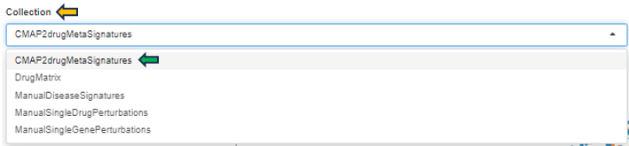
-
CMAP2drugMetaSignatures: Focuses on gene signatures from metabolic responses to drug treatments.
-
DrugMatrix: Encompasses signatures from drug effect studies across various cell types or tissues.
-
ManualDiseaseSignatures: Features curated gene signatures linked to specific diseases, facilitating the discovery of disease-associated genetic markers.
-
ManualSingleDrugPerturbations: Contains signatures from studies examining the effects of single drugs.
-
ManualSingleGenePerturbations: Offers signatures from research on the effects of perturbing individual genes.
Signature
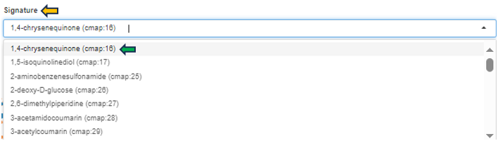
This feature enables researchers to explore how different compounds affect gene expression, aiding in the identification of potential therapeutic targets or the understanding of compound mechanisms. This filter allows users to select specific gene expression profiles or signatures associated with various compounds or treatments. Each option represents a unique gene expression pattern resulting from exposure to a particular substance. The numbers (e.g., cmap: 16) are identifiers within the “Connectivity Map (CMAP)” database, facilitating easy reference to detailed experimental results.
Comparison

This option guides users to a selector tool, facilitating the selection of specific comparisons for thorough analysis (for detailed guidance on utilizing the Comparison Selector feature, please refer to the manual available here Comparison selector). Engaging with this feature allows users to explore the intricate relationship between their chosen comparison and the gene signature in question.
Signature meta-data
The signature metadata table on the left side presents detailed metadata associated with the selected signature collection and ID. This table aggregates and displays comprehensive information that characterizes the signature’s origin, facilitating a deeper understanding of its background and relevance within the chosen collection.
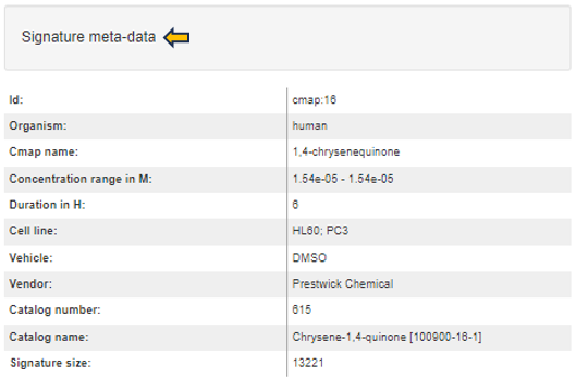
Signature plot
After selecting a top table dataset as well, the signature plot is visualized in the central part of the app.
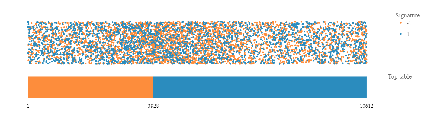
The bar represents top table genes:
- In orange are down-regulated gene and in blue are up-regulated genes, ordered according to the fold-change. The numbers of down-regulated genes and all top table genes are marked at the bottom of the bar. The dots above the bar represent signature genes mapped to the ordered top table genes and the color reflects regulation of genes in the signature.
- The resulting plot is interactive: hover dots to see data labels, click-drag to zoom, double-click to autoscale.
- Further, you can click the “Flip the plot” checkbox and the visualization of top table and signature will be reversed: the signature will be represented by the bar and the top table genes will be represented by the dots. Especially, CMAP signatures can benefit from the flipped visualization.
- If you change the hover mode to ‘Box Select’ or ‘Lasso Select’, a table of selected data points (dots) is visualized bellow the plot. If you wish to visualize only up-regulated/down-regulated signature genes, click on the legend dot representing down-regulated/up-regulated genes and these will be hidden in the plot.
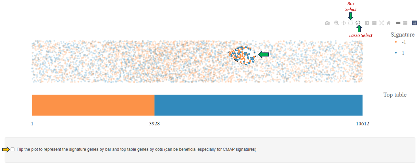
Signature genes selection table
If the signature statistics were pre-calculated when generating a new top table (see the comparisons app), these statistics are visualized in the table at the bottom left side. The type of statistics included in this table differs based on the type of the selected signature (e.g. based on length of the signature and values representing the signature).
Signature statistics
For signatures from CMAP collection the following statistics are provided:
-
Consensus direction: Telling whether the signature gene regulation is mimicking or reversing the top table regulation (according to the most of the statistics; if statistics are inconclusive the direction is ’none’).
-
Tau correlation: Kendell’s tau correlation coefficient (based on signature effect size values correlated with full profile of top table fold-changes; ranges between -1 and 1).
-
Connectivity score: A nonparametric, rank-based pattern-matching score based on the Kolmogorov-Smirnov statistic (as defined by Lamb et al. 2006, however not scaled to range of -1 and 1). Top table genes are compared to rank-ordered signature gene list to determine whether up-regulated top table genes tend to appear near the top of the signature list and down-regulated top table genes near the bottom (“positive connectivity”) or vice versa (“negative connectivity”).
-
Expression score: A score based on signature z-scores multiplied by up/down information of significant top table genes. Normalized to the top table size and transformed to z-scores.
-
FDR Expression score: Corresponding false-discovery rate value assessing the significance of z-scores.
For signatures from CREEDS collection the following statistics are provided:
-
Consensus direction: Similar as above (mimic, reverse, or none).
-
Concordant overlap: A number of genes that are common for both the signature and top table gene lists, and have the same regulation sign in the both lists.
-
Discordant overlap: A number of genes that are common for both the signature and top table gene lists, but have different regulation sign in the both lists.
-
Signed Jaccard index: Signed version of Jaccard similarity coefficient as defined by Wang et al. 2016 (ranges between -1 and 1).
-
KS score: Kolmogorov-Smirnov statistic-based score similar to Connectivity score. In contrast to the connectivity score, the signature genes are compared to rank-ordered top table gene list.
-
Expression score: A score based on negative logarithm of FDRs from top table genes multiplied with fold-change direction and signature direction. Normalized to the signature size and transformed to z-scores.
-
FDR Expression score: Corresponding false-discovery rate value assessing the significance of z-scores.
16 - TF Targets
The TF Targets app provides a user-friendly platform for exploring the intricate network of transcription factors (TFs) and their target genes. By inputting specific TFs or genes of interest, users can swiftly uncover regulatory relationships, aiding in the understanding of gene expression dynamics and regulatory mechanisms. With interactive visualizations and comprehensive data integration, the app facilitates efficient investigation into transcriptional regulation with the help of data intrepretation features such as “number of targets, number of hits, jaccard similarity rank and jaccard normalization rank”.
Comparison selector

With the “Comparison” selector tab, users can select a comparison for study, and then further refine their focus by choosing the transcription factor (TF) they wish to investigate, in the following steps.

TF Experiments
Users can navigate to the “Select TF Experiments” tab located at the top to choose transcription factor experiments for analysis based on their interests.
If users opt for “Get TF” from the experiments selector, they can select the desired transcription factor for study from the “TF Symbol” option beside it.


Alternatively, for analysis based on Jaccard similarity (Jaccard) or Jaccard normalization (JaccardNorm), users can choose “Get Top N (Jaccard)” or “Get Top N (JaccardNorm)” respectively from the experiments panel. In this scenario, users can also specify the desired number or rank of the TF similarity or difference using the “Top N” selector. This selection will generate a heatmap consisting of the set of transcription factors corresponding to the chosen number or rank of interest.

Heatmap
Here is an example presenting a heatmap generated for the TF “AEBP2”. Hovering over the heatmap provides additional information about the TF, including the “Cell line Group,” “number of targets,” “number of hits,” “Jaccard similarity rank,” “Jaccard normalization rank,” and more.
Adjacent to the heatmap, you’ll find the “Heatmap options” panel. This panel enables users to customize the rows and columns of the heatmap based on various features.
At the bottom of the heatmap, there’s a “Download” option enabling you to save the heatmap in xlsx format.
")