Special Apps
Special Apps in PanHunter refer to custom-built applications that are designed to address unique data types, workflows, or analytical needs that aren’t covered by the standard suite of apps available across all projects. These are tailored to specific datasets or research questions and are only used in several PanHunter projects.
They typically:
- Handle non-standard data formats (e.g. imaging data, custom assay outputs)
- Implement custom logic or workflows
- Provide interactive visualizations or dashboards that unique to the data
- Support collaborative efforts with external partners or consortia, where specific tools are needed
Special Apps should not be confused with Project-specific Apps.
1 - Cross Comparison
The Cross Comparison app streamlines the analysis of samples from diverse omics datasets. Users can link and visualize samples in dimension reduction plots, aiding in identifying similarities, differences, and patterns across datasets. This tool enhances the integration and comparison of samples, allowing users to split or match them according to their preferences, thus enabling more tailored analyses.
Sample selection
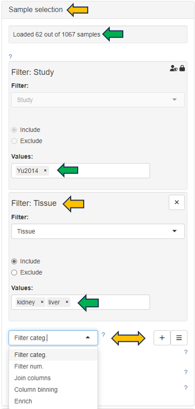
Samples can be selected through the “Sample selection” option located on the left side of the interface. The Sample Selector provides a variety of filters and other operations, called "Modifiers", that can be used to narrow down the samples selected from the entire catalogue of samples in your project to the ones you are interested in.

The Cross Comparison app offers a panel on top of the interface with options like “Split samples by” and “Match samples by”, enabling users to customize sample grouping based on their interests. This functionality allows for flexible manipulation of datasets, enhancing the precision and relevance of the analysis to the user’s research objectives.

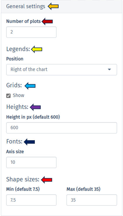
On the top-right of the page, you will find the “General Settings” panel, providing options to customize your plots for data analyses.

Dimension reduction Plots
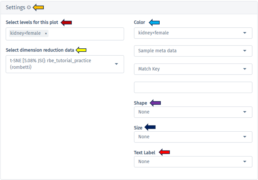
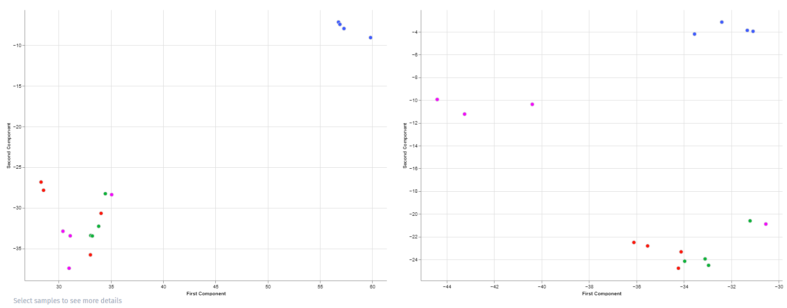
In the “Dimension Reduction Plot” tab, each plot illustrates samples from a specific split-factor in dimension-reduced coordinates. Additionally, there’s a “Settings” panel above the plots, for fine-tuning each plot according to the user’s preferences, ensuring detailed and streamlined visualization. Hovering over the dots in the plot provides information on the corresponding samples, while selecting samples enables more specific visualization by highlighting them accordingly. This feature enhances user interaction and facilitates deeper exploration of the data.

Here is an example plot comparing Tissue: “Kidney” and “Liver” in a female rat

Similarly, you’ll find tabs for “Analyses Few Matches Key,” “Analyses Single Feature,” and “MA/Volcano Analyses” for data analysis through various plot types, providing comprehensive tools for in-depth exploration and interpretation.
2 - Patient Data
The Patient Data app is used to explore rich clinical data of patients, to link patient data with gene expression samples, and to calculate univariate statistics.
Summary panel

For selected dataset, this panel provides a comprehensive overview of categorical, numerical and time variables. If recruitment date is available, two additional plots displaying patient recruitment process are provided.


Table panel

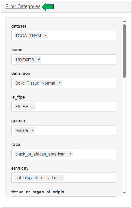
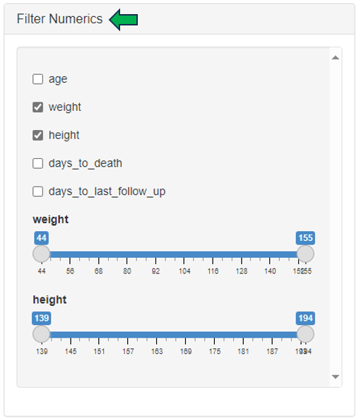
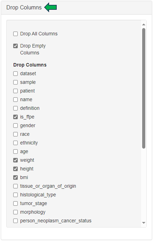
In this panel, the user can filter patients based on:
- Categories (by selecting different category levels) in the “Filter Categories” section

- Numerics (by setting ranges with sliders) in the “Filter Numerics” section

- Drop columns to shape patient table into a smaller dataset with the help of “Drop Columns” section.

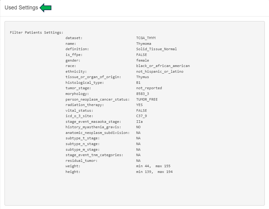
Finally, the settings used to filter the patients data can be viewed under the “Show Settings Used” option.


This filtered patient table can be sent to New Comparison app and joined there with sample table and expression data.

Graphics panel

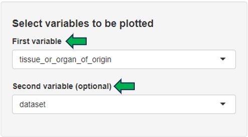
This panel contains a visualization of patient clinical variables. Different variables can be selected from the “Select variables to be plotted” option on the left hand side of the interface.

Depending on the number and type of selected variables, a bar plot, a box plot, a histogram, or a scatter plot is displayed. The displayed plot can be downloaded as a powerpoint slide with the help of the download link given below.

Cluster Patients panel

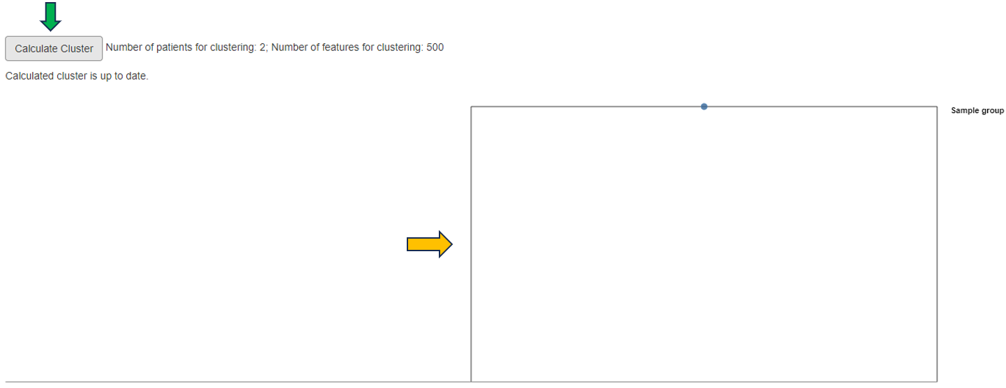
In this panel, filtered patient table from Table panel is joined with sample table and corresponding gene expression samples are loaded. The patients can be here further filtered based on sample’s categories. Hierarchical clustering analysis is performed on the selected patient samples and results are visualized as a dendrogram. Various gene sets can be specified for the clustering analysis: N top variable genes, pathway and GO sets, or manual gene selection. Clinical variables can be visualized as bars added below the dendrogram.

Patient clusters can be interactively defined within the dendrogram plot and the univariate statistics are calculated between the defined patient groups for selected clinical variables. Additionally, corresponding heatmap can be visualized (recommended only after final selection of patients, samples, genes and clinical variables).

Lab Results QC panel

In case the patient data includes measurements from blood and urine tests, the quality of these results can be inspected in this panel.

Lab Time Series panel

In case the patient data includes measurements from blood and urine tests in multiple time points, a time series plot of a selected measurement is visualized.

Reports

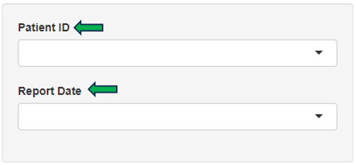
Selected patient’s report can be obtained through this panel for review and analysis.

3 - NanoBRET
⚠️ This page is still under construction.
Documentation
The documentation is in a separate page in html format:
link to full documetation
4 - App Documentation Not Ready
⚠️ Unfortunately the documentation for the app you were looking for is not ready yet.
Try going back to our home page
